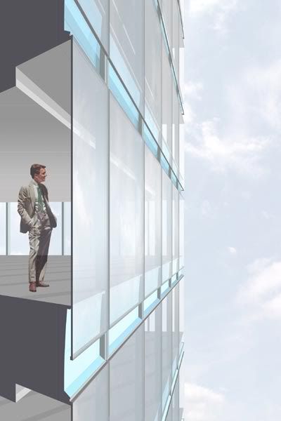
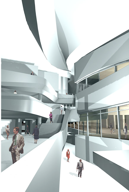
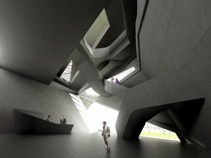
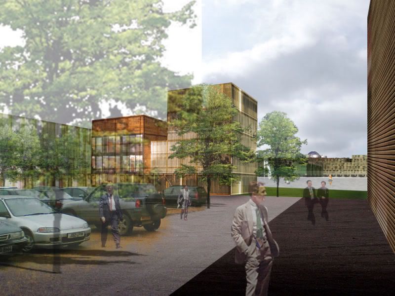
So I hope this isn't just me... but over the years, being it competition entries, feasibility studies, marketing websites, urban proposals, etc, there is a familiar face that consistantly makes an appearance:
I'm sure some of you have seen him before, being one of the only royalty free, hi-res, white-background, photoshop elements on the top of the google list when searching for such.
Aside from this being an open forum to discuss where you've seen him and/or any other emotional attachments you may have to him, I wonder more about who this man actually is (the person, not the downloadable TIF image), and wonder if he has any knowledge that he has appeared in intern renderings for some of the worlds more important new buildings. And yeah, I'm bored
sometimes he has 65% opacity
sometimes just a silhouette
sometimes he's talking to someone
other times he's staring at some improbable feature on a never built competition entry.
in undergrad i used images of friends and professors. trendy acquaintances usually made the best scaleys...with their fashionable shoes, colorful handbags and pompous stances.
Why haven't i seen anyone use homeless scalies? They would make any rendering photo realistic. Here's one. I'll give a quarter to the first person to crop him out from his background.
that guy is actually the thing i HATE most in the state of architecture atm. everytime i see him it put me in a bad mood. that friggin bad beige suit.aaaaaaargh!!!
and the fact that ever supposedly creative architectural offices use such a dork in their images is just plain wrong!
i wish i could post my "people" library on line for all to use. it is filled with half naked ladies. i did get called out one jury for having only scantily clad women in the rederings. though it wasnt the attire that was noted, only the fact that there were no men...
Some guys tend to fancy the shot with some really fashionable hot sexy blonde females with sunglasses and mini skirts.
it's a dirty technique but it works ... at least for me
wat do u think guys ?
I'm a girl and I tend to use really fashionable hot sexy blonde females with sunglasses and mini skirts in my dirty renderings... and it worked for me too, because it appeals to your typical studio critics.
There was an office where I worked that had alot of those 1960 renderings hanging around the office for highrise buildings, and expansive plazas. The guy who did the renderings was fantastic, they were smooth and flowing. One day I was looking at one of those plaza drawings when one of the older guys comes up behind me and points out a dog peeing on a ladies leg. He says if you look close enough you will find that dog in very one of his renderings doing his duty.
my favorite, is to use people from the actual site, or city that the project is located in (if possible) - gives the rendering a sense of reality - even if i am the only one who knows it...
back in the day before ps & cad renderings were the norm I used to stick people on my line drawings from magazines.
I found cosmo and playboy were crap because they rarely showed full lengths of people (unless they were lying down....full page spread). So it was usually the trendy elle or those "learn to sow" magazines you get in the supermarket for about a nickle
My mate tends to use Halle Berry alot, deceptively so
i'de like to start using pirates. i'de like to design a nice prosthetics care center, and having hobbling pirates with peg legs and parrots as my rendered people. i'm talking 15-20 pirates in various shapes and sizes with sweet weapons and eye patches. i feel like it would really be the selling point because pirates are pretty much the most badass kinds of humans with tattered limbs.
Now that this thread has been brought back to my attention; I forgot I had collected a few images over the years of the guy in question from my original post (his image is gone above, but he's the potential pocket pooling fellow in the khaki suit). From WTC7 to Eisenmann to Zaha to crappy developments in Brooklyn, he's been around:
n_ and Hasselhoff, great ideas. subliminal messaging using naked chicks, y didnt i think of that? oh wait i did. i not only put naked chicks in my ptf, but on one page i had a girl being humped by a dog. it was a silhouette in the background, and was positioned so that if you weren't looking carefully, it just looked like the woman was bending down to pick something up while the dog was jumping up. but look closer and you can see the true story. im pretty sure it got me into the top colleges
phuyaka...i read your thread title, and that "guy" immediately popped in my mind...glad to know he is the same person, and he gets to travel around the world looking at all prospects of what architecture could be...
i think i have an idea for halloween...time to practice that "pose"
"That guy" in renderings
So I hope this isn't just me... but over the years, being it competition entries, feasibility studies, marketing websites, urban proposals, etc, there is a familiar face that consistantly makes an appearance:

I'm sure some of you have seen him before, being one of the only royalty free, hi-res, white-background, photoshop elements on the top of the google list when searching for such.
Aside from this being an open forum to discuss where you've seen him and/or any other emotional attachments you may have to him, I wonder more about who this man actually is (the person, not the downloadable TIF image), and wonder if he has any knowledge that he has appeared in intern renderings for some of the worlds more important new buildings. And yeah, I'm bored
well he isn't a "hand" model, because they are in his pocket
Dad!?
i stick naked people in my renderings to see if anyone notices. so far, NO ONE has ever noticed. i
he is the ghost who walks
sometimes he has 65% opacity
sometimes just a silhouette
sometimes he's talking to someone
other times he's staring at some improbable feature on a never built competition entry.
I put a French maid dusting a tree once in mine. It was classic. I know this girl that puts werewolves and stuff in her's. It's sweet.
That's Dick Hertz.
it's tom strogenouf
jimmy hoffa?
in undergrad i used images of friends and professors. trendy acquaintances usually made the best scaleys...with their fashionable shoes, colorful handbags and pompous stances.
I use Magritte:

pictures of myself only, many many times, enough to block out the architecture.
I put Steve Jobs hanging out at a certain charitable foundation HQ in Seattle.
Why haven't i seen anyone use homeless scalies? They would make any rendering photo realistic. Here's one. I'll give a quarter to the first person to crop him out from his background.

that guy is actually the thing i HATE most in the state of architecture atm. everytime i see him it put me in a bad mood. that friggin bad beige suit.aaaaaaargh!!!
and the fact that ever supposedly creative architectural offices use such a dork in their images is just plain wrong!
i wish i could post my "people" library on line for all to use. it is filled with half naked ladies. i did get called out one jury for having only scantily clad women in the rederings. though it wasnt the attire that was noted, only the fact that there were no men...
Some guys tend to fancy the shot with some really fashionable hot sexy blonde females with sunglasses and mini skirts.
it's a dirty technique but it works ... at least for me
wat do u think guys ?
I've seen from Jimi Hendrix and Kurt Cobain (yes, Kurt) to Marilyn Monroe and Humphrey Bogart (yes, Bogart).... and not only in Archigram biographies
I'm a girl and I tend to use really fashionable hot sexy blonde females with sunglasses and mini skirts in my dirty renderings... and it worked for me too, because it appeals to your typical studio critics.
There was an office where I worked that had alot of those 1960 renderings hanging around the office for highrise buildings, and expansive plazas. The guy who did the renderings was fantastic, they were smooth and flowing. One day I was looking at one of those plaza drawings when one of the older guys comes up behind me and points out a dog peeing on a ladies leg. He says if you look close enough you will find that dog in very one of his renderings doing his duty.
Usually put animals in all the time, jack russels or large cows tend to draw attention from lousy designs.....
But skip the renderings and go directly on real life Cad-blocks for authenticity throughout the process.
http://www.partiv.com/2007/03/real-life-dwgs.html
Nice, those did the round here in London a week or so a ago.
I had a tutor who put cow(s) and steam trains in all his models, regardless of the context or scale. Sweet.
I put King Kong in a section once...he is the king after all....
my favorite, is to use people from the actual site, or city that the project is located in (if possible) - gives the rendering a sense of reality - even if i am the only one who knows it...
I stockpile mine in one photoshop file that is getting rather fat.
other faves...
everyone in tux's
my friend doing the buddy jesus
a knight
the naked cowboy
grandparents ballroom dancing
streetkids drumming (good for urban renders that beg a crowd)
Any good sites for free entourage?
there are a few to be found here, not too many though: www.lespaysagistes.com
if my french doesnt let me down i think they are totally free to use.
Any more? Anyone?
back in the day before ps & cad renderings were the norm I used to stick people on my line drawings from magazines.
I found cosmo and playboy were crap because they rarely showed full lengths of people (unless they were lying down....full page spread). So it was usually the trendy elle or those "learn to sow" magazines you get in the supermarket for about a nickle
My mate tends to use Halle Berry alot, deceptively so
This blog has done a good job of running down all the free stuff available for renderings.
models from w< (great clothes), models from dsquared (great bodies), and mannequins from the photos of bernard faucon (great what the hell...?)
i am going to start using garwondlers in mine...
(I did once sneak a garwondler in the far, far background. When he's only a couple pixels tall he's really quite fetching.)
I used to use Chewbacca pretty frequently, but after awhile I began to realize the 7+ foot tall wookie made my ceilings look low.
this guys showed up in metropolis...based loosely on the originals
homeless RPC's would rock
Have you ever had clients make weird comments regarding the people you chose to put in a rendering?
I was once asked to take a woman out of a rendering because the client thought she looked like "a slut."
she was a slut wasn't she...dirty!
i'de like to start using pirates. i'de like to design a nice prosthetics care center, and having hobbling pirates with peg legs and parrots as my rendered people. i'm talking 15-20 pirates in various shapes and sizes with sweet weapons and eye patches. i feel like it would really be the selling point because pirates are pretty much the most badass kinds of humans with tattered limbs.
Now that this thread has been brought back to my attention; I forgot I had collected a few images over the years of the guy in question from my original post (his image is gone above, but he's the potential pocket pooling fellow in the khaki suit). From WTC7 to Eisenmann to Zaha to crappy developments in Brooklyn, he's been around:


I'm gonna start populating my drawings with the Amish. I figure they'll provide a nice contrast to the modern sexiness around them...
n_ and Hasselhoff, great ideas. subliminal messaging using naked chicks, y didnt i think of that? oh wait i did. i not only put naked chicks in my ptf, but on one page i had a girl being humped by a dog. it was a silhouette in the background, and was positioned so that if you weren't looking carefully, it just looked like the woman was bending down to pick something up while the dog was jumping up. but look closer and you can see the true story. im pretty sure it got me into the top colleges
phuyaka...i read your thread title, and that "guy" immediately popped in my mind...glad to know he is the same person, and he gets to travel around the world looking at all prospects of what architecture could be...
i think i have an idea for halloween...time to practice that "pose"
This is really old school, I know, but. . .I found this guy at some free entourage site, recently. I had to add his right elbow. . .

Block this user
Are you sure you want to block this user and hide all related comments throughout the site?
Archinect
This is your first comment on Archinect. Your comment will be visible once approved.