“ ‘OK you want "some real criticism’? First I'll simply quote Orhan's comment in the archinect news section: that the "winning proposal is so sold out. After seeing the real thing in Silverlake, this looks like a waste of energy and missed opportunity to build something new."
And expect me to take anything you say seriously. Anything you say after that meaningless quote is just hogwash.
I agree 100% with Magnetic Chuck and I believe that all the entries have strengths and weaknesses. In the end Ball Nogues is the strongest project presented. Do not get wrapped up on how the media presented these guys. They won because they have a strong project. I’ll refer back to Magnetic chuck’s post.
Not that I agree with Tourant or anything but you (kill69) make it hard for me to take you seriously when you say things like "In the end Ball Nogues is the strongest project presented."...
you seem too biased to accept a "true critique" whatever that is...
Maybe so Ricky Bobby. Maybe so. Your right! I am bias. I am on to the next thread. The one about the adulterous employee is much more intriguing. I will leave you guys to this one.
if you kids are going to argue, then say something with content....
kill69, you begin you post by saying that you can't take anything Tourant says seriously because the post begins with a quote from Orhan, then you yourself base your argument on "agreeing with Magnetic Chuck 100%". Then go on to say that B-N has the strongest project? Based on what?
Tourant, to say something is 'just plain ugly" is about the same as saying something is "the strongest project presented."
Ruy Klein's is innovative tectonically for it's knotting pattern. Magnetic Chuck says it's not possible, but we've seen Marcel Wanders do it effectively (okay for a catenary curve) but it seems possible for the ropes to span if the they don't stay totally flat, and from the model, they look like they are intentionally sagging a bit.
Iwa-Scott's suspends a volume (rather than a surface), and makes a pretty great space underneath. True, it looks like they have more 'cable boundaries', but so what? Are you, Magnetic Chuck, saying that 24 telephone poles are more efficent? better? elegant? I disagree with that, especially the way the 'strucutural surface' crawls up onto them. MaxSchell was cool, partly because the way it used the site boundaries. I don't see that with Liquid Sky.
MOS's entry uses the coolest and most technologically innovative material, and smokers and drunks aside, it seems as feasible as B-N putting all those interconnected mylar pieces in close range to the same drunks and smokers.
Yes, all the schemes are good and bad in their own way. kill69, to say that B-N presented the 'strongest project' reveals your own bias and shows how that makes you blind.
PS - Ricky Bobby I was not the one giving any criticism on the projects. I openly admitted in my first post I was all for Ball Nogues project. I did not state anymore than that. So yes I am bias. My intentions are to curve people on this thread from referring to work as "lame" or “sucks” without giving anything to back it up. That is all.
Well said samanthas... Kill69: I can start a post anyway I want. And that quote is far from meaningless, it states a strong opinion I happen to agree with.
I am certainly not alone with this opinion: I and everyone I know who've seen these projects think BN do not have the strongest project -- so its a simple difference of opinion in your arena versus mine. You say I am "too bitter" -- you are obviously 'too convinced' to feel the need to offer any critique.
Magnetic Chuck certainly seems to know their Frei Otto, and the particulars of BN's work/software etc. - you wouldn't happen to be the engineer working with them on the project?
As for the argument about "anticlastic surfaces" and "3D to 2D back to 3D", in the end those mylar scales or shingles come from a sheet and essentially stay a flat sheet in repetitive rows of same size pieces per row, to ultimately form the larger anticlastic shape. In both the MOS and IwaScott projects the sheet material is transformed from a flat sheet material to a more emergent, 'volumetric surface' -- not a technical term but one I use here to describe their projects' more nuanced and far more interesting looking results. They're less based on the kind of strong geometry architypes that are very familiar if not cliche by now. One of them seems more contextually-derived form the courtyard (IwaScott) and one seems more autonomous (MOS), but both seem more sophisticated spatially and formally. RuyKlein and Gage's are another matter, not being in this realm of volume/surface, but they seem also more interesting/challenging as architectural experiments, particularly RuyKlein's.
And I agree with samanthas' point about structural efficiency or lack thereof. Although in the end, structural expression, efficency or inefficiency can not be the sole arbiter of architectural quality. Rather, how structure and material come together to make space that is compelling inevitably involves questions of aesthetics, and the arguments presented thus far are never going to convince me Liquid Sky is the "strongest project" in this regard. When it is built perhaps I will be more impressed than I am now; but as it stands, from what I've seen so far, this is not the strongest design that was presented. And again, I am far from alone in this belief.
And by the way, Kill69, How do you "curve" a person? Do you mean "curb"?
media presentation is not to be scoffed at by scoffers. when the goatee gets the girl you have to wonder whether or not the design is kinda lame or sucks in the eye of the author, and if the author is kinda lame or sucks because they dont know if that red tinted russ meyer circus could be the best thing in christendom. we exist in a world of metaphors and images, it seems only fitting that a comment about imagery and presentation can be tolerated. im bored already.
these designs are built by young firms who are holding firm to what can most generically be described as ideals, despite how similar they are to other young firms who rarely get something built. cheers to them...i liked last years entries better.
but if you're saying Obra's (or Rahim's which you could hardly tell what it was from what's been circulated) was better than these? then I have to question to your judgement, wit or no wit.
i liked the one with the wierdo grotto or the colorful lazy circular one...i dont remember when those were...you cant question my judgement (i cant bear it!), but you can question my memory...i remember last year being kinda boring but i enjoyed the mist as it trickled up my shorts...he he
Tourant- Nope, I'm not the engineer working with them on this project and the reason that I know so many particulars is simply because I asked them last week while they were here in NY. I also happen to be an engineer and therefore know Otto quite well.
With regard to the mylar pieces they happen to be a scaling parametric component and therefore are not all the same as you state. As far as what you are calling "emergent volumetric surfaces" I think the BN piece has that in spades and their use of structure/skin advances the discourse begun by Otto.
Samanthas-Please go get a nice fat rope and try to pull it flat between two points about 80 or so feet apart...you will not be able to, no matter how hard you try and you will find out that in reality it will sag down far more than "a bit". If you would like, take the experiment further by measuring the amount of sag on the first day and then again several days later...add a hefty dowsing of water to the rope and repeat measuring. Now go and look at Ottos work and see if you can figure out why the man used steel cable. Rope may work at the scale of a chair...but not at the scale of the PS1 courtyard. If you still think that you can work with that much rope then count the number of knotts divide them up by the amount of days left before the opening date and figure out how many knotts you will need to tie per day and how many thousands of feet of rope you will need to pull back on forth per knott. I hate to bring it up but in the real world you have to consider those things, otherwise you just bought yourself a lot of rope to hang yourself with.
not without- have long have you been without? at least Tourant and Samanthas offer valid opinions/comments that could further the discussion and while I'm at it (and since I met them) I think that they are charming guys and well schooled in the realities of getting a project built within the time frames and budgets set forth by the client. enough said...I'm also moving on to the thread about cheating in the workplace.
magnetic chuck, I could count the knots (with one 't', the jam has 'tt') but I could also count the number of mylar pieces, and choose not to. I find that a moot point, as any winning team will make it work -- and that would be in the "real world". They may be knotting for days, but so what?
Please to not tell me to go find a rope. If you want to prove your point, I suggest you find the rope, try to stretch it, and send me pictures of how it fails. I would not attempt to stretch a single rope across 80 feet. I might make a netting out of it, strengthen it with a resin/polymer (as I said, in the Wanders chair) that would make it watertight, and then have it span. The courtyard has walls that are what? 15-18' high? It could sag quite a bit and still be out of people's way.
Is that enough said? I don't know. I don't typically tell people what to do, try to have the last word and then say I am 'moving on' without giving someone else a chance to respond. That's just bad manners.
I think the Iwamoto Scott one looks really great. cool video. But the one by gage clemenceau is definatly not "aweful." seems pretty hot and they built part of it too. i just saw it on their website www.gageclemenceau.com
but
I heard they had a video but couldnt find anything anywhere-- any suggestions? And did ruy Klein have a video? i found the others on youtube.
Samanthas,
Sorry if that was upsetting to you...that was not the intention.
I certaintly was not trying to tell you what to do but only just merely putting it out there for you to consider. since most of us will never be lucky enough to experience "anti gravity" anything you should become familiar with the forces of nature and the forces of budget.
If rope is too big, get a string and study it that way. I think that it is a worthwhile, yet simple experiment that anyone who questions gravity should perform.
And by the way you better get out a mountain of 55gal drums of "resin/polymer" to coat that rope...but wait the resin alone costs 70 grand! and which one should you buy from the many types available (shit what to do now) and even if you manage to procure the resin, mixing and degassing equipment and safety gear, how do you plan to put it on...a brush? well, then you better buy quite a few brushes, grab anyone with arms and get to painting because you are going to need to mix a lot of resin and every available minute you have to finish it on time...imagine the clean up! It is OK to not finish a school project or to make a big sloppy resin mess on the floor next to your desk...and resin would'nt fix the problem anyway.
reality bites.
Sevensixfive, I kind of agree with you about the juju, with all the character bashing at the beginning. But now what's being discussed is the merits of the winning scheme and whether it's the best design or not. No one's bashing these guys as people. Though some have suggested personality/package might have played as much a part in winning as design quality, that kind of scrutiny is part of the deal with winning such a high profile competition as this.
And dorian81, I also agree, the Gage Clemenceaue one is certainly not awful -- some of those images are pretty powerfull. It has an intensity, but seems a bit derivative. And I don't get the overall symmetry + local symmetry of each module thing (just like BN's) -- but then again I never bought into all the symmetry with much of Greg Lynn's work. In the end, regardless of formal logic, it does seem like an awfull lot of metal to put in the courtyard, and probably searing hot metal in the summer.
And samanthas, I didn't take magnetic chuck's suggestion for you to 'get a rope and try it' as offensive on his part either. But regarding RuyKlein's scheme, to actually knot rope on that scale does seem kinda crazy, yet interesting -- and we probably don't know enough about it yet to really judge...However it does seem quite similar to Michael Meredith's first PS1, which was a big knotted, fishnet / hammock proposal.
On the other hand, I don't remeber seeing any PS1 entry like IwamotoScott's or MOS' current one.
Back to the discussion of the winner --magnetic chuck: I did not say the mylar pieces are all the same, but that they are "same size pieces per row" (meaning horizontal row, or 'course') -- which as far as I can tell seems the case. This in addition to the fact that the 'funnels' themselves seem repetitive has me far less interested in BN's formal strategy than the others, along with the general familiarity with it thru MaxSchell and many other such hyperbolic/paraboloid tent things. Add in the general clunkiness of the whole thing, and again, I don't see how you have a winner, design-wise.
gage's entry: hernan meets elena manferdini. looks like mark has west coast envy. especially with the greg lynn website. at least he is being original.
why is original so bitchin-- whats wrong with just being , i dunno, good? or talented man? if we keep aiming for original, every generation will be trying to reinvent the wheel. i think the best schemes, like the iwo scott one and the gage one-- and even the bn one (transparent frei otto anyone?) are taking existing technologies and pushing them towards something better.
i mean, come on, the "whites" all had the same kinda crap going on when they were young, just like all these people were talking about, and they developed into the eisenman, gwathmey, meier, and graves of today right? (some better than others of course eh?). but wildly different given time to bake at 350. Yeah. a bunch of the work looks similar, theres a limited number of tools out there. but the question is, whos best with them?
and whats with this east coast west coast thing, sounds pretty lame to me. didnt greg lynn go to princeton and alonzo to columbia? and even frank gehry (mr west coast!) went to harvard for a stint right? is that who you're calling "west coast?" Im in CA too bro and dont feel any of that territorial crap. Architecture isnt some tupac vs. biggy thing. word up!
isnt that waht the ps1 thing is for, seeking out young firms who are tyring to be inventive and anti- establishment? Ten bucks (the most i have) says these people would all make more at Gehrys office or kpf. I worked on the obra scheme (a little) last year and it was a big pain for those guys (less for me). We should be propping these guys up not hacking them to pieces.
Personally the whole program have not evoke that much of a critical thought in my mind. So far, I have not found any of this program critical of anything but a publicity activity for PS1 and MOMA.
Fine, at that level it deserves these two to ten minutes snippets.
These events are certain building types and have their roots in expo pavillions. Nothing young.
Public (me) like to see a proposal of a high school graduated Barcelona Pavillion made out of semi hardened plastic, declared official for universal event architecture, made in three different sizes with soft color selections for good snooze.
Event architecture? That's old. Installation art? This tent is art. Sort of like brand art. Like Christo brand. It will make the designers, but eventually kill their art.
Winning entry is a good shade and certainly a good design, provided it is merely a fabrication concept for shade device god sake, god sake.
"Will have the young architects create shades boys. Ahem ahem... Shade boys, shade.."
I thought same designer's installation in Silverlake, Los Angeles was a beautiful approach to an interesting venue, an adoptive use of otherwise typical Los Angeles lot condition turned into an urban public courtyard. a pocket park with hay bales for sitting and a dreamy tent for providing shade. Sleep there.
It was a good Barcelona Pavillion where you could pee on the marble, or read your newspaper. Good boy, good boy. Have beer, have a beer.
the wheel was probably pretty easy to invent, i mean, slice a log, get a wheel, party over. we're so hampered by available technology, gravity, budgets, five fingered hands, bilobal brains, tongues of typical dimensions...please, try to reinvent something!
Agreed...it's not about reinventing the wheel, but advancing the wheel, or collection of wheels toward something better/stronger/faster. I'm not conviced that that applies when the scheme is essentially a duplicate (see above) rather than testing those same technologies toward a different end.
magchuck, your skewing of the real world that implies RuyKlein's proposal couldn't be built could be applied to any of the schemes. Resin would not cost $70,000, and the same number of arms to brush it on will equal the number that it takes to install BN's. Does the macrame need a different structural system? what about 24 telephone poles? But wait! that would ruin the beauty of the surface. yeah, reality does suck.
Is anyone else underwhelmed by this? I actually love the overall idea and form, even the translucent material, but the little triangle flag shapes remind me too much of used car dealerships.
it just looks so poorly crafted. the mylar (or whatever it is) just looks wimpy when combined with those huge telephone poles which to me dominate and overwhelm the much more intersesting translucent material. it just looks so clunky and unresolved.
yeah, i was just at PS.1 for bastille day with all those people in the picture. the installation, like all the contemporary art in the museum, was extremely underwhelming. ball-nogues' models portrayed a series of connected canopies that covered most of the courtyard, but it simply did not provide ample shade. It was a great idea that was sloppily executed. i feel that if you know something isn't working then modify it, change it, do what you can to make it better in the end.
Orphan did you go and see Maximilian's shell at M&A?
I thought it was actually quite magical in its spectacularly tacky form and finish. To me, M&A is an extraordinary space in itself and the vortex filled the space beautifully as contextual parallels were not difficult to draw. I think thats where PS1 disappoints. The scale of these floating teepee's is off, nothing grounding the forms- no site specificity.
Also, the inversion of the vortex is far less impressive. I see why is was done programmatically, but i think they could have created more interesting pockets of space had they stuck to the original form, literally tying it into the existing architecture. Also, aside from the street view, the magic of Maximilian's shell was the buoyancy of the vortex and how the connections happened at the [top] edges, but the "trunk" or "eye" didn't quite touch the ground. Inverted, the PS1 installation looks, as AP said, like party banners.
Having said that, Benjamin & Gaston look and swagger like 80's porn stars, complete with mustaches and aviators- they're awesome.
word on the street here in LA is that the mylar was NOT working in the way they wanted. basically they couldn't figure out a way in the time allotted and money they had to make it work like their proposal.
im just sorry is so poorly executed, and also u know, i just dont get it in my head, isn't it the call for entries for the competition already mentioning how much money/time u will get??, if u present an idea, just as an idea, without considering how much money and time u will get, then ur not worth of even being consider it as a "young talent", besides, thats a lame excuse, just thing of the work done by Xefiro-Diaz_Alonso and N Architects, even OBRA qhich was a pavillion i hated...but anyways, this pavillion, is sorry to say, CRAP for me
beefeaters...it was gold mylar internally reinforced with bundled Nylon and Kevlar fibers...I think the construction quality was impressive. It's a heavily published project so there are lots of mentions online.
PS1 YOUNG ARCHITECTS
That's good reasoning and criticism. nice.
Tourant
You can’t start a post:
“ ‘OK you want "some real criticism’? First I'll simply quote Orhan's comment in the archinect news section: that the "winning proposal is so sold out. After seeing the real thing in Silverlake, this looks like a waste of energy and missed opportunity to build something new."
And expect me to take anything you say seriously. Anything you say after that meaningless quote is just hogwash.
I agree 100% with Magnetic Chuck and I believe that all the entries have strengths and weaknesses. In the end Ball Nogues is the strongest project presented. Do not get wrapped up on how the media presented these guys. They won because they have a strong project. I’ll refer back to Magnetic chuck’s post.
You seem too bitter to give a true critique.
Not that I agree with Tourant or anything but you (kill69) make it hard for me to take you seriously when you say things like "In the end Ball Nogues is the strongest project presented."...
you seem too biased to accept a "true critique" whatever that is...
Maybe so Ricky Bobby. Maybe so. Your right! I am bias. I am on to the next thread. The one about the adulterous employee is much more intriguing. I will leave you guys to this one.
if you kids are going to argue, then say something with content....
kill69, you begin you post by saying that you can't take anything Tourant says seriously because the post begins with a quote from Orhan, then you yourself base your argument on "agreeing with Magnetic Chuck 100%". Then go on to say that B-N has the strongest project? Based on what?
Tourant, to say something is 'just plain ugly" is about the same as saying something is "the strongest project presented."
Ruy Klein's is innovative tectonically for it's knotting pattern. Magnetic Chuck says it's not possible, but we've seen Marcel Wanders do it effectively (okay for a catenary curve) but it seems possible for the ropes to span if the they don't stay totally flat, and from the model, they look like they are intentionally sagging a bit.
Iwa-Scott's suspends a volume (rather than a surface), and makes a pretty great space underneath. True, it looks like they have more 'cable boundaries', but so what? Are you, Magnetic Chuck, saying that 24 telephone poles are more efficent? better? elegant? I disagree with that, especially the way the 'strucutural surface' crawls up onto them. MaxSchell was cool, partly because the way it used the site boundaries. I don't see that with Liquid Sky.
MOS's entry uses the coolest and most technologically innovative material, and smokers and drunks aside, it seems as feasible as B-N putting all those interconnected mylar pieces in close range to the same drunks and smokers.
Yes, all the schemes are good and bad in their own way. kill69, to say that B-N presented the 'strongest project' reveals your own bias and shows how that makes you blind.
PS - Ricky Bobby I was not the one giving any criticism on the projects. I openly admitted in my first post I was all for Ball Nogues project. I did not state anymore than that. So yes I am bias. My intentions are to curve people on this thread from referring to work as "lame" or “sucks” without giving anything to back it up. That is all.
Tu che Samanthas. Seems you have it all figured out.
i'm sorry but you all are lame and therefore suck.....
as do the schemes.
; ) okay, i'm laughing too hard at myself to pull that one off straightfaced
Well said samanthas... Kill69: I can start a post anyway I want. And that quote is far from meaningless, it states a strong opinion I happen to agree with.
I am certainly not alone with this opinion: I and everyone I know who've seen these projects think BN do not have the strongest project -- so its a simple difference of opinion in your arena versus mine. You say I am "too bitter" -- you are obviously 'too convinced' to feel the need to offer any critique.
Magnetic Chuck certainly seems to know their Frei Otto, and the particulars of BN's work/software etc. - you wouldn't happen to be the engineer working with them on the project?
As for the argument about "anticlastic surfaces" and "3D to 2D back to 3D", in the end those mylar scales or shingles come from a sheet and essentially stay a flat sheet in repetitive rows of same size pieces per row, to ultimately form the larger anticlastic shape. In both the MOS and IwaScott projects the sheet material is transformed from a flat sheet material to a more emergent, 'volumetric surface' -- not a technical term but one I use here to describe their projects' more nuanced and far more interesting looking results. They're less based on the kind of strong geometry architypes that are very familiar if not cliche by now. One of them seems more contextually-derived form the courtyard (IwaScott) and one seems more autonomous (MOS), but both seem more sophisticated spatially and formally. RuyKlein and Gage's are another matter, not being in this realm of volume/surface, but they seem also more interesting/challenging as architectural experiments, particularly RuyKlein's.
And I agree with samanthas' point about structural efficiency or lack thereof. Although in the end, structural expression, efficency or inefficiency can not be the sole arbiter of architectural quality. Rather, how structure and material come together to make space that is compelling inevitably involves questions of aesthetics, and the arguments presented thus far are never going to convince me Liquid Sky is the "strongest project" in this regard. When it is built perhaps I will be more impressed than I am now; but as it stands, from what I've seen so far, this is not the strongest design that was presented. And again, I am far from alone in this belief.
And by the way, Kill69, How do you "curve" a person? Do you mean "curb"?
media presentation is not to be scoffed at by scoffers. when the goatee gets the girl you have to wonder whether or not the design is kinda lame or sucks in the eye of the author, and if the author is kinda lame or sucks because they dont know if that red tinted russ meyer circus could be the best thing in christendom. we exist in a world of metaphors and images, it seems only fitting that a comment about imagery and presentation can be tolerated. im bored already.
these designs are built by young firms who are holding firm to what can most generically be described as ideals, despite how similar they are to other young firms who rarely get something built. cheers to them...i liked last years entries better.
not without: not without wit certainly
but if you're saying Obra's (or Rahim's which you could hardly tell what it was from what's been circulated) was better than these? then I have to question to your judgement, wit or no wit.
i liked the one with the wierdo grotto or the colorful lazy circular one...i dont remember when those were...you cant question my judgement (i cant bear it!), but you can question my memory...i remember last year being kinda boring but i enjoyed the mist as it trickled up my shorts...he he
can someone offer a link or image of the ruyklein proposal?
thanks.
Tourant- Nope, I'm not the engineer working with them on this project and the reason that I know so many particulars is simply because I asked them last week while they were here in NY. I also happen to be an engineer and therefore know Otto quite well.
With regard to the mylar pieces they happen to be a scaling parametric component and therefore are not all the same as you state. As far as what you are calling "emergent volumetric surfaces" I think the BN piece has that in spades and their use of structure/skin advances the discourse begun by Otto.
Samanthas-Please go get a nice fat rope and try to pull it flat between two points about 80 or so feet apart...you will not be able to, no matter how hard you try and you will find out that in reality it will sag down far more than "a bit". If you would like, take the experiment further by measuring the amount of sag on the first day and then again several days later...add a hefty dowsing of water to the rope and repeat measuring. Now go and look at Ottos work and see if you can figure out why the man used steel cable. Rope may work at the scale of a chair...but not at the scale of the PS1 courtyard. If you still think that you can work with that much rope then count the number of knotts divide them up by the amount of days left before the opening date and figure out how many knotts you will need to tie per day and how many thousands of feet of rope you will need to pull back on forth per knott. I hate to bring it up but in the real world you have to consider those things, otherwise you just bought yourself a lot of rope to hang yourself with.
not without- have long have you been without? at least Tourant and Samanthas offer valid opinions/comments that could further the discussion and while I'm at it (and since I met them) I think that they are charming guys and well schooled in the realities of getting a project built within the time frames and budgets set forth by the client. enough said...I'm also moving on to the thread about cheating in the workplace.
kill69,
if you want, i can grab your tail and plug your major opening to the sound transmissions so you don't have to hear my meaningless words.
magnetic chuck, I could count the knots (with one 't', the jam has 'tt') but I could also count the number of mylar pieces, and choose not to. I find that a moot point, as any winning team will make it work -- and that would be in the "real world". They may be knotting for days, but so what?
Please to not tell me to go find a rope. If you want to prove your point, I suggest you find the rope, try to stretch it, and send me pictures of how it fails. I would not attempt to stretch a single rope across 80 feet. I might make a netting out of it, strengthen it with a resin/polymer (as I said, in the Wanders chair) that would make it watertight, and then have it span. The courtyard has walls that are what? 15-18' high? It could sag quite a bit and still be out of people's way.
Is that enough said? I don't know. I don't typically tell people what to do, try to have the last word and then say I am 'moving on' without giving someone else a chance to respond. That's just bad manners.
Man, this thread just had some bad juju right from the start ...
I think the Iwamoto Scott one looks really great. cool video. But the one by gage clemenceau is definatly not "aweful." seems pretty hot and they built part of it too. i just saw it on their website
www.gageclemenceau.com
but
I heard they had a video but couldnt find anything anywhere-- any suggestions? And did ruy Klein have a video? i found the others on youtube.
Samanthas,
Sorry if that was upsetting to you...that was not the intention.
I certaintly was not trying to tell you what to do but only just merely putting it out there for you to consider. since most of us will never be lucky enough to experience "anti gravity" anything you should become familiar with the forces of nature and the forces of budget.
If rope is too big, get a string and study it that way. I think that it is a worthwhile, yet simple experiment that anyone who questions gravity should perform.
And by the way you better get out a mountain of 55gal drums of "resin/polymer" to coat that rope...but wait the resin alone costs 70 grand! and which one should you buy from the many types available (shit what to do now) and even if you manage to procure the resin, mixing and degassing equipment and safety gear, how do you plan to put it on...a brush? well, then you better buy quite a few brushes, grab anyone with arms and get to painting because you are going to need to mix a lot of resin and every available minute you have to finish it on time...imagine the clean up! It is OK to not finish a school project or to make a big sloppy resin mess on the floor next to your desk...and resin would'nt fix the problem anyway.
reality bites.
Sevensixfive, I kind of agree with you about the juju, with all the character bashing at the beginning. But now what's being discussed is the merits of the winning scheme and whether it's the best design or not. No one's bashing these guys as people. Though some have suggested personality/package might have played as much a part in winning as design quality, that kind of scrutiny is part of the deal with winning such a high profile competition as this.
And dorian81, I also agree, the Gage Clemenceaue one is certainly not awful -- some of those images are pretty powerfull. It has an intensity, but seems a bit derivative. And I don't get the overall symmetry + local symmetry of each module thing (just like BN's) -- but then again I never bought into all the symmetry with much of Greg Lynn's work. In the end, regardless of formal logic, it does seem like an awfull lot of metal to put in the courtyard, and probably searing hot metal in the summer.
And samanthas, I didn't take magnetic chuck's suggestion for you to 'get a rope and try it' as offensive on his part either. But regarding RuyKlein's scheme, to actually knot rope on that scale does seem kinda crazy, yet interesting -- and we probably don't know enough about it yet to really judge...However it does seem quite similar to Michael Meredith's first PS1, which was a big knotted, fishnet / hammock proposal.
On the other hand, I don't remeber seeing any PS1 entry like IwamotoScott's or MOS' current one.
Back to the discussion of the winner --magnetic chuck: I did not say the mylar pieces are all the same, but that they are "same size pieces per row" (meaning horizontal row, or 'course') -- which as far as I can tell seems the case. This in addition to the fact that the 'funnels' themselves seem repetitive has me far less interested in BN's formal strategy than the others, along with the general familiarity with it thru MaxSchell and many other such hyperbolic/paraboloid tent things. Add in the general clunkiness of the whole thing, and again, I don't see how you have a winner, design-wise.
gage's entry: hernan meets elena manferdini. looks like mark has west coast envy. especially with the greg lynn website. at least he is being original.
why is original so bitchin-- whats wrong with just being , i dunno, good? or talented man? if we keep aiming for original, every generation will be trying to reinvent the wheel. i think the best schemes, like the iwo scott one and the gage one-- and even the bn one (transparent frei otto anyone?) are taking existing technologies and pushing them towards something better.
i mean, come on, the "whites" all had the same kinda crap going on when they were young, just like all these people were talking about, and they developed into the eisenman, gwathmey, meier, and graves of today right? (some better than others of course eh?). but wildly different given time to bake at 350. Yeah. a bunch of the work looks similar, theres a limited number of tools out there. but the question is, whos best with them?
and whats with this east coast west coast thing, sounds pretty lame to me. didnt greg lynn go to princeton and alonzo to columbia? and even frank gehry (mr west coast!) went to harvard for a stint right? is that who you're calling "west coast?" Im in CA too bro and dont feel any of that territorial crap. Architecture isnt some tupac vs. biggy thing. word up!
isnt that waht the ps1 thing is for, seeking out young firms who are tyring to be inventive and anti- establishment? Ten bucks (the most i have) says these people would all make more at Gehrys office or kpf. I worked on the obra scheme (a little) last year and it was a big pain for those guys (less for me). We should be propping these guys up not hacking them to pieces.
May I point out how hilarious it would be if an award for Young Actors was shortlisted to a bunch of 40 year olds? I love this profession.
peace out
Personally the whole program have not evoke that much of a critical thought in my mind. So far, I have not found any of this program critical of anything but a publicity activity for PS1 and MOMA.
Fine, at that level it deserves these two to ten minutes snippets.
These events are certain building types and have their roots in expo pavillions. Nothing young.
Public (me) like to see a proposal of a high school graduated Barcelona Pavillion made out of semi hardened plastic, declared official for universal event architecture, made in three different sizes with soft color selections for good snooze.
Event architecture? That's old. Installation art? This tent is art. Sort of like brand art. Like Christo brand. It will make the designers, but eventually kill their art.
Winning entry is a good shade and certainly a good design, provided it is merely a fabrication concept for shade device god sake, god sake.
"Will have the young architects create shades boys. Ahem ahem... Shade boys, shade.."
I thought same designer's installation in Silverlake, Los Angeles was a beautiful approach to an interesting venue, an adoptive use of otherwise typical Los Angeles lot condition turned into an urban public courtyard. a pocket park with hay bales for sitting and a dreamy tent for providing shade. Sleep there.
It was a good Barcelona Pavillion where you could pee on the marble, or read your newspaper. Good boy, good boy. Have beer, have a beer.
the wheel was probably pretty easy to invent, i mean, slice a log, get a wheel, party over. we're so hampered by available technology, gravity, budgets, five fingered hands, bilobal brains, tongues of typical dimensions...please, try to reinvent something!
Agreed...it's not about reinventing the wheel, but advancing the wheel, or collection of wheels toward something better/stronger/faster. I'm not conviced that that applies when the scheme is essentially a duplicate (see above) rather than testing those same technologies toward a different end.
magchuck, your skewing of the real world that implies RuyKlein's proposal couldn't be built could be applied to any of the schemes. Resin would not cost $70,000, and the same number of arms to brush it on will equal the number that it takes to install BN's. Does the macrame need a different structural system? what about 24 telephone poles? But wait! that would ruin the beauty of the surface. yeah, reality does suck.
For those of us not in NY and wondering what got built in the end, we can thank [http://flickr.com/photos/tags/liquidsky/]flickr[/url]
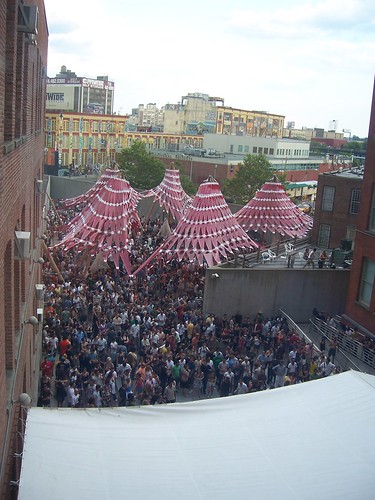
that would be flickr
Robots!
Is anyone else underwhelmed by this? I actually love the overall idea and form, even the translucent material, but the little triangle flag shapes remind me too much of used car dealerships.
doctor i keep dreaming of wigwams and teepees > i know what your problem is. you're two tents/too tense!
Hahahahahahaha that;s goofy Steven
sorry. first thing i thought of.
underwhelmed - yes. absolutely. party banners?
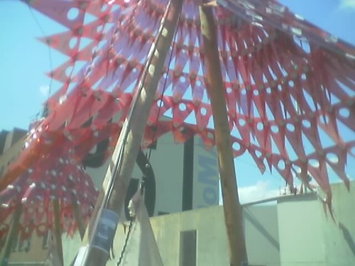
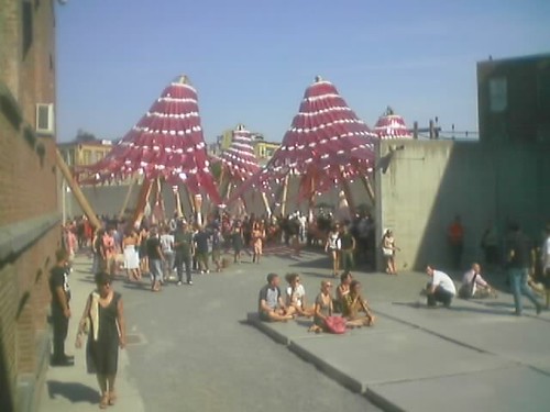
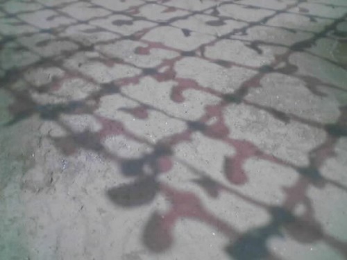
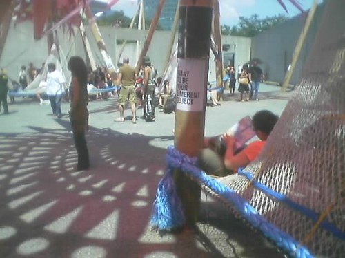
the various posters are pretty sweet...and the installation has its moments...but overall, eh.
either way, PS1 is definitely worth the short trip into Queens...
it just looks so poorly crafted. the mylar (or whatever it is) just looks wimpy when combined with those huge telephone poles which to me dominate and overwhelm the much more intersesting translucent material. it just looks so clunky and unresolved.
yeah, i was just at PS.1 for bastille day with all those people in the picture. the installation, like all the contemporary art in the museum, was extremely underwhelming. ball-nogues' models portrayed a series of connected canopies that covered most of the courtyard, but it simply did not provide ample shade. It was a great idea that was sloppily executed. i feel that if you know something isn't working then modify it, change it, do what you can to make it better in the end.
boooorinnng
next.
Orphan did you go and see Maximilian's shell at M&A?
I thought it was actually quite magical in its spectacularly tacky form and finish. To me, M&A is an extraordinary space in itself and the vortex filled the space beautifully as contextual parallels were not difficult to draw. I think thats where PS1 disappoints. The scale of these floating teepee's is off, nothing grounding the forms- no site specificity.
Also, the inversion of the vortex is far less impressive. I see why is was done programmatically, but i think they could have created more interesting pockets of space had they stuck to the original form, literally tying it into the existing architecture. Also, aside from the street view, the magic of Maximilian's shell was the buoyancy of the vortex and how the connections happened at the [top] edges, but the "trunk" or "eye" didn't quite touch the ground. Inverted, the PS1 installation looks, as AP said, like party banners.
Having said that, Benjamin & Gaston look and swagger like 80's porn stars, complete with mustaches and aviators- they're awesome.
Where are all those folks that six months ago were arguing that PS1 represented staggeringly important work?
maybe it's a "staggeringly important" process not outcome.
"party banners" quote was lifted from a comment samba made at flickr (linked to above)...
AP - I hope that it was about the process. But you know that was the same line that we used in school when at the final review our projects sucked.
sorry AP, I missed the link...
word on the street here in LA is that the mylar was NOT working in the way they wanted. basically they couldn't figure out a way in the time allotted and money they had to make it work like their proposal.
that's through the grapevine...
what material did they use for that project in LA ? the diamond pattern translucent material?
im just sorry is so poorly executed, and also u know, i just dont get it in my head, isn't it the call for entries for the competition already mentioning how much money/time u will get??, if u present an idea, just as an idea, without considering how much money and time u will get, then ur not worth of even being consider it as a "young talent", besides, thats a lame excuse, just thing of the work done by Xefiro-Diaz_Alonso and N Architects, even OBRA qhich was a pavillion i hated...but anyways, this pavillion, is sorry to say, CRAP for me
beefeaters...it was gold mylar internally reinforced with bundled Nylon and Kevlar fibers...I think the construction quality was impressive. It's a heavily published project so there are lots of mentions online.
Block this user
Are you sure you want to block this user and hide all related comments throughout the site?
Archinect
This is your first comment on Archinect. Your comment will be visible once approved.