Since the article 'The Hokusai Wave' of Alejandro Zaero-Polo (Foreign Office Architects) in Volume in september 2005 I started to work with the concept he proposes. Alejandro Zaero-Polo proposes that an architect can use an image out of our image-culture and use it in his design. That way, Alejandro Zaero-Polo argues, you as architect can very easily sell your design to the broader public, which is especially useful for practices like FOA that do a lot of competitions and projects like the London 2012 Olympic Games where the public plays a major role as a sort of indirect commisioner.
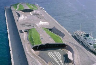
The use of iconography in the projects of FOA is defined by Alejandro Zaero-Polo as 'form with a double agenda'. The image/iconography that is being used both conceptually structures the organization of the building, and is useful in the communication of the project to the public. Take for instance the Yokohama Cruise Terminal: the image of the Hokusai Wave represents the weaving organisation of the terminal-building, and easily communicates the project to the public.
The problem of representation, that was the theme of the lectures last semester at the Berlage, was an 'interesting and timely' subject, Rem Koolhaas stated. In his lecture Rem Koolhaas questioned whether or not a 'city of exceptions' to which OMA attributes widely with contemporary icons like the Seattle Public Library, the Porto Concert Hall, the CCTV building, etc. is a sustainable strategy for the future.
Rem Koolhaas discarted the statement of Alejandro Zaero-Polo in his lecture last week in the Berlage-Institute by calling it 'decoi language'. When Alejandro Zaero-Polo asked Rem Koolhaas what strategy he would prefer, no answer followed.
With this forum I would like to start a discussion about the use of iconography in architecture and the problem of representation. I would also like to try to map different strategies in the field of iconography by publishing pictures of a architectural project next to a picture of the iconography that is referred to.
The Beijing 2008 Olympic Stadium designed by Herzog & de Meuron refers to the image of a birdsnest. The second image was a product that was shown in their 'No. 250' exhibition. The project is explicitly communicated as a birdsnest to the Chinese commisioners and public, and this nickname is already been adopted.
I shall quote Alejandro Zaero-Polo to explain what he means by that 'double agenda':
"In order to produce this disciplinary expansion we need to revisit representation with the same fluid perpective that we have dealt with material organizations, without falling back into the trap of the analagy of the witten language, like what happened with the previous incarnation of semiotic model is architecture. The semiotics that inspired architects in the past belonged fundamentally to the fied of linguistics - Saussure to Barthes. Our hypothesis here is that the consistency bewteen the material and the significant will have a brighter future when mediated through form - that which mediates matter and substance - rather that through signs, indices or other modalities of coded transfer. Rather that embracing the contingent, ambiguous nature of shape as an alternative to the hermetcism of indexicality, we forecast the development of a discipline of form with a double agenda, operating simultaneously as an organizational device and as a communicative device. This direction could be expored to sustain the future growth of the discipline, to expand architecture's audience to include a public component, which the form argument has traditionally avoided by locating itself exclusively on a disciplinary plane. By opening form into the reprocessing of identitiy and iconography, we can perhaps sustain a re-empowerment of the architect as a relevant expert with a public dimension, rather than a hermetic - even if seductive - practitioner."
"Our decision to resort to iconography as an alternative to a coded or indexial language is a kind of primitive choice - a protocaol of communication that comes bound with form and can therefore be directly coupled to material organization. Rather than deploying rhetorical modes of existing systems of signs, as in classical architecture, or signes in a calligraphic mode, as in post-modernism, the potential of extracting forms out of well established formal identities to de-stabilize material assemblages and vice versa, seems to be a viable escape from the arbitrary deployment of shapes with neighter binding relationships nor deliberate effects on the typological, organizational, or constructive nature of a building, to which a large part of 'signature architecture' has been reduced."
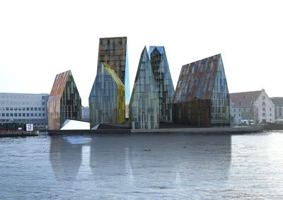
The Kroeyers Plads project of Erick van Egeraat (EEA) in Kopenhagen explicitly refers to the iconography of the 'Nikken', the goblin-helpers of Santa Claus that are part of the National culture of Danmark. Erick van Egeraat had showed an image of the Nikken explicitly at the presentation of the competition. And won.
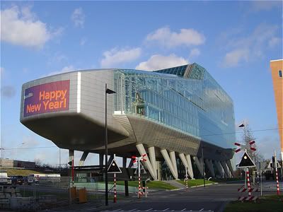
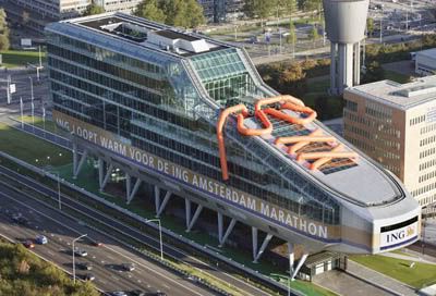
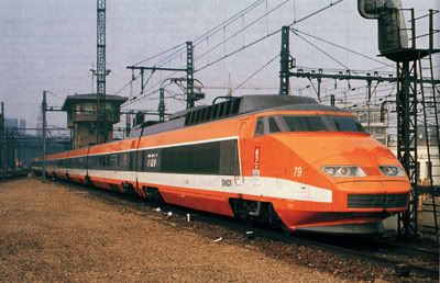
The ING House in Amsterdam of the Dutch architects Meyer & Van Schooten is not explicitly designed to be iconographic in any sense. To the public however the building looks like a shoe, an ice-skate or portable vacuum-cleaner. When you ask people about that building next to the highway in Amsterdam, they refer to it like 'O, that ice-skate!'
Feb 14, 06 8:23 am ·
·
I see reenactionary architecturism iconographically represented throughout this thread.
alejandro gave a lecture last yr in berlage talking about his london project. if my memory works, he said that AFTER his primary proposal, he was asked by the client to give an image to the project. then he came up with the muscle idea.
is it a kinda cheating?
another issue, if it's ok to present this kinda icon to public, is it ok to give lectures in shcools all over the world, saying that the icon matters both for public and the academy?
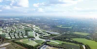
Well, as far as I know FOA and HOK Sports in the first fase of their design for London 2012 focused on the technical research and landscaping design, and left the design of the buildings unclear. The result what that critics like Deyan Sudjic publicly asked for 'images' of the buildings. So FOA designed as fast as they could this 'muscle' stadium that would fit in their flowing landscape design. Why is that cheating? It is an illustration of the power of media, something that is nowhere more powerfull than in London I guess. If the media asks for images, why not deliver them? I think it is part of the modern condition to deal with media.
The problem -obviously- with this (projective) strategy is that you design a building not only for the experience in real life, but also for the experience through media.
we have students in our class that take an ordinary object and use it as their design "concept" repetedly. they do not research the object, just use certain visual aspects of it as a basis for the design. i, personally, hate this approach. i dont think that it has the merrit of other approaches. i dont like the idea of architecture being SO representational [though i know that no matter what architecture will be, but this is direct]. i think that if you take an object as a concept that you need to analyze it and draw out conclusions and details and properties that the object possesses, more than visually, to affect design.
This is an interesting topic and I love seeing these pictures. But I'm headed out so no time to comment further - will come back to it. Briefly, outside of the question of whether it's a legitimate approach to form-making, I think ordinary people love to look at a building and say "See, those pointy shapes were inspired by the hats of elves!". It gives them an access point.
ManuG, to resize the image type a space then "width=400" (without the quotation marks) after the end of your image url (which is usually .jpg).
i just dont see any analyse and transformation from MUSCLES(they r awesome btw)... this "approach" has nothing to do with organizations and typologies but simply an opportunistic trick.
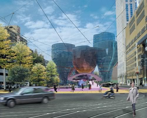
Will Alsop's 'champagne glasses' for Rotterdam Central. The architect added this buildings in the last fase of the design-process because the client asked for more 'image'. However, in this specific case, it was not such a successful strategy: the municipality, media and public turned against these 'excessive' buildings, that just looked to expensive. The architect was ditched and after a competition replaced by Neo-Modernists BenthemCrouwel.
In response to 'e': personally I think architecture is architecture. Architecture's form can succesfully refer to images of our image-culture, but a building is never going to be a picnic-basket. Plus: how succesful can 'funny' architecture be? No, I think architecture has to keep something of a autonomy, a discipline. Therefore the use of iconography is always a bit abstract.
In response to 'backu' and 'ideo': Yes, sometimes the use of iconography is 'thin', whether we speak of student-projects or the designs of Alejandro Zaero-Polo. But maybe that's because we're just about to learn to do it better. The Yokohame Cruise Terminal is for now among the best examples, but there must be more examples out there, because more and more architects are using iconography.
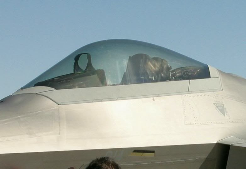
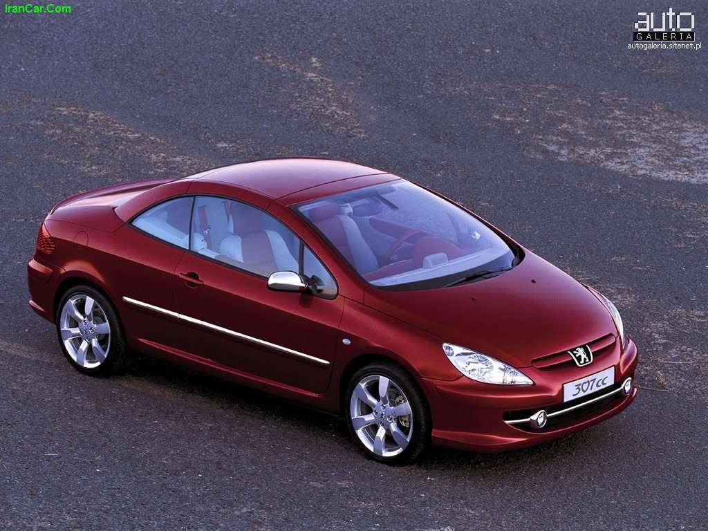
The recently finished Cockpit-building by ONL explicitly refers -as the name already indicates- to a cockpit of a car or airplane. More implicitly the building refers to Kas Oosterhuis' fascination for the form of the headlights of cars like the Peugeot 307, which is also his personal vehicle...
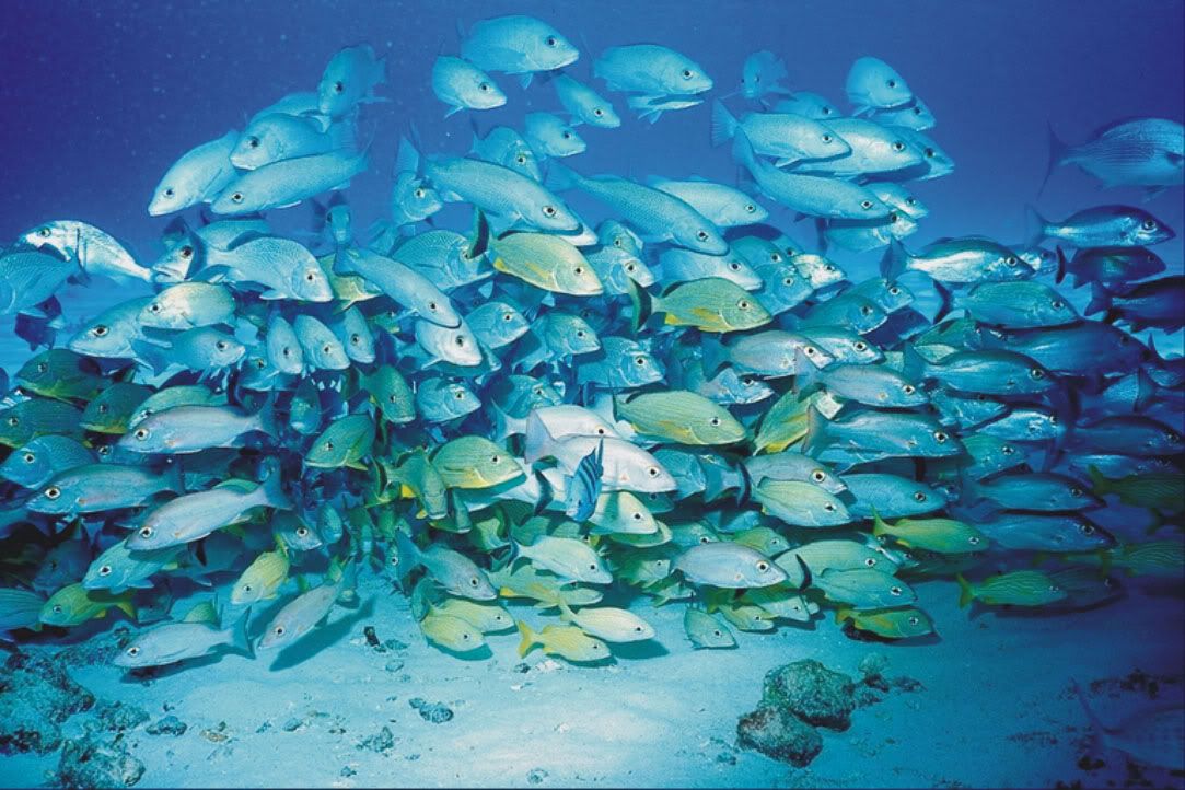
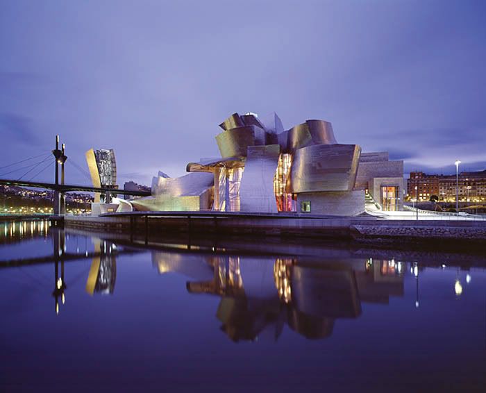
Big question is whether or not Gehry's buildings do refer to images or not. Charles Jencks does some suggestions in his book on iconography. Personally I like the idea that the building resembles a swarm of fish. Gehry ones asked if architecture could look like a fish, and the answered the question himself by building some fish-like forms, for example in Barcelona. Later that iconography became more abstract? I don't know, what do you guys & girls think?
Interesting is that Alejandro Zaero-Polo considers Gehry's forms as 'empty' because that seem to not be iconographic. Alejandro Zaero-Polo prefers therefore the Patronas Towers, that refer to the local situation, culture of Malaysia.
"The fish form first appeared in Gehry's unrealized design for the Smith Residence in 1981, and it continues to be a recurring motif in his work. Initially a gently mocking response to the postmodern penchant for adapting classical forms, its continued presence is a symbolic allusion to childhood memories and a testament to the functional appeal of the form's structural flexibility." link
gehry's architecture is like abstract painting. [to me..] still referring directly to an object and not really delving into what the object means or is or does. he just takes it and screws about the form.
I am very critical and sceptical about Alejandro's work and it seems this high-profile discourse just confirms my doubts. Could someone explain why certain building would remind us of male's abdominal muscles or shoes or vacum-cleaners? Isn't this just arbitrary deployment of shapes, the very thing Alejandro planned to save us from? It's funny and ironic. That's what the architect of the picnic-basket building was probably thinking when he designed it, but at least he didn't "justify" his ideas with references to Barthes and Saussure.
Ideo is right, it's cheating because "the coded transfer", "the communicative device", "the protocol of communication " was glued afterwards, when dear Alejandro had to impress the students once again.
For me the London stadium sucks big time. And BTW it doesn't remind me of muscles, it looks more like flower leaves welded together.
i thought Jencks's point was that the 'emptiness' of ghery's forms, as ZP describes it, is their sucess. that the ambiguity of the actual represented image added a level of complexity of 'meaning' not precent in earlier works like the binoculars. that the building still engages long after the 'oh, it looks like a fish' has worn off.
having said that i still like the binoculars, perhaps because there is no attempt to comprise the whole building from the iconography
what does'nt seem clear to me is the position of ZP on the issue of literality vs multiple readings of the 'image'. he appears to be advocating a position somewhere in the middle, a single yet abstracted metaphore. personaly i would see icongraphy as unnessecary to foa's architecture, the yokahama terminal is engageing for its own sake, not for the reference to the wave as a 'public relations' device. which may have been Rem's point about decoys.
the hokusai wave is absurd. it first of all doesn't look like a wave and second most japanese don't really think about japanese prints very much, and if they did they would likely be negative about it.
if foa did make that link explicit i would guess the japanese forgave them for being foreigners and ignorant about japanese culture... like many asians japanese are not so interested in their own cultural iconography and in any case tend to be more interested in the future than the past.
as an idea seems better to leave the icons at the door, or if you are going to use them better not to talk about them. unless its a joke, like egeraats gnomes. that was funny.
the biulding behind it i had to wonder if it was really gehry, but i guess it came before he convinced himself the fish scales could actually be ON the building.
Also, would like to add, that the Hokusai wave seems to have very little to do with FOA's terminal design; using the image feels like an afterthought. The image's assymetric dynamism and flatness don't really speak about the FOA terminal. and vice versa.
So, the use of an image is in fact usually only a marketing strategy - not a device with a "double agenda" but a way of pushing the project towards the public. Furthermore AZP's ruminations on their firm's turn towards iconographic-architecture are quite funny because their apparent complexity (the ruminations', that is) and lack of a real "complex" substance - making them hard to decipher by "the public" they want to embrace. Maybe just saying "we make building, look like duck, sweet." would be good communication towards "the public", but not towards the architectural-intelligentsia-salon. oh, the predicaments of sincere architects...
A telling image/project combination comes to mind: the Mansilla/Tunon project for a regional art museum in Spain (I think) - they did the design and afterwards the political figure that was concerned with getting it off the ground, asked the architects to come up with an idea, so he can sell the project to the public - they thought about it and came up with the image of a river: changing it's flow all the time but staying essentially the same. This was very appropriate - the one-storey building is made of (almost) interchangeable parts and has an undulating, organic overall structure. The point being, that the image fitted the selling attempt very well (it's a nice image, everybody loves rivers), it also described the building well (better than the wave describes the FOA terminal and more "profoundly" than a shoe describes something else looking like a shoe) BUT it was completely invented afterwards - the designprocess itself worked around questions of program, structural solutions, the evolving use of the institution and so forth - the actual building blocks of something called "architecture".
AZP seems to imply that the only routes forward are the "semiotic" or the "iconic" ways - it's hard & unnecessary to agree with that.
Anyway, Alejandro said that because he spends more time with clients these days, communicating with them has become the focus of his interests. As a consequence, he continued, FOA has begun to take a second look at the symbolic to facilitate that communication. He then went on to show a series of projects illustrating his point: building as palm tree in Tenerife, building as film strip for the BBC, walls with bullet holes for a police station. Get the picture?
His impenitent embrace of commerce, if not quite commodity culture, and FOA’s flirtation with vulgar symbolism made many Princetonians squirm, a discomfort for which I was grateful, since not so long ago that school was the wellspring of American post-modernism in its most saccharine manifestations, and proud of it. Still, Farshid must be tearing her hair out, or having it torn out at John Frida's salon.
I think it is important to realize that iconography works two ways:
1. People recognize images of our image-culture in buildings that have a unfamiliar form. I think strange forms puzzle us and trigger a process of trying to find analogies to try to understand the form. The ING House wasn't designed as iconographic - its architects are traditional modernists - but to the public it got all kinds of nicknames... and ING has turned that interest to their profit by literally dressing their building like a running shoe.
2. When an architect realizes that the human mind works that way, he could try to use that. Alejandro Zaero-Polo tries to do that. In some projects he adds the image afterwards (as the Hokusai-Wave), and in some projects he adds the image before the actual design (Muscle, and the BBC Music Center). I agree that the attempts of Ali-J (as Eisenman called the man) are too thin for now, but I still think the strategy he proposes might be fruitful.
This may be, but taking iconography to the frontline seems a bit too much when you consider other factors that could be the "leading lights" of a particular design: context, program, even self-expression... the effects of visual similarities and connections are interesting, but seem somehow a bit secondary.
But an image like the Mercedes-Benz star IS about the program (car-museum), self-expression (communicating) and context (next to an highway). An image like the gnomes of Erick van Egeraat also refers to the local context/culture.
Other examples of course are not that connected to the program or context, are more autonomous, like the birdsnest of Herzog & de Meuron that has nothing to do with the Olympic Games.
That image of the birdsnest has evolved out of a research on the construction. Very ironic however is that the build stadium has a very simple construction with only these random lines as decoration put on it.
Well, If you build Mercedes-Benz a phallus symbol, a tribute to it's might and splendor, you might as well use their logo somewhere...
As for the Gug. Bilbao, I never saw it as a fish (even though I know of Gehry's favourite creatures and some people like to see a fish-shape in the plan of the building) and I'd like to keep it that way. The visual power of this project for me resides in its irreducibility to some pre-fixed image or icon.
More in general, should we really be talking about iconography? Isn't it just imagery? Iconography is linked to icon, which often refers to an image somewhat more powerful or enduring than a palm tree or a fish. Indeed, something more like the Three Pointed Star.
If AZP likes icons so much, why can't he use architectural icons? Why should a building look like a palm tree (Canarian Government
Multiples III, Tenerife)? So the public can marvel at 'how much it looks like a palm'? Or the quarry analogy in the Torrevieja Theater; where else in the area does he see buildings with 'salt crystal' finishings? Why does he so desperately wants architecture to not look like architecture? I know he also wants to use his images for the organizational aspects of his designs, but not nearly every project he proposes in his Hokusai Wave article goes that far. But even if it does, why isn't possible to use architectural references and keep architecture readible as architecture, and not as some form or offshoot of our image-focused society?
A far more appealing use of iconogaphy, from my point of view, is Mies van der Rohe's Neue National Gallerie, Berlin. It doesn't look like a coconut or a horse, but works with the language of one hell of an architectural icon: the classic Greek temple. You may call it formalistic or conservative, but at least its references and sources are easily understood, even for outsiders.
right... the self-axpression thing was just a throw - not intended as something to elaborate on.
The contextuality of using the silhouette of a group of gnomes might be a bit far fetched, don't you think?
the Mercdes Benz museum on the other hand is a "diagram" building much more than an "icon" building - the formation that could be imagined as a mercedes-star is the result of structural considerations, not aimed at achieving an "image" (they don't try to capitalize on the similarity anywhere) - the context is relevant in the way that it's viewed (almost exclusively) from a moving car - and the outside is not easily conflated to a single "icon".
The wish to see a simple idea made visible in buildings has to do with marketing more than the experience of the architecture.
the different values of "iconic" gestures that Jencks is talking about is interesting and I pretty much agree with him that iconic combined with ambiguous is interesting and that stance in buildings might have the endurance to weather fashion-swings. the Jencks-argument really takes us to the core of "iconicness" instead of this hide&seek of easily reducible buildings and their gnomic origins.
It is a classic: a more ambiguous building is more sustainable. Several architects and critics are talking about that. Ben van Berkel does, Charles Jencks does, and so on. But is it true?
I like the idea that a building can have multiple readings. Therefore I like the ING House. Therefore I like the Guggenheim in Bilbao. But is it necessarily more sustainable or more meaningful than the FOA-approach? I don't know. I tend to think all architecture is inherent ambiguous, also Alejandro's buildings. But that doesn't stand in the way of selling your architecture properly.
On the Mercedes-Benz Museum. It's to simple to reduce the building to 'it is a diagram'. You're already saying that the building refers to (a circling) road. It's a multiple iconography that not only refers to the Mercedes-Benz star, but also to the highway. I think it's just naive to suggest that that thing on the photo doesn't refer the badge of the car-company. It's an element that does have the double agenda that Alejandro is talking about: AND image, AND construction/organization.
Maybe. I'm just saying that they are not capitalizing on the (in my opinion accidental) similarity of the star(s) - and that makes the difference between UN studio and FOA.
Most buildings are Alejandros double-agenda-vehicles: they look like crap AND a box/balloon/coconut. Fantastic.
And accidental similarity is not really anything to get caught on here - because the important thing should be questioning the relevance of using images as basis for intentional design. HdeM might actually have some interesting thoughts on this in their book on "natural" processes and whatnot (haven't read it). - Eventhough some of their designs seem to be conceived more through the fearless use of Illustrator's polygon-tool that by investigating mineral formations.
I think Heslinki hits the sweet spot here: what should be questioned here is the relevance of images as a basis for design. I'd like to specify this to: why should architecure use images from outside architecture as a basis? It's not that I propose an architecture that's completely formalistic, constantly reworking it's historic body of forms. But if you want to use iconography/imagery to root your project in a specific context (like Alejandro also proposes, next to his muscles), why not use local architectural references?
I think Helsinki hits the sweet spot here: what should be questioned here is the relevance of images as a basis for design. I'd like to specify this to: why should architecure use images from outside architecture as a basis? It's not that I propose an architecture that's completely formalistic, constantly reworking it's historic body of forms. But if you want to use iconography/imagery to root your project in a specific context (like Alejandro also proposes, next to his muscles), why not use local architectural references?
ai! ... local architectural references ... but what if you're out in a context without any? And doesn't that just put us back into the pomo era? Firms like Caruso St. John are experimenting with this idea of using architectural sampling. Reviving Sullivan ornamental patterns, Venetian marble patterns ... etc. to disastrous results.
Furthermore, practices like FOA, Fosters, UN Studios ..etc, are also interested in pushing the boundaries of what architecture looks like. The side effect of that is that you have buildings appearing in the world that don't look like, say, "a skyscraper" and there’s a void that presents itself. Typically pet names such as the Gurkin come from the public, and although they may seem trivial, end up carrying significant weight - especially in high stakes projects like the Olympics or Ground Zero.
AZP's article really addresses that void in naming as a moment of opportunity for designers to manipulate.
Iconography, or the problem of representation
Since the article 'The Hokusai Wave' of Alejandro Zaero-Polo (Foreign Office Architects) in Volume in september 2005 I started to work with the concept he proposes. Alejandro Zaero-Polo proposes that an architect can use an image out of our image-culture and use it in his design. That way, Alejandro Zaero-Polo argues, you as architect can very easily sell your design to the broader public, which is especially useful for practices like FOA that do a lot of competitions and projects like the London 2012 Olympic Games where the public plays a major role as a sort of indirect commisioner.
The use of iconography in the projects of FOA is defined by Alejandro Zaero-Polo as 'form with a double agenda'. The image/iconography that is being used both conceptually structures the organization of the building, and is useful in the communication of the project to the public. Take for instance the Yokohama Cruise Terminal: the image of the Hokusai Wave represents the weaving organisation of the terminal-building, and easily communicates the project to the public.
The problem of representation, that was the theme of the lectures last semester at the Berlage, was an 'interesting and timely' subject, Rem Koolhaas stated. In his lecture Rem Koolhaas questioned whether or not a 'city of exceptions' to which OMA attributes widely with contemporary icons like the Seattle Public Library, the Porto Concert Hall, the CCTV building, etc. is a sustainable strategy for the future.
Rem Koolhaas discarted the statement of Alejandro Zaero-Polo in his lecture last week in the Berlage-Institute by calling it 'decoi language'. When Alejandro Zaero-Polo asked Rem Koolhaas what strategy he would prefer, no answer followed.
With this forum I would like to start a discussion about the use of iconography in architecture and the problem of representation. I would also like to try to map different strategies in the field of iconography by publishing pictures of a architectural project next to a picture of the iconography that is referred to.
Also look at:
michielangelo.blogspot.com
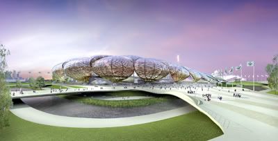
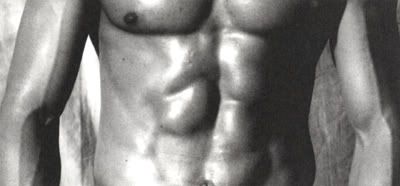
The London 2012 Olympic Stadium proposed by FOA uses the iconography of the muscle:
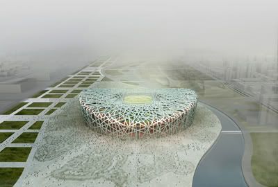
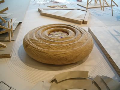
The Beijing 2008 Olympic Stadium designed by Herzog & de Meuron refers to the image of a birdsnest. The second image was a product that was shown in their 'No. 250' exhibition. The project is explicitly communicated as a birdsnest to the Chinese commisioners and public, and this nickname is already been adopted.

Is 'double agenda' the same as 'double coding'?
I shall quote Alejandro Zaero-Polo to explain what he means by that 'double agenda':
"In order to produce this disciplinary expansion we need to revisit representation with the same fluid perpective that we have dealt with material organizations, without falling back into the trap of the analagy of the witten language, like what happened with the previous incarnation of semiotic model is architecture. The semiotics that inspired architects in the past belonged fundamentally to the fied of linguistics - Saussure to Barthes. Our hypothesis here is that the consistency bewteen the material and the significant will have a brighter future when mediated through form - that which mediates matter and substance - rather that through signs, indices or other modalities of coded transfer. Rather that embracing the contingent, ambiguous nature of shape as an alternative to the hermetcism of indexicality, we forecast the development of a discipline of form with a double agenda, operating simultaneously as an organizational device and as a communicative device. This direction could be expored to sustain the future growth of the discipline, to expand architecture's audience to include a public component, which the form argument has traditionally avoided by locating itself exclusively on a disciplinary plane. By opening form into the reprocessing of identitiy and iconography, we can perhaps sustain a re-empowerment of the architect as a relevant expert with a public dimension, rather than a hermetic - even if seductive - practitioner."
"Our decision to resort to iconography as an alternative to a coded or indexial language is a kind of primitive choice - a protocaol of communication that comes bound with form and can therefore be directly coupled to material organization. Rather than deploying rhetorical modes of existing systems of signs, as in classical architecture, or signes in a calligraphic mode, as in post-modernism, the potential of extracting forms out of well established formal identities to de-stabilize material assemblages and vice versa, seems to be a viable escape from the arbitrary deployment of shapes with neighter binding relationships nor deliberate effects on the typological, organizational, or constructive nature of a building, to which a large part of 'signature architecture' has been reduced."
The Kroeyers Plads project of Erick van Egeraat (EEA) in Kopenhagen explicitly refers to the iconography of the 'Nikken', the goblin-helpers of Santa Claus that are part of the National culture of Danmark. Erick van Egeraat had showed an image of the Nikken explicitly at the presentation of the competition. And won.

The Yokohama Cruise Terminal and the Hokusai Wave:

The ING House in Amsterdam of the Dutch architects Meyer & Van Schooten is not explicitly designed to be iconographic in any sense. To the public however the building looks like a shoe, an ice-skate or portable vacuum-cleaner. When you ask people about that building next to the highway in Amsterdam, they refer to it like 'O, that ice-skate!'


I see reenactionary architecturism iconographically represented throughout this thread.
oops, how do you resize an image?
Thats an actual basketball shoe, by the way.. the adidas kobe II.
Images can be 400 pixels wide max. Most of the time you have to resize them with Photoshop.
alejandro gave a lecture last yr in berlage talking about his london project. if my memory works, he said that AFTER his primary proposal, he was asked by the client to give an image to the project. then he came up with the muscle idea.
is it a kinda cheating?
another issue, if it's ok to present this kinda icon to public, is it ok to give lectures in shcools all over the world, saying that the icon matters both for public and the academy?
Well, as far as I know FOA and HOK Sports in the first fase of their design for London 2012 focused on the technical research and landscaping design, and left the design of the buildings unclear. The result what that critics like Deyan Sudjic publicly asked for 'images' of the buildings. So FOA designed as fast as they could this 'muscle' stadium that would fit in their flowing landscape design. Why is that cheating? It is an illustration of the power of media, something that is nowhere more powerfull than in London I guess. If the media asks for images, why not deliver them? I think it is part of the modern condition to deal with media.
The problem -obviously- with this (projective) strategy is that you design a building not only for the experience in real life, but also for the experience through media.
we have students in our class that take an ordinary object and use it as their design "concept" repetedly. they do not research the object, just use certain visual aspects of it as a basis for the design. i, personally, hate this approach. i dont think that it has the merrit of other approaches. i dont like the idea of architecture being SO representational [though i know that no matter what architecture will be, but this is direct]. i think that if you take an object as a concept that you need to analyze it and draw out conclusions and details and properties that the object possesses, more than visually, to affect design.
This is an interesting topic and I love seeing these pictures. But I'm headed out so no time to comment further - will come back to it. Briefly, outside of the question of whether it's a legitimate approach to form-making, I think ordinary people love to look at a building and say "See, those pointy shapes were inspired by the hats of elves!". It gives them an access point.
ManuG, to resize the image type a space then "width=400" (without the quotation marks) after the end of your image url (which is usually .jpg).
and then there is nbbj. hahaha


like anything, it's what you do with an idea.
am with backu
i just dont see any analyse and transformation from MUSCLES(they r awesome btw)... this "approach" has nothing to do with organizations and typologies but simply an opportunistic trick.
Will Alsop's 'champagne glasses' for Rotterdam Central. The architect added this buildings in the last fase of the design-process because the client asked for more 'image'. However, in this specific case, it was not such a successful strategy: the municipality, media and public turned against these 'excessive' buildings, that just looked to expensive. The architect was ditched and after a competition replaced by Neo-Modernists BenthemCrouwel.

In response to 'e': personally I think architecture is architecture. Architecture's form can succesfully refer to images of our image-culture, but a building is never going to be a picnic-basket. Plus: how succesful can 'funny' architecture be? No, I think architecture has to keep something of a autonomy, a discipline. Therefore the use of iconography is always a bit abstract.
In response to 'backu' and 'ideo': Yes, sometimes the use of iconography is 'thin', whether we speak of student-projects or the designs of Alejandro Zaero-Polo. But maybe that's because we're just about to learn to do it better. The Yokohame Cruise Terminal is for now among the best examples, but there must be more examples out there, because more and more architects are using iconography.
michiel, i got to this thread thru this thread,
here is an iconography puzzle as i understood.
michiel, so we agree then?
The recently finished Cockpit-building by ONL explicitly refers -as the name already indicates- to a cockpit of a car or airplane. More implicitly the building refers to Kas Oosterhuis' fascination for the form of the headlights of cars like the Peugeot 307, which is also his personal vehicle...
Big question is whether or not Gehry's buildings do refer to images or not. Charles Jencks does some suggestions in his book on iconography. Personally I like the idea that the building resembles a swarm of fish. Gehry ones asked if architecture could look like a fish, and the answered the question himself by building some fish-like forms, for example in Barcelona. Later that iconography became more abstract? I don't know, what do you guys & girls think?

Interesting is that Alejandro Zaero-Polo considers Gehry's forms as 'empty' because that seem to not be iconographic. Alejandro Zaero-Polo prefers therefore the Patronas Towers, that refer to the local situation, culture of Malaysia.
I obviously meant to post this picture:
snake and fish lamp, frank gehry
"The fish form first appeared in Gehry's unrealized design for the Smith Residence in 1981, and it continues to be a recurring motif in his work. Initially a gently mocking response to the postmodern penchant for adapting classical forms, its continued presence is a symbolic allusion to childhood memories and a testament to the functional appeal of the form's structural flexibility."
link
(?)
gehry's architecture is like abstract painting. [to me..] still referring directly to an object and not really delving into what the object means or is or does. he just takes it and screws about the form.
i think so too.
I am very critical and sceptical about Alejandro's work and it seems this high-profile discourse just confirms my doubts. Could someone explain why certain building would remind us of male's abdominal muscles or shoes or vacum-cleaners? Isn't this just arbitrary deployment of shapes, the very thing Alejandro planned to save us from? It's funny and ironic. That's what the architect of the picnic-basket building was probably thinking when he designed it, but at least he didn't "justify" his ideas with references to Barthes and Saussure.
Ideo is right, it's cheating because "the coded transfer", "the communicative device", "the protocol of communication " was glued afterwards, when dear Alejandro had to impress the students once again.
For me the London stadium sucks big time. And BTW it doesn't remind me of muscles, it looks more like flower leaves welded together.
i thought Jencks's point was that the 'emptiness' of ghery's forms, as ZP describes it, is their sucess. that the ambiguity of the actual represented image added a level of complexity of 'meaning' not precent in earlier works like the binoculars. that the building still engages long after the 'oh, it looks like a fish' has worn off.
having said that i still like the binoculars, perhaps because there is no attempt to comprise the whole building from the iconography
what does'nt seem clear to me is the position of ZP on the issue of literality vs multiple readings of the 'image'. he appears to be advocating a position somewhere in the middle, a single yet abstracted metaphore. personaly i would see icongraphy as unnessecary to foa's architecture, the yokahama terminal is engageing for its own sake, not for the reference to the wave as a 'public relations' device. which may have been Rem's point about decoys.
i thought the binoculars were by oldenburg...?
the hokusai wave is absurd. it first of all doesn't look like a wave and second most japanese don't really think about japanese prints very much, and if they did they would likely be negative about it.
if foa did make that link explicit i would guess the japanese forgave them for being foreigners and ignorant about japanese culture... like many asians japanese are not so interested in their own cultural iconography and in any case tend to be more interested in the future than the past.
as an idea seems better to leave the icons at the door, or if you are going to use them better not to talk about them. unless its a joke, like egeraats gnomes. that was funny.
Gehry has also literally done 'a fish'.

you are correct jump. the binoculars are by oldenburg.
love gehry's fish in kobe!
the biulding behind it i had to wonder if it was really gehry, but i guess it came before he convinced himself the fish scales could actually be ON the building.
Also, would like to add, that the Hokusai wave seems to have very little to do with FOA's terminal design; using the image feels like an afterthought. The image's assymetric dynamism and flatness don't really speak about the FOA terminal. and vice versa.
So, the use of an image is in fact usually only a marketing strategy - not a device with a "double agenda" but a way of pushing the project towards the public. Furthermore AZP's ruminations on their firm's turn towards iconographic-architecture are quite funny because their apparent complexity (the ruminations', that is) and lack of a real "complex" substance - making them hard to decipher by "the public" they want to embrace. Maybe just saying "we make building, look like duck, sweet." would be good communication towards "the public", but not towards the architectural-intelligentsia-salon. oh, the predicaments of sincere architects...
A telling image/project combination comes to mind: the Mansilla/Tunon project for a regional art museum in Spain (I think) - they did the design and afterwards the political figure that was concerned with getting it off the ground, asked the architects to come up with an idea, so he can sell the project to the public - they thought about it and came up with the image of a river: changing it's flow all the time but staying essentially the same. This was very appropriate - the one-storey building is made of (almost) interchangeable parts and has an undulating, organic overall structure. The point being, that the image fitted the selling attempt very well (it's a nice image, everybody loves rivers), it also described the building well (better than the wave describes the FOA terminal and more "profoundly" than a shoe describes something else looking like a shoe) BUT it was completely invented afterwards - the designprocess itself worked around questions of program, structural solutions, the evolving use of the institution and so forth - the actual building blocks of something called "architecture".
AZP seems to imply that the only routes forward are the "semiotic" or the "iconic" ways - it's hard & unnecessary to agree with that.
from kipnis:
Anyway, Alejandro said that because he spends more time with clients these days, communicating with them has become the focus of his interests. As a consequence, he continued, FOA has begun to take a second look at the symbolic to facilitate that communication. He then went on to show a series of projects illustrating his point: building as palm tree in Tenerife, building as film strip for the BBC, walls with bullet holes for a police station. Get the picture?
His impenitent embrace of commerce, if not quite commodity culture, and FOA’s flirtation with vulgar symbolism made many Princetonians squirm, a discomfort for which I was grateful, since not so long ago that school was the wellspring of American post-modernism in its most saccharine manifestations, and proud of it. Still, Farshid must be tearing her hair out, or having it torn out at John Frida's salon.
yup. and maybe even "selling" instead of "communicating". communication is serious business, after all.
I think it is important to realize that iconography works two ways:
1. People recognize images of our image-culture in buildings that have a unfamiliar form. I think strange forms puzzle us and trigger a process of trying to find analogies to try to understand the form. The ING House wasn't designed as iconographic - its architects are traditional modernists - but to the public it got all kinds of nicknames... and ING has turned that interest to their profit by literally dressing their building like a running shoe.
2. When an architect realizes that the human mind works that way, he could try to use that. Alejandro Zaero-Polo tries to do that. In some projects he adds the image afterwards (as the Hokusai-Wave), and in some projects he adds the image before the actual design (Muscle, and the BBC Music Center). I agree that the attempts of Ali-J (as Eisenman called the man) are too thin for now, but I still think the strategy he proposes might be fruitful.
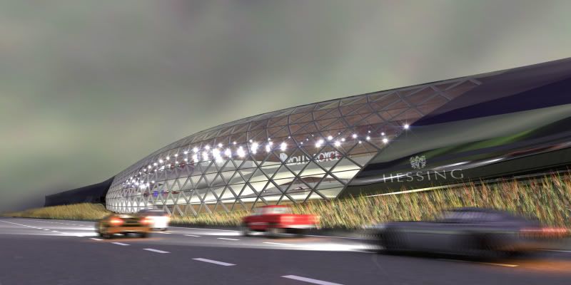
Another example of an 'a-priori' use of iconography: UN Studio's Mercedes-Benz Museum in Stuttgart.
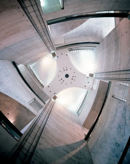

This may be, but taking iconography to the frontline seems a bit too much when you consider other factors that could be the "leading lights" of a particular design: context, program, even self-expression... the effects of visual similarities and connections are interesting, but seem somehow a bit secondary.
But an image like the Mercedes-Benz star IS about the program (car-museum), self-expression (communicating) and context (next to an highway). An image like the gnomes of Erick van Egeraat also refers to the local context/culture.
Other examples of course are not that connected to the program or context, are more autonomous, like the birdsnest of Herzog & de Meuron that has nothing to do with the Olympic Games.
That image of the birdsnest has evolved out of a research on the construction. Very ironic however is that the build stadium has a very simple construction with only these random lines as decoration put on it.
Well, If you build Mercedes-Benz a phallus symbol, a tribute to it's might and splendor, you might as well use their logo somewhere...
As for the Gug. Bilbao, I never saw it as a fish (even though I know of Gehry's favourite creatures and some people like to see a fish-shape in the plan of the building) and I'd like to keep it that way. The visual power of this project for me resides in its irreducibility to some pre-fixed image or icon.
More in general, should we really be talking about iconography? Isn't it just imagery? Iconography is linked to icon, which often refers to an image somewhat more powerful or enduring than a palm tree or a fish. Indeed, something more like the Three Pointed Star.
If AZP likes icons so much, why can't he use architectural icons? Why should a building look like a palm tree (Canarian Government
Multiples III, Tenerife)? So the public can marvel at 'how much it looks like a palm'? Or the quarry analogy in the Torrevieja Theater; where else in the area does he see buildings with 'salt crystal' finishings? Why does he so desperately wants architecture to not look like architecture? I know he also wants to use his images for the organizational aspects of his designs, but not nearly every project he proposes in his Hokusai Wave article goes that far. But even if it does, why isn't possible to use architectural references and keep architecture readible as architecture, and not as some form or offshoot of our image-focused society?
A far more appealing use of iconogaphy, from my point of view, is Mies van der Rohe's Neue National Gallerie, Berlin. It doesn't look like a coconut or a horse, but works with the language of one hell of an architectural icon: the classic Greek temple. You may call it formalistic or conservative, but at least its references and sources are easily understood, even for outsiders.
right... the self-axpression thing was just a throw - not intended as something to elaborate on.
The contextuality of using the silhouette of a group of gnomes might be a bit far fetched, don't you think?
the Mercdes Benz museum on the other hand is a "diagram" building much more than an "icon" building - the formation that could be imagined as a mercedes-star is the result of structural considerations, not aimed at achieving an "image" (they don't try to capitalize on the similarity anywhere) - the context is relevant in the way that it's viewed (almost exclusively) from a moving car - and the outside is not easily conflated to a single "icon".
The wish to see a simple idea made visible in buildings has to do with marketing more than the experience of the architecture.
the different values of "iconic" gestures that Jencks is talking about is interesting and I pretty much agree with him that iconic combined with ambiguous is interesting and that stance in buildings might have the endurance to weather fashion-swings. the Jencks-argument really takes us to the core of "iconicness" instead of this hide&seek of easily reducible buildings and their gnomic origins.
It is a classic: a more ambiguous building is more sustainable. Several architects and critics are talking about that. Ben van Berkel does, Charles Jencks does, and so on. But is it true?
I like the idea that a building can have multiple readings. Therefore I like the ING House. Therefore I like the Guggenheim in Bilbao. But is it necessarily more sustainable or more meaningful than the FOA-approach? I don't know. I tend to think all architecture is inherent ambiguous, also Alejandro's buildings. But that doesn't stand in the way of selling your architecture properly.
On the Mercedes-Benz Museum. It's to simple to reduce the building to 'it is a diagram'. You're already saying that the building refers to (a circling) road. It's a multiple iconography that not only refers to the Mercedes-Benz star, but also to the highway. I think it's just naive to suggest that that thing on the photo doesn't refer the badge of the car-company. It's an element that does have the double agenda that Alejandro is talking about: AND image, AND construction/organization.
Maybe. I'm just saying that they are not capitalizing on the (in my opinion accidental) similarity of the star(s) - and that makes the difference between UN studio and FOA.
Most buildings are Alejandros double-agenda-vehicles: they look like crap AND a box/balloon/coconut. Fantastic.
And accidental similarity is not really anything to get caught on here - because the important thing should be questioning the relevance of using images as basis for intentional design. HdeM might actually have some interesting thoughts on this in their book on "natural" processes and whatnot (haven't read it). - Eventhough some of their designs seem to be conceived more through the fearless use of Illustrator's polygon-tool that by investigating mineral formations.
I think Heslinki hits the sweet spot here: what should be questioned here is the relevance of images as a basis for design. I'd like to specify this to: why should architecure use images from outside architecture as a basis? It's not that I propose an architecture that's completely formalistic, constantly reworking it's historic body of forms. But if you want to use iconography/imagery to root your project in a specific context (like Alejandro also proposes, next to his muscles), why not use local architectural references?
I think Helsinki hits the sweet spot here: what should be questioned here is the relevance of images as a basis for design. I'd like to specify this to: why should architecure use images from outside architecture as a basis? It's not that I propose an architecture that's completely formalistic, constantly reworking it's historic body of forms. But if you want to use iconography/imagery to root your project in a specific context (like Alejandro also proposes, next to his muscles), why not use local architectural references?
ai! ... local architectural references ... but what if you're out in a context without any? And doesn't that just put us back into the pomo era? Firms like Caruso St. John are experimenting with this idea of using architectural sampling. Reviving Sullivan ornamental patterns, Venetian marble patterns ... etc. to disastrous results.
Furthermore, practices like FOA, Fosters, UN Studios ..etc, are also interested in pushing the boundaries of what architecture looks like. The side effect of that is that you have buildings appearing in the world that don't look like, say, "a skyscraper" and there’s a void that presents itself. Typically pet names such as the Gurkin come from the public, and although they may seem trivial, end up carrying significant weight - especially in high stakes projects like the Olympics or Ground Zero.
AZP's article really addresses that void in naming as a moment of opportunity for designers to manipulate.
Block this user
Are you sure you want to block this user and hide all related comments throughout the site?
Archinect
This is your first comment on Archinect. Your comment will be visible once approved.