when the hell did chincy-nasty, or kentucky, for god's sake, become the heartland? the heartland...it just breaks my heart-land to think what that fancy pants liebskind will do when he invades our slice of flag-waving, honest-to-goodness apple-pie...protect our heartland!!!
oh the humanity....
Wondering if the tree topping thing is related to the Iriqouis Iron Workers, who were responsible for most of the early high rise buildings in America.
I went to his little talk on Wednesday evening and even though he was being interviewed by former DAAP dean Jay Chatterjee, it was illustrative of what a sell-out architect talking to a primarily business audience sounds like. (It doesn't help that he was introduced by local king of horrible suburban office developments Bill Butler.) He just went on about how wonderful northern Kentucky is and how he's making a great statement with the building. Oh, and the form is based on the Roebling Bridge, or the curve in the Ohio river, or the surrounding hills . . .
Frankly, I think the building sucks. For one, you can't really see it from the Cinci riverfront (at least not where the talk was at the Freedom Center) because it's blocked by an ugly office building also developed by Bill Butler. It doesn't have the material complexity and texture of many of his earlier works (and doesn't look like it will when it's finished) and . . metallic blue glass??? Are we in the 80s again?
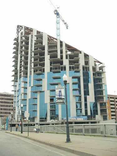
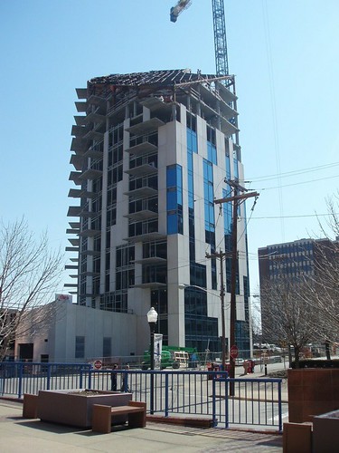
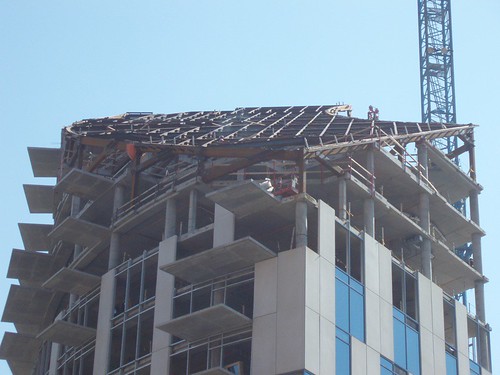
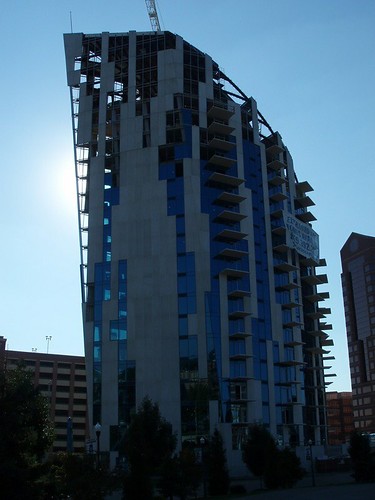
OK, a little more than 2 years since I first saw the "dead building outline" in the parking lot and now the Ascent is almost complete. I love following a building through construction, especially when you don't see details like this in the area very often, and even though aesthetically it's a little, um....lacking. I went and took some photos to leave you with before I get out of town. I thought about breaking into the site (a favorite past time) but didn't want to get arrested on one of my last days in the city....
It does look a little shallow. Still, though, as I dive deeper into the business world myself, I appreciate the business/practical side of it.
Overall, it looks better than 99% of condo mid/high-rises. Disappointing in depth, I agree, particularly when you look at his early work and the insane attention to detail, texture, etc.
separate from what i think of it as capital-'A' architecture, i will admit that it's one of the few star projects i can remember that looks much better than the rendering.
I was wondering if Libenskind's wife did the interiors? Anyone go take a look at the developers site for this project.....I believe they think they hired God to do this project.
Libeskind's vision for the heartland
when the hell did chincy-nasty, or kentucky, for god's sake, become the heartland? the heartland...it just breaks my heart-land to think what that fancy pants liebskind will do when he invades our slice of flag-waving, honest-to-goodness apple-pie...protect our heartland!!!
oh the humanity....
if you squint your eyes, the shape of ohio looks like a heart.
'ohio - the heart of it all'...
yeah, what do you call the heartland, not without?
If this isn't the heartland, what do you propose is? I guess I was just trying to give the thread a clever title at the time.....
Beyond that, say what you want about the building, but it's certainly confusing the hell out of people around here, which amuses me.
Wondering if the tree topping thing is related to the Iriqouis Iron Workers, who were responsible for most of the early high rise buildings in America.
The picture at the start of the tread xpired , Scandinavian sound like Klingon.
Kill The Tower.
Sorry this took me so long.


The first one was taken just a few days ago, while the last two were taken about a month ago.
Wish we could get a 3D-H rendering of this.
I went to his little talk on Wednesday evening and even though he was being interviewed by former DAAP dean Jay Chatterjee, it was illustrative of what a sell-out architect talking to a primarily business audience sounds like. (It doesn't help that he was introduced by local king of horrible suburban office developments Bill Butler.) He just went on about how wonderful northern Kentucky is and how he's making a great statement with the building. Oh, and the form is based on the Roebling Bridge, or the curve in the Ohio river, or the surrounding hills . . .
Frankly, I think the building sucks. For one, you can't really see it from the Cinci riverfront (at least not where the talk was at the Freedom Center) because it's blocked by an ugly office building also developed by Bill Butler. It doesn't have the material complexity and texture of many of his earlier works (and doesn't look like it will when it's finished) and . . metallic blue glass??? Are we in the 80s again?
Ha ha ha, very good points, archtopus. I will say that I would like the building a lot better if they knocked down 3 or 4 of the ones around it.
The reasoning behind it is indeed pure BS. I just don't even think I have a real opinion of it though. I guess my opinion is "indifferent".
Anything interesting go down at the lecture?
OK, a little more than 2 years since I first saw the "dead building outline" in the parking lot and now the Ascent is almost complete. I love following a building through construction, especially when you don't see details like this in the area very often, and even though aesthetically it's a little, um....lacking. I went and took some photos to leave you with before I get out of town. I thought about breaking into the site (a favorite past time) but didn't want to get arrested on one of my last days in the city....

Enjoy.
gross
It does look a little shallow. Still, though, as I dive deeper into the business world myself, I appreciate the business/practical side of it.
Overall, it looks better than 99% of condo mid/high-rises. Disappointing in depth, I agree, particularly when you look at his early work and the insane attention to detail, texture, etc.
*sigh* it's just business.
separate from what i think of it as capital-'A' architecture, i will admit that it's one of the few star projects i can remember that looks much better than the rendering.
is it me or does that building look like its only half as tall as it should be. seems truncated.
I was wondering if Libenskind's wife did the interiors? Anyone go take a look at the developers site for this project.....I believe they think they hired God to do this project.
Block this user
Are you sure you want to block this user and hide all related comments throughout the site?
Archinect
This is your first comment on Archinect. Your comment will be visible once approved.