Montreuil, FR | Wien, AT
Text by Dominique Boudet / Architektur aktuell / 2014
In approaching the project for the extension of the humanities faculty of Aix-en-Provence University Dietmar Feichtinger found himself confronted with a contradiction. On the one hand the extension, by nature of its position, had to mark an entrance to the campus, but on the other neither the brief
nor the context suggested a specific form of architectural expression.
The brief, relatively modest in terms of floor area (8,000 m²) and banal in terms of content (lecture halls and offices), contained no elements such as an auditorium or large library that would have called for strong architectural expression.
In addition the dreary mediocrity of the context spoke against a too striking kind of architecture. Given the featureless nature of the periphery of this provincial town with its groups of little houses and allotment gardens, banal workshops, pizzerias, and here and there a social housing block, even a minor architectural gesture would have seemed unsuitable, indeed even provocative.
Consequently, Feichtinger opted for restraint, if not to say architectural neutrality. He prefers a space to a building, an empty volume to a full one, and a place to a piece of architecture. By breaking up the brief into a number of small buildings he allows an entrance to the campus to develop. Through the considered way in which he positions the buildings and the subtle expression of the facades
he gives the place an identity. These are two important characteristics of this project which Feichtinger achieved by appropriating the characteristics of the campus and reinterpreting them. This proved to be a discrete way of integrating this small extension in one of France’s most important university complexes.
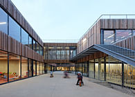
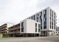
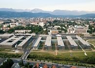
One of the essential characteristics of Aix-en-Provence campus that results from its difficult topography (a steeply sloping site) is the existence of small open spaces directly in front of the buildings. They all represent recreation spaces along the routes through the campus. Feichtinger takes up this urban pattern: he divides up the brief into three small blocks of different sizes and configurations in this way creating a virtual rectangle whose centre is an empty area. The placing of this ensemble, which is set back from the road, avoids direct confrontation with the context. You enter the campus by crossing this space. The layout of the buildings creates two directions, two streets that lead the students either to the main buildings on the higher ground of the campus, or to the neighbouring library. This quiet place, with proportions comparable to a large internal courtyard, forms a calm entrance to the campus both with regard to the external context and to the steep routes that the students must follow to reach the individual buildings that step up the slopes.
The way the three blocks are laid out also offers the advantage of protecting this space from the Mistral, a cold wind that often blows from the north and is one of the region’s climatic problems. Another is the strong sunshine, a privilege of this region, which, however, is tolerable only when combined with the benefits of shade. This makes it all the more regrettable that the fine plane trees which were removed in order to make room for the building were replaced by scrappy shrubs which will take years to reach a decent height. It is also to be hoped that elements of street furniture will soon make this area more comfortable and encourage people to spend time there. These elements could include a fountain – a typical feature that is found throughout this region and would be highly suitable here: there is a river flowing underneath the forecourt, which prevented the construction of underground buildings and led to an open car park being made nearby.
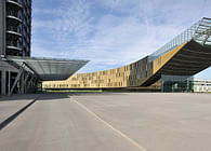
The uniformity of materials and the construction method used in the facades strengthen the impression of something greater, something open to the skies. The architect’s concept strives for a close relationship to the existing buildings. Erected in the 1960s during the major expansion of the Aix-en- Provence campus, these buildings are characterised by a striking architectural signature: an emphatic repetition of arcades that produces a compressed vertical rhythm. The cladding of light ochre-coloured concrete panels was intended to allow these buildings blend with the landscape of Provence.
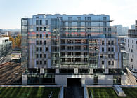
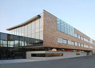
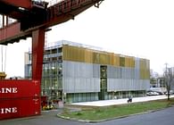
Feichtinger reinterprets this rhythm and verticality but in a minor key, so to speak, as he used louvres for all the facades. This very simple and economical system consists of series of screen-printed glass elements that can be turned around their centre axis and overlap slightly to ensure air tightness. By adjusting the louvres the marvellous light in Provence, whose intensity drove Van Gogh mad, can be modified. The grid of the elements that runs up the entire height of the facade provides the vertical quality aimed at.
The facades are treated differently, depending upon their position. The fronts facing onto the courtyard consist entirely of louvre bands. This creates homogeneity in the surfaces. The external skin here becomes a kind of wallpaper, strengthening the spatial coherence of the place and its outdoor character.
Only the variations in the positioning of the louvres, which indicate the spaces behind them, provide a gently animated quality. In the outward facing facades that address the old buildings the bands of louvres alternate with piers made of thin concrete panels. Here the classic rhythm of solid and empty surfaces reveals the construction system. The structure consists of reinforced concrete load-bearing walls in which identical solid and empty areas alternate within a compressed grid. The low loads meant that no internal columns were needed. Inside the concrete was left exposed in all the
rooms. Long cylindrical boxes fixed to the ceilings of the lecture halls and offices increase the absorption surface area and ensure good acoustics.
The concrete mass contributes to the buildings thermal inertia and takes into account the climatic conditions of the region with marked differences between day and night-time temperatures. Only the
lecture halls have an air cooling system. In the other rooms traditional methods are used to ensure comfort: large amounts of external insulation in the solid areas, triple protection for the glazed areas: double glazing, awnings and the louvre system on the facade. When the louvres are closed the transmission of light into the space is reduced by 70 %. Like in houses in Provence where the window shutters are closed during the day to protect against heat and opened at light to allow
cool air to flow inside, here, too, thermal comfort is dependent on the behaviour of the users of the space. “I prefer nature to technology”, says Dietmar Feichtinger.
Project completed : 2013 for the buildings T1+T2 / Building T3 to be completed
Surface : 6.119 m² (Buildings T1+T2)
Building Cost : 11.3 M Euros
Status: Built
Location: Aix-en-Provence, FR
Firm Role: Head Designer
