Montreuil, FR | Wien, AT
Text extracts by Mathias Boeckl / Architektur Aktuell / September 2010
Passerelles in the park
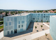
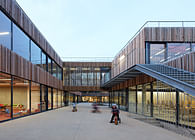
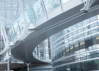
The most striking characteristics of the new complex are without doubt the “fingers” housing the patients wards which extend northwards from the spine of the surgery wing into the park. The overall structure, which is both compact and open, is rooted in a strong double slab with an east-west orientation: here the emergency department, the operating theatres and the doctors’ offices are located in the northern of the two parallel slabs. Between them there are a number of courtyards, attractively planted and even creatively designed using glass blocks (design: idealice - Alice Größinger). The wards and intensive stations which are housed in the four north-south wings can be conveniently reached from these central areas. The intensive stations are open spaces with glass partitions that take up almost the entire depth of the wing, a corridor running along the east façade allows one to walk past them. The patients wards in contrast are organised on the traditional central corridor circulation system with central service stations, all the rooms have just one or two beds, patients with general category health insurance are on the first floor, those with additional insurance on the second. At the northern end of these wings open into a lounge and from the lounge onto a terrace – from there the route continues along the attractive passerelles, Mediterranean constructions that are something of a trademark of Dietmar Feichtinger. With their “escape route” function these lovely light steel structures connect the wings to create a single major form, while also allowing space to flow unhindered from the surroundings into the garden-like open courtyards between the “fingers”. The clarity, reasonable dimensions and elegance of this system truly succeed in achieving the hotel-like character promised.
Two main routes
The patients wards are sliced transversely by one of the two “main routes” that were among the convincing original concepts in the competition design. Mega volumes can only be translated into a lucid sequence of space by means of simple and clear circulation, a basic requirement of the user-friendliness that was aimed for, and certainly achieved, here. The designers created two “main routes”: a patients’ route and a visitors’ route. The latter leads from the central, multi-storey entrance hall at the south-east of the centre right through the ward wings on all levels, in the process forming further courtyards. And the patients' route runs parallel along the north side of the out-patient and surgery wing. In addition to this unambiguous separation of spheres there is also a colour concept that, astonishingly, was adhered to and is impressively simple: yellow for the examination rooms, blue for nursing areas, green for operating theatres, and grey for general zones. These colours are restricted to the floors and thus also serve as a guidance system.
Perfect integration
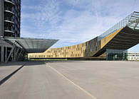
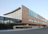
Naturally, a complex of this kind has a multitude of special rooms to describe which would fill an entire book. In the public areas it is above all the forecourt with its magnificent roof, the entrance hall with its generous height and cafeteria on the gallery, the chapel with its elegant panelling, and the interdenominational meditation room with a slate wall in the joints of which people can deposit their wish lists. The overall character of the complex emanates a Mediterranean flair, the anthracite façades, the steel passerelles, the areas of glazing and the yellow external blinds develop a subtle play of minimalist design means. Thanks to the internal permeability of the complex and its connection to the city coreby an axis between the medical centre and the supplies and disposals building a major complex has been integrated entirely naturally in a park-like urban body, an achievement which for Austria is certainly unique.
Project completed : 2010
Surface : 75.000 m²
Building cost : 314 M Euros
Status: Built
Location: Klagenfurt, AT
Firm Role: Head Designer
