
ShowCase is an on-going feature series on Archinect, presenting exciting new work from designers representing all creative fields and all geographies.
In this special series of ShowCase features, we are profiling a single project from each of the eight Architectural League's "Emerging Voices", as profiled in our recent feature 3 Questions for 8 Emerging Voices .
We are always accepting nominations for upcoming ShowCase features - if you would like to suggest a project, please send us a message.
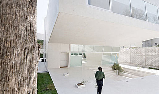
This artist's studio is located in a residential area in the west corner of Mexico City, on a 20 x 40 m (66 x 131 ft) site.
The program includes an underground parking space, as well as a three story-building which is comprised of a triple-height space, offices on the third floor, and a service area on the roof. Two functions had to be served: as a studio space on one hand, and on the other, as a venue for private temporary exhibits.
The client asked for additional spaces: one apartment for guest artists who would stay for a short time while developing a practice or a show, a 9 x 9 x 9 m space for work or exhibit, one studio/office, one kitchen in the large space to be used as a side bar for openings, and finally parking for 25 cars.
The project refines itself towards the center of the space. Both the east and west sides open up, thus allowing views of the trees and gardens on the site.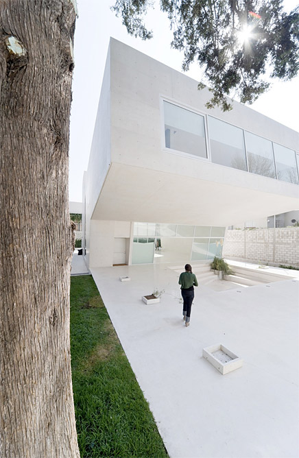
↑ Click image to enlarge
Estudio Explanada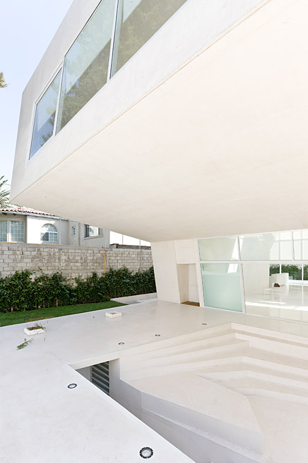
↑ Click image to enlarge
Estudio Explanada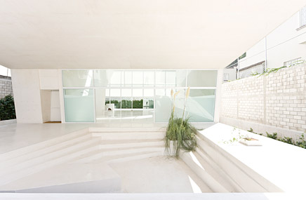
↑ Click image to enlarge
Estudio Explanada
Construction and Technical Aspects
A 14 x 8 m cantilevered concrete structure covers the exterior program used for different open-air activities such as lectures, exhibitions, or just as a meditating area.
The concrete structure, overlooking the main space of the exhibition area, houses the studio and office spaces.
This project is mainly interested in its spatial qualities, rather than in the programmatic conditions itself, due to its multiple and diverse events.
The entire building is constructed in white exposed concrete.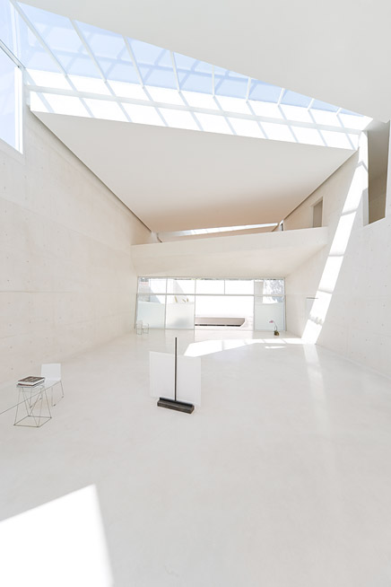
↑ Click image to enlarge
Estudio Explanada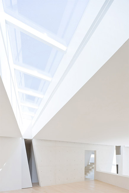
↑ Click image to enlarge
Estudio Explanada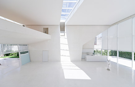
↑ Click image to enlarge
Estudio Explanada
↑ Click image to enlarge
Estudio Explanada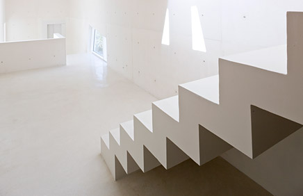
↑ Click image to enlarge
Estudio Explanada
Design team: Tatiana Bilbao S.C. with Julio Amezcua - Francisco Pardo; Israel Alvarez, Aida Hurtado, Arturo Peniche, Jorge Vazquez, Carlos Leguizamo y Octavio Vazquez, Tiberio Wallentin
Structural engineering: IESSA, Ing. Francisco Javier Ribe
Contractor: MZM, Ing. Miguel Cornejo
Construction management: Elizabeth Huerta
Client: Undisclosed
Design phase: June 2006 – December 2006
Construction phase: March 2007 – December 2008
Maximum height of the building from ground level: 9 meters
at 103
The fast technological unfolding that ruled the last decades has caused designers to reflect on its creative processes, leading them to fortify multidisciplinary work. Founded with the clear intention to investigate and create new techniques for architecture in the contemporary city, a multidisciplinary group shares a need for integration among the capacities of logistics and the multiplicity of knowledge. Each member contributes within its particular field of experience together with its dedicated commitment for innovation. This methodology of associations tries to identify specific modes of action taking MEDIA as a tool that allows the understanding of TIME and SPACE. Architectural typologies are in constant mutation in order to survey on the idea of a SKIN as a surface that within its space allows the existence of a BODY. To explore the relationship between two autonomous but interrelated systems: surface and program, as instruments of negotiation. Through MEDIA "Low-Tech High-Resolution" effects can be achieved, the set of relationships rule the materiality of the projects: Skin becomes the outfit that protects the body while the body contains all programmatic activities. The focus is placed on the relationship between the various spaces and their changeability over time rather than in the spaces themselves.
Partners
Julio Amezcua
(Mexico City 1974) Architect by Universidad Anahuac with honors (1999), studied a Masters Degree in Architecture at Columbia University (2001). He began his professional practice at TEN Architects (1997-2000), and SOM in New York (2000-2001). In 2001 founded at103. He has as been a professor at UNAM, Iberoamericana University, Anahuac University (Mexico) and University of Pennsylvania. He is currently visiting assistant professor at Pratt Institute (NY). He has lectured at USC, SCI-Arc, Iberoamericana and Anahuac among others Institutions and has participated in several Biennales around the world. In 2000 he received CONACYT and Bank de Mexico Grants for studies abroad; in 2001 he received the scholarship for architecture by the Culture and Arts Council.
Francisco Pardo
(Mexico City 1974) Architect by Universidad Anahuac with honors (1998), studied a Masters Degree in Architecture at Columbia University (2000). He began his professional practice at TEN Architects (1995-2000); CHOSLADE Architecture in New York (2000-2001). In 2001 founded at103. He has been a professor at Technologic de Monterrey, Anahuac University and University of Pennsylvania. He is currently Professor at Iberoamericana University in Mexico. He has lectured at Hong Kong Polytechnic, Innsbruck University, UBA Buenos Aires, and multiple institutions in Mexico, has participated at several Biennales around the world. In 2001 he received the scholarship for architecture by the Culture and Arts Council.
Creative Commons License
This work is licensed under a Creative Commons License .
/Creative Commons License
4 Comments
i'm sure you are going blind inside :-)
ok seriously, thats pretty good architecture
Design und Constructions meets at one point
I get a sense of what portions of this amazing space look like. However, by the documentation provided I'm unable to fully understand this project. It leaves me wanting more.
i agree that it is slightly difficult to fully understand the project. aside from its planning and spatial arrangements, I am especially interested in the space at the end of the cantilever: what is it and what is the view like from it?
I was shocked by the starkness of its Meier-like feeling upon my first impression that it was a residence. understanding that it is used for exhibits, etc makes the whiteness seem more appropriate. it would give importance to the art or activities taking place in the space. if only the building was depicted life-giving art or something!!
good shit
Block this user
Are you sure you want to block this user and hide all related comments throughout the site?
Archinect
This is your first comment on Archinect. Your comment will be visible once approved.