

ShowCase is a new feature on Archinect, presenting exciting new work from designers representing all creative fields and all geographies.
We are accepting nominations for upcoming ShowCase features - if you would like to suggest a project, please send us a message.
The geometry of the building is based on the footprint of the house that previously was located on the site, originally built in 1984 and with many extensions and modifications since then. The new building echoes the „family archeology" by duplication and rotation. Lifted up, it creates a semi-public space on ground level between two layers of discretion.
Dupli.Casa: Terrace View
Dupli.Casa: Terrace View
The spatial configuration of the villa performs a sophisticated connection between inside and outside and offers spectacular views onto the old town of Marbach and the German national literature archive on the other side of the Neckar valley. The overall envelope is a smooth skin from roof to ground that avoids detailing by homogeneous transitions.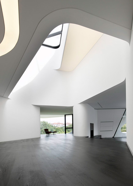
Dupli.Casa: Interior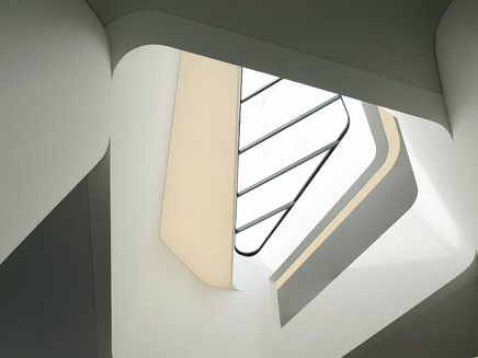
Dupli.Casa: Skylight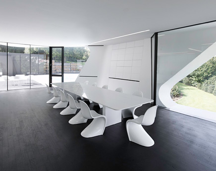
Dupli.Casa: Interior, Dining Room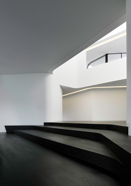
Dupli.Casa: Interior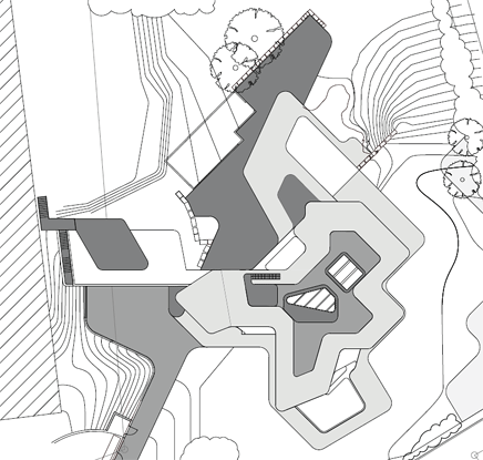
Dupli.Casa: Location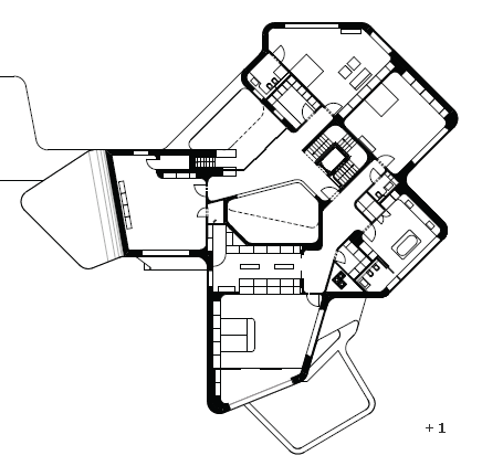
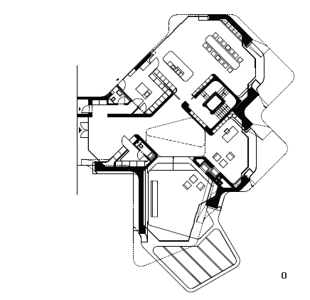
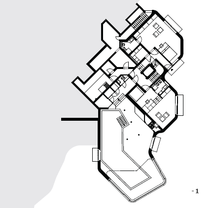
Dupli.Casa: Floor Plans
J. MAYER H.
Founded in 1996 in Berlin, Germany, J. MAYER H. focuses on works at the intersection of architecture, communication and new technology. Recent projects include the Town Hall in Ostfildern, Germany, a student center at Karlsruhe University and the redevelopment of the Plaza de la Encarnacion in Sevilla, Spain. From urban planning schemes and buildings to installation work and objects with new materials, the relationship between the human body, technology and nature form the background for a new production of space.
Jürgen Mayer H. is founder and principal of this crossdisciplinairy studio. He studied at Stuttgart University, The Cooper Union and at Princeton Universtiy. His work was published and exhibited worldwide and is part of international collections like the MoMA New York and SF MoMA. His work was awarded with numerous prizes, i.e. the Mies-van-der-Rohe-Award 2003 Emerging Architect and Winner Holcim Awards 2005 Bronze Europe for Metropol Parasol. Jürgen Mayer H. tought at Princeton University, University of the Arts Berlin, Harvard University, Kunsthochschule Berlin, the Architectural Association in London and is currently teaching at Columbia University in New York.
18 Comments
beautiful renderings,
especially the interiors.
anyone know the modeling/ rendering software?
as unbelievable as it seems, but these are actual photographs of the final building!
photographer: david franck.
If this really is real, then it's my favorite thing ever.
it's beautiful, I wonder what kind of hotness some sections would reveal
if it's not real, those are the most convincing renderings i've ever seen.
Rendering or not, this house is a modern Mc Mansion. Photographs well.
^hmm. i counted 8 bathrooms.
there are some in between spaces neither a hallway nor a room. it looks like a mix of home office/living/gallery/swimming structure for somebody extremely well off and in art business.
is there information on the client and the program drive?
however, it is photogenic and i suspect some of the photos and renderings are hybrid, meaning reality enhanced.
i remember neil denari telling me the difficulties of matching exterior surfaces with interior surfaces in terms of continuity. special mixtures of paint, plaster etc...
it is a house which would require a lot staff to keep it pristine.
This is a terrifically designed house. The geometry is what sets this apart. The smooth flow of lines and curves makes it mesmerizing...
We will give this a feature at Home Design Ideas
little info on his website, including a lack of a completion date. found a couple photographers named david franck, but none had work like this on their website. but in the end, I think they might be photos. the renderings on mayer's website are clearly renderings, not photorealistic. and the photography for some of this other completed work looks almost identical to these in light, atmosphere, and polish. Likely a lot of their slickness and the perfection of the surfaces comes from photoshop touching up. if you compare his pr images versus the pics of his buildings on flickr, the flickr ones have some clear seams and mismatches in their surfaces that somehow don't show up in his... and even assuming they are tweaked, those exterior shots of the house are hard to go along with.
but if they were renderings, I'd guess maxwell and photoshop. if your materials and texture maps were good enough, I don't think there's anything in there that maxwell couldn't do... for that matter, if they are photos, the after-the-fact tweaking makes them look like maxwell renders. my first thought when I saw them.
and yeah, even with a staff to maintain it, let's see an untouched photo in 5 years.
Not bad. But why avoid detailing? That is the best part of architecture, homogeneous surfaces are momentarily sexy- but I find material transitions more interesting. Hasn't the pure white space for space's sake been done enough?
agreed about the detailing issue. seems like a lot of high level work is moving in this direction, esp zaha, all these surface gymnastics, with masking materials, matching paints, etc., to produce a building aesthetic that emulates that of an industrial design product. the purest realization of this house would have all the white as molded plastic, one seamless homogeneous material forming those sexy curves and clean edges -- that might be closest to living up to the crisp flawlessness of the digital version.
come on, those are renderings. i'd bet money on it. they're really fucking good, but they're definitely renderings.
okay... might be highly retouched photos, the interiors. the exterior shots are *obviously* renderings.
but anyway, fuck it, i don't care, cool house, real or not.
Very nice renderings, except the first exterior day shot. Clouds looks like they are spherically mapped. Plus that pic has zero landscaping design detailing how the building meets the site which is a sin regardless if this was a real pic or rendering. Plantings?
House is oversized for a single family. Doesn't seem practical and appears to be missing venting windows in most rooms. Natural illumination appears pleasant.
This will make a great public art gallery some day.
i am a second sem student...when iseethis its like a beautigul building pyut when i ssee it with a point f view of my project farmhouse..i get the ideas...thanks a lot..
i am a second sem student...when i see this its like a beautiful building but when i see it with a point f view of my project farmhouse..i get the ideas...thanks a lot..
I know for a fact that they are NOT renderings. Check out his other projects as well and you will see the same level of smoothness in his built work. ie. Karlsruhe mensa
Great design, architect produce brilliant place that every body would like to be in the palce.
Led nailed it, just another McMansion, and probably a stage set for a scifi movie.
It appears thoughtfully detailed but so what? Any ridiculously expensive project should have that at the bare minimum. But all that effort in drywall and paint? Barf. In reality nobody lives in such an austere minimalist environment, except prisoners in solitary confinement, and they don't do it by choice. White box minimalism is dead, not just stylistically but humanistically. All hard surfaces makes the building an echo chamber.
Block this user
Are you sure you want to block this user and hide all related comments throughout the site?
Archinect
This is your first comment on Archinect. Your comment will be visible once approved.