
ShowCase is an on-going feature series on Archinect, presenting exciting new work from designers representing all creative fields and all geographies.
We are always accepting nominations for upcoming ShowCase features - if you would like to suggest a project, please send us a message.
Project Description from Neil M. Denari Architects, Inc. (NMDA):
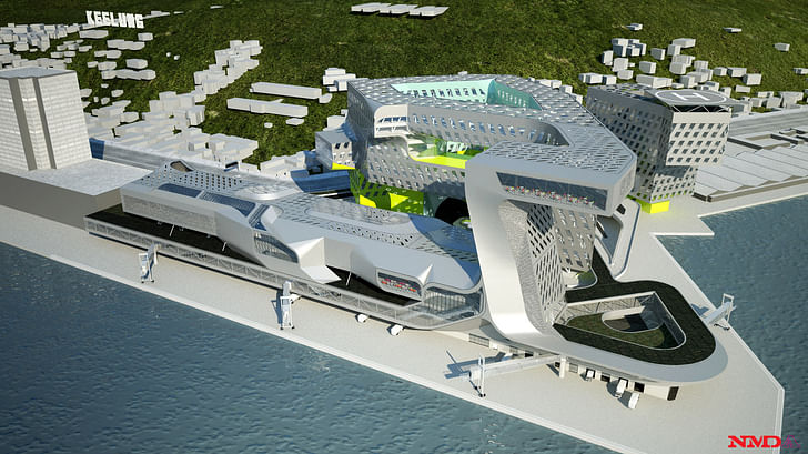
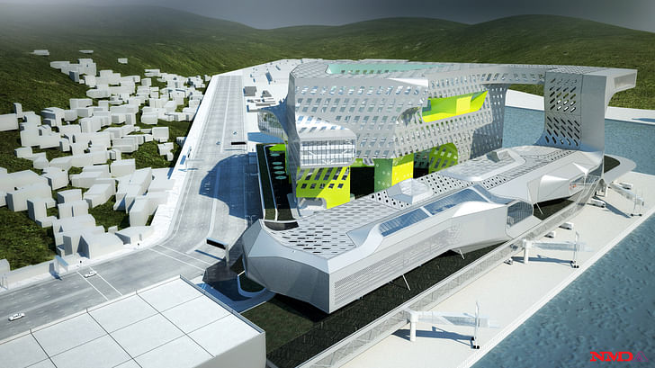
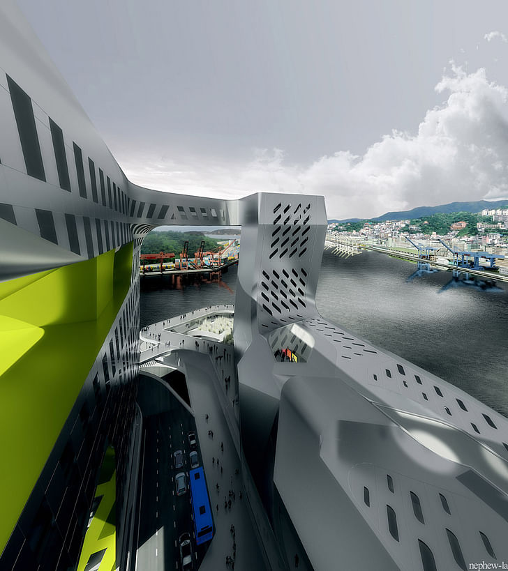
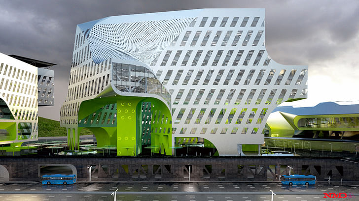
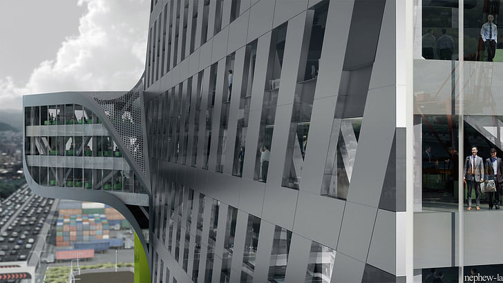
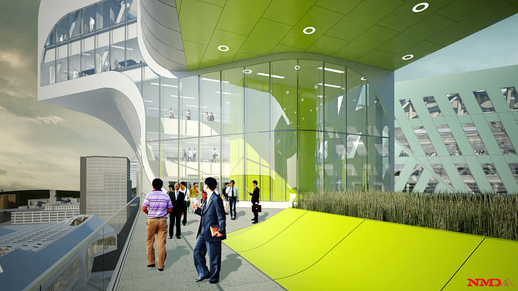
The project site consists of a new cruise ship port terminal, a 250 meter long, three level building that will accommodate the largest ships in Asia; a 53,000 square meter Harbor Authority office complex; parking for 1000 cars; and a third phase 23,000 square meter speculative office building.
The total budget for the new complex, which will cover 120,780 square meters, has been set at NT$6.2 billion (US$211.5 million). The project will break ground next year. Construction of the three-floor terminal is expected to be completed in 2015, while work on the complex's office building is expected to come to a conclusion in 2017.
The Port of Keelung office and the city’s Mayor Tong-Rong Chang have expressed optimism that the new building will become a landmark of the port city.
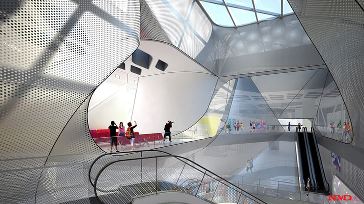
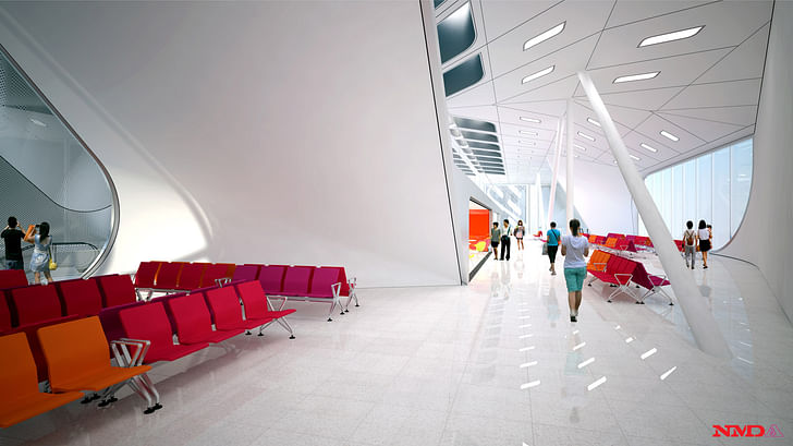
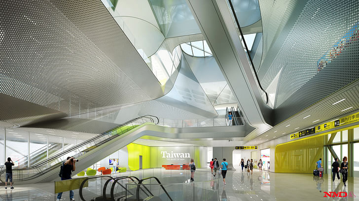
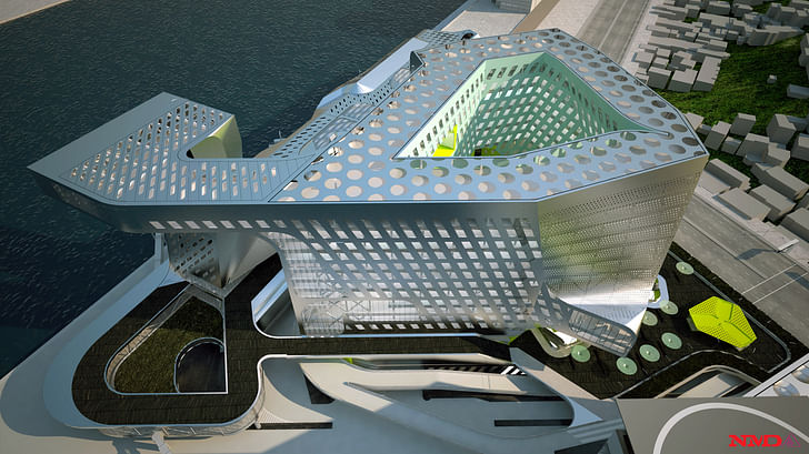

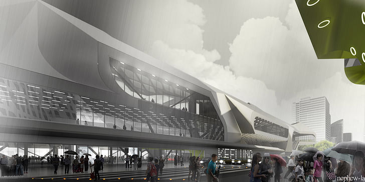
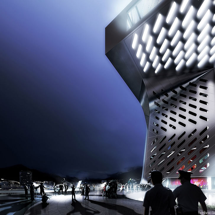
Project Details:
Project title: New Keelung Harbor Service Building
Location: Keelung, Taiwan
Status: First Prize, International Competition, September 2012
Client: Taiwan International Ports Corporation
Budget: NT$6.2 billion (US$211.5 million)
Size: 120,780 square meters
Ground breaking: 2013
Completion: terminal (2015), office building (2017)
Architects: Neil M. Denari Architects, Inc. (Los Angeles) and Fei and Cheng Associates (Taiwan)
Consultants: Thornton Tomasetti (Los Angeles) and ARUP (Hong Kong).
16 Comments
Something like this would have countless comments just a few years ago. Now it is just another thing.
visually stunning. and obviously unlike anything we've seen to date.
i agree with you, double. so, why do you think that's true?
have these kinds of renderings become like movie trailers where we understand that these represent the best potential of the project and the reality will pale in comparison? even if not, i'm not likely to ever go to taiwan, so images will be the most i (and most of us) ever experience even if it IS good.
or is it that there is no longer even an effort to publish it with an argument - a set of ideas and intentions, that we are to discern value and quality simply from shiny sun-kissed fly-bys of the proposed objects? what kind of qualitative discussion can these images generate beyond a series of guesses about what software/renderer was used, how it will fit in to an environment to which it is likely to be completely foreign, how someone arrived at the magnified-mcnichols-metals-sampler fenestration?
there are some jarring geometries in the project, shifts, cuts, and folds that appear to lack rigor or reason. except that we can be sure that there was an internal self-referential logic that drove these decisions and that - once the rules were established - it was probably approached in a highly rigorous way. we are just denied access to it.
there are limits to our ability to access the project in any critical way. i don't know why we should care, why anyone should spend so much to build such a uniquely difficult set of forms.
so all i can do it 'ooh' and 'aah' over while watching the video with its peaceful new age soundtrack.
betsky helps put the selection in some context: http://www.architectmagazine.com/architecture/neil-denari-wins-keelung-harbor-building-competition.aspx
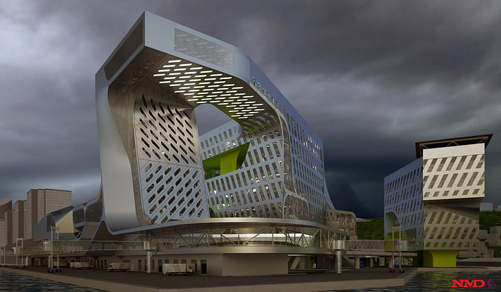
The problem I have here is that the thing built will *never* look as slick as it does in these renderings. That long single swoop of silver down from the roof to the promenade canopy will be made of lots of smaller panels that will *never* align perfectly and seamlessly. There *will* be oil-canning and gapping and caulk.
I don't dislike it, at all, I just know it won't look as dreamy and flawless as it does here. It will be more clunky, and this type of form doesn't lend itself to being clunky gracefully.
I love NMD and his work, but this seems to be all over the place, lacking rigor or reason. Sad, but if he actually gets to build this, it would be great.
@Donna your comment re: "the thing built will *never* look as slick as it does in these renderings" calls to mind Kickstarter's recent decision to "ban renderings"... I wonder how such a move would change the discussion within architectural criticism.
Also Steven for some reason i feel that i would be much more excited by some physical models of this project even if cnc/3dprinted than these renderings. Perhaps that says more about some sort of contemporary preference for analog, on my part though..
architecture as pure sculpture, which will be a nightmare to maintain. Modernism has come a long way, baby!
double o - agreed... I just kind of glazed over this project thinking - eh - I've seen that before. I think partly because the renderings (and material choices) make it look like product design from the past decade. I thought some kind of cross between a scion and a dell computer case. last year's model architecture. I'm sure it'll be a nice project, but to me it's just noise.
something like this is more likely to catch my eye lately. it's kind of a dumb project (arbitrarily rotate a square 10 degrees?) but even something with simple moves like this hotel project seems refreshing. I think I'm probably just getting tired of the over-wrought complexity for complexity's sake and the shiny iphone architecture - and craving something a little more introspective and simple...
@toast i really like that chapel!
Something like this would have countless comments just a few years ago. Now it is just another thing.
I agree. I think it's because the new economic reality (from my perspective, at least) has made me more critical of grand opulence and expressive formalism. The fact that we are only given renderings and a video, rather than diagrams and drawings reinforces my reaction.
I find myself much less interested in form-making, and much more interested in architectural value that is added to the project. What efforts are being made to make it public? What's going on in the section? How's it connected to the wider urban context, both architecturally and socially? There's a lot of happy people and balloons being rendered, but is the program only going to have office space? And most importantly, is that cop in the bottom rendering taking someone into custody?
The design is worth to watch i just simply loved it...
http://www.usatoday.com/news/opinion/forum/2010-12-30-column30_ST2_N.htm
Look at all of the small structures on the hillside adjacent (dwellings? probably.) that currently have what are probably lovely views of the harbor. That is until they build a giant, scaleless perforated lime green pretzel in front of them.
The profession is quickly approaching the Wall Of Terminal Weirdness.
Could it be that this mode of architectural expression has been established and entrenched as the expected outcome? The results of many recent competitions and prestigious commissions around the world seem to fall within a fairly narrow range of architectural form making. The avant-garde has become the establishment...
Like many of these proposals, seductive form making and skillful rendering and presentation, but leaving issues open. Donna's comment is spot on. Interior spaces, while not lacking some drama, seem to be a consequence of the exterior form-making and not considered in a formal sense with the same attention as the overall exterior mass. The building seems to work in the context of the harbor and ships and cargo cranes, but what about the little structures across the street? Not enough info to determine whether that is anything worth considering...
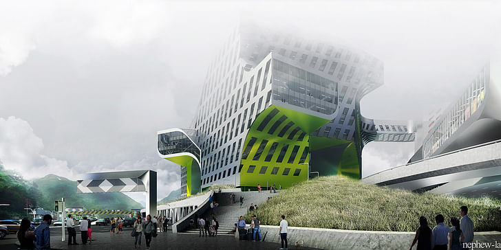
Brightly colored lounge seating in the concourse renderings not withstanding, my biggest question is how this type of expression resolves itself down to human scale. Will the resulting built project find a way to communicate it's intent at the places where users directly interact? Will the ideas demonstrated in fly-bys and aerial renderings resonate organically at the level of detail where the inhabitants "touch" the building?
Shut up Aldo Rossi!
Sorry, I didn't even read your post. I just always wanted to say that.
Shut up Mies!
Back off Mies! I'm dead, OK?
Completely.
Block this user
Are you sure you want to block this user and hide all related comments throughout the site?
Archinect
This is your first comment on Archinect. Your comment will be visible once approved.