
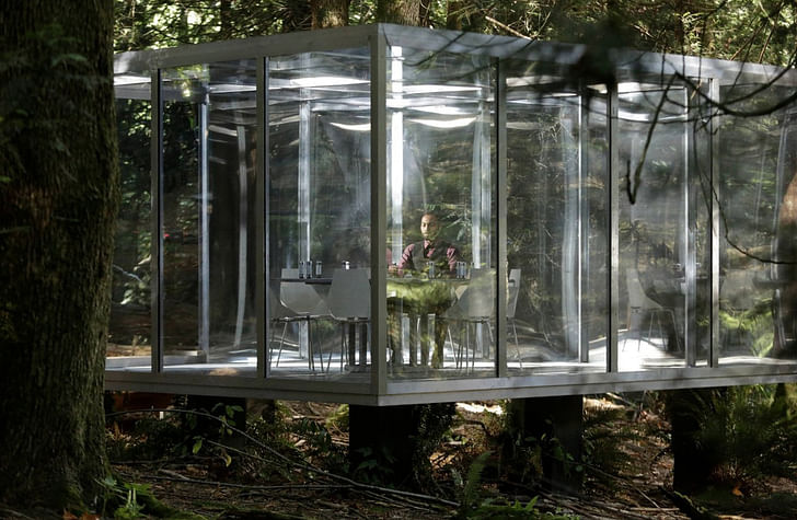
By definition, a background can be easy to forget about—but it can have as much of an effect on the overall feel of a show as the script or an actor. When it comes to a show like Legion on FX, the set takes on additional importance, serving as a visual representation of the (incredibly unstable) mental state of the lead character.
Based on a Marvel comic book, Legion depicts a man, David Haller (played by Dan Stevens), who was diagnosed at an early age as a schizophrenic. When the show opens, he’s in Clockworks, a psychiatric hospital with a distinctly brutalist feel. But as the show progresses, it becomes clear that not everything is what it appears to be. David, it turns out, may not be schizophrenic at all, but rather a mutant with incredible telepathic and telekinetic powers.
In most sci-fi shows, telepaths have a grip on their power. Even if they don’t, like with Jean Grey of the X-Men, lack of control is depicted through occasional outbursts or uncontrolled expressions of psychic power. This is not the case with Legion, where being psychic translates into an experience of reality that is fundamentally unfixed and unstable. David constantly is questioning his mental state, even as it becomes clear it’s not a mental illness. And the instability of his consciousness manifests in changes to the world around him, visible as both minute and dramatic changes to the set. In this show, ‘unreliable narrator’ is an understatement. The viewer is constantly unsure of what is real and what is not.
I talked with Michael Wylie, the production designer of Legion, to hear about what goes on behind-the-scenes of the sets of this unusual and gripping show.
What is your background? Did you study set design?
I didn't. I was kind of in the music business, and then I ended up in Los Angeles and bumped into a friend who was working on a Nightmare on Elm Street movie. I started working in the art department—literally as low as you can go—and loved it. So I kind of just worked my way up.
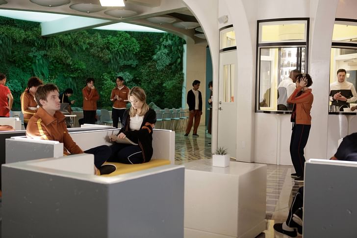
One of the first environments that you see in the show is the Clockworks Psychiatric Hospital. It's a pretty freaky environment. Describe the atmosphere you were trying to create.
Well I think the overarching idea of most of the show is that we’re trying to keep everyone on their back foot a bit as far as where we are or what we're perceiving as being real. We wanted to make a hospital that, for me anyway, was as far away as you could get from the standard mental hospital. We went and looked at a bunch of locations around Vancouver and—I don't know why, and I'm not judging—but there are a lot of really spooky closed down mental institutions in Vancouver. We [wanted to] find something that was far away from One Flew Over The Cuckoo's Nest or 12 Monkeys or any iconic sort of mental institution.
At the same time there's a ton of brutalist architecture in Vancouver so we wanted to get some of that in there. Also, Noah had in his original pitch for the design of the show a lot of stuff from from A Clockwork Orange. All those things led us to this oddly inviting, brightly-lit kind of brutalist ‘70s feeling for the mental hospital. There's a ‘70s feeling kind of throughout the show, in a lot of different parts from the wardrobe to the sets.
Can you speak to that?
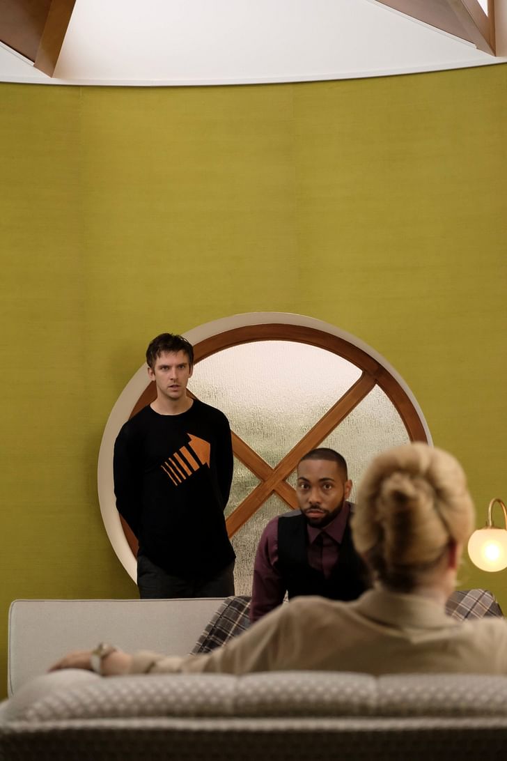
I'm an unreliable narrator so I don't remember ever having a conversation with anyone about making a ‘70s looking show. But I think as we started doing visual research for the show, kind of starting in the corner of brutalism and working our way out while also having so much at the beginning of the first episode take place in flashback, we just ended up in this spot that we liked that that felt mildly ‘70s. It had a little bit of a Scooby-Doo vibe to it. I think it just happened.
So then there's the other really dramatic set which is Summer Land, the headquarters of the mutant resistance, so to speak. That's such a cool building.
It is. It's up near the ski resorts in Vancouver. It's a couple of hours north of Vancouver and it is a rather amazing place where students come to live and learn about conservation. They do day trips and also there are cabins all around that you couldn't see in the show. That building has been there eight years or something like that. We saw the picture of it and decided the minute we saw the picture to drive up there and have a look at it. It was proximous to this little lake that it was on and it was a river and and just had this weirdness. It was exactly what we were looking for. We were looking for an antidote to the Clockworks [set]. David, when he is in Clockworks, at the beginning of the show, is constantly dreaming about nature and fields and open sky and blue. That's why we wanted him to go toward what he's been dreaming about.
There are these sometimes dramatic, sometimes minute changes to the set that reflect David's mental state. How do you approach that? This seems to happen a lot at Summerland.
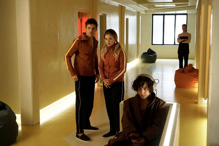
Well the exterior of that set was location but everything else was built on the stage so we had an amazing amount of flexibility in the way that we portrayed everything we wanted. The really fun plan before we started building anything was that every single time we went back into a set what we saw in the window was going to be different. We were going to maybe paint the rooms different colors every single time you go in there just to make sure that everyone knows that this may or may not actually be existing. We didn't really get to a lot of those ideas but we did change the rooms around a lot. And it was an effort to make this very conscious decision to keep the audience thinking that there is something familiar about this but also at the same time, something unfamiliar. We wanted to get the audience to feel what David's feeling where he doesn't ever really know what's real and what's not real. We're giving the audience a subjective point of view and David's life color seems to play a big role in signaling these different changes.
We wanted to get the audience to feel what David's feeling
A lot of the times with the new lighting technology they have,...there's a board where you can literally change the color of the lights even in the middle of a shot. You can get a lot of the freaky stuff that happens in Clockworks with lighting changes and it's all happening in real time so we used a lot of that. Color, as a production designer—that's just my thing. I like to go way overboard with color. I have this philosophy that I don't think anybody tunes in on a Wednesday night to watch something that they could see [in their own] home and even reality television shows have hair and makeup and wardrobe teams for all the ladies of the Real Housewives of wherever so if they can do it we can do it too. I like to use a lot of color and I like to make things just a little bit over the top with special regards to color, texture, and pattern—and that's just kind of my design aesthetic. I know it's not me and I'm not supposed to impose my own sort of design likes and dislikes onto somebody else's story, but I can't help myself.
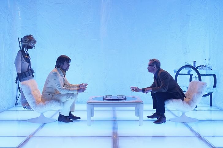
In the show, there is a space referred to as the ‘astral plane’, that exist entirely within the mind. How do you come up with a space that's not a space, so to speak?
We had, as you do on TV shows, a ton of meetings about it. The way things go these days with visual effects, we tried to shoot a couple of things that were sort of rooms that were completely filled with smoke and use some lasers and none of it really worked. Often when we don't know what we're doing, we just shoot it all on the screen and then the visual effects department kind of comes up with that landscape, for lack of a better word, in post[-production]. I thought it was incredibly cool. It was more of the idea that we tried to do with the show where there's a touchstone of reality to it. There's grass and there's trees and there's sky, but it's all sort of dropped on its head. That, the astral plane environment, all came about in post. There wasn't anything that I specifically designed including the loungy pneumatic space...Like so many things on some TV shows I work on, you're reading the script and all of a sudden you come to the ‘interior ice cube’ and you start to read the scene and then you go, “Oh how the hell am I doing an interior ice cube” and you get exactly one and a half days to think about it. You have to implement something. The first version of the ice cube was a really bad idea of mine to use that super clear plastic that they make clear wedding tents out of. We just layered it and just kept layering and crunching it and squishing it and gluing it all together using a big sheet and it looked awful. One of the painters said, “Oh you know, I had this idea that we could make these big giant molds and just pour acrylic in there and you blow air on it so that the acrylic moves around while it's drying.” That's what we did the second time you see the ice cube and subsequent times. That ice cube had big giant acrylic walls that were poured on the floor and then tipped up onto that little Kubrick floor and that's how we made that thing.
And once again there’s a very ‘70s feel.
The character has been in suspended animation in a room in the basement for 25 years so we went back 25 years and then went back another couple 15 because he's such a good actor and such a great character that we wanted to give him something to play with. That sort of very ‘70s English, playboy kind of thing, was what we came up with and that, I think, was really cool.
Writer and fake architect, among other feints. Principal at Adjustments Agency. Co-founder of Encyclopedia Inc. Get in touch: nicholas@archinect.com
1 Comment
This show is amazing in part because of its gorgeous sets. Thanks for posting!!
Block this user
Are you sure you want to block this user and hide all related comments throughout the site?
Archinect
This is your first comment on Archinect. Your comment will be visible once approved.