

Individuality is a prized commodity. “Dare to be different,” we’re told. “To thine own self be true,” inspirational posters implore, butchering a quotation from Hamlet that originally implied multiple, different meanings. But how? After all, the most punk of punks is the one who copies the best.
In “Vanishing Twins”, an essay from “Of the City”, the eighth issue of the journal Fresh Meat, Paul Mosley delves into the duplicate. “Authenticity is deceit,” he contends, asserting that there is no single without its double. In a series of “micro-arguments”, he considers a diverse range of pairs, twins, and copies in both painting and urbanism. In fact, even the essay itself is structured according to the logic of the double: an architectural proposal by Jesus Aguilar runs “parallel” to the essay, while paintings and cities are proposed as mirrors to the each other. Yet replication always implies differentiation, even if it’s minute. Jpegs degrade as they proliferate; identical twins think different thoughts. Likewise, Mosley’s micro-arguments are in dialogue, but also “possibly in conflict with one another”.Does the city reveal anything about itself? About us?
Fresh Meat is a journal produced entirely by the student at the University of Illinois at Chicago School of Architecture. Founding in 2008, the journal attempts to publish content that “both reflects and challenges UIC’s pedagogical agenda”. With “Of the City”, Fresh Meat questions “prevailing and forgotten ideologies”, endeavoring to instigate questions instead of proffering solutions. “What pre-existing conditions in the city can we learn from?” they ask. “Does the city reveal anything about itself? About us?”
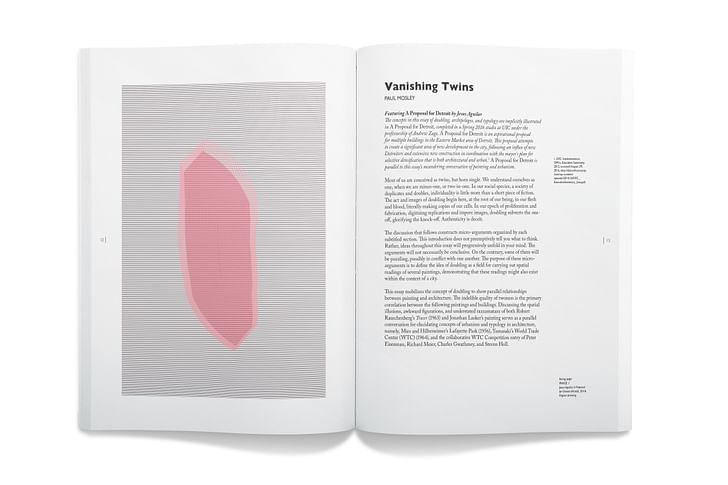
Our featured excerpt for Screen/Print is “Vanishing Twins” by Paul Mosley, an editor of Fresh Meat currently pursuing an M.A. in Design Criticism at the UIC School of Architecture. The essay has been slightly edited for length and formatting. For citations, contact the author.

Vanishing Twins
by Paul Mosley
Most of us are conceived as twins, but born single. We understand ourselves as one, when we are minus-one, or two-in-one. In our social species, a society of duplicates and doubles, individuality is little more than a short piece of fiction. The act and images of doubling begin here, at the root of our being, in our flesh and blood, literally making copies of our cells. In our epoch of proliferation and fabrication, digitizing replications and impure images, doubling subverts the one-off, glorifying the knock-off. Authenticity is deceit.
The discussion that follows constructs micro-arguments organized by each subtitled section. This introduction does not preemptively tell you what to think. Rather, ideas throughout this essay will progressively unfold in your mind. The arguments will not necessarily be conclusive. On the contrary, some of them will be puzzling, possibly in conflict with one another. The purpose of these micro-arguments is to define the idea of doubling as a field for carrying out spatial readings of several paintings, demonstrating that these readings might also exist within the context of a city.Most of us are conceived as twins, but born single
This essay mobilizes the concept of doubling to show parallel relationships between painting and architecture. The indelible quality of twoness is the primary correlation between the following paintings and buildings. Discussing the spatial illusions, awkward figurations, and understated razzamatazz of both Robert Rauschenberg’s Tracer (1963) and Jonathan Lasker’s painting serves as a parallel conversation for elucidating concepts of urbanism and typology in architecture, namely, Mies and Hilberseimer's Lafayette Park (1956), Yamasaki’s World Trade Center (WTC) (1964), and the collaborative WTC Competition entry of Peter Eisenman, Richard Meier, Charles Gwathmey, and Steven Holl.
Tracing Twoness
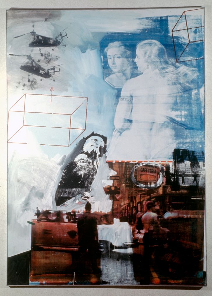
Robert Rauschenberg’s Tracer (figure 1), one of his seventy-nine silkscreened paintings produced in 1963, reenacts both doubling and quotation in extremely intricate ways. Rauschenberg pulled incongruous imagery from books, magazines, and newspapers, and transferred them to the canvas in a dizzying array of spatial illusions. We see two photographic helicopters, an image of a bald eagle, a pair of caged birds, a portion of Peter Paul Rubens’ 1615 painting Venus Before a Mirror (figure 2), two wireframe boxes floating around and outside of the painting, and a street scene in the lower right. Each image transfer brings with it its own space, resulting in a disparate collection of spaces that neither absorbs nor confronts the viewer, but synthesizes with the same effortless ease that has it joining a helicopter to a seventeenth century painting of a goddess.
Each image transfer brings with it its own spaceTracer mixes these image transfers in a seemingly precarious way, yet it forms highly meticulous relationships through a catalog of doubling and quotation. There is an intentional doubling of objects in this painting: Venus, from Venus Before a Mirror, is reflected in the mirror, the helicopter is printed twice (appearing a third time as negative in the painting’s bottom right corner), a couplet of birds perch in a cage, the words “Coca-Cola” appear twice, and two axonometric boxes float freely. Within the monochrome tone of the eagle’s shoulder emerges the head of a second eagle. These complex arrays of space—the helicopter’s doubled perspective, the unlike orientations of the wireframe boxes, the nested face of the eagle, the confinement of the birds, and the reflection of Venus—are grounded by the crimson urban scene above which this firmament plays.
Many elements in Tracer relate to the setting from Ruben’s Venus Before a Mirror, depicting the goddess seated on red furniture. Tracer replaces the red furniture with a tinted red street scene at the lower part of the image. This quotation of Venus reenacts the original literally, reflecting her face, and then goes back in time and doubles it again before it happened in the first place, producing less a reference to an origination than creating a re-origination in itself. This cacophony of irreconcilable spaces is as turbulent as the vortex of paint which shrouds the helicopter’s photographic certainty in vacillations, dithers Ruben’s brushstrokes as though filtered by static white noise, thickens under the box and washes over its edge before churning up into a maelstrom of black paint encircling the eagle. Through the unfamiliar twinning together of these paintings, their perceptions of space and brushstrokes are joined, if only for an instant, within the context of a city.

Displacement and Disappearance
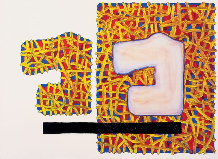
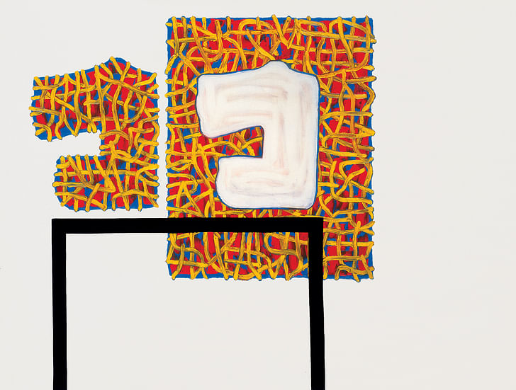
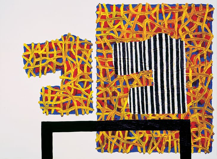
Tracer may prefigure the obsessively compositional, serial paintings of Jonathan Lasker (American, 1948-). Lasker’s systematic work utilizes repetitions and variations on type. After 1990, his paintings consistently occur as either diptychs or triptychs. His compositions consist of shapes, scribbles, and grids, which across multiple paintings often maintain common positioning on the canvas. For example, the three paintings, Assertive Absence (figure 3), Conspicuous Absence (figure 4), and Domestic Arrangement (figure 5), all 1999, operate as a set of triplets that maintains and subverts compositional consistencies between them. For the sake of provocation, one could say Assertive Absence and Conspicuous Absence were originally like twins in the womb, and Domestic Arrangement was conceived later, producing a set of triplets.
the left shape absorbed the right shape, like a sibling absorbing their twin in the wombWhat of Domestic Arrangement then sets it apart from the other two paintings? One answer lies in the titles, which provides clues about how to engage with the picture—a common aspect of Lasker’s titling. All three paintings contain twin shapes. The word “absence” in Assertive Absence and Conspicuous Absence suggests that the left shape in these two paintings can be read as a displacement of the right shape, leaving a negative trace of its original placement. This trace is cut from a field of yellow, blue, and red scribbles, foregrounded by a black bar. In the titles, the modifying words “assertive” and “conspicuous” draws presence to the absent figure—one actively (assertive) and the other passively (conspicuous). As a title, Domestic Arrangement draws attention to its subject matter, the representational value of a still life painting, rather than its object substance, the material and abstract value of composition.
Another reading of this piece allows the remaining traces to connote the idea of disappearance. Hillel Schwartz writes that in 1975, Salvator Levi “lifted the vanished twin out of fiction and philosophy into obstetric fact.” Levi found in exam reports of 6690 pregnant women that “71 percent of twin gestations diagnosed before 10 weeks were singletons when delivered.” As an analogy, this scientific report helps explain how the vanishing shapes within Assertive Absence and Conspicuous Absence appear differently in Domestic Arrangement by shifting one’s perception of the shapes to appear in elevation as a still life on a table. This disappearance of a shape suggests that the left shape absorbed the right shape, like a sibling absorbing their twin in the womb. The compositional twinning in these paintings are indivisibly this and that; where one perceives the other in itself and the other-than-itself perceives us.
Replication and Reenactment
Of all modernism’s unfulfilled, alchemistic promises of hygiene and social order, the promise of transforming quantity into quality through replication still seems viable today. For example, Alison and Peter Smithson’s Economist Plaza (1964) was a collection of chamfered office towers composed over a plinth containing parking. The Smithsons made a collage replicating the Economist Plaza throughout London’s Soho district. Although, eventually resolving in a single location in Soho, the possibility for replication remains in the Economist Plaza’s genetics. Reyner Banham (a purported ally of the Smithsons) compared this project to the “lid of a large dust bin,” sweeping modernism under the rug to make way for a regressive, Acropolis-like civic design. Perhaps it’s useful to dwell on Banham’s berating critique, as a virtue—using the idea of doubling to drive forward the horror story of art, architecture, and what exactly it is today we call “the” city.
Urbanization fundamentally implies the capacity of the city to expand, accommodate, and trigger growthUrbanization fundamentally implies the capacity of the city to expand, accommodate, and trigger growth. A crisis occurs when this capacity is reversed, when a city suffers from decline and depopulation. Oswald Mathias Unger’s project Berlin: A Green Archipelago (1977) was a response to the postwar crisis of depopulation in the war-torn landscape of Berlin, adopting a logic of shrinking to conduct the city as a collection of individual artifacts. These artifacts, or “urban islands,” were literal quotations of existing urban conditions such as Kreuzberg as a mini-Manhattan, a “Linear City” after the plan for Magnitogorsk, and an “Amphitheater City” after the Amphitheater in Arles. These “cities within the city,” as Unger would say, serve as nodes for the accrual of population and architecture. Herein lies the importance of this project within the history of urban planning; it departed from the tradition of urban expansion and population growth as fundamental goals of government. It used depopulation, a traditionally undesirable scenario, as a catalyst for an urban proposal.
Detroit faces a similar challenge today. It hangs over the public conscience as a city pockmarked with a diminished population and depleted neighborhoods. But now that it has emerged from bankruptcy and is under new leadership, the opportunity exists to reimagine its future. The Green Archipelago is an important reference for Detroit, suggesting that a logic of condensation, rather than expansion, is a more viable form of urbanism for Detroit as a model postindustrial city. The significant losses of urban density in Detroit call into question the need for more open space. To borrow Banham’s words, Detroit could use more “lids over the dust bin”—that is, more instances of individual and exemplary artifacts among the detritus. Doubling fortifies these exemplary artifacts against the pressures of an ever-expanding urban context. Given these conditions, it is useful to look back at the brief collaboration between Mies van der Rohe and Ludwig Hilberseimer (architecture’s Jekyll and planning’s Hyde?) on Lafayette Park in Detroit, which serves as both a model and instance upon which architects can, and have been, proposing work for Detroit today.
One Made Many
Lafayette Park embodies principles where there is no differentiation between urbanization and the city. Restating the influence of the Smithson’s Economist Plaza, Hilberseimer’s project is conscious of the necessity to elevate architecture above the design of objects, working instead from the economic processes that produce architecture itself. The specific graphic language of Hilberseimer’s urban form and architecture is often abstracted as a circulation system, a ladder of flows and movement. Mies never proposed a model city. His architecture, and perhaps by extension his urbanism, is bound to the scale of the building.
The approaches of Mies and Hilberseimer are complimentary. Their proposal for Lafayette Park strikes a balance between extensive forms of movement (i.e. the arrangement of streets, sidewalks, and parking) and intensive building placement (i.e. doubling the east high rise apartment towers). Neither of these elements gains dominance over the other. Hilberseimer’s site planning for Lafayette and Mies’s buildings, together with Alfred Caldwell’s landscape plan, display an effective manipulation of the ground plane by making differences in grade between the parking lot and pedestrian paths along the edges of the townhouses. A perceptive distance between buildings and paths is also implemented, providing privacy for units with floor to ceiling glass walls.These buildings have one indelible quality: twinness
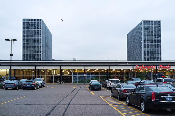
The two East Tower Apartments (figure 6) at Lafayette Park unify problems of organization (such as parking, various scales of housing, and Caldwell’s landscape plan) with problems of building (pronouncing vertical elements of structure and inverted corner detailing). This unification takes place within Detroit’s history of depopulation, a derelict context, yet one latent with opportunity and promise. This project may be viewed as an individual artifact within this depleted and depopulated context, as with Unger’s Green Archipelago. Through a logic of condensation, such an artifact reconnects neighborhoods and communities, recovers forms of transportation, and potentially provides housing for a homeless population of more than 34,000. This view enfranchises unity without fostering it through a spatial logic of differentiation and separation. The two East High-Rises are identical, producing a spatial intelligibility not possible as singletons. As if by mitosis, doubling enables this unity by strengthening an exemplary organism through repetition.
The East High-Rises emit the qualities and effects of doubling to be deferential to the image of the pair. These buildings have one indelible quality: twinness. The different approaches of Mies and Hilberseimer resolve in the dual composition of twin towers. Both are self-effacing and unfamiliar, confronting one another, and delineating a void within which lies a low shopping center. The low-rise townhouses of Lafayette maintain a discrete position within the city, its patterning spreads into the neighboring areas of Detroit. Like the Economist Plaza, one can imagine an archipelago of Lafayette Parks punctuating the decaying fabric of Detroit’s Eastern Market. This view of Lafayette exists at the scale of the city, without proposing a general plan for the city. Instead, it exists somewhere between the two—not quite a building, and not quite a city.
The Twin Towers
Ada Louise Huxtable wrote, “Who’s afraid of the big, bad buildings? Everyone, because there are so many things about gigantism that we just don’t know…The Trade Center towers could be the start of a new skyscraper age or the biggest tombstone in the world.”
Eerily, they became both. In life and death, the Twin Towers illustrate doubling in ways that few buildings have. The unsettling memorial voids commemorate not only the 2,996 lives lost, but also the vanished towers that once occupied them. These two towers contained more office space across 220 floors than all of Houston or L.A., shifting the network of the financial district from the street of Wall Street, to the building of twin towers.
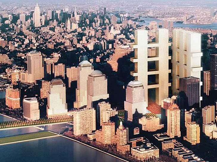
Duplicates, doubles, and recurrences call identity into questionMany of the entries for the WTC competition can be viewed as alternative personalities of the original twins—like Yamasaki in drag. The use of twinning recurs especially in the collaborative entry of Eisenman, Meier, Gwathmey, and Holl (figure 7). This proposal doubles two hashtag megastructures. The building replicates the street grid, reversing the street as void into a positive and upright figure. This replication is literal by embedding the Manhattan grid into the scale of a building. Their entry is figural in its elevational profile. The two towers are perpendicular to each other, with two and three vertical towers connected by four horizontal, volumetric bridges. The vertical towers are nearly four times larger in width than the bridges, which extend beyond the outside of the vertical towers. This extension suggests, if only by implication, a space beyond the buildings themselves, towards an urbanism of elevated streets reminiscent of Moses King’s 1911 Cosmopolis of the Future (a utopian vision projected to exist only two years before 9/11). Their likeness to a double hashtag asserts their presence as a replicated instance of the Twin Towers’ form of urbanism.
The alternative realities of twin towers were drawn out by the memorial competition, unsettling in the ceaseless urge to compare the two in time (original and counterfeit) and in the proposals themselves (a second Twin Towers typology). As in Tracer, cities can learn from synthesizing the disparate collection of junk spaces that defines their present condition, re-originating old buildings and fabric in new ways. As in Lasker’s paintings, cities can enfranchise unity through dazzling forms of awkward, yet liberating typologies, reenacting similar compositions across multiple urban canvases (a painting is never a city—however, it is possible for a city to be a painting). The qualities of intelligibility unique to doubling enable this unity, wrought against an increasingly complex urban context in constant accrual. Duplicates, doubles, and recurrences call identity into question (who am I and who are you?). They render uncertain the difference between this and that.

Screen/Print is an experiment in translation across media, featuring a close-up digital look at printed architectural writing. Divorcing content from the physical page, the series lends a new perspective to nuanced architectural thought.
For this issue, we featured Fresh Meat's eighth issue, "Of the City".
Do you run an architectural publication? If you’d like to submit a piece of writing to Screen/Print, please send us a message.
Writer and fake architect, among other feints. Principal at Adjustments Agency. Co-founder of Encyclopedia Inc. Get in touch: nicholas@archinect.com
No Comments
Block this user
Are you sure you want to block this user and hide all related comments throughout the site?
Archinect
This is your first comment on Archinect. Your comment will be visible once approved.