
The act of play rests heavily on the ability to indulge in the imagination. While a certain degree of functionality is required for elements like swings, slides, and climbing walls, the key to any great playground design is that it be inspiring: and oddly enough, it doesn’t always have to be strictly for children. Game-playing takes multiple forms, from the stream of consciousness rules of a child's adventure to the psychologically penetrating/illuminating construct of an artist. These examples of architectural spaces for play from around the world openly embrace the esoteric and playful.
Belleville Playground by BASE Landscape Architecture: Paris, France
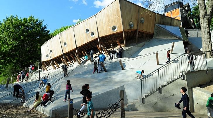
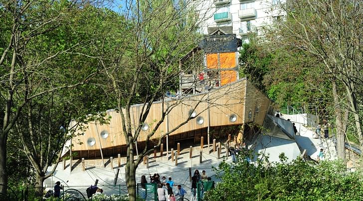
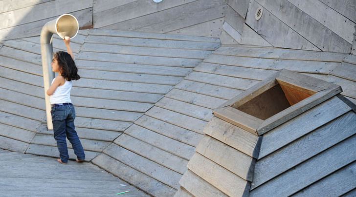
With massive curved wooden arches, oddly angled posts, and porthole-like windows, the BASE Paris Playground at first appears to be a ship stranded in a vast concrete iceberg. However, the free-flowing array of materials and their unusual juxtaposition makes the playground impossible to summarize in a single concept. It is very much like an unspooling dream, on which children can travel from one tangible idea to the next. It is very much like an unspooling dream Here’s how the firm describes their work: “The resulting form of the playground overlays many familiar landscape types, evoked through abstracted forms that recall a mountain landscape, construction site, flying carpet, ramparts and medieval fortifications, pirate ship scuppers, etc. Located on a steeply-sloped site, the playground area is a climbing course with different inclinations for different levels of difficulty and different age groups. Open since 2008, there have been no reports of injury despite its challenging nature, with record-breaking numbers of children playing here since its realisation.”
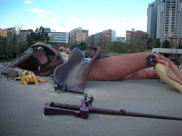
Parque Gulliver by Rafael Rivera: Valencia, Spain
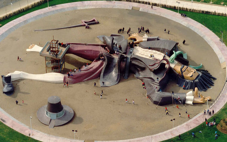
Originally built in 1990, the enormous playground in Valencia, Spain that is in the shape of Gulliver from Gulliver’s Travels was rejuvenated in 2012, making it ready for another generation of kids to climb its ropes, ladders, and swooping sculptural forms. A leg becomes a staircase; a multi-level shaded play area is hidden beneath a giant calf. The playground essentially transforms those who visit it into Gulliver's Lilliputians, not only helping them make their own additions to a classic story, but also to experience the thrill of encountering architectural elements in a highly imaginative format.
Slides by Carsten Höller: London, England
While not strictly a playground, the slides designed by Carsten Höller function as a kind of playground for deeply serious adults. The slides, by virtue of their semi-transparency, are as much about the environment around them as they about subverting that environment and a person’s understanding of their role within it: instead of taking the stairs or elevator, a person can slide through the environment, providing them with views they would never ordinarily experience. Since 1998, Carsten has mounted the slides in multiple sites throughout England and in Berlin. simultaneous delight, madness and ‘voluptuous panic’ For the Tate, he installed the 'Test Site' in the museum’s Turbine Hall, which he describes thusly: “The slide is an object that we associate with playgrounds, amusement parks and emergency exits. I’d like to extend the use of the slide: I don’t see any reason why slides should only be used by children and in the case of an emergency… People coming down the slides have a particular expression on their faces, they’re affected and to some degree ‘changed’...The state of mind that you enter when sliding, of simultaneous delight, madness and ‘voluptuous panic’, can’t simply disappear without trace afterwards. In this sense the ‘Test Site’ isn’t just in the Turbine Hall, but is also, to an extent, in the slider or person watching who’s stimulated by the slides: a site within.”


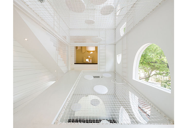
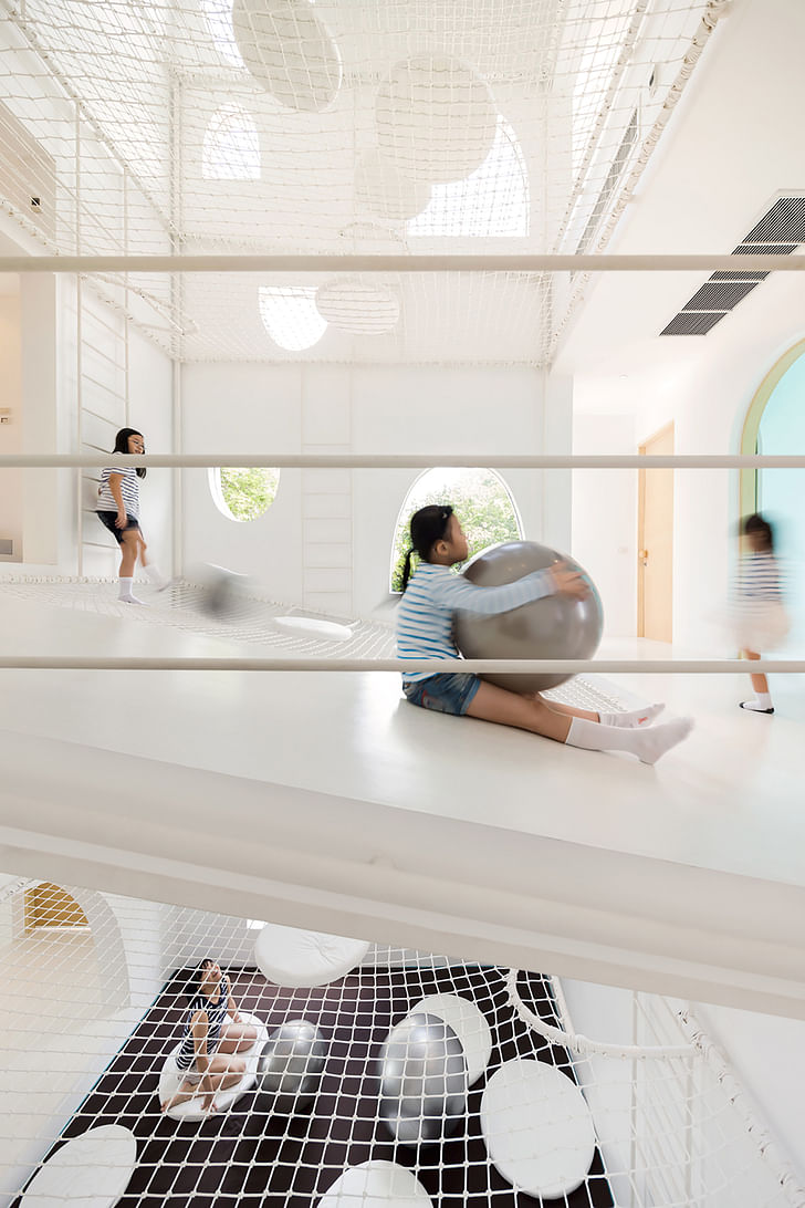
Jerry House by Onion: Cha-am Beach, Thailand
A cartoon brought to life, replete with nets to catch children who purposefully fall through holes in the floor, the Jerry House is part beach house, part perpetual playground. Designed as a holiday home for a family with four young sons, the house is a study in irregularly spaced, playful geometric cut-outs, swathed in natural light. Cushions and bright colors encase much of the interior, creating an upbeat, safe, and fun impression.
In an interview, the architects said: “If the house of Jerry the Mouse were built, it might appear as a big piece of cheese in which the möbius strip would be a desirable route for him to run away from Tom the Cat. Thus, the dwelling is thought of as the object that children would yearn for and that increases the meaning of having a holiday for the parents.”
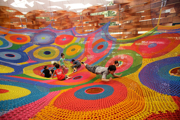
Woods of Knit Playground by Tezuka Architects: Hakone, Japan
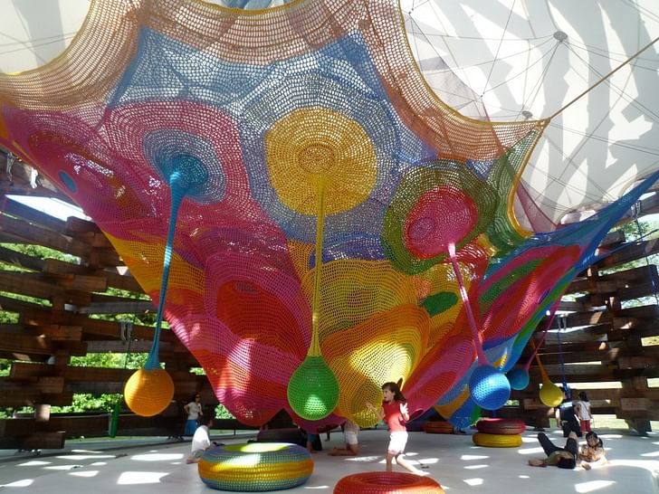
Designed by Tezuka Architects and knitted by Toshiko Horiuchi Macadam, this playground is a combination of soft and hard, permanent and impermanent: the interior rainbow-colored fiber net allows children to play, while the surrounding wooden pavilion is composed of 589 timber members that, if properly maintained, could last for three hundred years. The timber is meticulously designed so that it joins without any metal components. The space attracts people like campfire. As the architects explain, “The artist knitted the net entirely by hand, which is designed for children to crawl in, roll around, and jump on the net. It was easy for us to see the artwork being outside even when it cannot be exposed to rain or ultraviolet light. We wanted to design a space as soft as the forest where the boundary between outside and inside disappears. The space attracts people like campfire. The children play inside of the net just as fire and parents sit around and lay on the woods.”
Anansi Playground Building by Mulders vandenBerk Architecten: Utrecht, the Netherlands
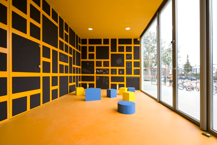
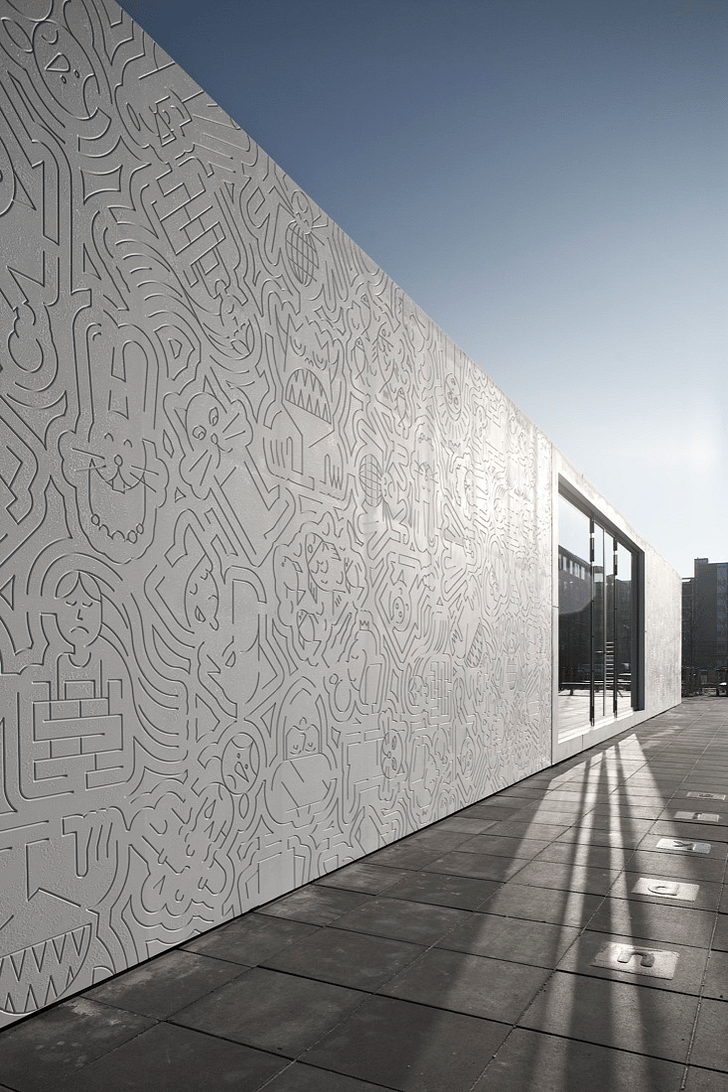
Instead of overt ostentation, this playspace uses quiet details to create a holistic fun experience. Milled lines on the otherwise seamless Corian exterior make up characters and other fantastical creatures from fairy tales from around the world; inside, a colorful grid and outsize foam geometric blocks encourage inventiveness and imagination among the children. Divided into three primary spaces, the structure also encourages a natural division by age group. Younger children gather at one end; teenagers on the other. As the architects describe it, “The idea of the building is to excite and stimulate curiosity and creativity of the children.”

The Crooked Houses by MONSTRUM: Copenhagen, Denmark
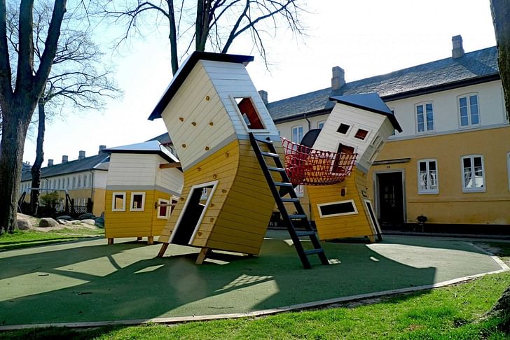
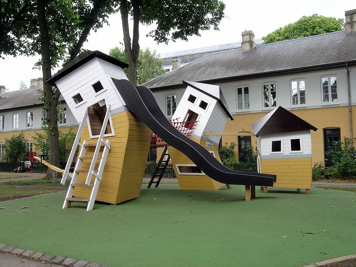
Where other structures incorporate playful elements or imaginative backdrops, the Crooked Houses playground in Copenhagen’s Brumleby housing project literally makes the buildings play together. What appear to be miniature versions of the area’s two-story houses abandon their traditional straight-backed posture and instead romp together, tugging a net between them. Here, everything is allowed. A ladder leads climbing kids into the window of one of the houses, while another slide almost seems to be writhing in motion thanks to the wild contortions of the house to which it’s attached. As the architects note: “Back in the days in 1800-something, when Brumleby was located in the countryside there was a dairy and a slaughterhouse at Brumleby. The idea of the playground is to create a piece of this old Brumleby to remind us of its fantastic history. At the same time the Brumleby playground had to be a pretty sight for the adults, and a fun place to play in for the little ones. Here, everything is allowed. There are climbing grips on the walls, slides from the windows, and balancing lanes from house to house. The children can rush in and out, and up and down. All this without risking the safety.”
This piece is part of Archinect's August editorial theme, Games. For related pieces, click here.
Julia Ingalls is primarily an essayist. Her work has appeared or is forthcoming in Slate, Salon, Dwell, Guernica, The LA Weekly, The Nervous Breakdown, Forth, Trop, and 89.9 KCRW. She's into it.
4 Comments
And not a plant to be seen :(
Missing from this list is the St. Louis City Museum... former shoe factory turned into 10-story play park for both kids and adults. I have never experienced anything like it and how it legally exists in our-liability conscious culture of the United States is beyond me. I am happy that it does
http://www.thisiscolossal.com/2015/06/city-museum/
Ha-ha-ha Alexander Morley just made this page REALLY boring! (the cool kids are over there)...
@Alexander, love City Museum!
@fen-om, what you on about?
Block this user
Are you sure you want to block this user and hide all related comments throughout the site?
Archinect
This is your first comment on Archinect. Your comment will be visible once approved.