
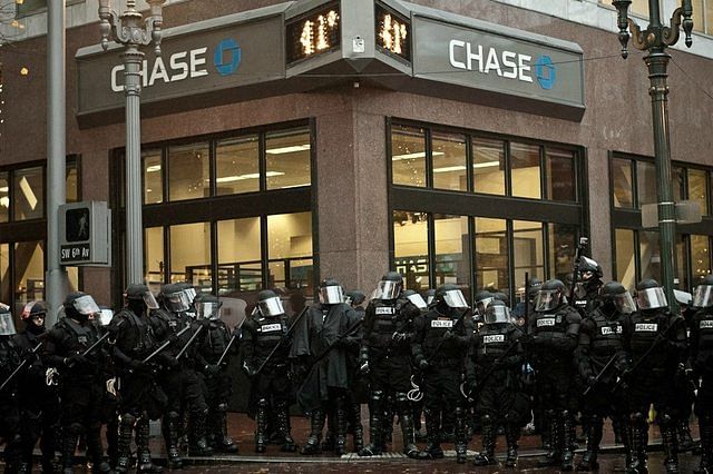
Joe Loya, a former bank robber turned TV writer, learned to read spaces the way other criminals learned to crack safes. His insights illuminate the changing role of privacy in the architecture of crime prevention design for banks.
I meet Joe Loya at his office at The Hollywood Center Studios, which with its guard-staffed entrance, harried writers and off-white bungalows, is an oddly fitting place to discuss the architecture of bank robbery. We take a seat in this fantasy factory, where the blank walls seem to be begging for a fresh coat of imagination. Joe tells me that the art of robbery—of moving through any place, really—is based in understanding the assumptions that people have about a particular spatial configuration, and using them to one’s advantage.
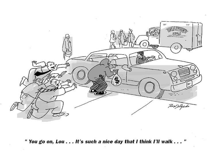
“A perfect example of these assumptions is thinking about getting away in bank robberies,” he explains, recalling the era when, without ever firing a gun, he robbed over 30 different banks, making off with about $250,000 before getting caught. “I would rob a bank that was on a corner of a mini-mall area. When I stepped out of the bank to go into the parking lot, when people walked out of the bank after me to chase me, they would walk out, and their head would be on a swivel looking for a get-away car to be driving away. They’d be looking at the nearest car to be pulling away from the curb. They never suspected that I would be walking through the lot to the nearest Ralph’s or Safeway because my car would be parked behind the structure, the grocery stores or the mini-mall. If they had just looked up, they would have seen me! But their assumption was that there was a get-away car.”If they had just looked up, they would have seen me! But their assumption was that there was a get-away car
In addition to choosing banks that were enmeshed in a banal urban fabric, Joe made sure the locations were close to freeway connections and on-ramps. Once he had evaded people by playing on their expectations, he would walk to his vehicle and then drive onto the freeway, where he would be lost in bumper-to-bumper anonymity.

Joe’s ability to accurately read a space—and the behavior of the people who function within it—has provided him with a livelihood in one form or another for most of his 54 years. His insights are based in part on the fact that in bank design, architects must balance the appearance of privacy with the more invasive reality of security. Recent changes in crime-prevention for banks are based on so-called “abuser-centered design” principles, in which architects are encouraged to design spaces not only from the perspective of the intended user, but from that of the potential offender.
According to Crime Prevention Through Environmental Design by Timothy Crowe, throughout the latter half of the 20th century branch banks were designed as mini-fortresses because architects felt this would subliminally make people think that their money was safe. The banks were placed on corner lots in order to make it easier for customers to drive-through on the sides and back. However, studies (and Joe Loya himself) have shown that robbers prefer this style of bank because they feel less surveilled on the outside, making it easier to disappear once they’ve robbed the interior or to simply assault someone at an ATM.robbers prefer this style of bank because they feel less surveilled on the outside
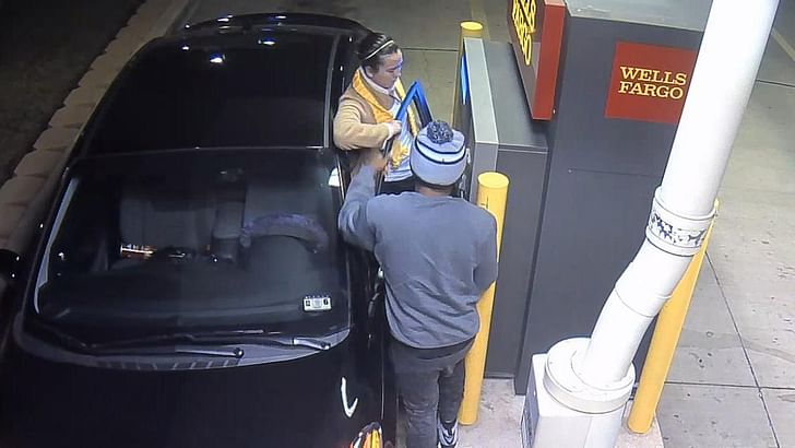
Speaking of which: when ATM machines originated roughly forty years ago, architects initially wanted to place them next to the secure teller areas within the bank, but “the traditional design and flow plan” of the bank’s layout eventually pushed them to areas with little natural surveillance. This made it easy for pick-pockets to transact their own quick withdrawals. This prompted a rethinking by bank designers. For those ATMs that are located on the street or in other isolated areas, different design strategies have been employed to make them safer. For the UK Design Council, these moves include painting brightly colored squares directly in front of the machines that, much like street markings, cordon off a space and create a sense of private separateness for the user. This helps both combat “over the shoulder” crime, where someone standing directly in line behind a customer can memorize a stranger’s PIN number, and also highlights criminal behavior by making it more visually pronounced.
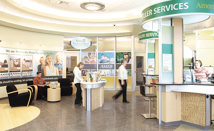
Of course, banks have started to move their ATMs not just indoors, but into the spaces formerly occupied by tellers. Joe and I talk about how brick and mortar banks have changed in the twenty-plus years since he last robbed one. He notes that the decades-long migration of ATMs from outdoor kiosks to the front of the bank, then to the lobby of the bank, and finally as replacements for the formerly human-staffed teller stations inside, has made it possible to do all of one’s banking without ever interacting with a person. This physical design change increasingly mirrors the experience of online banking. While online banking would seem to be a boon for banks in terms of reducing overhead and the need for brick and mortar spaces, it obviously has its downsides, too.
As ATMs have moved indoors, teller “pods” have begun to spring up in the formerly linear teller stalls, purposefully creating less of a portal to simply transact cash and more of an environment in which to have a conversation. Many of the hard lines used in banking architecture are giving way to more curvaceous, welcoming areas.
So how do architects account for bank security in an age which relies as much on the virtual as it does on the physical? Incorporating strategic and tactical countermoves in design development is crucial, especially in an age of ever-advancing technology. Design Council UK gives a prompt for an anticipatory tactical countermove as: “what happens if a bank robber, confronted with a security screen in a bank, takes a customer hostage?” Strategic countermoves anticipate how thieves would attempt to undo security features such as a new the ability not just to steal an object, but to make reality itself disappeartechnological interface. To prevent crime, one must always work under the assumption that someone will invariably be working just as hard to destroy, or at least evade, every design element, whether it’s a viewscreen or a reinforced vault.
As Joe noted, it’s all about people’s assumptions. So I’m curious: how does someone who has spent so much of his life using physical spaces to his financial advantage conceive of a virtual world? Unsurprisingly, in Joe’s mind the architecture of the virtual world enables a much sneakier kind of theft: the ability not just to steal an object, but to make reality itself disappear.
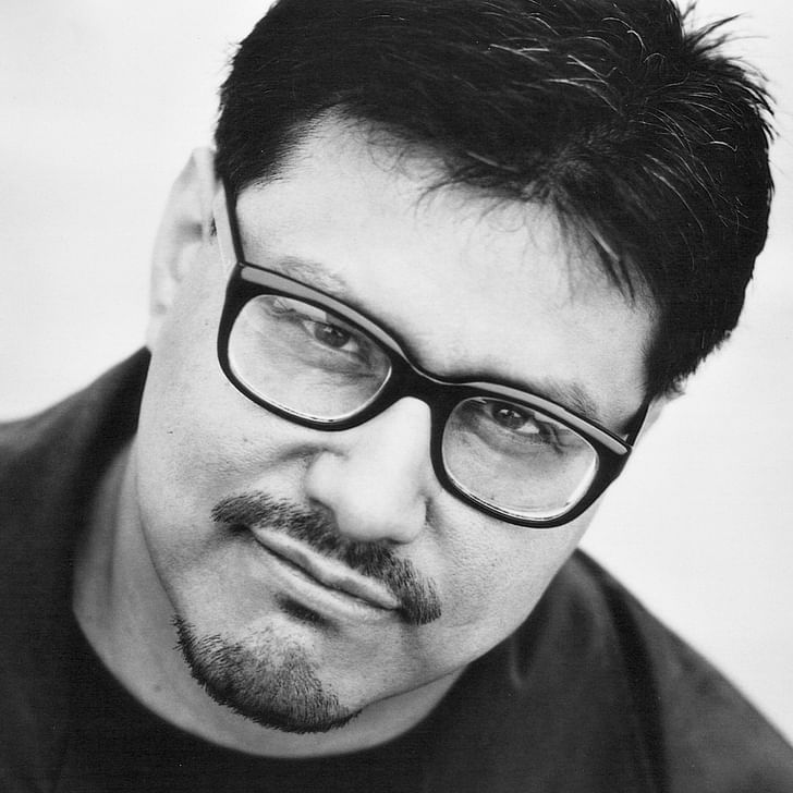
“I think that we are already thinking about money the way we think about a lot of things in the world, which is we don’t think about them as real things,” he says. Whether or not one agrees with him, the challenge for bank architects seems increasingly to be about designing around kinds of crime that have yet to be imagined.
More on the architectures of security and surveillance can be found here, as part of our special June editorial theme of Privacy.
Julia Ingalls is primarily an essayist. Her work has appeared or is forthcoming in Slate, Salon, Dwell, Guernica, The LA Weekly, The Nervous Breakdown, Forth, Trop, and 89.9 KCRW. She's into it.
No Comments
Block this user
Are you sure you want to block this user and hide all related comments throughout the site?
Archinect
This is your first comment on Archinect. Your comment will be visible once approved.