
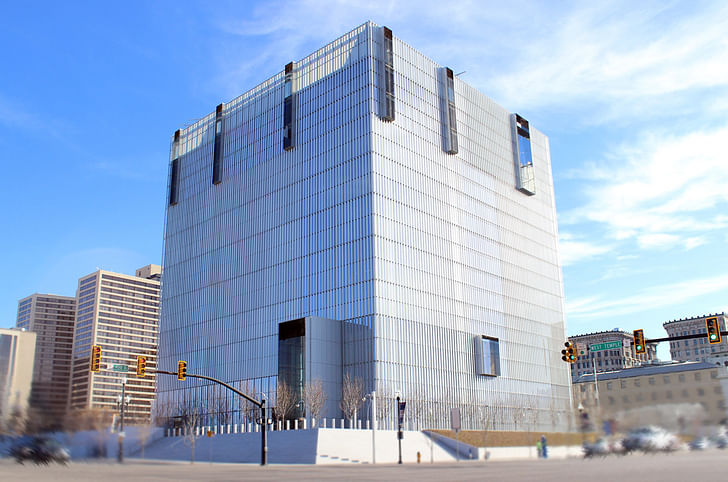
Architecture normally receives very little public notice in Salt Lake City, but the new federal courthouse here got the public’s attention. The Salt Lake Tribune and a local TV news station’s website KSL.com received a wave of letters and posts in response to articles about its opening in 2014. The overwhelming consensus was negative.
The building’s unadorned cubic shape and metallic finish elicited comparisons to “a big swamp cooler”, “a gigantic air conditioning condenser” and “the justice dumpster”. What was more interesting, however, were the many commentators who saw it as a sinister image of the Federal government. Some sample comments: “Is this where the NSA charges you after they tapped your phones, PCs, email, etc.?” “This gives the Federal Government more of the image that it does not need. Bizarro World.” “…the nauseating horror of the outside appearance is an explicit representation of the stupefying inefficiencies of the modern day courtroom system and the brutal injustices that can occur there.”
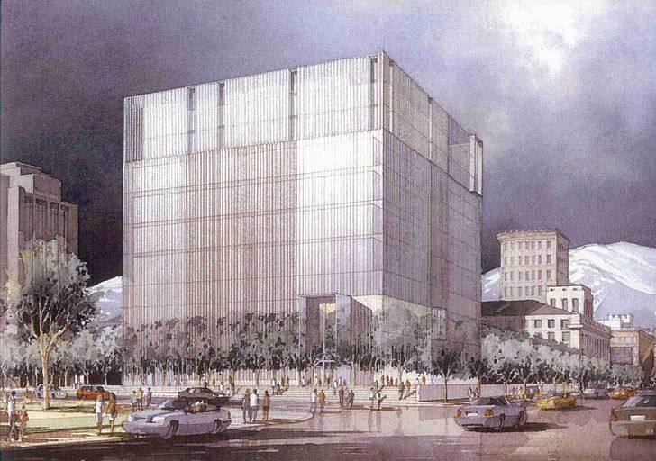
But of all the labels attached to the courthouse, the one that appears to have stuck is the “Borg cube,” referring to the fearsome adversary of Captain Picard and his crew on Star Trek: The Next Generation. It is revealing that this reference should prove so popular. The Borg, you may recall, travelled in a ship in the shape of a cube that contrasted dramatically with the sleek form of the Enterprise. They were supposedly not individuals but members of a “collective,” like bees or ants. They were visibly parts of a machine, disfigured by the addition of various technological prostheses—most prominently around one eye (a “window to the soul”). Their threat was that everyone they encountered would be “assimilated”, that is, become Borg and lose their individuality.
Labeling the courthouse the “Borg cube” expresses a distrust of reason as a guide to life.The Borg embody a type of dystopian future myth in which the individual is crushed by an oppressive society. In one sense, they recall George Orwell’s novel 1984 which evoked the insidious rise of totalitarianism and its subjection of the individual to the will of the state. This is precisely what many Utahns fear: that the federal government will “assimilate” them by such means as imposing universal health care and educational standards. The Borg myth resonates with another Utah preoccupation as well. The Borg are the product of reason run amok. The cubic shape of their space ship symbolizes this unbridled reason. Their “collective” demonstrates the danger of allowing reason to rule morality, taking the utilitarian maxim “the greatest good for the greatest number” to an extreme. In the Borg myth, it is not totalitarianism but reason that eradicates the individual. Labeling the courthouse the “Borg cube” expresses a distrust of reason as a guide to life. Given the predominance of Mormonism here, this answers a widely felt need to assert faith over reason.
This reaction was to be expected in Utah. The roots of Mormon distrust of the Federal government are deep. When they settled Utah in the mid-nineteenth century, the Mormons created a “theodemocratic” territorial government that was viewed as fundamentally at odds with the values of rest of the country. They found themselves in frequent conflict with the (non-Mormon) Federal appointees sent by Washington to administer the territory. The distrust was mutual. The first major architectural presence of the Federal government in Utah was Fort Douglas, established by the U.S. Army in 1862 to ensure that Utah would not secede from the Union. This fort was strategically located on a hill to place much of Salt Lake City within cannon range.The city thus became binuclear, with distinct religious and secular centers.
The first federal building in Salt Lake City was a courthouse built in 1905 and later named for Senator Frank E. Moss. Siting it created considerable controversy. Downtown Salt Lake City was small and dominated by the Mormon temple. As a symbol of the secular U.S. government, the Moss courthouse was viewed as an unwelcome presence that threatened to compete with the centrality and authority of the temple. A site south of the temple was eventually agreed upon in an area that was becoming the center of secular life in the city. The city thus became binuclear, with distinct religious and secular centers.
It was against this background that the new Federal courthouse was designed. That the result was a modern building is, on the surface, extraordinary. It is hard to imagine a form that would be more alienating to the local populace than an abstract, technological cube that refuses any iconography or reference to historical architecture. Its isolation from the surrounding city fabric only serves to reinforce its alien presence. How this came about is an interesting story that highlights the crucial role of architecture in mediating the relationship between the state and its citizens.
the purpose of this selection process is to “choose the architect, not the design”.Given its vast portfolio and the complexity of modern buildings, the General Services Administration (GSA) traditionally gave priority to technical competence in choosing its architects for federal projects. The result, according to Ed Feiner, a former Chief Architect of the GSA, was a large number of bland, uninspiring buildings. After becoming GSA’s Chief Architect in 1981, Feiner decided that federal buildings should showcase the country’s highest ideals through their design. In 1995, he initiated the Design Excellence program which was intended to do this by changing the way the GSA chooses its architects. Under Design Excellence, a list of about five architects is created for each project based on their individual design talent, according to Feiner. Each of these architects is paid a nominal fee to assemble a design team and come up with a design for the project at hand. The designs are judged by a group of respected architects and GSA employees familiar with the project. The winning design is chosen (again according to Feiner) for the overall approach each designer takes, and this architect is awarded a contract for the project.
Feiner emphasized that the purpose of this selection process is to “choose the architect, not the design”. Since the requirements of a building project often change over the course of the design process, a submitted design will probably not be built. He believes, however, that having the right architect ensures that a good building will result regardless of changes that might occur. As we will see, adaptability certainly proved to be essential for the architect of the Salt Lake City courthouse.This implies a belief that a “good” architect can be identified without reference to a particular locale or culture.
Putting the individual architect at the center of the selection process has important consequences. By winning the competition, the architect gains the GSA’s approval of his or her design judgment before the project begins. This puts the architect in a strong position to set the project’s direction and make subsequent decisions. What the process does not do is give the local population a voice in choosing the architect or providing input during the project’s design. The GSA decides who the architect will be and the local community can only accept its decision. This implies a belief that a “good” architect can be identified without reference to a particular locale or culture. It makes federal buildings a homogenizing influence throughout the country.
For the Salt Lake City federal courthouse, this process resulted in the selection of Thomas Phifer of New York City as the architect. Phifer worked for many years in Richard Meier’s office and his work reflect Meier’s Modernist sensibility. His winning design was no exception, so it was a given at the outset that the building would be in this style. But this alone does not account for the building we see today. The design evolved over a lengthy period from a relatively modest annex to the existing courthouse to the freestanding monument we see today.
Designing and constructing the Salt Lake City courthouse took almost twenty years. The design competition that resulted in Phifer’s selection took place in late 1996. He and his fellow competitors were asked to design an annex to the Moss courthouse, not a separate building. Working with the Salt Lake City firm of Naylor Wentworth Architects (now known as Naylor Wentworth Lund Architects), Phifer came up with the winning design which inserted itself sensitively into the context of the old courthouse and the surrounding streets. It featured an annex building similar in scale to the Moss courthouse, joined to it by a covered atrium. Its controversial aspect was that it required demolishing the historic Odd Fellows Hall.The second design went the way of the first and it was, as they say, back to the drawing board.
Soon after Phifer and his team were hired, a problem appeared with their winning design. The design called for keeping some of the federal district courtrooms in renovated parts of the Moss building. According to Ross Wentworth of Naylor Wentworth Lund, the layout of the old courthouse made it impossible to meet certain internal security requirements. The design team was asked to come up with a new design that housed all of the courtrooms within the new annex.
The second design featured a larger but still low-rise annex building, now separated from the Moss by an open plaza. A problem remained, however, with the proximity of the new building to the street and to nearby buildings. According to Alan Camp, the GSA’s project manager, large setbacks were mandated around all new federal courthouses. This was to prevent a bomb-carrying vehicle from approaching the building, as happened tragically in Oklahoma City. Camp says that these setbacks could be modified if the federal district judges agreed. For reasons that are not clear, it took a considerable amount of time to reach a decision to maintain the setbacks. In the meantime, according to Wentworth, the project was well into design development. The second design went the way of the first and it was, as they say, back to the drawing board.
After a few false starts, the judges and the GSA decided that the security requirements could only be met if the courthouse had the block to itself. It took several years of negotiations as well as congressional intervention before the entire block was finally acquired. The Odd Fellows Hall had to be moved to a new location across the street, in itself no small feat. Phifer's team started again with a clean slate in 2005—nine years after winning the commission.
The team then proposed three designs, one of which was the cubic design that became the building. Why the cube? Several people I spoke with mentioned the supposed efficiency of the form—a cube encloses a given volume of space with a minimum of wall area, assuming flat walls. They claimed that this saved money in construction and reduces the cost of heating and cooling compared with the other designs. This rationalization simply does not hold water. The walls as-built were made more expensive by a custom-fabricated system of shading louvers. A larger wall area could have been built for the same amount of money with less expensive construction. Relatively efficient heating and cooling was the inherent nature of the design—a glass cube—was an obstacle to be overcome, not an argument in its favor.achieved through a variety of means, but the inherent nature of the design—a glass cube—was an obstacle to be overcome, not an argument in its favor. The efficiency argument only works if the decision had already been made to build a glass building. Only then would the expensive shading and advanced HVAC argue for a minimal envelope. As it happens, glass buildings are Phifer’s specialty.
According to several people involved in the project at the time, the cube was Phifer’s preferred design from the moment he had the whole block to work with. His idea—a pure form on a plinth—is clearly expressed in the main image of the project on his firm’s website. But while this may explain the architect's proposal, it does not account for its acceptance by his clients. Although the GSA hired Phifer and funded the project, their mandate, according the Al Camp, is to serve the judges. These men and women were the true clients for the courthouse. Crucially for the outcome, the chief judge at the time and co-chair of the committee working with the architect was Judge Tena Campbell.
With Judge Samuel Alba, Judge Campbell represented her colleagues in guiding the design. She says that while the two of them consulted periodically with the other judges, they made most of the day-to-day decisions themselves. By the account of several people involved in the project, her judgment and personal relationship with Phifer were in large part responsible for the latter’s ability to realize his vision. She clearly respected Phifer as talented and creative: in an interview she referred to him as a "Picasso architect". Having seen his previous work, she knew in advance that he would design a Modernist building and thought “it made sense to let him do what he does best”. With Phifer and other members of the design team, she and Judge Alba toured many courthouses around the country. They were especially struck by the effects of daylight in some of the buildings they saw and decided that theirs would provide as much daylight as possible. She says that Phifer was very receptive to this request as well as others the judges made: wood floors, a spiral stair, using different types of wood on different levels, water pools and other features. She is very pleased with the completed building. The daylight, she says, affects her mood positively and makes the building an “easy place to work”. Jurors in particular are much more comfortable in the new building, she says. This is due in large part to amenities such as video screens in the jury box and well-appointed jury rooms, but speaks well of the design team’s—and the judges’—attention to detail.
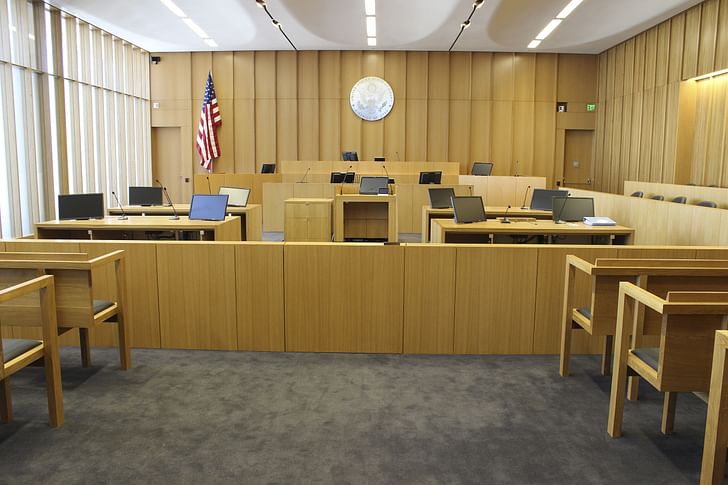
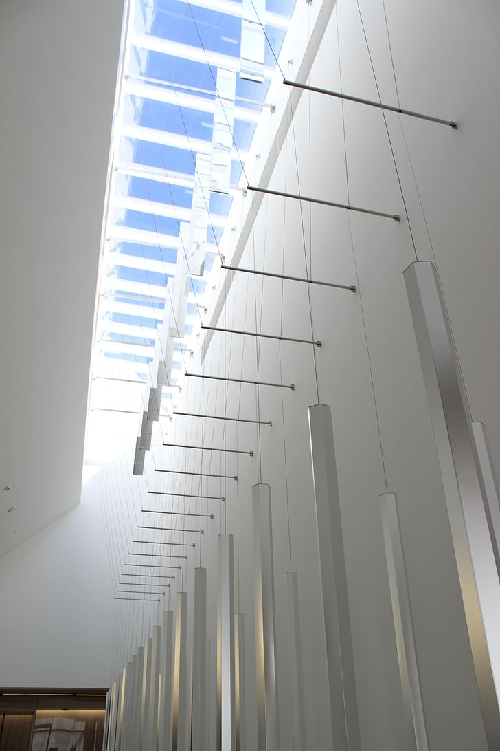
The interior is indeed suffused with daylight, including the courtrooms. While the building appears solid from the exterior, the interior gives expansive views in every direction. Light is brought into the center of the building by an atrium and glass floors. An installation of suspended hexagonal mirrors (by artist James Carpenter) that hangs in the atrium varies the light and reflects it outwards. Phifer sees light not only as beneficial for the work of the courts, but as a symbol for the ideals of the justice system. "Light is enlightenment," he said in an interview, "A metaphor for showing the way, for justice." He says that light is the theme of the exterior as well, citing the way the walls "hold the light" and change with direction and the times of day and year.Making a glass building in Salt Lake City that doesn't alternately roast and freeze its occupants is no mean trick.
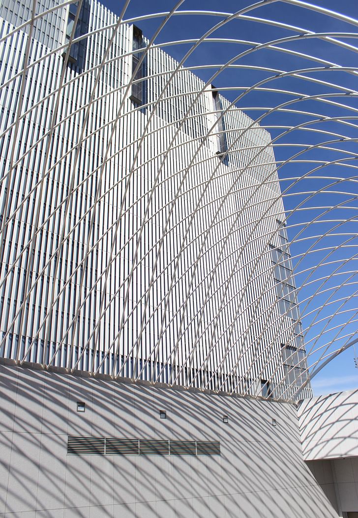
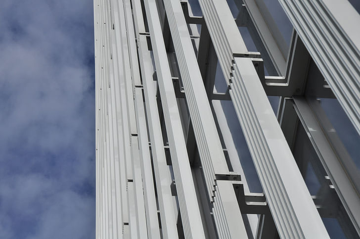
Making a glass building in Salt Lake City that doesn't alternately roast and freeze its occupants is no mean trick. In the hands of Mr. Phifer, however, this seeming liability became an opportunity to add richness to the simple form. The surfaces of the cube are subtly varied by metal louvers and glass fritting. The vertical louvers are angled differently on the four sides to deflect the sun. They are assembled in panels of varying width, covering more or less glass depending on the direction they face and the sensitivity of each interior space to sunlight. From a distance, they form a screen that lends the building its metallic appearance. Come closer and they become lacy columns. Standing next to them, they are opaque or transparent depending on the angle from which they're viewed. The glass is treated with fritting that is spaced closely on walls receiving the most sun and more widely on others. The variations in the louvers and fritting create areas on the façades that appear darker or lighter from a distance. Look carefully and you can see from outside the locations of the lobby, the hallways, the courtrooms, the offices. Perhaps the best effect is from across the street, where the louvers appear to wrap a box of sky reflected in the glass.
The building’s response to its urban setting is another matter. Judge Campbell was candid about the importance of security concerns in the design. She recalled with obvious discomfort how, in the Moss courthouse, she and other judges could find themselves riding in the same elevator with someone they had just sentenced to prison. It took some time, she says, for her to understand that the security setbacks could not be created if other buildings remained on the block. Nevertheless, she believes that the courthouse is neighborhood-friendly thanks to planters, trees and steps that are a traditional feature of courthouses.For a pedestrian, the building is largely hidden and the effect is of a nicely planted street.
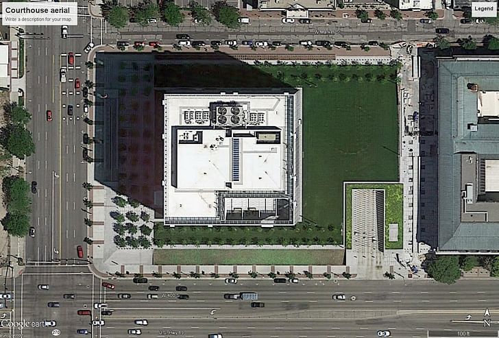
Given the necessity of large setbacks on every side, the treatment of the large open spaces thus created becomes critical, both in terms of their own qualities and their effects on the surrounding streets. Because the elevation changes significantly across the site (the north side is about 15 feet higher than the south side) the project’s effect on the streets varies greatly. The best street space is on the north side, where the sidewalk’s elevation is closest to that of the building’s ground floor. Here, concrete planters and steps provide the required vehicle barriers, reinforced by a line of trees. For a pedestrian, the building is largely hidden and the effect is of a nicely planted street. On the west side where the building entrance is located, a paved plaza occupies the entire width of the block with stairs at both corners. It is embellished by trees and pools. On the south, the sidewalk is some fifteen feet below the plaza (hence the intimidating stair). According to several project participants, Phifer wanted a shear retaining wall at the back of this sidewalk. This would have created a pure plinth for the building. Fortunately, he was persuaded to lower the wall and create a berm to soften the effect on the street.
The spaces around the building on the site are required by law to be public, but the design seems to intentionally avoid inviting people to use them. The entrances to these spaces consist of a sudden transition from paving to lawn. Where walkways are provided, they circumambulate the space rather than entering it. The largest space, a lawn to the east, is not provided with paths, seating or shade to encourage use. This is a park in name only and serves to accentuate the isolation of the building. The building’s isolation and failure to create true public space are particularly harmful in downtown Salt Lake City which has too little open space and lacks the critical mass of urban fabric needed to sustain such a major disruption.This is what good public architecture should do.
Overall, the project bears eloquent testimony to a belief in the ability of instrumental rationality to solve social problems and reconcile society’s internal contradictions. The cubic form, un-compromised by its surroundings, is the ultimate symbol of rationality. The contradictions inherent in an entirely glass building in this climate, are resolved by a combination of sophisticated construction and advanced mechanical systems. As a piece of construction, it is beautifully detailed and executed—a virtuosic performance of modern building technology. It functions beautifully as well, amply fulfilling the judges’ request for daylight and thoughtfully accommodating the judicial process, while meeting complex internal security requirements. The courthouse anticipates a society that harnesses technology to accomplish ethical as well as practical ends. It affirms that the United States still promises Utopia—not Jefferson’s agrarian Arcadia, but one based on rationality and technology. Phifer’s invocation of “enlightenment…leading the way” is an indication of this belief.
This vision will not appeal to everyone. Some will recoil at the iconic representation of government power. Others will find hypocrisy in a universal, rational form representing an unequal, discriminatory society. Still others will object to the rationalism, or the faith in technology that the building evinces. These raise important questions we need to ask ourselves about the kind of society we want, the problems that need to be addressed, the means of achieving our goals. This is what good public architecture should do.
Like all buildings, the Salt Lake City federal courthouse is a product of its time. The decisive role of security in its design makes the courthouse a visible sign of our anxious times. It could not avoid embodying the security state we increasingly inhabit. The isolation of the building from the city is the result of the bombings of the Beirut marine barracks, the Nairobi embassy, the Murrah building and World Trade Center. It is a reminder of—almost an inadvertent memorial to—these tragedies. The result of the setbacks, barriers and vacant open spaces—all rational responses to these events—is a distancing of the government from the people, a weakening of the ties that hold society together.For all the care that went into its design, this building welcomes no one.
By articulating who is welcome and who is excluded, public space makes social hierarchies visible. For all the care that went into its design, this building welcomes no one. The hierarchy it articulates places the government on one side and the people on the other. This was not lost on those who see it as the Borg ship. This building represents the government as an alien entity among us, reinforcing the “us vs. the government” attitude that prevails among certain segments of the population, particularly here in Utah. In this context, the delicate detailing is overwhelmed by the image of a fortress standing mute and foreboding in the middle of the city.
This piece is part of Archinect's June editorial theme of Privacy. More on the networks and institutions that delineate private and public life can be found here.
Having a delayed mid-life crisis- I closed my 20-year-old firm and started over. Had to break the routine. I took time off last year to write a book about the effects BIM and computational design are having on what an architectural idea is. It's called The Death of Drawing: Architecture in the Age ...
8 Comments
Should have added a warped facade
Wonder how people are going to feel about this Police Station....
This is an excellent piece of architectural criticism.
I like the building very much, but it's a good piece of criticism that allows one to consider both good and bad aspects of the design and how they represent society.
It seems everyone wants daylight, and I think there are plenty of studies that show access to daylight improves performance. Modulating the daylight with physical screens and technology seems, to me, like a successful approach, particularly in a building with a significant maintenance and operations budget to make sure those features keep working.
It is disappointing that the "public" space of the lawn isn't really functioning as a public space, though.
Agree this is a great piece. Can't say I ever see any arch criticism that compares both public reaction/ context with a critical reading. Usually critics cater to easy public sentiment (NYtimes) or alternatively offer a very academic reading.
Have to agree more with the critical reading... government buildings have always been monumental.... It gives the law a sense do perminance and importance that would otherwise be diminished if it were in a strip mall. We need that respect for the law, or else our society will fall apart.
The problem with this piece is that Salt Lake City proper is primarily non-Mormon, with only about 20% of the city being Mormon nowadays, and the moniker the 'Borg Cube,' was largely started by the non-Mormon population who are primarily liberal, and agnostic/atheist.
Also, the local non-Mormon population calls the LDS church (Mormon) HQ building the 'Morg,' which is short for the Mormon Borg, because the Mormons act collectively like the Borg. They seem to think with one mind. They are a hive. The LDS church's main symbol is a beehive. The Mormon culture is an oppressive society that tries to force everyone to act the same, even if you're non-Mormon.
>>>so poor and insignificant
Perfect representation for the totalitarian Police/Surveillance State. As for the design itself, it redefines the word hideous. Of course..that is exactly what it represents. A box with bars for those of the 99% who fail to adhere to it's two tiered "rule of law." However, for those of the 1%, like Hillary Clinton, the rule of law is only a myth. The only question left is how architects look in the mirror after selling out to the real criminals.
Block this user
Are you sure you want to block this user and hide all related comments throughout the site?
Archinect
This is your first comment on Archinect. Your comment will be visible once approved.