
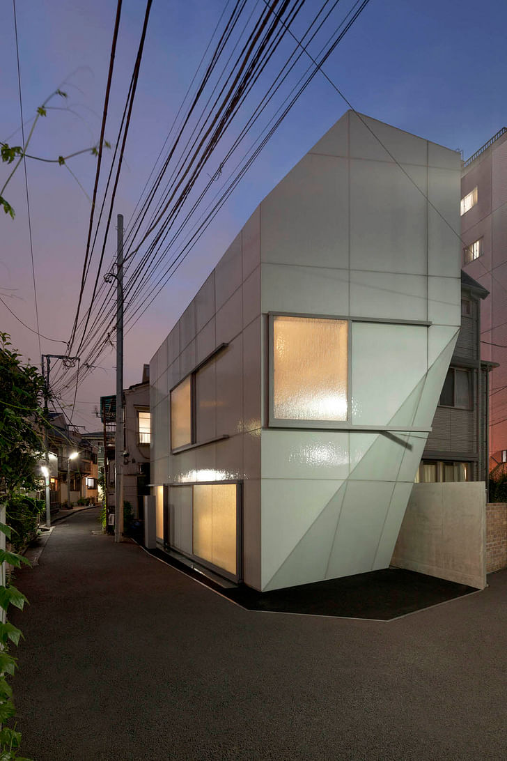
Wedged between the narrow alleys and razor-sharp property lines of Tokyo's Nishi-Azabu neighborhood, A' House fits in its dense context like a shiny puzzle piece. Bold yet familiar, expansive yet compact, transparent yet opaque, open to dialogue yet impenetrable like an oyster shell.
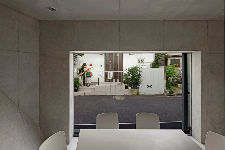
Designed by Wiel Arets Architects, the building's innovative system of immense sliding windows responds to varying desires for privacy, air flow, light intake and participation in the neighborhood's social life.
Turns out, where Dutch and Japanese practicality intersect, one might discover concrete poetry.
From the architects:
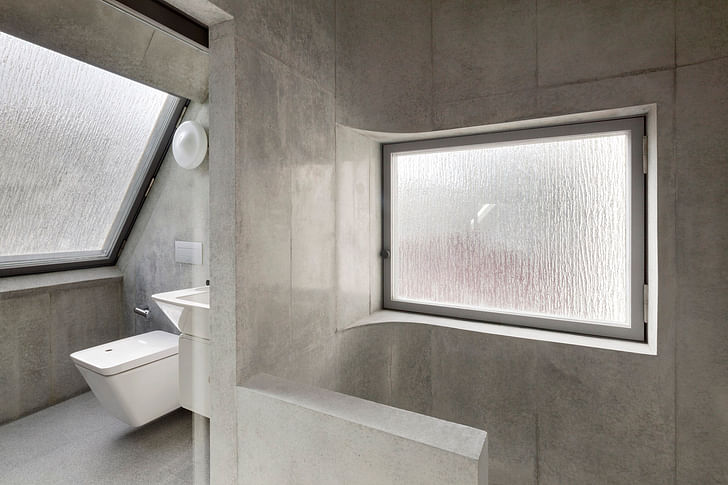
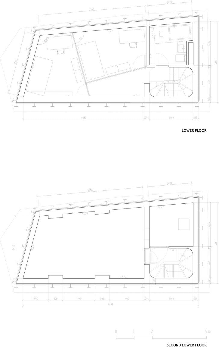
This compact private residence is nestled within the dense expanse of Tokyo, in Nishi-Azabu—a neighborhood characterized by narrow streets and traditional low-rise houses—which borders a park heavily visited during the spring, when the city’s cherry trees begin to bloom. Its 136-square-meter area consists of five horizontally divided spaces, each connected by a minuscule sculptural spiraling staircase that, given the footprint of the house, allows for loft-like spaces within its intimate confines. Oversized windows punctuate the house, each with two layers of glazing; one is transparent and one is of the same relief glass that wraps the façade. These oversized windows, with their dual layers of glazing, can be countlessly reconfigured, to regulate the interior flow of daylight.
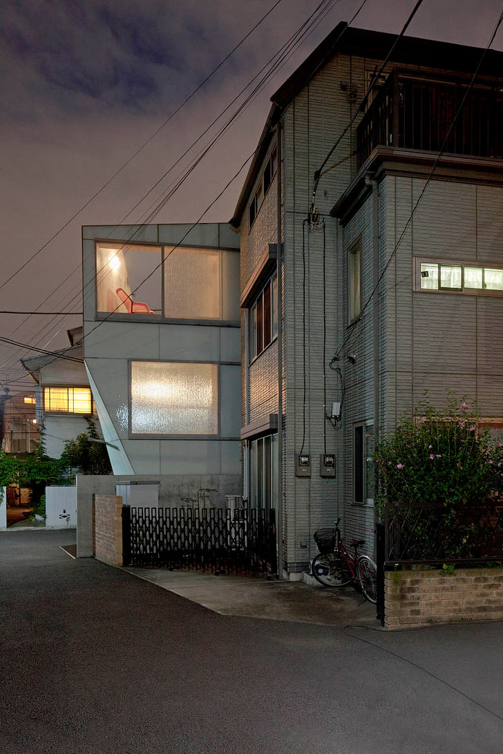
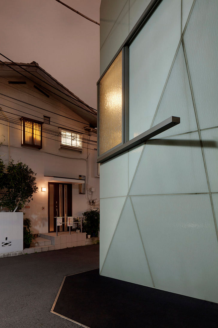
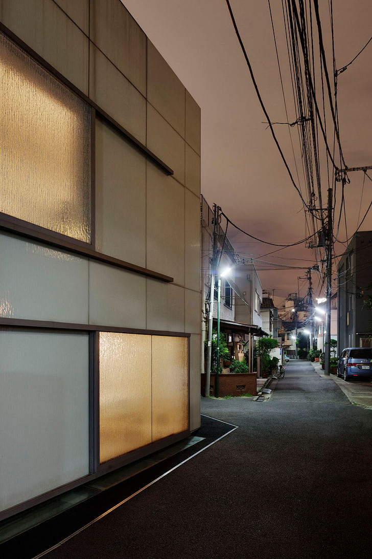
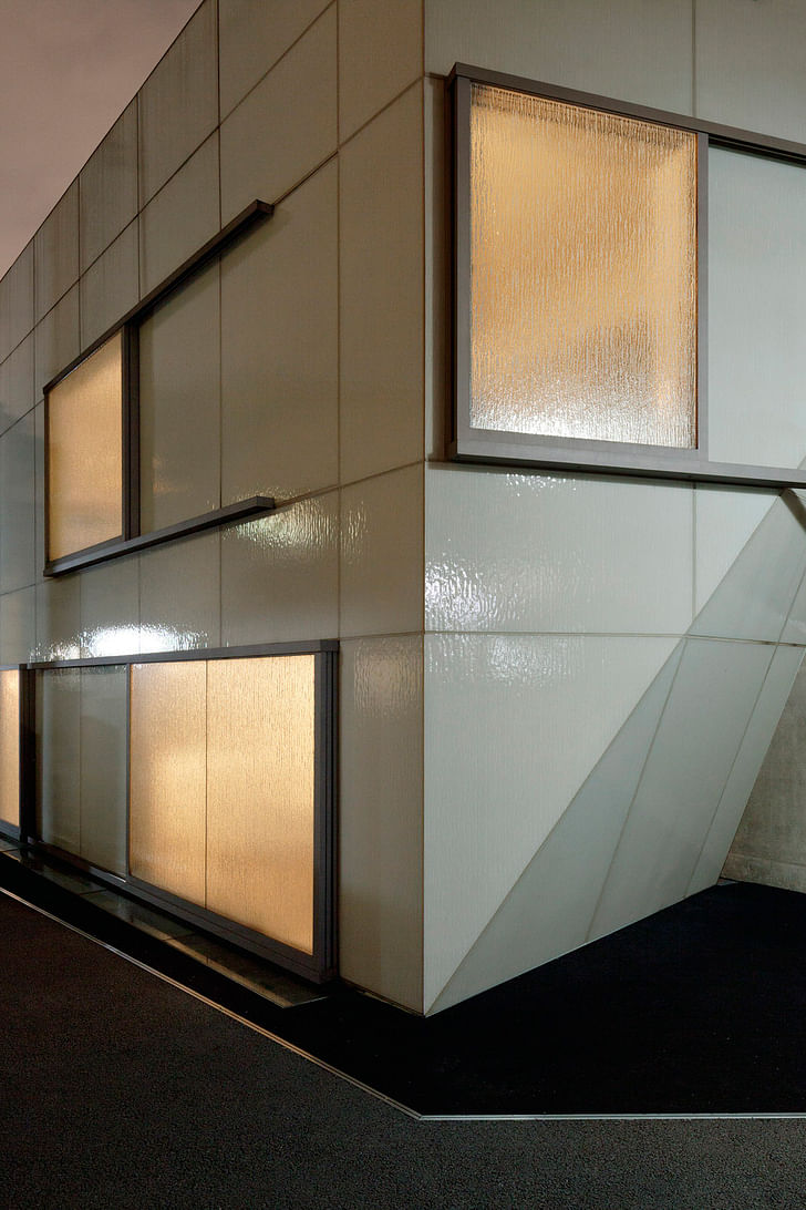
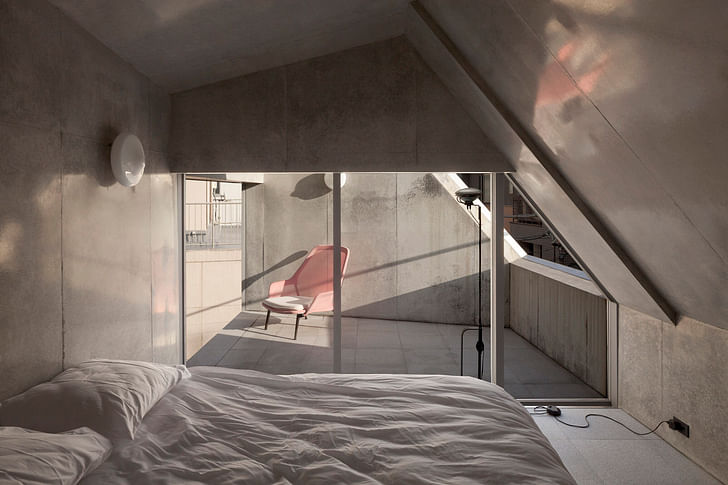
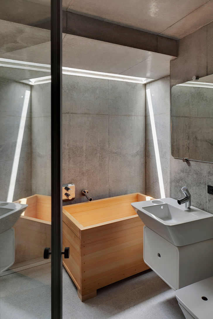
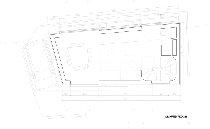
The house’s windows [...] also extend to the floor, to ensure that the house remains responsive to passing street life.Both the transparent and relief glass of the house’s windows slides on tracks, which extend to double the width of each, for unobstructed views. They also extend to the floor, to ensure that the house remains responsive to passing street life. When closed, they cloak the house within an iridescent texture. On the ground floor, one of these windows serves as the main entry, and slides open to reveal the kitchen. Each level has a different program: the lowermost consists of storage and technical spaces; the lower two bedrooms, permeated by daylight via sliver windows that span the full length of the house, at street level; the kitchen and dining room occupy the ground floor; the living room the first; and the uppermost a master suite, with a wooden ofuro.
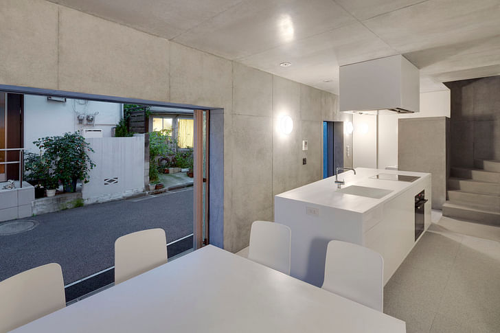
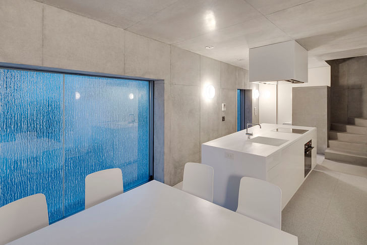
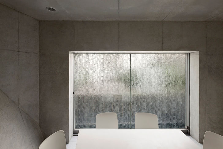
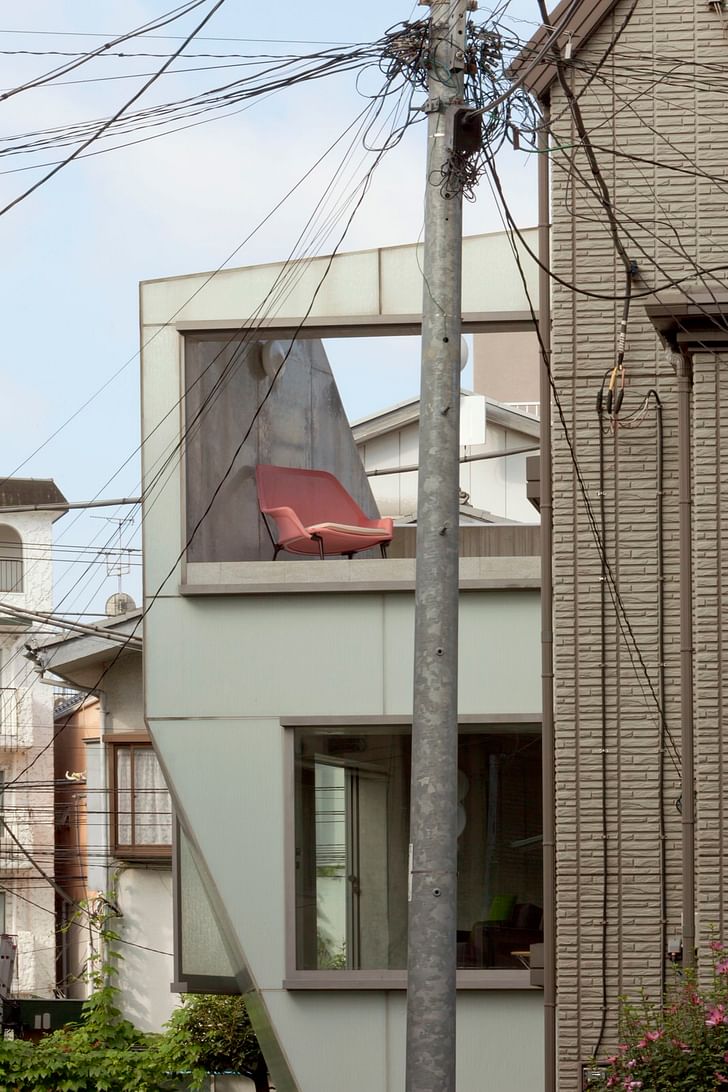
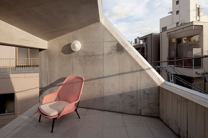
A small terrace is attached to the master bedroom, yet it is expansive, relative to the house’s size. Its northeastern wall is composed of the same textured glazing that shields the house’s windows, except that there is no layer of transparent glass behind it, as the terrace is completely open to the exterior elements. When retracted, a balustradeless view toward the park suddenly appears. When closed, the view is obstructed, which introverts the terrace and imparts privacy within this publicly exposed level of the house. Conversely, the southwestern wall of the terrace is also the pinnacle of the house’s textured façade, into which a cut was created to introduce ample interior daylight to the master suite. The cut left a void in that wall of the terrace, which in turn created an enveloping exterior space, roofed only by the sky.
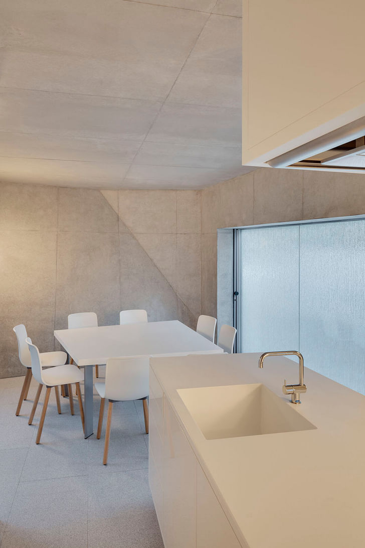
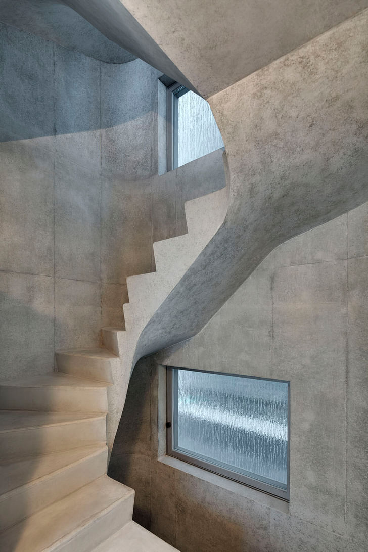
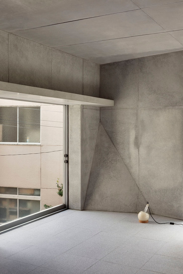
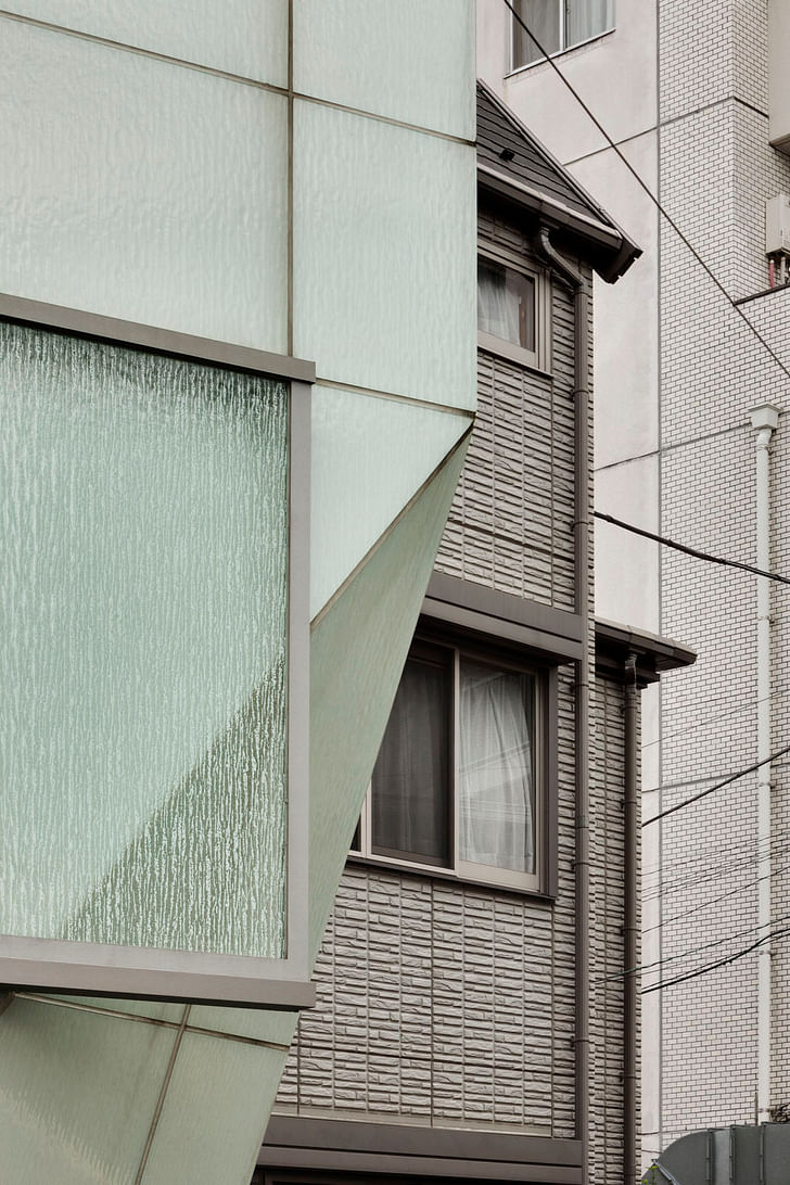
Subtly bold when seen from afar, the house blends into its context.Due to the house’s slender site, a fold was created along its southern façade, angled so that it retreats from the street-site boundary at ground level; it provides just enough space for a Smart car. Subtly bold when seen from afar, the house blends into its context. And when all of its windows are opened, or when a combination of several are open and closed, the house morphs to expose its kaleidoscopic qualities to the neighborhood and its residents. Structurally, it is composed of concrete, and is earthquake proof in accordance with stringent local regulations. Centrally sited within Tokyo, with the possibility to turn toward the city, or retreat into itself, all in multiple configurations; A’ House is an idiosyncratic private residence engaged in a continual dialogue with its traditional context, which simultaneously anticipates the future.
Project credits:
Location: Tokyo, Japan
Program: Residential
Size: 136 m2
Date of design: 2007-2009
Date of completion: Fall 2014
Project team: Wiel Arets, Satoru Umehara, Alex Kunnen
Collaborators: Jörg Lüthke, Jean-Jacques Jungers, Sadamu Shirafuji, Ilze Paklone
Client: Arets-Sijstermans
Consultants: Tai Mikio Architect & Associates, LOW FAT Structure INC, EOS plus Co. LTD, Comodo Co. LTD, Oskomera Group BV, Saint Gobain Glass, Eiger Co. LTD
Drawings:
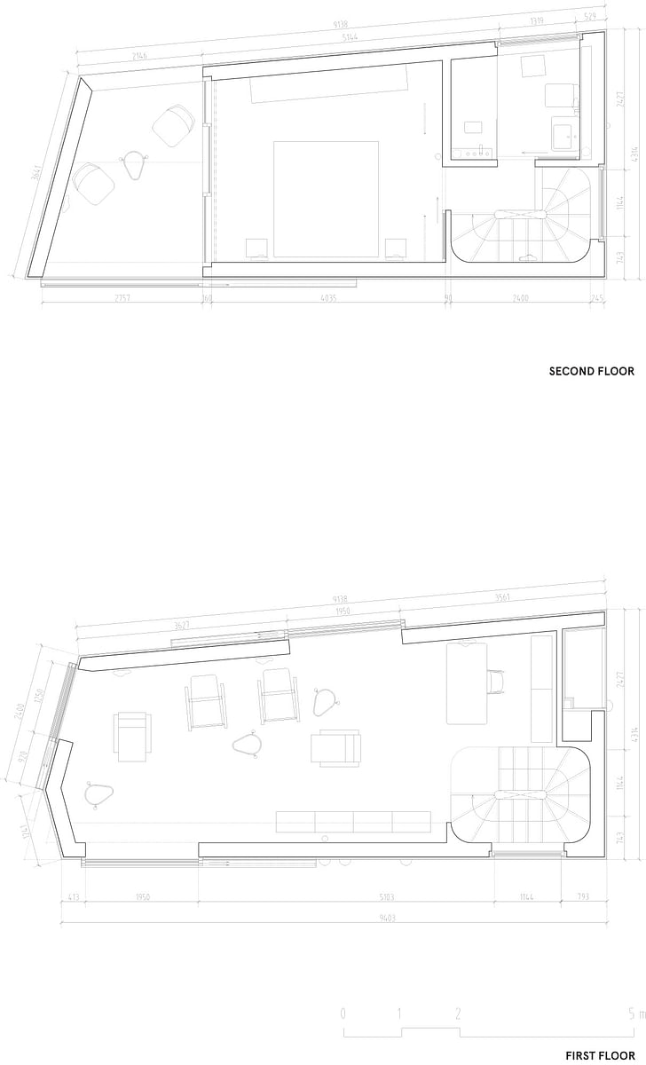
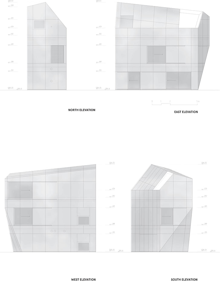
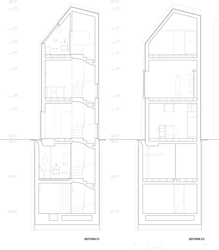
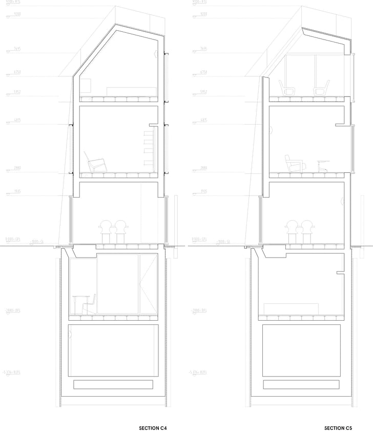
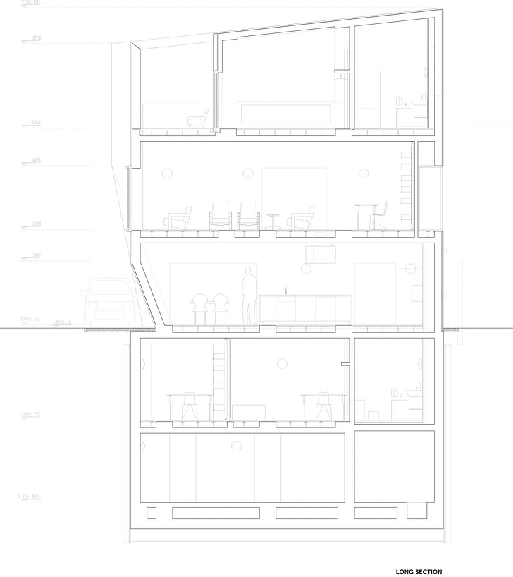
ShowCase is an on-going feature series on Archinect, presenting exciting new work from designers representing all creative fields and all geographies.
We are always accepting nominations for upcoming ShowCase features - if you would like to suggest a project, please send us a message.
Alexander Walter grew up in East Germany with plenty of Bratwurst. He studied Architecture and Media Design at Bauhaus-Universität Weimar, Germany, and participated in foreign exchange programs with Washington-Alexandria Architecture Consortium in Alexandria, Virginia and Waseda University in ...
13 Comments
cool project, assuming those panels on the exterior are some form of rigid insulation to allow exposed concrete inside? Only thing that bugs me about these Japanese projects is the way they are photographed, or maybe it is the way people live, in a hermetic empty tiny project. super sterile. faceted sterile gelatin pill.
its glass exterior with insulation on the outside. european project by european architect in japan. standards are high with the glass+insulation panels, not remotely normal in japan. not even available in Japan actually (was imported for the project)
cant speak to the photography, but again its a european project, photographed by a european photographer as well. best not to generalize. Its a Dutch design. By the Dean of IIT. The only thing Japanese about it is the location and the laws. Hm, maybe Japanese archtiecture is really an outcome of regulations, not culture? Interesting that it is not obvious to some just by looking that this is not done by a Japanese architect.
for what its worth the house is beautiful in person and neither feels hermetic nor sterile. Those doors/windows open the house to the city in a fantastic way that really makes you experience the place as part of the city, and tokyo is in fact a city worth being part of. Great design.
Looks cozy.
This:
it is cozy. just like living on the street, but without the downside. You should like this EKE, you believe in street life right? Isnt that one of your things?
You can see the vernacular all around it. None of that is anywhere close to being as interesting or as engaged in the context as this home. Its one of the reasons it works so well.
will, no need to get bent out of shape..
I read the article, saw that it was a dutch architect. When I say Japanese projects, I am referring to what, I assume, are the zoning codes and small lots that make many of those projects look the same in terms of small footprint, multilevel, residential projects.
I still stand by my original comment that the way many of these projects are photographed makes them look sterile and un-lived in, regardless of who it was photographed by.
I think you are right, the project forms are not culturally driven, because there is no culture, especially in contemporary design. It is a lineage of international style, but more so, the internet allows architects to look at the same stuff. Unless somebody specifically designs a project with cultural history as a conceptual driver, everything is tabla rasa, short of the most recent issue of el croquis you looked at.
To reinforce the point, you are a westerner teaching in a Japanese institution and many Japanese architects go to schools in the US or Europe.
I think the planning is clever. I have no objection to how it relates to the neighborhood. It's the aesthetics that don't work for me. I could never live it such a spare, cold interior. It's like a prison cell inside. Not my thing.
I agree about the trends in photography for avant-garde architecture...there are almost no sign of human habitation. It's intentional, since the normal artifacts which humans use would almost certainly be distracting to the appreciation of the abstract sculpture.
not bent. its the medium bending my message ;-)
Im not sure if its really the laws that create this kind of house. For me the monolithic character is something particular to Wiel Arets. What I find most interesting about the work is that unlike most Japanese architects working at the same level he maintains the form as a sculpture. Japanese tend to not do that as they (we) are interested in removing the building from existence in a way. Form is always left behind in favour of dematerialization. The cost of building is tokyo is so high that purposefully removing yourself from the city with actual hermetic construction becomes self-destructive and oppressive.
When architects try to go the other way and build pure form it seldom works. But Wiel is able to pull it off because of the double skin and large windows. It is an impressive thing if you have ever tried to do it yourself. I am seeing the project from that perspective.
The photography I agree. It is why Iwaan Baan is so popular. Feels more real, even if it is just as idealized/romantic. But I think maybe Arets is indeed interested in showing the form and expects us to see past the imagery to imagine how it would be inhabited.
Anyway, to me it remains not so much a japanese house. its clearly a project from aret's office, following a set of themes he is interested in. Context modifies that goal, but i don't see it as homegrown from Tokyo like the projects above. Those are the new contemporary starting point perhaps, depending on what you feel about urbanity. Not sure about the idea that modernism means there is no context. That is not what modernism was ever saying. And Japan has never been about physical form historically speaking in any case. Architecture here is more about daily life and routine. Modernism is just a layer on top of that, not something that has usurped a more humane past, etc... In that way, Aret's seems to have grasped something useful by bringing the street into the house. Its perceptive and I admire that he has done it without needing to mimic a Japanese architect to get there, modernist or not.
Will - does the phenomenon of NIMBYism happen in Tokyo? It's hard to imagine neighbors in even the most progressive American cities (actually, especially in the most progressive US cities...) accepting something like this without a rough fight. It makes it tough to do work that plays off an urban context because anything so clearly different ends up being too much trouble.
it happens sometimes. The argument about the stadium by Zaha is the only big instance that I am aware of though.
Laws do not require approval from neighbours for construction, more or less. Compared to Europe or USA its really close to carte blanche.
When it comes to houses though, the rules are basically performance-based, limited to areas, slant lines, ratios, and so on. There is no aesthetic review, and nothing like the red-lining sort of thing in USA that is designed to keep poor and wealthy apart. Property value is based on distance from station more than on who your neighbors are, so the incentives to control the neighbourhood through nimby-ism is not pronounced. It is a remarkable thing.
Beautiful project.
Amazing how intimate the context is. Like a make believe village. The scale and geometry mitigate the sterility quite nicely. Suppose you might want something spartan with this amount of space where the 'village' outside provides the visual stimulus some crave.
good job! :).
Block this user
Are you sure you want to block this user and hide all related comments throughout the site?
Archinect
This is your first comment on Archinect. Your comment will be visible once approved.