May '13 - Feb '16
If you have read my other posts on the metro system in Mexico City, I have decried the stations and trains as packed, claustrophioc, inhumane, vascular spaces like a human meat packing plant. Many of the stations are so old the stone floors have noticably worn down.
And then, one day, crossing the city by metro, I stumbled across line 12.

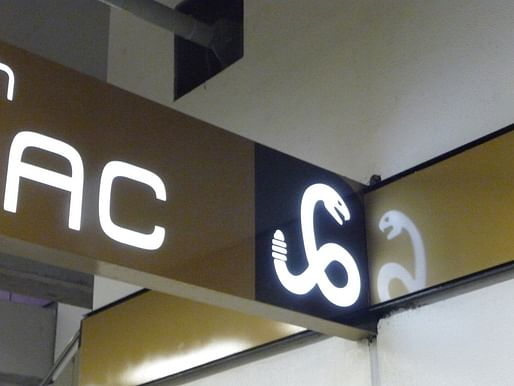
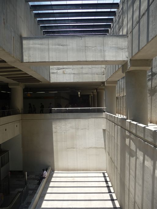
Instead of the traffic-cone-orange and gray textured concrete walls and claustrophic and dingy platforms, I was suddenly in vast spaces filled with daylight, pure clean modernist forms with cleanly fabricated exposed concrete, white metal walls, sleek illuminated signage, and a kind of spatial clarity absent from the maze of intersecting tunnels in other stations.


The train that arrived looked and felt like it had just left Switzerland. Sleek, clean, modern, and well-lit. I felt completely thrown for a loop. While no one had ever denied the existance of line 12, I felt like a massive work of modernist design had been concealed. It's by no means secret, but nobody seems to really care.
These new stations with thier massive lightwells consitute a kind of public architecture which is overlooked, perhaps because it is underground, but continues the tradition of government investment in modernist public works. If anything can get the white collar classes of Mexico City back underground (and off the congested roads), this kind of architecture, progressive, clean, inviting, is a fantastic first step.

Urban and architectural explorations from Mexico City to Stuttgart Germany through the eyes of a iterant architectural designer
No Comments
Block this user
Are you sure you want to block this user and hide all related comments throughout the site?
Archinect
This is your first comment on Archinect. Your comment will be visible once approved.