May '13 - Feb '16
After writing about one day of modernism in Mexico City, I decided to take this weekend to catch up on the places I'd recommended sight unseen (at least, in person). Here are three projects, one unexpected, which all made reference to time- temporary cities on ancient, new buildings enveloping old, and an attempt to capture the future.
The centro historico was busier than usual, more people, more activity than a typical weekend. The striking teachers union was encamped, filling the Zocalo, and occupying several major streets, many of them from Oaxca. They turned the sidewalks and streets into obstacle courses with a web of cables and string holding up tarps and political banners. The massive void at the center of the city, the Zocalo, is full of a tent city holding hundreds. The temporary architecture of occupation, surrounded by centuries old palaces which have seen a blinding succession of occupations come and go.


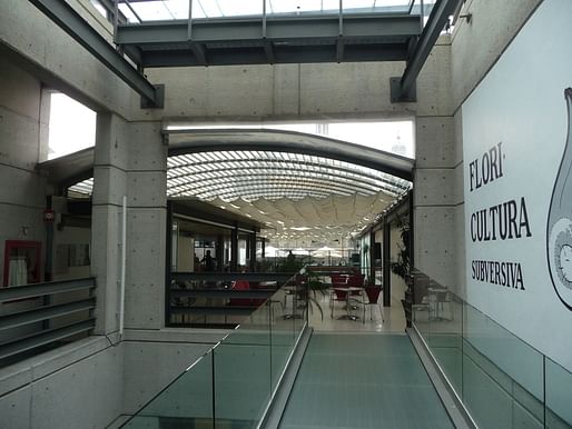
The Centro Cultural de Espana is an interesting building with an interesting history. Located behind the apse of the ancient national cathedral which faces the Zocalo, the center was once a small courtyard building built in the 1930s. The old building fell into decrepitude and ruin, especially damaged in the 1985 earthquake. In 1997 the building was ceded to the Spanish government who restored the building as a cultural center and embassy. The neighboring lot was purchased and a new building was erected around and on top of the old by Mexican architect Javier Sanchez, and opened to the public in 2012. (building history via Wikipedia). The old building remains embedded within the new building.

During the course of excavating the basement, the builders uncovered the ruins of some Aztec structures including much building sculpture and several walls and platforms. This is hardly surprising, given the building's location less than a hundred meters from the most sacred pyramid in the middle of the holiest plaza of the Aztec Empire.
The new facade, which is earth red stained concrete, with a hexagonal rusted steel lattice screen, doesn't really stand in shocking contrast to the 1930's buildings around it. This is both from the way the architect used voids to mimic the windows and pilasters of the neighboring building, but also because the buildings in the historic center do not generally adhere to a particular historic "look." The center of Mexico City is a fractal palimpsest.


When you enter, there's an information desk and the main entrance to a large auditorium, and the rest of the center is accessed via a daylit passageway beside the auditorium. Downstairs, there is a small museum of archeology around the the exposed excavation of the Aztec structures.
The center is really a bit labyrinthine with mezzanines, the large auditorium, a media center, galleries, classrooms, and multipurpose rooms. In the old villa, they put in a design boutique shop/ bookstore, and a few small galleries on the ground floor. Above the old building, they installed an airy bar/tapas restaurant with an open air terrace (Spanish cultural center, remember?). Climb further up and you'll get to a few exterior patios which have views of the back of the cathedral and the surrounding roofscape of the historic center.


Sunday, I decided to go see a movie.
The XXI Century Cineteca Nacional (21st Century National Cinemas) is also a very new building, opened within the last year by Mexican architect Michael Rojkind. The complex includes theaters, concessions (of course!) but also new facilities for the national film archives.

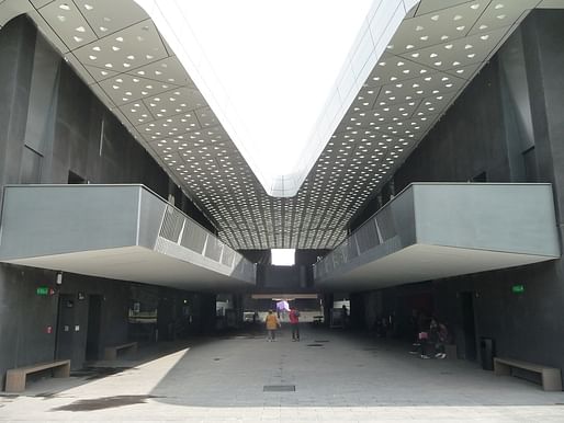
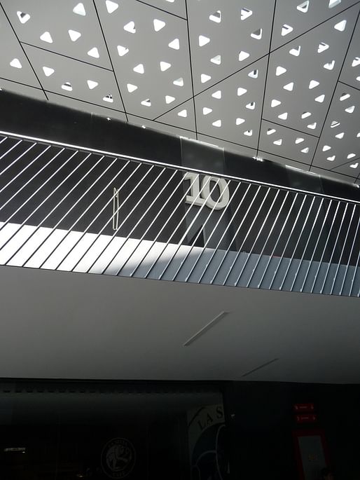
The complex is laid out on a cross of intersecting axes, with theaters along one axis and offices along another, with a parking garage at the far end of the latter axis. The building does try to capture the idea of what buildings should look like in the 21st century. There are CNC milled perforated metal panels, a fair amount of "swoopiness", and a heady dose of futurism and movement especially in the areas with the theaters which are covered by a massive perforated canopy. The perforated canopy allows light to filter down like a tree canopy, and actually makes the grand public spaces very pleasant, with plenty of seating as well.


It's a different, freer moviegoing experience. With the mild climate, everything is outside or open air. You buy your tickets from a window or a machine under the canopy, and walk to your theater, which is directly accessible from the open concourse which anyone can enter. An employee checks your ticket at the door to the theater and in you go with whatever you brought to drink or eat.
I always found movie theaters in the US to be mildly claustrophobic and media-oversaturated experiences, even nice theaters feel like casinos with an overpowering scent of old popcorn replacing cigarette smoke. Here, no posters, no cardboard cutouts, no blasting previews or StreetFighter consoles. The monochromatic architecture embodied enough futurism so that for me, the fun and anticipation before the movie was communicated through the architecture.


The complex which still feels like its filling out, also includes an upscale concessions take-away cafe, with a wide array of drinks for Mexico City, including Japanese Ramune, sake, iced green tea, and beer, and a respectable array of Mexican craft beers, along with the usual selection of sodas and domestics. Actually, I can't wait to come back at night and see if the second floor terrace with the bar fills up and to see the canopy lit.


Urban and architectural explorations from Mexico City to Stuttgart Germany through the eyes of a iterant architectural designer
No Comments
Block this user
Are you sure you want to block this user and hide all related comments throughout the site?
Archinect
This is your first comment on Archinect. Your comment will be visible once approved.