May '13 - Feb '16
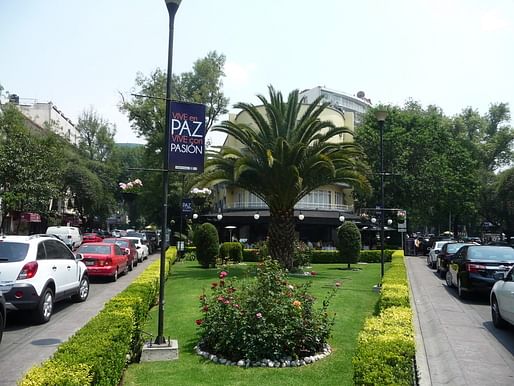
For a bit of context, Polanco is a very ritzy neighborhood in western Mexico City, filled with offices, luxury housing, and some of the most expensive boutiques, clubs, and restaurants in the city. The main thoroughfare of the neighborhood is the city's Rodeo Drive with its line of Hugo Boss stores, Gucci, Louis Vuitton, Porche dealerships, Tiffany's, etc. etc.


In the northern end of Polanco, there has been a new business and musuem district in the works over the past few years.
The most notable works of new architecture are the Cervantes Theater (nearing completion) by Ensamble Studio, the new building to house the Jumex art collection (nearing completion) by David Chipperfield Architects, and the completed Museo Soumaya.


The Museo Soumaya a very interesting museum especially in the context of who designed it, who funded it, and whose art is inside of it.
You may have heard of Carlos Slim, who owns an effective monopoly over the wireless networks in Mexico. I’m paying him, and if you have a Mexican cell phone, odds are you’re paying him, too. I can only guess as to his motivation, but many people of wealth want to use their money to buy something a little more lasting- in this case, Slim wanted a museum, free to the public, to showcase his art collection. Give something back to the community, bid for immortality, ego trip, take your pick.
To design the museum, which he naturally wanted to be as expressive and iconic as possible since its basically a memorial to himself, he needed a starchitect. But not just any Hadid will do.
Buried in the portfolio of almost every starchitect and rising star is a house designed for mom and dad who will let you do “crazy architecture things" and not bug you too much about the budget. It turns out Carlos Slim, the Tio Rico to top all other Tios Ricos, has a nephew who is an architect, Fernando Romero.
Now, to be fair, Fernando Romero was pretty well ascended in the Mexico City design world on his own merits as an architect. Even before the architect was selected for the Soumaya, if there was a national leaderboard for hotshot arquitectos, he'd probably be in the top ten.
But back to the archtiecture. It’s also interesting to me that the museum also houses a Telcel information center, a company owned by Carlos Slim, and sits within a campus including the Telcel headquarters in uptown Polanco.
From an urbanistic perspective, the Museo Soumaya loses points for being unnecesarily inaccessible for anyone hoping to use public transportation to get there. The nearest mass transit station is over 20 minutes away on foot. Carlos Slim wanted to bring the art from the rest of the world to the masses who will never have an opportunity to travel, but they’re going to have have to walk a few kilometers to see it.
It always bothers me when there is blatant class bias in the programing of space. Polanco had a few metro stops, but in the area where I was, the city and developers are sending a clear message: we only want people with cars here.
Anyway, the museum sits in a complex of buildings including an upscale shopping mall, the cervantes theater still under construction beneath a giant amazing steel canopy, and some office blocks. The mall and the office blocks are about as architecturally unobtrusive as possible, massive boxes clad entirely in reflective blue glass to hold a mirror to the Soumaya.


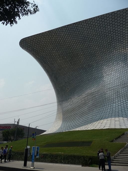
The Soumaya is a squat building with a complex inwardly curving geometry. Its kind of like Frank Gerhy or Karim Rashid designed a stool and covered it with dimes. The surface is very interesting, covered entirely with reflective metal hexagon tiles. It was kind of cool to see and fun to get up close to it and see the patterns of lines created when you’re at eye level.

The interior of the museum is based around a series of gentle ramps which take you from floor to floor. The main public spaces are the most incredibly white areas I’ve ever seen. White marbe floors, white curving walls which flow into ceilings so you don’t even get a sharp line or contrast with the edge, like the backdrop to a photographer’s studio. The artworks in the lobby in bronze read as solid black against the stark whiteness. In this blizzard, the eye become attracted to any color. The red fire extinguisher on the floor becomes a focal point. Actually, the other visitors become the most interesting and visually arresting component to the public spaces. Brightly colored typical Mexican textiles, people moving around in groups of two or three or single, you cannot help but be drawn to the moving figures against the white ground.


It’s an interesting space, it feels like something out of 2001: A Space Odyssey or Star Wars.
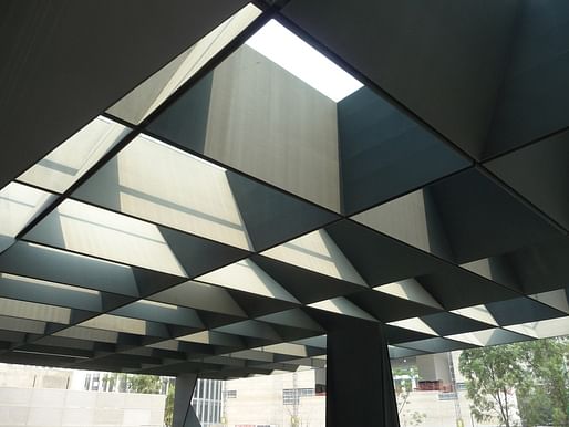
When I got to the top floor, I laughed. It looked like they’d run out of money to finish the grand ceiling. The white sculpted walls fell away and what covered the giant gallery was a massive web of massive metal trusses with a huge central skylight overhead in the center. It was really quite shocking against the highly finished rest of the interiors.

And the gallery itself was a maze of sculptures on pedestals, too close together, and not grouped according to any apparent rhyme or reason. It really felt like a department store floor sale.
Judges?
Effort: A
Urban planning: C+
Architecture: B
Art: B-

As for the collection, it was largely copies of famous European sculptor's work, although they did actually have a decent collection of Mexican artists, especially the notable murialists. However, they also had a bunch of this guy's work- the whitest Aztec women I’ve ever seen leaning suggestively against temple walls, embracing torrid Anglo Aztec men, or being carried away by amorous Danielle Steele conquistadores. If I was a pulp romance writer, I would put these images on the cover of “Unconquistadored," “The Plumed Serpent," “Tenochitlán Intrigues" and “Stolen Hearts and Sacrificial Altars"
Urban and architectural explorations from Mexico City to Stuttgart Germany through the eyes of a iterant architectural designer
No Comments
Block this user
Are you sure you want to block this user and hide all related comments throughout the site?
Archinect
This is your first comment on Archinect. Your comment will be visible once approved.