
After a long and ever-relaxing break in subtle southern New Jersey from the hustle and bustle of New York City, I bring to you the long (nearly 6 month) awaited conclusion to the first year second semester experience at Pratt Institute. If I had written this post earlier in the summer I may have included infinitely more archibabble than this one will house, however I will try to keep the vocabulary level up to par. I will begin with Representation, followed by Design.
In Representation, throughout the semester we were tasked with developing a diagrammatic grammar for analyzing Palladian Villas. Later, we used this grammar as a technique for developing a new villa.
The first stages of the project was relentless diagramming, layering and diagramming some more. Most of the students in the class never wanted to hear the name Palladio again by the end of it. However, each week new discoveries were made as to the nature of the way Palladio developed his villas. In my analysis I found repetitious layering of squares in plan that mimicked vertical depth in the space. I also did another diagram set that attempted to trace the hand of Palladio by illustrating the movements he made, all tools considered, when splitting the spaces.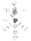
In many other analyses the class found that Palladio's villas are notorious for inaccuracies most likely due to lack of consideration for thickness of material while designing. Other inaccuracies include asymmetrical window and door treatments, major changes during construction and a burning question about why Palladio chose to keep representing his buildings as planned in The Four Books of Architecture, instead of as built. After Palladio's work had been analyzed our projects moved into reproduction mode. We took our diagrammatic techniques and used them to create our own villa. Some students took a rather straight forward and literal approach to this task and designed a brand new villa, likely to fool the most educated Palladio enthusiasts. Others took this assignment as an opportunity to explore what he would have done if he was an architect in the 21st century.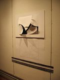
In this “villa” I chose a piece of music, the solo by Nina Simone in her song “Feeling Good”, and used pitch and frequency to determine a set of rules by which I would use my compass to layout divisions in the space. I chose identical proportions to Villa Pisani-Ferri's main building. I then began in one corner and drew arcs from the corner. If the pitch went up, I increased the radius of the arc. If it went down, I did the opposite. I continued to work these arcs around the space until all the corners and midpoints has been used, and then continued to swing arcs around each intersection made. Each of the 17 seconds in the solo had their own arc. The cuts and fold directions of the arcs were based on frequency. Setting the bar at 40 Hertz, if the average frequency for that section was above 40 the angle of the cut and/or fold direction would change. The end result was a landscape of positive and negative that made for a very intriguing threshold.
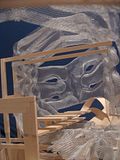
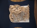
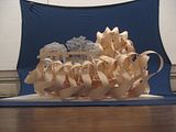
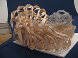
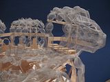
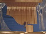
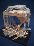
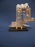
In Design 102, Che-Wei Wang's studio started with a bang. We drew shoes. A section of a shoe to be exact. It was an in depth visual prequel to the semester to follow. The section became highly integral to the understanding of our spaces. From there, our subdivided semester began with part one, an exploration of the growth of landscape modules through use of a system of variables. Part two was the adaptation of profile from found objects, into a modular ordering system defining a space. Ultimately, each step of the way these explorations were used to define neologisms, a combination of two words of their own individual meaning to create a new wordspace (see, we can even do it on Archinect). 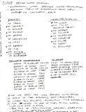
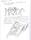
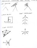
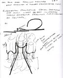
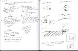
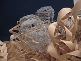
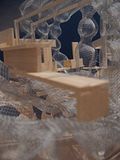
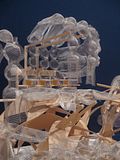
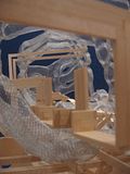
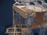
The neologisms each had inherent properties for both words that warped and intersected to create an entirely new definition, which in turn became the new defined program for our architecture. Many other architectural considerations required metaphors as well, so while the landscape we built was based on the movement, position and speed of our Kung-Fu film analyses, the architecture's relationship to the landscape emulated an exotic sea creature of our choosing and its relationship to its natural habitat. The result was what you see in the very unprofessional images to follow: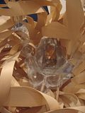
Weird Pratt:
I wish I could say that I waited this long to post this entry just so that I could bring you the awesomest most epic-est Weird Pratt section in the world, but that was not the reason, however at the very beginning of Fall 2010 I have for you a story you'll be jealous of for decades. My fraternity brothers and I were outside on the lawn throwing Frisbees around (I know, cliche) when a man approached us who had a shoe box. This was an old homely African American man. He said "Hey, I have a baby squirrel in here. Where should I leave him?" I pointed him over to another portion of the lawn and said "I guess over there." He released the squirrel and began walking away. The baby squirrel followed him around for a while before starting to follow around me and my friends. While he was following me I would run in circles and he'd chase me continuously. He also began to climb up my jeans. It was pretty amazing to see a baby squirrel up so close. Soon enough he had attracted enough attention that a vast majority of the folks hanging out on the main lawn had gathered around to watch him jump from shoe to shoe.
Additionally, I will be reworking my approach to my Pratt blog this semester and for the future as I make my way through the program. Hopefully my future content will be inspiring and make you folks think. :)
3 Comments
the pratt cats will not like this.
i like it. how did you bend all that basswood? did you heat it? The overall composition has good rhythm and a distinct contrast in materiality, but it's a little confusing.. what does an exotic sea creature have to do with kung fu?
I'll tell you what, if I had to actually bend that much basswood I would've quit the program. That is actually white oak table edging. You know, that stuff that gets glued to the edge of you table that always flaps off and annoys you when you're trying to do work. The good thing was that one side of it actually had glue, so with a butane torch at the ready, I just heated up the glue and laminated it wherever I needed them to be laminated. It was a pretty versatile material.
As for the sea creature. It had nothing to do with kung-fu. We were just tasked to look at movement to create our landscape, and a sea creature to define a condition of engagement. Remember Jay, this is still a first year studio's work ;).
Kevin
Block this user
Are you sure you want to block this user and hide all related comments throughout the site?
Archinect
This is your first comment on Archinect. Your comment will be visible once approved.