anchor
end of year one
design computing/paramod/wednesday nights with frank gehry
The final review for my Digital Project seminar was a few weeks back (nicely offset from other classes). After spending the first portion of the class working through tutorials, the second half was devoted to individual projects that, for some students, correlated with their studio work. The work was documented weekly through blogs (see them all aggregated
here and my blog
here). The final products (from undergraduate students through PhD candidates) really took on the parametric nature of the software. The critics at the review raised questions about the role of scripting in design and how constraints/knowledge of a program, like Digital Project, informed our projects.
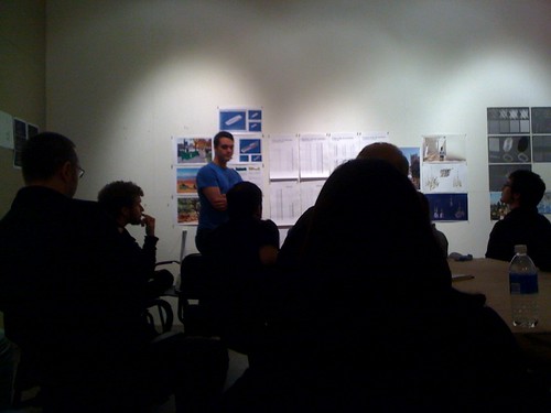
[final review]
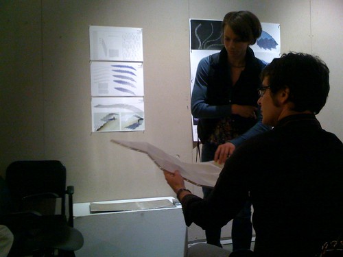
[final review]
architectural theory+criticism/silent partners+short circuits/"let's unpack this..."
Part of our preparation for thesis next year, this class was focused on constructing polemics--first written and then visual. The culmination of work was an exhibition in which work was organized by the text it was based on. My group took on Nic Clear's AD Issue,
Architectures of the Near Future. Each student had four parts: conceptual topography (top left under glass), theoretical grounds (bottom left), cover art (right), and the terms of engagement (bottom right). This class was taught concurrently in Ann Arbor and Beijing by video and then the Beijing students' work was displayed in the final exhibition on a monitor.
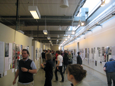
[wine, cheese, lots of work]
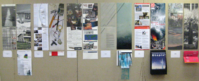
[the work of (left to right) adam smith, jamie wilson, nate doud, dorothy schwankl, drew powers, and denise huang]
2G2 studio/the grotesque/detroit is really gray in the winter
Based in book format, this studio took on multiple scales and ecologies related to the city of Detroit. The studio worked primarily in 7x9 book format using a universal template and compiled the work three times (
volume one and
volume two). My project was about exaggerating the productive uses of the landscape through saturation.
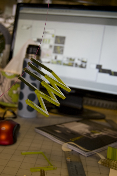
[model in progress]
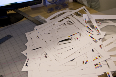
[the downside of walls full of full-bleed book pages]
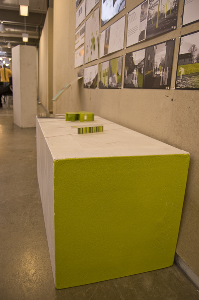
[low view of my wall]
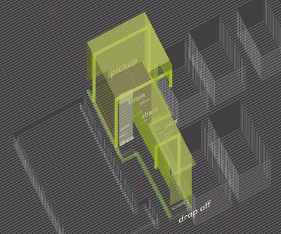
[layered axon/plan of a program intervention]
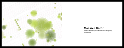
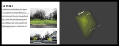
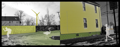
[a few of the book pages]


1 Comment
Thanks for the graphics. Your attention to quality is refreshing.
Block this user
Are you sure you want to block this user and hide all related comments throughout the site?
Archinect
This is your first comment on Archinect. Your comment will be visible once approved.