
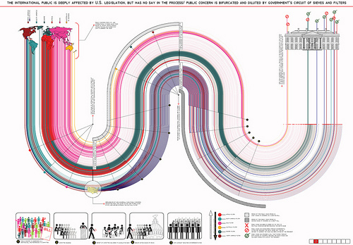
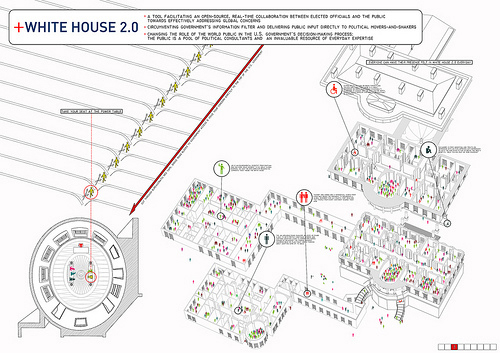
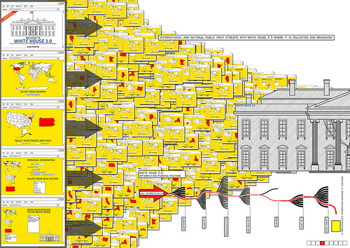
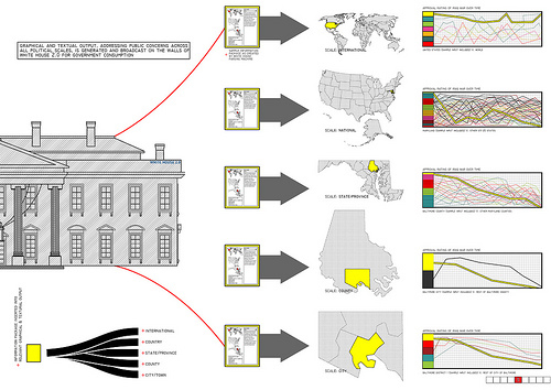
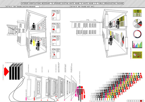
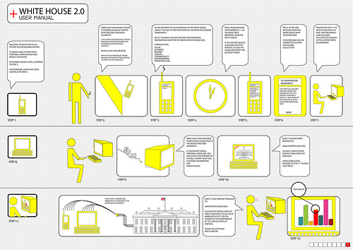
Today, The Storefront for Art & Architecture released the much-anticipated results for the White House Redux Competition. White House 2.0, a labRAD entry collaboratively produced by co-founders Arielle Assouline-Lichten and myself, was awarded 3rd prize out of 500 or so entries from 42 nations. The entry will be featured in an exhibition at The Storefront for Art & Architecture in New York opening October 2nd and published in White House Redux: The Book, chronicling 123 submissions to the call for ideas. Needless to say, we're ecstatic!
However, we need the help of the Archinect community! With the competition jury having made its final decision, we're hoping that you, the in-the-know architecture crowd, will wield your collective voice, voting White House 2.0 as your favorite project out of the 40+ shortlisted entries.
There is a benevolent side to what might be misunderstood as a shameless campaigning--the competition organizers at The Storefront for Art & Architecture, by adding a popular vote to the Jury's decision, are advancing the aims of our proposal for altering the White House of the future, namely open-source government dictated by citizen input, legislation and decisions informed by statistical majority and real-time large-sample polling. Help us propel White House 2.0 towards winning the competition's popular vote and championing the argument for a user-friendly, globally-oriented vernacular U.S. government architecture .
Click here to cast your ballot!
Polls close November 3rd with the winner announced the following day as the Presidential election is decided. With your help, whether it is Obama or McCain, The White House will be made aware of your desire for the building to be reconfigured according to the plans of White House 2.0, bringing the President's mansion into the 21st century information age and creating a global symbol of democratic transparency rather than cloistered cronyism.
Perhaps your personal judging criteria are apolitical. That's understandable and probably a common ground with the jury. Please follow this link to Greg J. Smith's blog, SerialConsign, to read his review regarding the project's graphical effectiveness. Our submission, an infographic project about infographics, owes considerably to the Dutch firm CatalogTree and, of course, Edward Tufte.
Tell your friends to vote!




4 Comments
That's alot of graphical info....
Congrats!
i agree and i feel stupid. how can i vote for something that makes me feel stupid. yellow people. grey people. magenta people. red people.but where did the purple people go?
I voted for team labRAD. Good luck Wayne!
when i said i saw your entry in the piles and piles of entries at storefront, it was because it was on top! congrats wayne.. see you at the opening?
Block this user
Are you sure you want to block this user and hide all related comments throughout the site?
Archinect
This is your first comment on Archinect. Your comment will be visible once approved.