
We are in Seoul, South Korea at the esteemed Ewha Womens University, the world’s largest female educational institute, for the ACSA’s International Conference, Open Cities, and it’s time for our closing keynote, delivered by none other than Toyo Ito. Ito-san’s website includes the following short biography that, I think, captures both his frankness and his humility:
Biography
1941 Born in Seoul Metropolitan City
1965-69 Graduated from The University of Tokyo, Department of Architecture
Worked at Kiyonori Kikutake Architects and Associates
1971 Started his own studio, Urban Robot (URBOT) in Tokyo
1979 Changed its name to Toyo Ito & Associates, Architects

TI: Thank you very much, for coming in spite of the heavy rain. I apologize that my English is slow, so I translate through Yasu-san. I present several new projects. [TI then switches to Japanese].

A person, surrounded by their…modern things, looks happy, but are they really happy? Though my life is very happy in Tokyo, it’s getting crowded, so sometimes I might want to go to the countryside…

Today I’d like to discuss how we can contribute to the city in which we are dwelling.

'Songshan - Taipei new horizon building' is a recently completed mixed use building.

The Taipei World Trade Center and city hall are nearby.
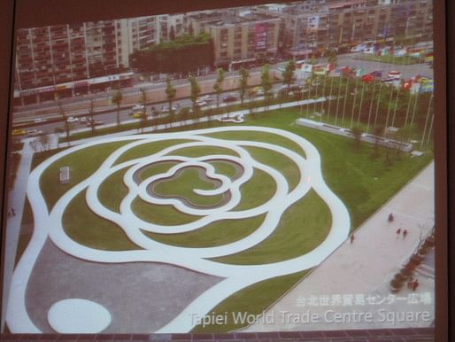
I also designed the outdoor space which is near the water. On the bottom right is the edge of the nearby high-rise building [that opens onto to the park space]. If you look carefully, the center of the open space has a slightly higher contour. The white pavement is travertine, with a small fountain along that.

Near the open space is the site with the mixed-use facility. On the upper left hand side, the rectangular shape represents the existing tobacco factory buildings. On the right, it used to have the same structure but it’s seismically unfeasible—so it’s been demolished and the site was made available for this project. The dome is where they’re planning to have a stadium for sports events. As you can imagine, in the future they’re going to have many large buildings including offices and cinema. On the north side, above this picture there’s an elevated highway.

This is the scenery of the tobacco plant in the 1960s era. The concept of this tobacco factory was based on the European idea of creating good working condition for workers—a place where they work but also where they eat.

The design concept of this multi-use building has two identities: 1) protection from the noisy highway on the north side, and 2) to have similar characteristics with the plan’s massive structures.

The curved facades accommodate the open spaces. At the point where it’s divided (gray semicircle), it’s a sunken garden.

This section shows the program; the floor area is roughly 1M square feet. The first couple of floors on the ground level accommodates the retail shops (orange). The selection of retail is oriented towards culture: books, art. The blue part represents office space. This is a culturally oriented city so the companies have a good understanding of culture. On the right hand side (purple) are the hotels, and they have a good understanding of culture as well. The basement accommodates the concert hall and the rooftop also accommodates cultural events.

On the right hand side you can see the old tobacco factory.
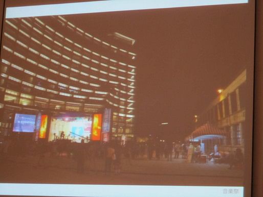
There are a lot of public events. Here’s an evening view.
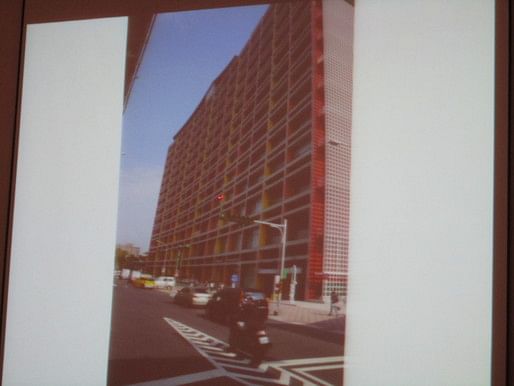
The many-colored façade [helps protect people from the highway noise].

The sunken garden.
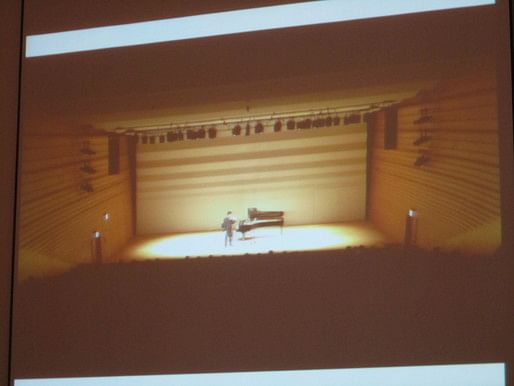
Concert hall for 400 people. There are also 3 cinemas.

Event hall for 300 people. This is the rentable space.

This is the second project I would like to show: ‘Minna-no-Mori’ Gifu Media Cosmos, similar to the mediatheque. It’s in Gifu city east of Kyoto.

The pink at the bottom is the train station, and the green dot is the site, about 1/2 mile from the station. The east side of the site has a mountain nearby, but the way from the station to the site doesn’t have any greenery. So my intention is to provide lots of green. Additionally, the river runs through the city, which lends identity to the city.
This is the site plan. The width is around 270 feet, and the depth is around 200 feet. You can see it’s a two layer structure on the ground.

Across the open space, the gray shape represents the future location of city hall.
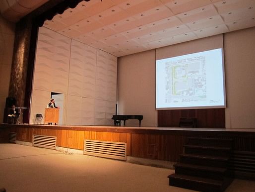

On the right side, the promenade is also part of the project.

South side façade.
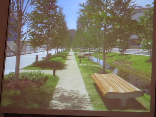
Promenade. This is the scenery, it comes with a little creek running across, with water source from the aquifer, which is pumped up and recycled after it runs down.

Three months ago, 60% of the promenade was open to the public even though the greenery wasn’t really growing yet.

This concept diagram shows how to use the underground water. The water level is quite high. We use the underground water as a heating device, similar to the ondol in Korea. How the air circulates: the left hand side represents summer; the hot air is discharged from the top (funnel/dome), while in the winter it is preserved to keep the space warm.
I call this structure which looks like an inverted funnel a “glob.”

The space below will be an ideal location for reading or browsing. In order to make the reading space more comfortable, direct sunlight comes in, partially shaded, through the grid walls.
The challenge is to conserve energy, so there are solar panels on the roof, and a water recycling system. Compared with other buildings, this one will utilize natural energy to the maximum and reduce energy consumption by 50%.
You can see how the light comes into the space and is diffused very gently.

And over the globes there is the waving timber structure.
This is the ground floor plan: the blue parts in the center represent the closed stacks/bookshelves. This is a good strategy to keep the precious books in good condition because the area in the center is more environmentally stable.

Also, the walkway from north to south or east to west goes through the buildings as if it’s part of the park. Besides library functions, the project also accommodates an open gallery (circle at bottom), closed gallery (rectangle above that), and an auditorium (above that).
On the left side of the plan (west side along the promenade), this is a place for the communities to hold workshops. Daylight but also urban development. This is a good place for lunch; there’s a 70 seat restaurant attached to this building.

Right after you enter on the south side, there’s a way to the second floor via the stairs.

This is the community activities area. You can also see the closed stacks on the right, behind glass panels.

This is the second floor. This is the place where the lights diffuse through the globes, so that the spiral shape with the huge core represent the globes. The posture that I want people to feel: kids can lay on the floor, while others may sit seriously at desks. There are different postures for different purposes. The spiral shapes are the bookshelves for each globe.
The first time you come here, you might have no idea, so you go to the information desk so you can get help to find out where to take a nap or where to be serious. But if you follow in a spiral, you can find the book you’re looking for.
The space along the left with the beige and bright green is a semi open space that is enclosed, but you can enjoy fresh air. The reading counter faces the green plantings of the landscape.

Here’s an early stage of design development. The globe at this moment was much lower, closer to the floor, as if it were a house within a house.

This area has a very long history in the timber industry, so we used local material. The structure consists of long thin panels running through three directions. This is just a mockup.
Here’s a mockup, around 60’ feet wide.

Here’s another mockup, of the globe, which will be suspended under the wood structure. It’s made of polyester textile.

This picture of the actual construction site was taken two weeks ago. The planks are formwork to hold the timber structure we’ve already seen. The planks will later be removed.

I would like to show two more projects, which are trying to challenge how to provide character with the symbol of each city.


'Market Street Office Tower' is a high-rise in downtown Singapore along a market street.

The site shape is a triangle; the site is prominent, near the central business district.

This concept diagram considers how to build the city’s character. Just imagine, 50 years ago, most of Singapore was covered with jungle. The idea is to provide greenery back to Singapore from the walls up to the roof.

As you can see, approximately 50% of the facade accommodates some green. Fortunately, the FAR worked out so that there was extra 45m, and the solution was to provide extra green space on the rooftop.

Environmental system: here’s a diagram of how to maximize usage of the roof garden. Imagine if you climb a mountain; if you climb 100m, the temperature drops by 1’C. This is a 200m building so the temperature at the top is 2’C below at ground level. So the idea is to bring cool air down through the central core.
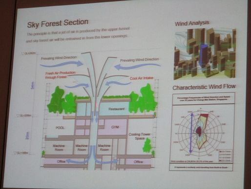
As you can see on the diagram the bottom right, the wind direction in Singapore is almost constant through the year.
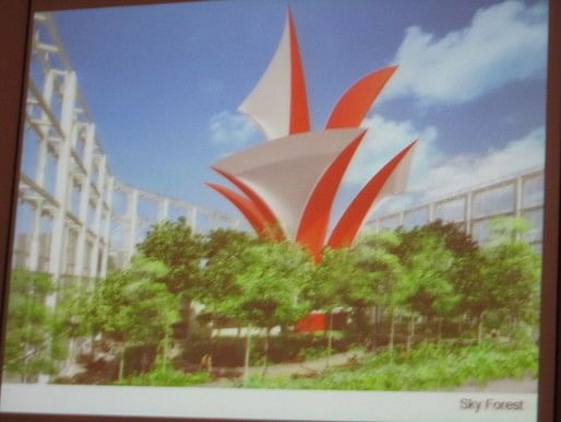
This is an image of how it’ll be seen; most of the project is already constructed.
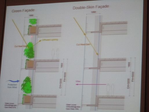
Facade sections: green facade and double-skin facade to reduce direct sunlight.

In this rendering, you can see the 40-50 feet high pilots around the entrance area. It’s a collaboration with an artist representing plant roots.
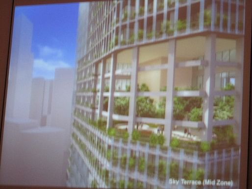
Sky terrace elevator transfer.

Here’s the first floor entrance. The brown skin is plaster by Japanese plaster professionals, representing the soil, related to the roots of the pilots.
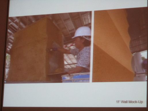
Here’s a mockup of the plaster application. Japanese craftsman.
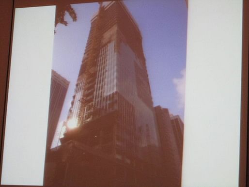
This is the construction site. The structural frame is already completed, and the facade is going to be gradually installed. It may be hard to see, but the lower part already has the plants growing up.

The last project I would like to share is the Metropolitan Opera House in Taipei. I already spent 8 years on this.

Site plan: The site is on the relatively northern side of the city. When the competition was held, the area was nearly empty because it’s a newly developed area, but now it’s surrounded by high-rise apartments.

Besides the opera house, there is the city hall and concert hall on either side of the site (pink). This is a diagram section showing the activities: 2000 seat theater, 800 seat theater. On the top of the roof, there was [supposed to be] another theater, which is now in the basement.

This is the concept diagram. The structural model is made of structural concrete but my aim is not to make the structure impressive. Instead of expression of the structure, it’s mimicking a human being’s body, which consists of lots of tubes: ears, organs—all tubes.
My philosophy for this project is using tubes as a connector between human beings and the nature around us.

This is a three dimensional membrane structure; the idea of tubes is already in there, running across each other.

This is what happens when you stack of the previously shown idea.

This is the floor plan, and you can see the water area coming into the plan; my intention is to make the floor area like a park.

Internal view: Modernist architecture relies on your visual interpretations. I would like to pursue an alternative: an acoustical approach, as if you can get the vibrations on your body directly.

Theater with 2000 seats.

Theater called “greenhouse” [or maybe ‘green hall’?] with 800 seats.

View of the small theater which used to be on the roof—now it’s underground, but if you open the wall, as you can see, it can act as part of the amphitheater attached to the outside.
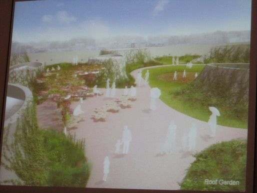
Roof garden—can also accommodate a small concert.

Finally, most of the frame is already complete.

We’re using a special construction method, which uses a steel fabricated nearby, pulled up to the proper location.

This shows how the metal frame is made: a truss, made with the curvature.

The applied the mesh panel as the formwork for the concrete. It looks like a very primitive method, but no part will be similar to the others so that’s appropriate for this kind of construction.

Construction site.

Playhouse January 2014. Construction of the 800 seat theater.

The opening on the top will be closed at the end of construction.
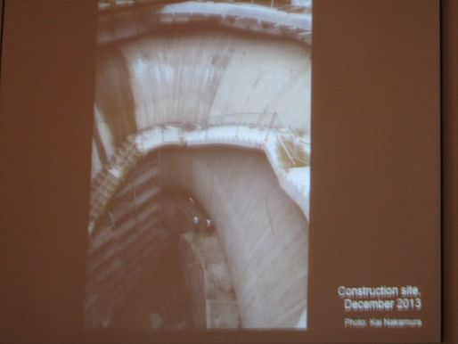
Staircase leading to rooftop.

It will probably take 3 years to complete this very complicated structure.
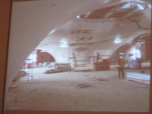
For the completion, the walls will be finished with resin painted on the surface. As of today I believe that most of the windows are installed.

Finally, [the construction in progress] is getting near to what we imagined originally through computer graphics. In the foyer area, I’m going to appoint local artists to make wall paintings.
Animated section (video below). This project started with a very primitive idea, living in a cave, for example. The architecture for modern life, in contrast, relies on a very artificial structure.
Applause.
Question: Thank you very much for showing such beautiful buildings. I’m an architect in Korea. Do you see consistencies and differences with the Metabolist movement in Japan?
TI: As you may know, I apprenticed under Kikutake, who was a metabolism architect in the 1960s. At this moment, metabolism is like a metaphor about plants. But how they define the time frame, of how the building is maturing in the future, was very systematic and based on an industrial point of view: “If it’s old, replace it.” On that point, my interpretation of the metabolism movement is that it’s industrial, and that’s not what I want. My interest in metabolism is how architecture can get matured as time passes—how plants, nature, animals can grow, get mature. Understanding the order, how they are growing and how they mature. That’s my interest in metabolism.
Question from Norman Millar: Thank you very much for a great presentation. This is a conference of architectural educators from around the world and the title of the conference is “Open Cities: the new post-industrial world order.”…It’s about a new kind of city. Do you have advice for architectural educators or students, or any comment on the idea of “open cities”?
TI: I have never been a full time faculty member in Japan, though I’ve done a bit of teaching. When it comes to the educational system in Japan, I have big doubts. That takes me to the initiative. Three years ago, I initiated a workshop to talk about architecture with young, emerging architects and elementary school children. 20 of them, for a year.
My feeling through this 3 year workshop initiative is that the elementary school kids are more energetic and more open minded to new possibilities. So I would like to share one story: the reason why I came to the conclusion about elementary school kids. Whenever we take the children and architecture students on site visits of famous architects, for college students, the fact that it’s made by a certain architect is enough for them to approve of it. Children [are more free to] say, ’it’s crap,’ or question why you would (build a house in this location?) The young kids are very strong critics but also good at finding where they’re comfortable, and they’re good at adapting this feeling into their designs immediately.
Children have a good intuition and are observant of things. I’d like to encourage kids to grow in this way. Most architects are good at ‘blah blah blah’ with concepts, but aren’t interested in talking about community. That’s very important and that’s how I’d like to influence architecture in Japan.
So community is a place where people get together. This is not about language, but about a tangible feeling: how do you define a place for gathering. I’m sorry that maybe the answer is not really clear but I hope it’s helpful.
Question: How has your family history in Korea and being born in Seoul affected your work?
TI: [In English] Before the war, my father was working in Seoul, so I was born in Seoul. But when I was two years old, I came back to Japan, so I have no memories of Seoul. I would say Japan, [as an] Asian country is very active and I am so excited for the Asian countries. But Japan is in a sense too sophisticated. [TI switches back to Japanese] Japan is getting too sophisticated. They pay so much attention to precision: if your train is delayed 30 seconds, you get frustrated. This precision is demanding, and people tend to pay more attention to details rather than seeing the big picture. What is actually the fun part of this wall? You’re missing something big. That’s why I don’t like living in Tokyo anymore.
For example in the opera house, that we showed at the end, if I made a presentation like that for a project in Japan, I wouldn’t be awarded the project.
End. Applause.

The Association of Collegiate Schools of Architecture is a nonprofit membership organization, founded in 1912 to advance the quality of architectural education. Our members are over 250 schools, including all accredited programs in the USA and Canada, schools seeking accreditation, and non-accredited and international programs--representing over 40,000 architecture faculty and students.
No Comments
Block this user
Are you sure you want to block this user and hide all related comments throughout the site?
Archinect
This is your first comment on Archinect. Your comment will be visible once approved.