Archinect
And Then What Creative

And Then What Creative

Los Angeles, CA

anchor
In-mall experience featuring Windows Phone and Xbox360 Kinect at Westfield's Valley Fair location.
7 more images  ↓

Microsoft Tech Lounge

For this project the brief called for us to create a “Tech Lounge” that features two experiential components - the new Windows Phone and Xbox360 Kinect products/services.

PROCESS & RESULTS

    Attention grabbing design showcasing Windows Phone and Xbox360 Kinect
    Integrate the latest technology for high impact engagement
    Product demo areas, seating, charging and free WiFi for increased dwell times

Creating an engaging experience for shoppers - the ability to demo products - was the top priority, followed by areas for Microsoft brand ambassadors/experts to answer questions/provide product info.

The result was a highly-engaging, feature rich, user friendly Tech Lounge for all to enjoy.

 
Read more

Status: Unbuilt
Location: California
Firm Role: Creative Direction + Design
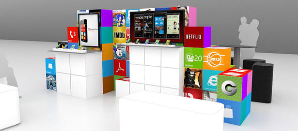
 
PROPOSAL - Windows Phone area
PROPOSAL - Xbox360 Kinect area
Option 1 – Display wall is built of light boxes showcasing Windows Phone apps or partner apps – illuminated static graphics with digital displays
Option 2 – Display wall is built of digital tiles which display individual graphics or one domination graphic – attention grabbing dynamic content without displays
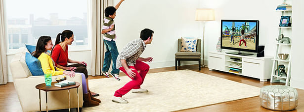
XBOX Kinect play
XBOX Kinect play
Colored tiles viewable from profile of display reinforce Windows Phone design direction
White vs black color delineates each activity space - Windows branding viewable from above