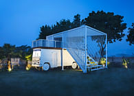
Panchkula (Haryana) India.
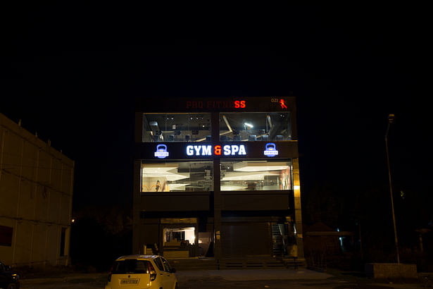
Born out of the idea of an individualistic and practical space design, Pro fitness Gymnasium is located in Kurukshetra, a small town in the state of Haryana. This ambitious project, spread over an area of 5000 sqft, was imagined and built as the largest gymnasium in the city.
The main challenge was to break the stereotypes surrounding the design of fitness spaces and to put together a new array of elements and systems that would work as a prototype whilst giving the space a bold, distinctive look.
DESIGN AND PLANNING
Not unlike most examples of good spacial design, Pro Fitness gymnasium leaves an impact on the psyche of the visitor and the user alike. Covering both the first and the second floors of a building, it speaks of sophistication blended with just the right amount of quirkiness to lend the space a unique character.
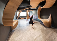
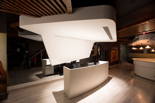
The entrance is via the reception dominated by a ceiling designed in a white, strikingly asymmetrical form that defines the reception and holds it together. The ceiling moves fluidly down and becomes a part of the back wall. This is specifically brought into focus using clean, monolithic highlighting to bring out its organic form.
Interlaced with the white ceiling are the wooden battens layered over a black/ dark grey ceiling surface, further adding complexity to the design. A green wall opposite the reception table makes for an interesting addition, making the space more vibrant.
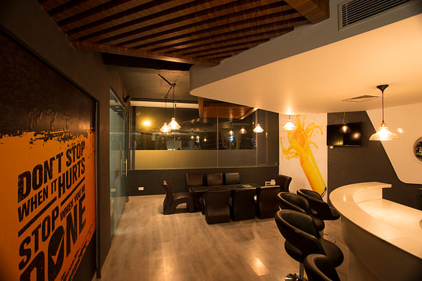
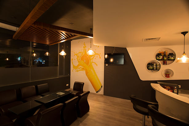
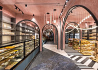
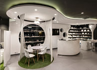
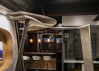
The white trapezoidal ceiling continues further, this time marking the café as a separate entity, yet not alienating it from the rest of the plan. It continues down to become a part of the wall, making way for round niches acting as storage units that add zing to the design, all the while supporting unique light fixtures and AC vents.
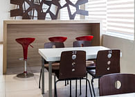
The café and sitting areas are well defined and awash with soft, ambient lighting. Bar stools are arranged around an informal semi- circular table, incorporating the circular storage units; a more conventional seating has been provided further on, in addition to it. Exuberant, life sized posters appearing throughout the space not only add context but also enliven the subdued color palette used for the interiors.
This floor also accommodates steam and shower rooms for men and women. Lockers are made available for the use of members as well as guests. A cabin, a pantry and a storage room are also weaved into the design.
The large Aerobics’ studio/ Multi-purpose hall, near the entrance, sees a reappearance of the white trapezoidal ceiling, juxtaposed with AC ducts, painted dark grey/ black to match the base colour of the ceilings. Most of the lighting is done using track lights and ceiling spots.
Black mirrors have been used throughout the interiors to give an illusion of space and add an element of depth to it. They give the design a certain character and unite the elements into one cohesive whole.
The concept of visual solidarity is essential to the plot of the design. It defines a new language for fitness design, all the while allowing for a balance of idiosyncrasies and conventionalities.
The upper floor caters to weight training and cardio.
With the staircase leading up from the first floor, the visitor is greeted by a plethora of state-of-the-art gym equipment on entering the second. Emphasis has been laid on the placement of machines and the way the visitors would interact with them.
The language is deliberately subtle, contrasting with the high energy exercises the space would witness. The muted overall lighting allows for the highlighting of the equipments, making them the clear focus of the space.
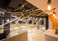
The ceiling features two wooden rafters running parallel in a defined zigzag pattern, finished in high gloss, white paint. These two elements running the length of the plan, effectively bind the whole floor together in one strong, visual language. Ropes crisscross at various junctions between the two rafters, along their length and also vertically from floor to ceiling. Special emphasis has been laid on the placement of the ropes in an attempt to contrast solid volumes against voids and grids against negative spaces, with carefully planned appearance of each rope- grid.
The overall impact is that of an art installation rather than a mere design element seeking to create interest. This dalliance with art is a crucial part of the design as it attempts to erase, or atleast soften the line separating art and architecture.
Vivid, inspiring posters introduce colour and brighten up the space on the upper floor as well, matching the energetic spirit of the space.
The flooring is practical and largely wooden, in tones of soft brown and beige.
All the materials, colours, lighting fixtures and technologies used share a common thought, enlivening the space with their finely tuned transmutations and precise, sensitive planning.
Status: Built
Location: Kurukshetra (HARYANA) INDIA.
Firm Role: PRINCIPAL INTERIOR DESIGNER
Additional Credits: Project Name – PROFITNESS GYM
Client – Mr Balwan
Architect – Studio Ardete
Photo Credits – Purnesh Dev Nikhanj
Site Area – 5530sqft
Gross Floor Area – 2765 Sqft
Location – Kurukshetra, (Haryana)India.
Status – Completed in December 2015
Collaborators – Studio Ardete Pvt Ltd.
