Archinect
Studio Ardete

Studio Ardete

Panchkula (Haryana) India.
anchor
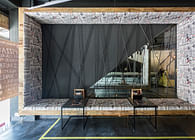
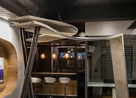
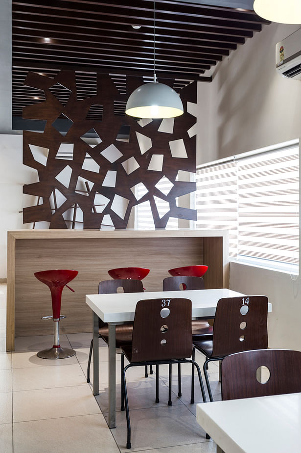
A high table with red bar stools adds a splash of colour to the warm toned interiors
15 more images  ↓

CAFE ZERO

Designed for the staff of a pharmaceutical factory in a remote location of Punjab, Café Zero came into existence as a purely need- based space. With very limited access to eateries and cafes, the workers required a space where they could have their meals in a comfortable atmosphere.

An old factory warehouse was chosen for the purpose of setting up the café; the only challenge was the budget.

There was no allocated budget for the space. This was the critical parameter that defined the way the interiors were shaped.

Recycling some and adjudging the re-usability of others, materials were scavenged from the administrative building, being built for the same factory. The entire design was set up, fabricated and erected by the workers of the factory after their work shift. Furniture and window blinds were salvaged from an old training center, due for renovation, minimizing cost.

The interiors were designed to be organic to make the most of the array of different materials. Left over ply boards were converted into screens and partitions; steel bars were interpreted as suspended ceiling elements. Visual connectivity was considered important and achieved via solid and void separator forming a background to the high table with bar stools.

The cafeteria also acts as a break out space for informal meetings and discussion of ideas. Executed by the workers, within a tight budget, it was named Café Zero by staff.

 
Read more

Status: Built
Location: ROPAR (PUNJAB) INDIA
Firm Role: PRINCIPAL INTERIOR DESIGNER
Additional Credits: Project Biodata

Project name – CAFE ZERO

Client – DSM SINOCHEM

Architect – Studio Ardete

Photo Credit – Purnesh Dev Nikhanj

Location – Ropar (Punjab)

Area - 1340 SQFT
 
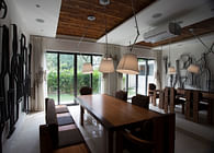
The colour palette is somber using beiges, browns and whites.
A solid and void cutout partition is used to segregate space and maintain visual connectivity
The ceiling is dark grey to contrast with the lighter floor and walls.
False ceiling and flooring are used to distinguish areas within the café
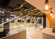
Left over steel bars are used as ceiling elements to add a whimsical twist to the interiors.
The design grew organically with unused ply boards utilized as partitions and storage shelves
Minimalistic design solutions are employed to keep the design clean and simple.
Striped blinds let in soft, muted light illuminating the café interiors.
Situated in an old warehouse, the café uses salvaged materials and furniture to minimize costs.
The furniture is borrowed from a training room to be renovated.
Ceiling layout plan
Ceiling layout plan
Elevation detail D
Elevation detail D
Elevation detail A
Elevation detail A
Furniture layout Plan
Elevation Detail B and C