Panchkula (Haryana) India.
“BRICK-BY-BRICK”
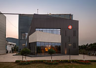
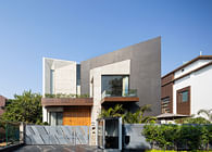
Nestled in a thriving industrial town of Mohali, ‘Brick by Brick is an endeavor to bring artwork and poetry together literally pieced brick by brick’. It's an office building primarily purposed for leasing out to different tenants to be used as per their requirement. The interior layout has been left subject to the creativity and functional needs of the user.
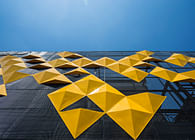
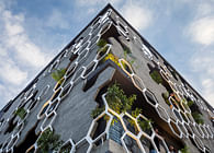
The local bye laws mandate set back in front and rear which left little to no scope for staggering of peripheral spaces so as to achieve a natural massing. Also, the project requisite demanded full use of floor space on each level to maximize saleable area. Consequently the front bland facade was intended to be treated as an art installation to enhance its visual appeal.
The region experiences subtropical climatic conditions with dust that is frequented due to construction work that happens locally. Owing to the above mentioned facts, it was imperative to put non permeable yet visually accessible partitions inside fenestrations; hence the glazed front facade. The sliding doors take care of natural lighting while keeping the dust from coming in.
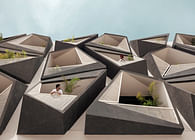
The composite nature of the weather conditions of the region make the sun unbearable during summer. This made it prudent to block the western harsh sun’s radiations in a manner that could also contribute to enhancing the facade. The vertical fins and brick jaali on the front together with planters on the parapet wall, help moderate the microclimate to some extent and keep the sun out.
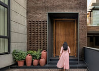
The brick jaali intended to infuse into the look of the building, a traditional Indian character, has gone on to stand out as quite a modern element. The vertical metal fins become seats for hanging bricks as screens. Where regular brick masonry with punctures and protrusions could have made for a decent jaali that served its purpose well, we intentionally went on to propose a screen that projected out from the building line to make way for a clear three feet wide space for balconies that could be used as spill out spaces for the offices on each level, and which also did not eat up carpet area.
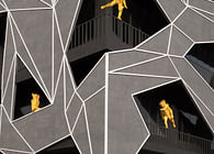
The dimensional and positional characteristics of the angular elements is divised to enhance the verticality of the building. Angles impart a dance of light and shadows that can be seen throughout the day. The entrance itself is accentuated with the vertical alignment of the fins. The sheer width of them also acts as a double wall which protects parts of the built envelope from heat gain. The entire facade is sliced into vertical segments that have punctures in the elevation which become lookout balconies free from any form of visual obstruction.
There is a strong play of colors that can be observed in the stark contrast between the white and gray of the wall finishes with a sprinkle of brick red to add drama. The black of metal pours rigid strength and yet adds interest to the mundane facade.
The immediate environs of the building is witnessing quite an expeditious development with several buildings popping up nearby. It was a challenge to design something that makes a promise of being remembered.
Status: Built
Location: Sector 82, MOHALI (Punjab) (India)
Firm Role: Principal Architect and designer
Additional Credits: Principal Architect : Badrinath Kaleru, Prerna Kaleru
Design Team : Sanchit Dhiman, Abhimanyu Sharma, Rahul Ghosh
Clients:
Engineering: Er.Ravijeet Singh (R.S. Builders)
Consultants: Structural consultant : Continental Foundations
Lighting Consultant : The Luminars
Electrical Consultant : The Luminars
