Panchkula (Haryana) India.
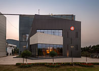
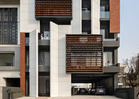
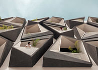
Marked by a presence of strong sculptural elements, Atelier Kirkos, was visualized as an office space that would break stereotypes and defy conventionality. Introducing layers of monochromatic components, Kirkos uses parametric modeling to introduce dynamism to the spaces, bringing fluidity in the visual dimension.
Located in Punjab, India, the office was designed for Mr. Ravijeet, a reputed Civil Contractor. His experience in the field and will to experiment allowed him to partake in the execution of the project, which came in useful while designing for the atypical site. With a clear width of 38 feet, the site was a column free space—a feature that was not to be overlooked.
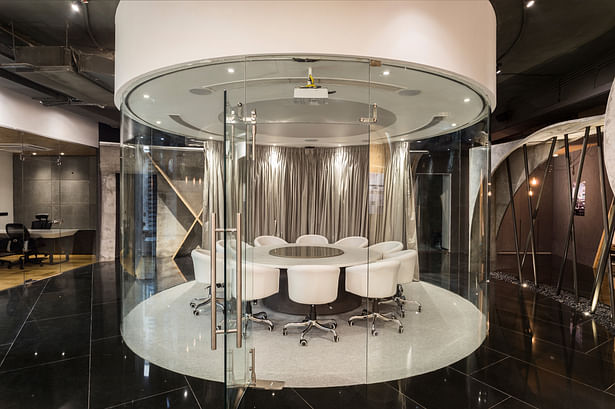
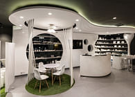
Since the office was to primarily host meetings in the future, the design was based on the Conference Room. The idea was to utilize the site conditions to showcase the progress and possibilities of the construction industry while reinterpreting contemporary office interiors. The circular conference room is 17 feet in diameter and is designed using completely transparent glass.
The entrance to the office is defined by a nine feet by six feet wide pivoted metal door, designed in a composition of tapering metal pipes.
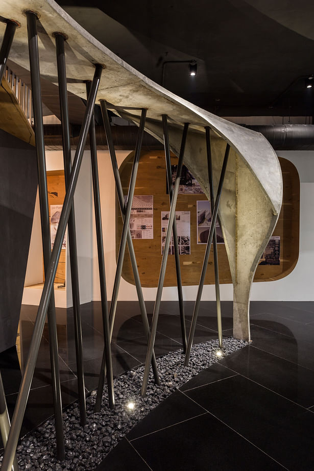
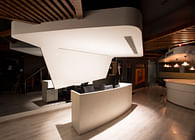
The reception and waiting area is tapered, opening onto the display wall that continues inside. An installation designed parametrically using 1500 circular rods hanging in an organic wave structure from the ceiling marks the waiting and reception area. The fluid structure aims to hold the attention of the viewer, subconsciously drawing her inside and setting the tone for the experience of the space.
The installation is visualized in white to contrast it against the grey of the walls and the floor.
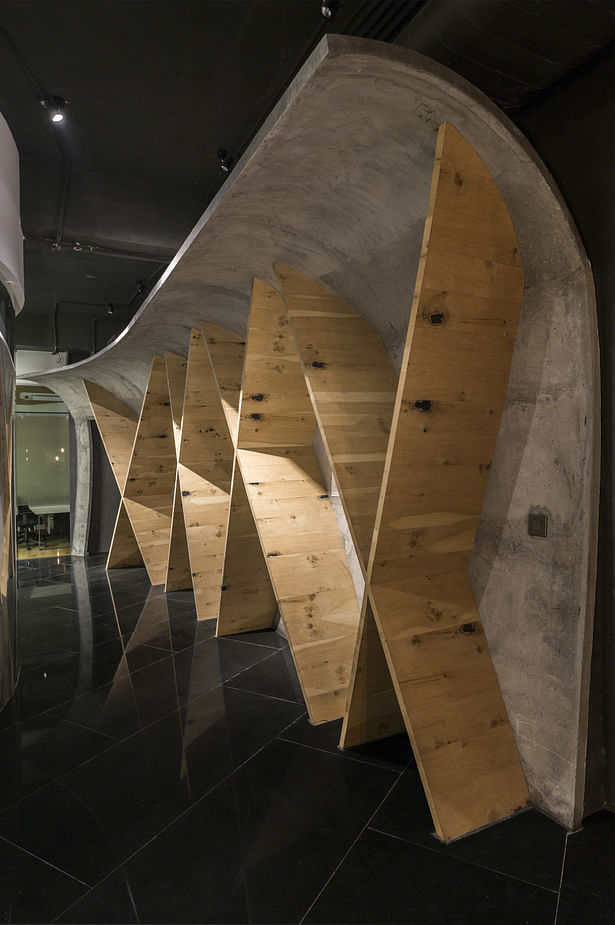
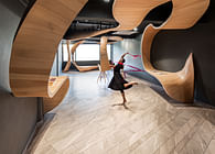
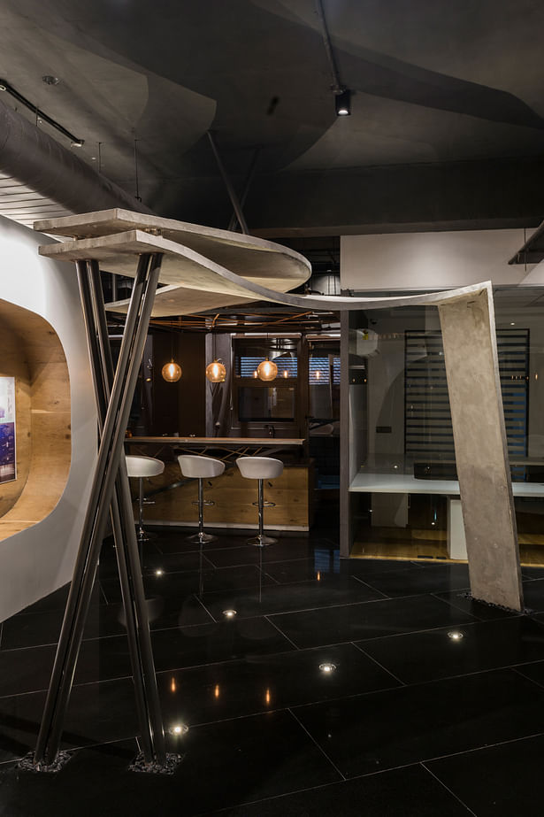
Creating drama and movement in the vast space, the conference is flanked by three dimensional curvilinear structures designed using special construction techniques and methods of reinforcement and formwork. The structures use M-30 concrete with OPC and graded aggregate with desired MS bars for reinforcement in 50mm complete thickness. Curvilinear framework and pouring of joint-less concrete caste in situ offered challenges that were carefully overcome. Bare of all external, decorative treatment, these structures contrast against the smooth interiors and lend the space a rustic feel.
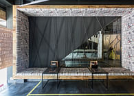
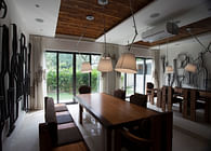
The interiors are, however, completely dominated by the glass conference room, partially visible from the reception via a partition inset with glass. Placed infront of the main door, the glimpses of the space inside create curiosity. The concentricity of the conference room is further enhanced by backlight stretch ceiling, nine feet in diameter and the use of motorized curtains. The furniture is custom made with micro concrete used to generate a raw table top.
The main cabin, staff and work spaces and the cafeteria are placed at the end of the layout so as to bring the circular glass room in focus. The display zones are integrated with the walls, leaving the center clear. The trapezoidal planer surfaces on the wall framing the display allow an easy visual flow and connectivity.
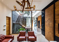
The various elements of the office space are brought together in a cohesive whole by the black mirror granite flooring. Light pippy oak veneers introduce colour to the neutral palette; cracked pippy oak is used in parquet style paneling for the reception backdrop whereas knotty pippy oak, in parquet form, is used for the rest of the spaces.
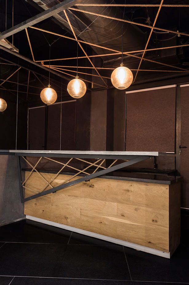
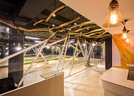
Lighting fixtures and the overall lighting design is carefully done to bring out the contrast between different areas; specific elements are highlighted to enhance their fluid, organic forms. Stretch ceiling forms the main light source in the conference room whereas, LED filament bulbs hanging from the ceilings are used to bring out the texture of the wall finishes. In a step towards sustainability, all the lighting fixtures and sources use solar power.
Use of digital software and careful planning along with meticulous attention to detail overcomes the challenges the project affords, both in design and ideology.
With the aims to bring about a perspective shift in the way office spaces are read and perceived, Atelier Kirkos flirts with the boundary separating art and architecture.
Status: Built
Location: Sec - 82 Mohali Punjab India.
Firm Role: Principal Architect
Additional Credits: EXECUTORS INFORMATION
About the Project
Client – R.S Builders
Location – Mohali, Punjab INDIA
Total Area – 3054 SQFT
Implementation – 2016
Design and Construction
Architectural Bureau : Studio Ardete Pvt Ltd.
Cheif Architect – Ar.Badrinath Kaleru
Project Architect – Ar. Prerna Kaleru, Ar. Anusha sharma and Ar. Mehak Gupta
Visualization – Purnesh Dev Nikhanj
Cheif Engineer – Ravijeet Singh
Project Management -R.S Builders
Lighting designer – The Luminars
General Contractor – Ravijeet Singh
