Recap of lecture on 10/17/12 - watch video here
Hagy Belzberg: Mitigating Complexity
http://www.belzbergarchitects.com
mitigating complexity – varying programs, clients, budgets that architects must balance

Howser Landscape Installation AWOL
- a host of a local public tv show has a house in the desert, but is paranoid & wanted a fence in the desert to prevent people from coming onto his property
- ship hulls cantilevered out of ground – radiate so much heat that no one would want to come near; performance patterning

Skyline Residence
- part of the set for Crazy Stupid Love
- environmental performance – building is balanced with prevailing winds
- sun shields – environmental patterning, passive architecture
- movies projected onto guest house; viewed from green roof over garage

Walt Disney Concert Hall
- design 12,000 sf inside building
- acoustical isolation critical in many spaces
- restaurant, café, retail, members lounge
- hanging bubbles from ceiling absorb sound, conceal HVAC, emit light
- CNC – relatively new technology within architecture at the time
- proverbial curtain created in wood ripple wall (absent in actual concert hall)
- water jet cut glass stacked bar – again playing on the idea of a ripple

Kona residence, Hawaii
- move away from kitsch architecture common in Hawaii
- formal dance and gift making as icon
- technology is void without a reference to icon
- house – view of volcano and ocean at either end of open gallery that creates axis and displays collection of wife’s orchids
- sustainable design for client who doesn’t want it
- reflecting ponds – volcano clouds; acid rain
- technology & iconography – ceiling pattern is indigenous, not colonial
- entry – upside down basket; been gifted; built in LA & reassembled by island workers

Denver Art Lab entry piece
- architecture had to be signage
- canopy, benches part of a folded skin
- fabricated pieces – lightweight fiberglass transported by truck
- weird tongue sticks out, inviting people in

LA Museum Holocaust
- Holocaust survivors came to LA – first “museum” in country – moved place to place
- build around existing monument in 1972 – surrounded by federal, state, and city land
- concentration camp architecture – not progressive, feels cheap – do away with this language but with huge resistance
- series of rooms – darker and lower, turn and release into light
- donor wanted iconic building, but building pushed below and allowed the language of the park to read – duality of happy park and dark themes
- long ramp down to entry – park and street sounds disappear
- language of connectivity
- 9th grade students in LA are required to learn about Holocaust, so many exhibits are interactive
- designing project while still under construction
- swimming pool contractors used full scale stencils & guide wires to create interior concrete structure
- black cubes with interactive media
- walls with 1.5 mil voids placed near playground – symbolic, haunting deaths of youth, helping young visitors understand magnitude of Holocaust

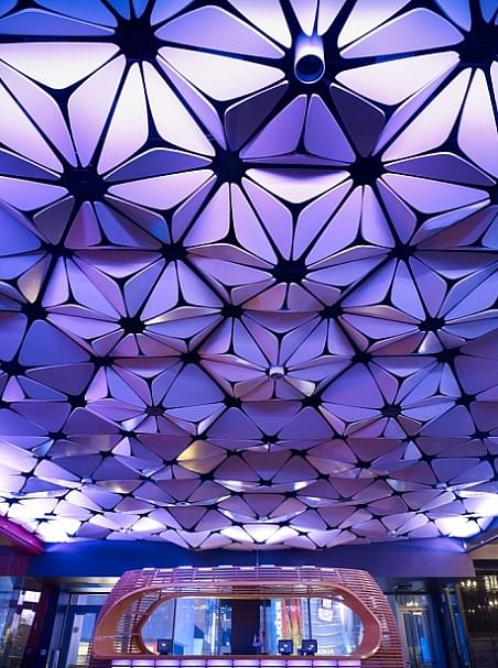
LA Conga Room
- took pattern from rumba steps – becomes floral
- parts of the ceiling are agitated; absorbed more sound per program
- work closely with acoustic engineers
- shoot horizontal lights across patterns to create multi-faceted affects
- pattern of ceiling brought down into a "head dress" above entry
- each person proceeds under head dress when waiting
9800 Wilshire in Beverly Hills (in progress)
- convinced client not to demolish an old building but to bubble wrap it instead
- slump glass – 4’ x 8’ sheets heated and were allowed to slump in formed pattern
- 3 layers – safety and high performance glass
- during design, the building was sold to a new owner who wanted to do a new Spanish or Mediterranean style building
- pushed instead for mechanically ventilated façade over existing building
- spiderwebbing to clear pattern on glass
- sky canopy to conceal HVAC
Conclusion
making technology relevant – performance based, not just off the shelf
This blog will provide a recap of events - lectures, gallery openings, major reviews, etc. - at the University of Cincinnati's School of Architecture and Interior Design. Most entries are written by graduate assistants at SAID; other authors will be noted by post.


No Comments
Block this user
Are you sure you want to block this user and hide all related comments throughout the site?
Archinect
This is your first comment on Archinect. Your comment will be visible once approved.