http://www.linkarkitektur.no/no/prosjekter/oljedirektoratet//
Link Arkitektur as have had both architectural and interior design for this building.
Our solution is unconventional for a state agency. It is fresh and youthful in its design, the client have been forward looking and participated in workshops for the concept.
This have given us a unique collaboration and joint feeling of ownership for the concept.
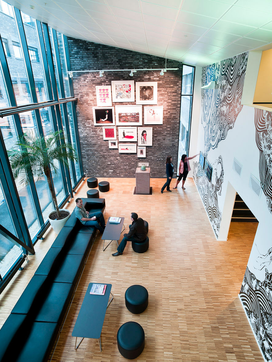
The building is modern both in its exterior and in the internal organization. There are few enclosed workspaces, people work in large open areas that inspire to spontaneous dialog.
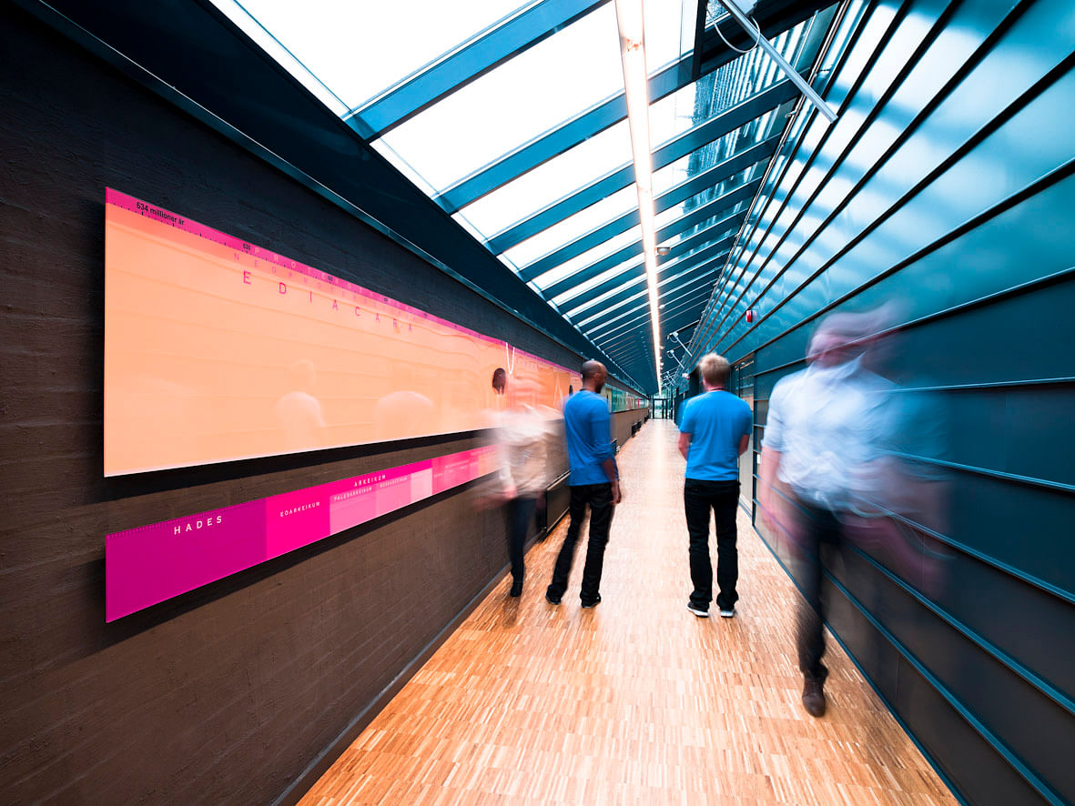
The lower floors in the building have colors corresponding to older periods, while the newest are found on the upper stories. That gives the NPD headquarters a unique identity and distinguish it from other office premises in the area.
“A dedicated design and visual identity are important in creating positive affiliation between the organisation and its employees as individuals,” maintains architect Erik Thesen at Link Arkitektur.
Material usage/façade expression:
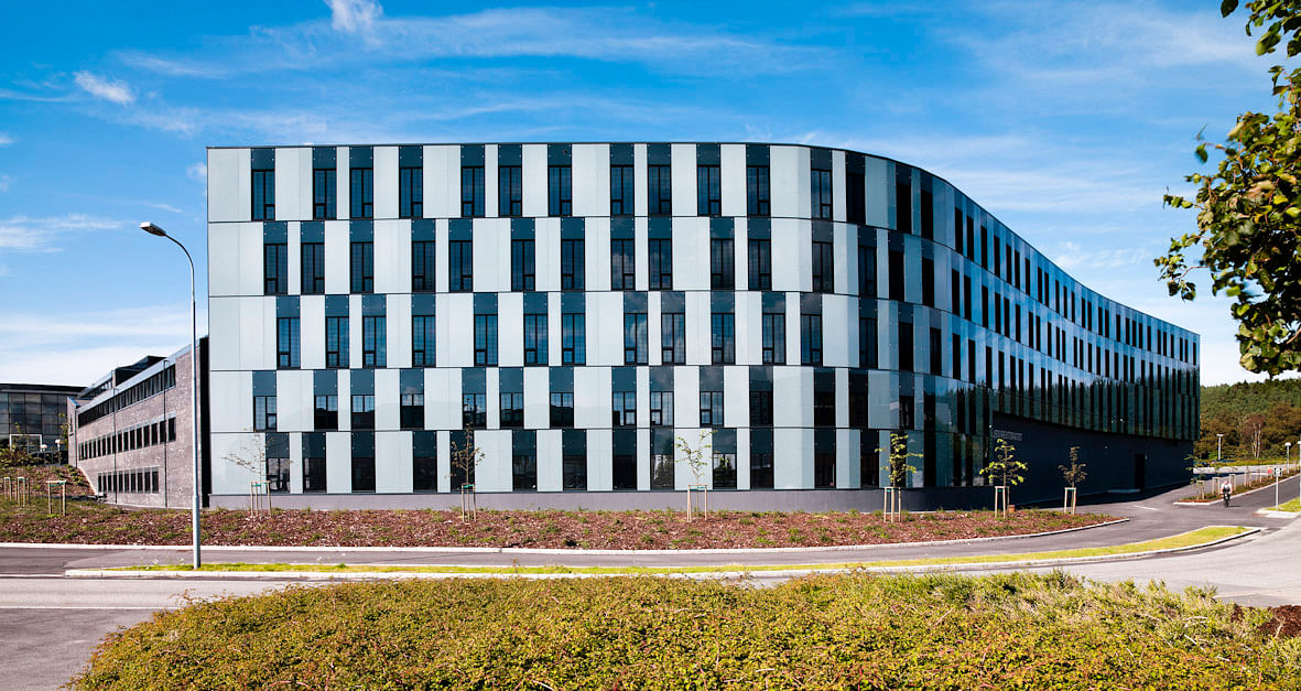
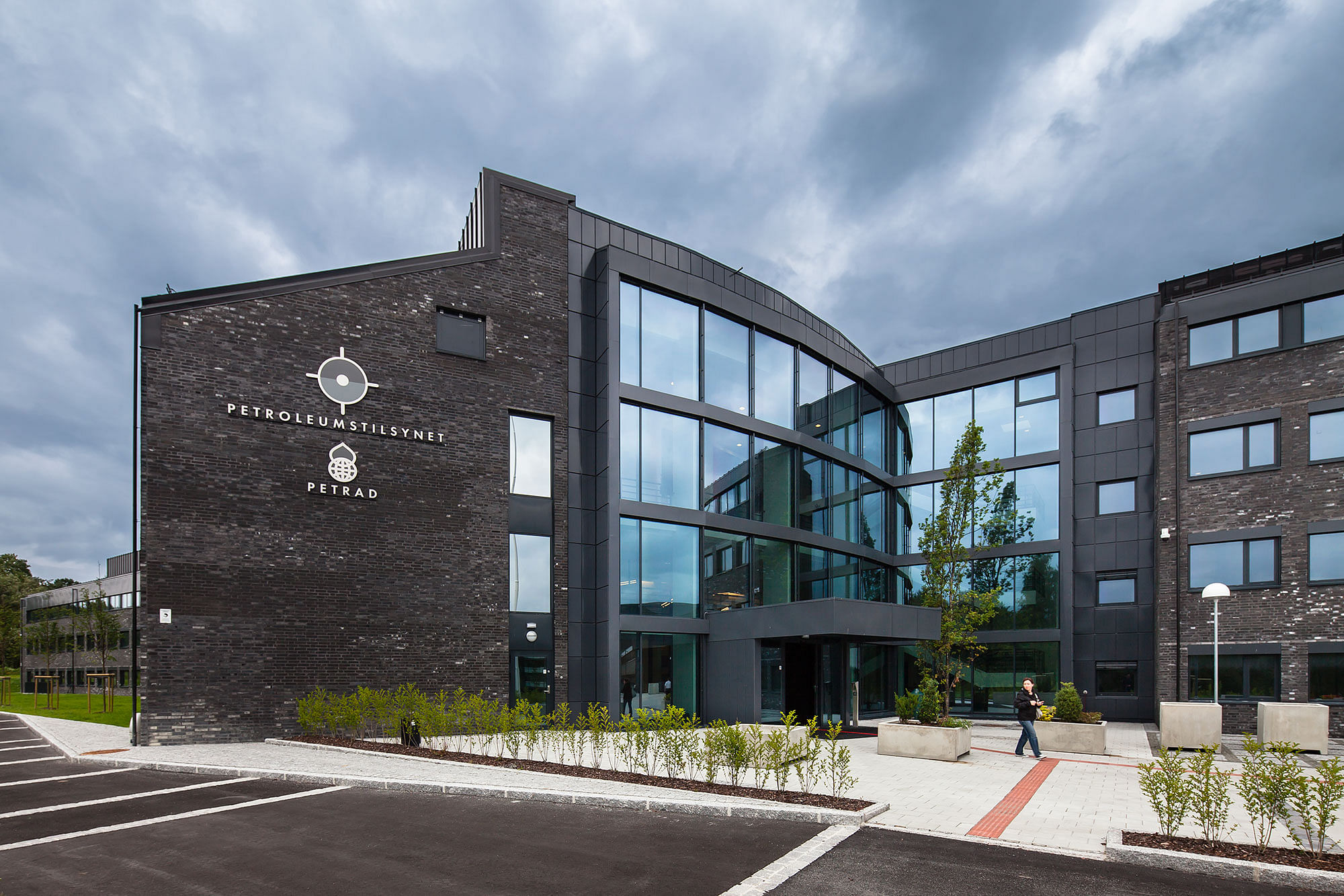
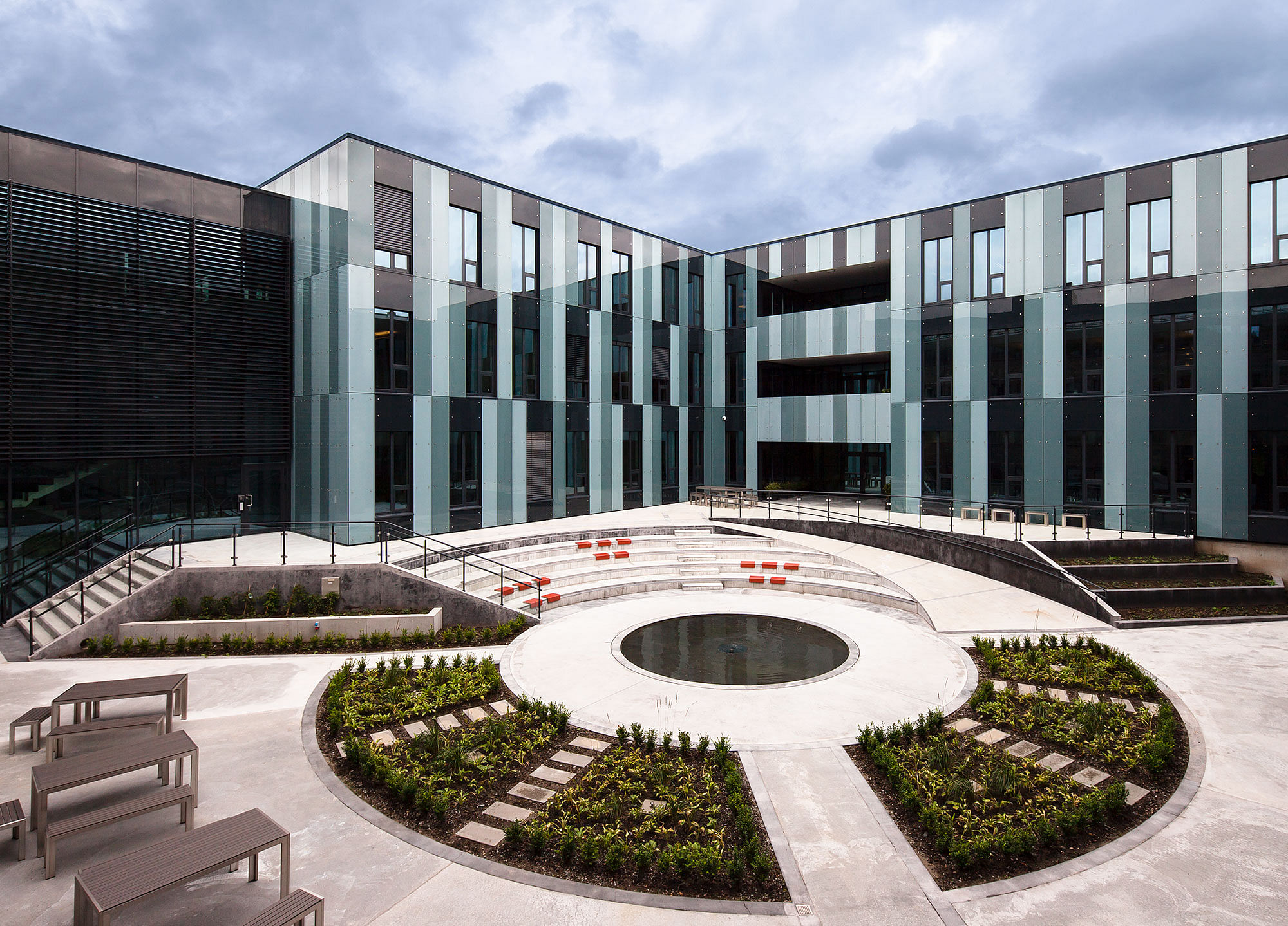
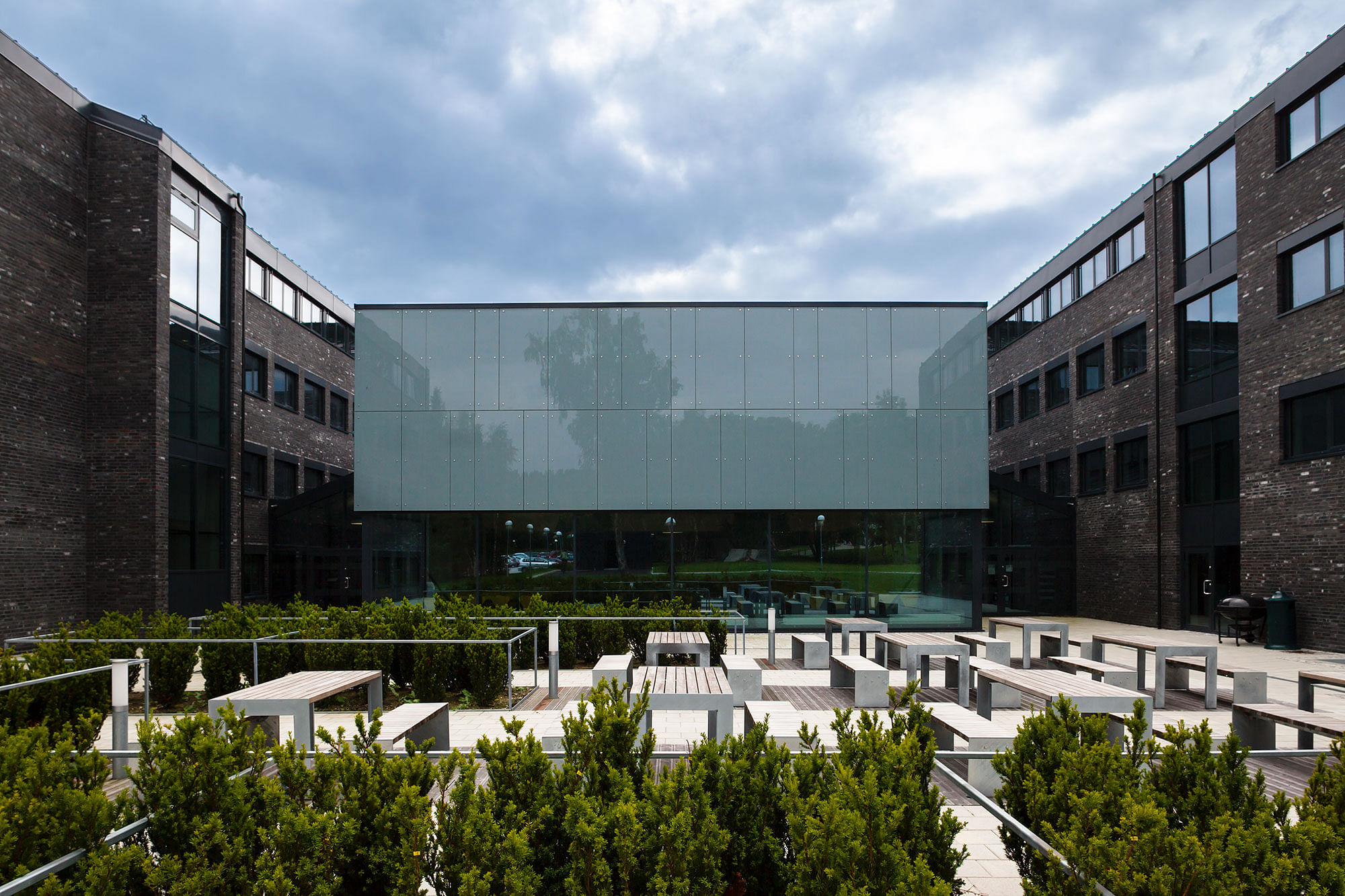
The existing structure is covered with dark bricks in order to preserve the buildings’ massive character. The dark color gives a representative and fashionable expression. The new structures have a characteristic curving glass façade, forming a pleasant contrast to the impressive brick facades. By altering the windows’ positions in relation to the office distribution, we try to create a playful variety along the new facades.
The façade have an irregular pattern that give life and a dynamic to the buildings expression and shows that NPD are a department that are looking into the future.
Interior design:
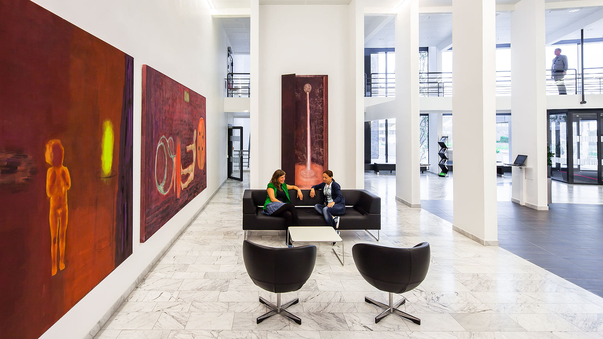
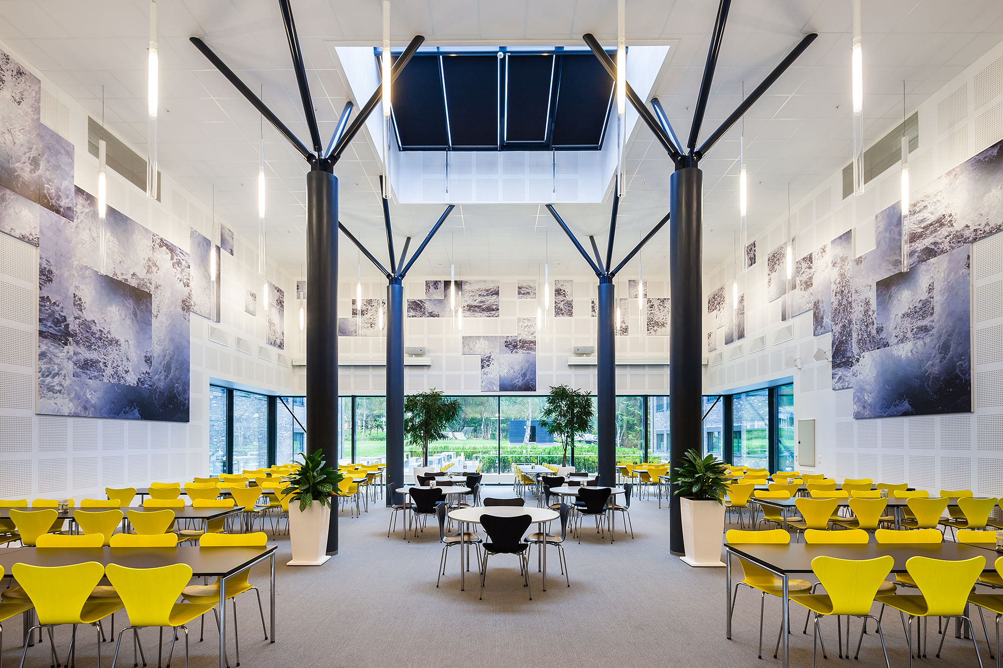
The interior is inspired by geologic timescales, with their respective biological developments and geology. All periods and events are illustrated in their proper official colors. The color setting in the various floors and interiors reflect the colors describing the different geologic periods, determined by the International Union of Geological Sciences. The chosen colors cover the periods relevant for Norwegian petroleum industry; the Permian period in rust-red, Jurassic in blue, Cretaceous in light green and Neogene in light yellow. The colors of the lower floors correspond to the oldest periods, while the most recent periods are placed on top. These colors are used in the cell-offices’ flooring materials and on floor- and stair-indications. The flooring in the cell-offices continues out in the corridor in order to create guiding lines for visually-impaired people. Colored stripes from different periods are used on the doors in the corridors to provide better visibility, to give identity and to split up the long sequence of even doors leading into the offices. This forms an additional, visual expression for orientation inside the building. Inspired by the first living organisms, the interior and the furniture are strict and plain, followed by more playful furniture in selected areas.
We have emphasized design and visual identity in order to create a positive correlation between the organization and its employees. Creation of bright and pleasant areas with variation between offices and conference rooms was important. There has been a thorough and constructive discussion with builder and users, regarding the choice of office solution, work approach, flexibility, room necessities/requirements, colors and artistic embellishment. Effort has been made to guarantee a balance between the enterprises’ unity and proper identity.
Facts:
Architecture and Interior design. Link Arkitektur as
CLIENT: Entra Eiendom
New construction: 15.000 m2
Rehabilitation: 22.500 m2
Total size. 37.500 m2
Completed . 2011
Status: Built
Location: Stavanger, NO
Firm Role: Architect, interior
Additional Credits: Hundven-Clements Photography
Landscape: Multiconsult / Rambøll


")