just wanted to make a home for cool diagrams, analytical drawings, graphic indexices, and information maps - and one of the favorite topics of BLDGBLOG, Pruned, visualcomplexity (the best resource on the web) & others. So let us discuss Tufte, Colin Rowe, Doug Graf, Rem, Tschumi, and Stan Alan who raised the diagram to new
heights.
holz- It's been too long since doug graf parsed mathamatics of an ideal villa in my arch theory at the KSA, good luck.
I've been thinking that landscape urbanism gains much of its power from the poetic diagramming and mapping of dynamic social and natural phenomena. compared the McHargian method of quantifying discreet layers of static information.
it seems to be time to create a congress for landscape urbanism...
A few years ago some guy with too much time on his hands had an elaborate subway / light rail system for Dayton, Ohio all mapped out and published to a slick-looking website made to mimic that of an official transit agency, complete with detailed service maps and fare information. Unfortunately, it no longer seems to be online, but it was quite a trip.
And just for shits and giggles, here's a graphic showing North America's major subway systems side-by-side, to scale.
A sign can be conventional: the word 'dog' is a sign for a furry mammal often used as a domestic pet, but the word 'dog' bears no direct resemblance to that animal. The word 'dog' doesn't look like a dog, or sound like a dog. The sign 'dog' is a convention we use.
An index is a trace of something. A footprint generally indicates that a foot has been there. It isn't just a convention. The pattern made on concrete by the formwork is an index of the process of construction used. A photograph is an index of a certain lighting-situation.
Charles Peirce, the semiotician, made the distinction. Rosalind Krauss, the art historian, argued that the index is key to understanding art of the modern period.
check out this interactive olympic medal map form The New York Times. It displays all the medals won in every Olympic games, with different ways to display them. The New York Times always has some amazing data representations..
Like this one that graphically displays Bush's state of the union addresses and each individual word that he used, when he used it, how often he used it. It's fun to check out the words 'terrorism' 'oil' 'september' and see how they have fluctuated across the years, especially after 2001.
well, these are cool, but they're all so 2d, so planometric. it's interesting how as architects we are trained to investigate and create 3d space but somehow so much ends up being 2d anyways.
also, all the tufte-esque diagrams are great, but i thought this would have something about the index and the diagram in the eisenman sense. i still don't understand what those are and really want to learn about it.
Nicolas alas, we are trapped in the two-dimensional plane of the internets. You would think that it being a series of tubes, we would get at least some semblance of a third dimension, but no.
agfa8x, shall we say that it was Eisenman, following Venturi, Scott-Brown, Izenour, that championed and later revoked the index. Pierce almost seemed like a back-up plan to circumvent the French resistance.
I would also venture that "index" is used increasingly more as a verb substitute for "parse"/"sort"/"understand". This usage seems informed by a greater understanding of the actual working of the internets and how things (browsers/servers) move information.
Stephen Von Worley has figured out that while located in these United States of America, one is always within 107 miles of a McDonald's.
He also created this nifty map to illustrate the concept. According to Mr. Von Worley, "Between the tiny Dakotan hamlets of Meadow and Glad Valley lies the McFarthest Spot: 107 miles distant from the nearest McDonald's, as the crow flies, and 145 miles by car!"

fun with diagrams, indexing, and mapping
just wanted to make a home for cool diagrams, analytical drawings, graphic indexices, and information maps - and one of the favorite topics of BLDGBLOG, Pruned, visualcomplexity (the best resource on the web) & others. So let us discuss Tufte, Colin Rowe, Doug Graf, Rem, Tschumi, and Stan Alan who raised the diagram to new


heights.
Previously on archinect:
Diagrams 1, 2, & 3.
fancy graphics: 1, & 2
Mapping 1, 2, 3, 4, & 5
cinematic maps
books:
Personal Geographies,
Precedents in Architecture, 3rd Ed, Mather/da Cunha's Mississippi Floods,
Cosgrove's mapping, mental maps
Some of my favorite diagrams are indexing is a way of revealing complex or latent relationships and phenomena
to kick it off - the most famous diagram ever:
now for some fun:
[url=http://www.gpsdrawing.com/]fun with gps[/img]
landscape urbanism
marcos weskamp's site
habitat perspectives
news map
social circles
also Brad Paley's textarc
textarc
nice, TK.
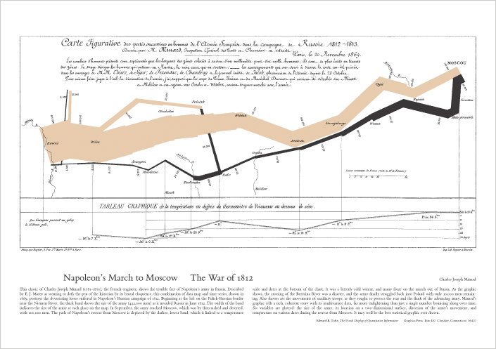
the napoleon poster can be picked up for relatively little on ed's homepage
also, anyone care to help me out w/ rowe's (via eisenman) affect v. effect? pics or diagrams would be ideal...
visualization projects from c71123.com
holz- It's been too long since doug graf parsed mathamatics of an ideal villa in my arch theory at the KSA, good luck.
I've been thinking that landscape urbanism gains much of its power from the poetic diagramming and mapping of dynamic social and natural phenomena. compared the McHargian method of quantifying discreet layers of static information.
it seems to be time to create a congress for landscape urbanism...
ooh, better yet, name it: congress for landscape urbanism and ecology (CLUE)!
or something...
this could be a spin-off thread... maybe.
Steven - brilliant!
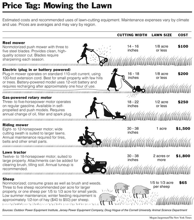
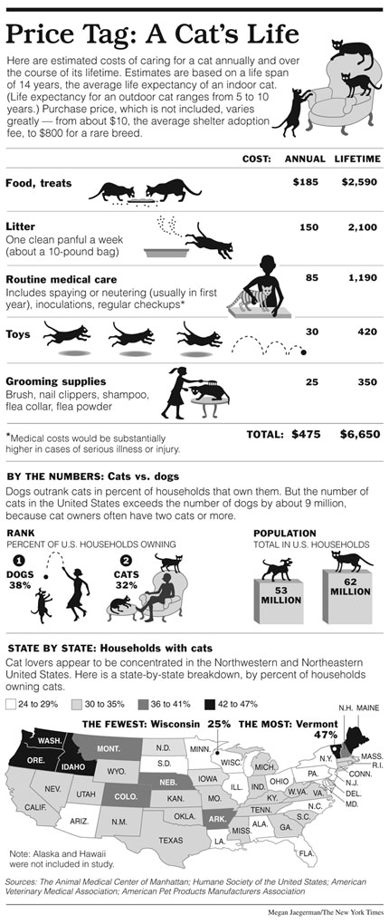
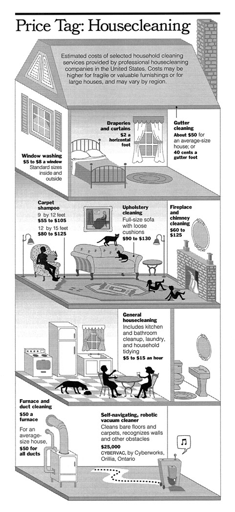
tufte highlighting Megan Jaegerman:


and something I need to do for work:
some recent mapping I worked on for studio this semester.
http://wetwares.org/index.php?title=Scenario_1
found a cool source for historic maps, David Rumsey Historical maps
to add to my long time favorite source the collection at U of Tx...
If Rickie Lee Jones were to have a conversation with Shigenobu Kobayashi, I think it would look something like this:

http://www.telegeography.com/products/map_internet/images/internet-map-2001_1088px.gif
can someone please explain to me what this term "index" is that i keep hearing architecture professors throw around?
I've always been fascinated by various subway and transit maps around the world. Here's a few notable ones:
NYC Subway:
MTA Official Map
Track maps
Historical maps
The KICK Map
Amazing how so many maps can show different aspects of the same transit system, and hardly any of them are geographically correct or to scale.
A few others:
Chicago 'L' route map
Chicago 'L' track map
Washington Metro
Boston's 'T'
London Underground
Paris Metro
Moscow Metro through the ages
Tokyo Metro (Holy fucking shit!)
A few years ago some guy with too much time on his hands had an elaborate subway / light rail system for Dayton, Ohio all mapped out and published to a slick-looking website made to mimic that of an official transit agency, complete with detailed service maps and fare information. Unfortunately, it no longer seems to be online, but it was quite a trip.
And just for shits and giggles, here's a graphic showing North America's major subway systems side-by-side, to scale.
An index differs from an ordinary sign.
A sign can be conventional: the word 'dog' is a sign for a furry mammal often used as a domestic pet, but the word 'dog' bears no direct resemblance to that animal. The word 'dog' doesn't look like a dog, or sound like a dog. The sign 'dog' is a convention we use.
An index is a trace of something. A footprint generally indicates that a foot has been there. It isn't just a convention. The pattern made on concrete by the formwork is an index of the process of construction used. A photograph is an index of a certain lighting-situation.
Charles Peirce, the semiotician, made the distinction. Rosalind Krauss, the art historian, argued that the index is key to understanding art of the modern period.
wow afga that's really helpful thanks! makes so much more sense now...
a score by john cage, thanks to aggegate456's art of notation
I love this blog.
NYtimes -genetic map of europe
Poor Belgians...
check out this interactive olympic medal map form The New York Times. It displays all the medals won in every Olympic games, with different ways to display them. The New York Times always has some amazing data representations..
Like this one that graphically displays Bush's state of the union addresses and each individual word that he used, when he used it, how often he used it. It's fun to check out the words 'terrorism' 'oil' 'september' and see how they have fluctuated across the years, especially after 2001.
well, these are cool, but they're all so 2d, so planometric. it's interesting how as architects we are trained to investigate and create 3d space but somehow so much ends up being 2d anyways.
also, all the tufte-esque diagrams are great, but i thought this would have something about the index and the diagram in the eisenman sense. i still don't understand what those are and really want to learn about it.
Nicolas alas, we are trapped in the two-dimensional plane of the internets. You would think that it being a series of tubes, we would get at least some semblance of a third dimension, but no.
for crowbert,
a third dimension - somewhat
still based on the convention of 'pages'
agfa8x, shall we say that it was Eisenman, following Venturi, Scott-Brown, Izenour, that championed and later revoked the index. Pierce almost seemed like a back-up plan to circumvent the French resistance.
from the institute for systems biology
there were a number of really interesting diagrams and models in this article of Wired.

including this one on tracking airfare:
http://www.wired.com/images/article/magazine/1607/pb_airfares_f.jpg
http://www.wired.com/images/article/magazine/1607/pb_airfares_f.jpg
scientists just have the coolest diagrams
http://www.flickr.com/photos/chakabry/2849857405/sizes/o/
i'm a 'soda' man per my yankee roots. never could fathom the term 'pop'.
fun with gps
diagrams+poetry
any opinions on this?
Is the Economy Getting Ready to Turn Around?
n400 - I was thinking about posting that - I think it only works if it is shown in motion, otherwise it's kind of confusing.
You're right. I should have posted a direct link to the NYT piece.
I would also venture that "index" is used increasingly more as a verb substitute for "parse"/"sort"/"understand". This usage seems informed by a greater understanding of the actual working of the internets and how things (browsers/servers) move information.
You’re Always At Most 107 Miles From A McDonalds!

from consumerist
Stephen Von Worley has figured out that while located in these United States of America, one is always within 107 miles of a McDonald's.
He also created this nifty map to illustrate the concept. According to Mr. Von Worley, "Between the tiny Dakotan hamlets of Meadow and Glad Valley lies the McFarthest Spot: 107 miles distant from the nearest McDonald's, as the crow flies, and 145 miles by car!"
That's quite a drive.
more unique maps at simplecomplexity
treehugger's 22 most amazing maps changing how we see the world


impact of climate change
NPR's power grid maps
& also maps make us greener
by James Corner Field Operations with Diller Scofidio Renfro
Very, very nice.
anything by Michael Sorkin
Block this user
Are you sure you want to block this user and hide all related comments throughout the site?
Archinect
This is your first comment on Archinect. Your comment will be visible once approved.