“I prefer drawing to talking. Drawing is faster, and leaves less room for lies.”
- Le Corbusier
I start my class every year with that quote to explain to these students the importance of visual communications. Since I've began teaching this course most of the students I get have never had to communicate using visual aids like drawings or models. I equate it to learning a different language that they're going to have to become proficient in.
The endgame of this course is to arm them with the weapons of the trade: cad, rhino, adobe, etc... But rather than treat this like a class at ITT Tech, the methodology takes on a design component of its own.

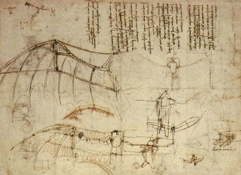
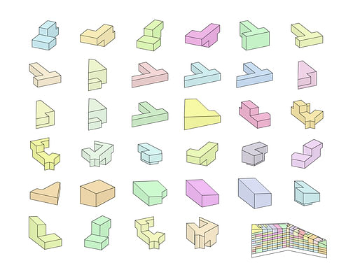
This class draws from a range of inspirations: DaVinci's detailed invention sketches, the diagrams from BIG, Wes Anderson films, IKEA instruction manuals, Archigram, A social history of drafting culture, and the list goes on.

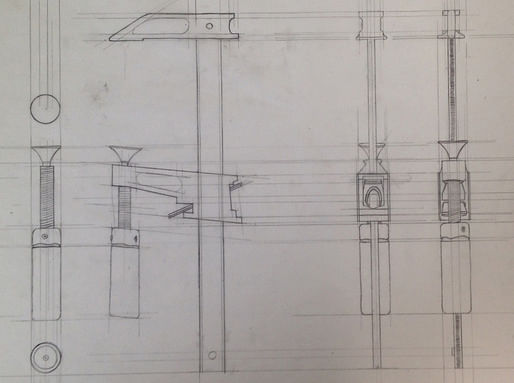
Currently they're engaged in their first assignment dealing with orthographic study of an object. This assignment isn't original; it's been taught at various other schools. But just because it is doesn't make it a bad one. Their requirement is to illustrate movement and describe an object that contains at least two moving parts only through mechanical drafting (no computer yet). As the semester goes on, examples of their work will be included in these posts. Here's a sample:
This blog gives a sneak peak into the architecture world at the University of Miami. What began as an experiment following one group of incoming graduate students through their first semester of design, has morphed into a window of the school of architecture through this professor's eyes. I will try to post as often as possible.
5 Comments
Those random shapes with now context perfectly explain BIG's process: random shape generator machine.
Fuck! from Da Vinci to Bjarke Ingels? Someone is in love with BIG
I would be interested in the questions you get from students who grew up on computers using mechanical means to draw.
Is this a studio section, or a separate course on visual communication? Tackling all this in one semester seems tough if it's course outside studio - but even as only an overview it could be valuable. It takes a while to figure out that the design concept is more than just the drawings, and to anticipate what technique will be the most effective way to develop the design.
Though I disagree agree with Corb: strong imagery is a great way to compensate for weak design!
Sounds really interesting, I am not sure if this post is only to give us a sneak peak and what the course covers and that's all. It would be nice to see more details of the topics covered, examples that supplement the topics and other student work, also if this course is available online etc. Thanks,
Block this user
Are you sure you want to block this user and hide all related comments throughout the site?
Archinect
This is your first comment on Archinect. Your comment will be visible once approved.