New Delhi, IN
A clubhouse designed to provide a ‘Live, Work and Play’ experience to Bengaluru’s young working professionals within a suburban Residential Complex.
Envisioned as a recreational wing for the Orchid Whitefield residential development under wayin Bengaluru, the 15,000 sq.ft. Fields Club offers a wide mix of amenities to young professionals and their families.The design scheme for Fields Club has been devised to speak to the aspirations of this group of professionals –incorporating a rich visual vocabulary, plush materials, and vibrant artworks to appeal to the well-heeled client base.
Whitefield is a suburban neighbourhood in the heart of Bengaluru, one of the city’s most important technological and economic hubs; the locality is home to a predominantly young demographic, with a large majority of them working in the burgeoning tech industry. Goyal and Co, the residential developers behind the Orchid Whitefield project, were keen to develop a distinct identity for the development in order to connect with this client base. This was achieved through a restrained yet quirky spatial expression to help create a design vocabulary for apremium, yet welcoming experience.
With the residential units under construction, the completion of the clubhouse was of great significance for the developer as a marketing device crafted to appeal to a niche demographic. Studio Lotus was hence entrusted with the responsibility of providing a holistic solution for the interiors and the architectural façade of the Fields Club building.
The built envelope planned by the project architects had predetermined locations for the vertical circulation core as well as the orientation of the larger functions such as the badminton court, the banquets halls etc. The size and configuration of these elements, especially the centrally-placed staircase, created significant zoning constraints that shaped the emergent design solution – which was subsequently developed to ensure correspondence of scale between each programmatic requirement and the larger scheme. The second guiding principle for the design scheme was the creation of an intuitive flow and engaging interconnections between the various spaces, in order to curate a holistic leisure experience.
Exploring different possibilities of what the space could offer, the design team mapped user activities to arrive at the requisite spatial interconnections, the circulation scheme, and subsequently the zoning plan. The central staircase hence emerges as the primary focal point – both visually as well as tectonically – with the various activity zones wrapped around this central circulation core, on three different levels. While the ground floor spaces have been planned to serve as a nodal point for the community– accommodatingsocial gatherings,F&B spaces, as well as opportunities for co-working–the more specific zones for play and leisure have been moved to the first and second levels to provide a sense of relative disconnection and quiet. On the first floor are the indoor sports and gaming zones (including a badminton court and a table tennis hall) and an AV room for group usage.The second level houses all the health facilities, including a gym, a yoga room, and a dedicated steam and spafacility.
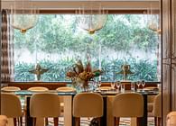
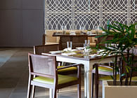
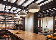
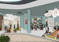
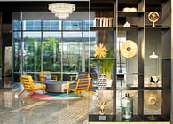
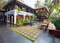
The staircase sits framed in the triple-height atrium, establishing lines of sight to various amenities within the building as soon as one enters the building; at a smaller scale, this interconnection is achieved between the first and second floors through the creation of a double-height space for the badminton court – with viewing balconies looking into the space from the topmost level.The roughly octagonal cut-outaround the central staircase forms the core of the lobby space: the expanse of the lobby houses multiple zones through subtle shifts in the material palette and tectonic layout – such as carved pockets of relatively private F&B seating,a living room-like casual seating area, and an elevated timber platform fronted by the reception desk. The staircase intersects this raised platform, creating quiet spaces utilized as hot-desking zones and reading nooks, overlooking the crèche beyond to enable working parents to stay in proximity to their kids. A café as well as a library unit have been integrated into the lobby space as well, through sculptural inserts in timber. The lobby opens out on the rear to an outdoor seating area, children’s play space, and a private garden; the transition between the built and the open is marked by deep verandas, and full visual access enabled through a glass façade – connecting the outdoors seamlessly with the indoors.
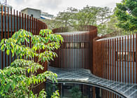
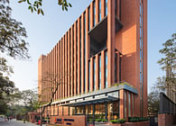
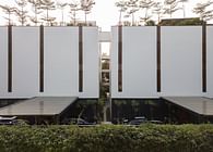
The façade treatment has been devised keeping in mind the placement of the residential towers in the property, the adjacent housing complexes, as well as the need to strike a balance between the privacy and communal interconnection. As a response, an aluminium screening system has been designed as an outer skin to the façade glazing. The intervention comprises a rhythmic arrangement of slats over the glass envelope, with spaces between the slats increasing to accord greater privacy and decreasing where required to create vistas and grant access for outdoor sit outson the clubhouse periphery.
The design brief of the Fields Club aimed to create a relaxed vibe, with a nuanced urbane touch –toexude a sense of understated elegance. The design approach, hence, establishes a minimalistic architectural expression as the core spatial identity, with each subsequent zone layered with distinctive interior elements – be it colours and patterns, material finishes, or tectonic inserts – to enable specific activities.
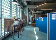
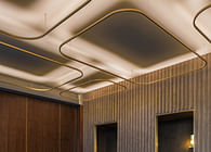
In line with this approach, the ceiling has been stripped bare to reveal the raw finish of the concrete slab; false ceilings have been limited to functional requirements, which has also helped retain the original ceiling heights. Services planning at the execution stage adds to the design outcome, with exposed conduits becoming an intrinsic part of the design scheme. The monochromatic architectural shell provides a neutral backdrop for the vibrant artworks and custom environmental graphics that define the clubhouse narrative; the minimal base also helps highlight the important user touchpoints, which have been expressed through finer finishes in contrast to the shell.
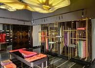
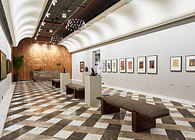
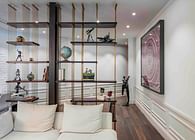
The material palette primarily engages a rich combination of natural finishes – such as concrete from the architectural shell, a tactile paint system, and timber in natural and walnut tones, as well as mild steel, ceramic tiles and marble. Recurrent gestures help create a cohesive narrative through the three floors of the clubhouse. At the ground floor level, this has been achieved through the use of cast in-situ terrazzo flooring –seating pockets on this floor have been delineated through a stone inlay pattern that mimics a notional rug in the terrazzo. The inlay detail in the terrazzo also connects the indoor-outdoor experience between the dining and the veranda, as well as createsentry markers for the banquet hall. This intervention has allowed the spaces to be flexible, free-flowing and maintenance-free. Colour has also been used distinctively in the washrooms and health zone facilities,to introduce a dimension of play and freshness. Another recurrent element is a simplified arch form, manifesting in various sizes and configurations – be it as the porous partition system in the games area, in the design of the gantry atop the café counter, in the metal profile for vanity mirrors in the washrooms, or as balustrade detailingfor the staircase. In subtle contrast to these recurring elements, a wide colour palette of pastel shades and visually engaging patterns helps create a sense of place for each zone. The playful archform is expressed as a porous partition device between the core circulation spaces and the play zone, where it also doubles up as a storage device. The furniture has been sourced frommultiple suppliers, with some of it conceptualized in collaboration with Mangrove Collective, a bespoke furniture design studio and manufacturer from Delhi. Apart from curating the furniture and accessories, specially commissioned mural-like wall art has been executed in collaboration with local artists such as KashmiraSarode and AamboStudio.Envisioned as high-octane illustrations that are inspirational and uninhibited in their use of colours, the artworks addvibrancy to the pared-back ground floor spaces and elevate the gaming experience in the recreation zone on the first level; their incorporation also exhibits a viable model of patronage for local artists within commercial developments.;
The Fields Club aims to offer a space for leisure and recreation to an ever-growing group of working professionals who seek to embrace a healthy work-life balance for themselves and their families — and to restore a sense of community among these residents by offering them a space to congregate, engage and unwind in. The client's feedback has been very positive towards the success of the Fields Club to substantially support their marketing efforts; the resultant space has elevated the notion of the conventional residential clubhouse by creating a differentiated experience, providing directions for future developments by the brand.
Status: Built
Location: Bengaluru, IN
Firm Role: Principal Architect


