New Delhi, IN
As a life on the go becomes the norm, business hotels are on the rise. Catering to the niche of globally-aware young professionals in need of accommodations tailored to their specific lifestyle, the Aloft Hotels by Marriott Group combine design and technology to provide a unique hospitality experience.
Aloft stands for all that is fresh and spirited – a sleek, uncluttered take on work, play and travel. With the objective of creating a loyal client base that utilizes Aloft’s facilities across diverse locations as a contiguous, cohesive experience, the hotels provide pocket-friendly packages without the drawbacks of cost-cutting. The spatial design plays a large part in creating this uniform interface – an approach both explored and subverted at Aloft New Delhi. Designed by Studio Lotus, the public spaces for Aloft at Aerocity, New Delhi bear a distinct spatial identity that interprets the hospitality brand in a unique manner.
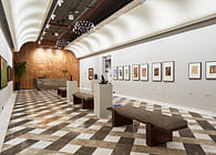
The interior design scheme juxtaposes the uniformity of material and colour with distinct elements for each public zone to create a consistent yet diversified spatial experience. A palette of grey and beige has been expressed through the marble flooring and textured paint, while timber louvers and screens break the monotony and infuse warmth. Lighting fixtures in black metal, plush furnishings in yellow, fuchsia and teal (derived from the hospitality brand’s visual identity), geometric patterns, and brass detailing run as common threads through all the spaces – the variations in which define the narrative for each space. Curated artworks and display pieces punctuate the space, commissioned to reflect the function of the space they inhabit. Following the young, contemporary vibe of Aloft, these pieces have been largely executed in a pop art style.
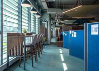
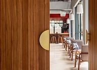
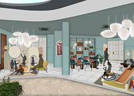
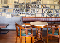
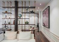
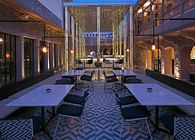
The spaces, spread across the ground, first and third floors of the hotel building, open into a central courtyard – a large sunlit area separated from the floorplates by floor-to-ceiling glazing. As the primary source of daylight, this courtyard becomes the spatial focal point within the scheme. The hotel lobby, placed between the courtyard and the driveway, weaves together small open pockets of recreational activities into a large, free-flowing space. Named Remix, the lobby houses seating clusters, reading nooks, pool tables and hotdesking stations that function together as an open office setup. At the centre of the lobby, facing the entrance is the Aloha desk – the circular reception table that is the staple of each Aloft property. Seating clusters in various configuration – loosely grouped lounge chairs looking out at the courtyard, timber benches in the deli (called Refuel), and ergonomic furniture at the workstations – offer a variety of experiences for the visitor to choose from, as per their current needs. Sleek louvered partitions and mild steel shelving distinguish the lounge areas from the more intimate Café and workstation zones – a distinction heightened by the timber flooring and low-hung ceiling.
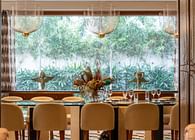
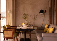
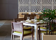
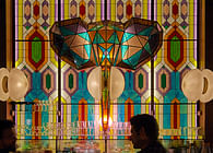
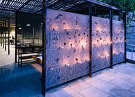
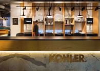
The bar ‘W XYZ’ opens into the lobby, a relatively private zone characterized by a muted colour palette. The shelving backdrop, fashioned after Aloft’s signature vinyl display, has been crafted in painted glass to create a pivoting screen. The backlit screens thus become a fully customizable display, allowing for the shelved liquor to be showcased and concealed at the hotel’s discretion. On the other end of the courtyard is Nook, an all-day dining area. A brightly-lit, expansive zone, Nook creates a communal, home-like experience for the hotel’s patrons who are likely to visit the space upto three times a day. Subtle pops of colour and vibrant artworks populate the monochromatic shell; strategically placed stone counters break the expanse of the space into smaller pockets.
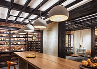
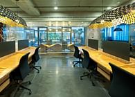
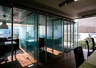
The design vocabulary of the lobby extends onto the first floor, culminating at Tactic, the business centre for Aloft. Tactic comprises several meeting rooms and co-working spaces to accommodate the needs of the hotel guests as well as visitors. Low-height metal shelving runs along the periphery as a subtle yet dynamic spatial marker that transforms with usage – being used by patrons for stacking books, stationary and gadgets when using the space. Two of the ten-seating meetings rooms have been separated by a mild-steel sliding partition, which can be adjusted to create a singular large conference space for larger gatherings; these rooms are separated from the co-working space with glass partitions, with a wide band of frosted fractals running across their middle to provide a modicum of privacy.
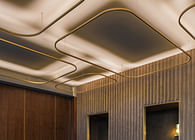
On the first floor is also the Banquet Hall, which has been designed to cater to private celebrations and business events alike. A low-hung space prefaces this hall – a shell of slatted timber has been created to render warmth and intimacy of scale into this pre-function area without making the low head-height discomforting for users. The ceiling of the shell rises to meet the banquet hall in a half-vault, created using exposed incandescent lightbulbs and lined with tinted mirrors. This tectonic intervention allows the user to anticipate the scale of the double-height banquet hall, and also created a small light well for the pre-function space.
The Banquet Hall has been designed to resonate with the youthful brand image of Aloft – eschewing traditional banquet elements such as chandeliers and heavy backdrops to create a space that is sunlit, bright and quirky. The design scheme of the banquet hall ties together three disparate elements to create a distinct space – a bold chevron-patterned ochre carpet as the base layer, acoustically-treated panelling expressed in a muted grey as the second layer, and a timber backdrop on the far side of the room as the third layer. Partially frosted glazing runs opposite the acoustic panel walls, the patterns of the glazing mirrored in the panelling. The timber backdrop and ochre carpeting introduce sobriety and elevate the mood of the space respectively.
The recreation zone for the hotel is located on the third floor, which consists of the gym, the yoga room, a swimming pool and a lounge. Following the design scheme of key guest areas, the gym features a muted shell offset by a green ceiling. Overlooking the hotel’s central courtyard on one side, the gym opens into a corridor leading to the swimming pool on the other side; alternating panels of mirrors and glass along this corridor offer slivers of views into the space, balancing privacy for the user and attraction for the viewer. One end of the gym space houses the yoga studio, which can accommodate upto 8-10 people at a time.
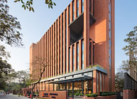
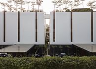
Beyond the gym is the swimming pool; overlooking the courtyard and open to sky, the swimming pool becomes the point of visual focus for the rooms of the hotel placed on the fourth floor and above – creating an elevated recreation hub for the patrons. The pool is screened on one side by a vegetated wall, to offer privacy to users from neighbouring properties – the other side ends in an infinity edge. This edge of the pool is clad with intricate mosaic tiles in the brand’s colours, contrasting vividly with the monolithic white structure of the hotel.
The design scheme for Aloft, New Delhi layers elements of familiarity from the brand’s international presence with smaller resonant interventions within the property – be it the birds in flight etched into the timber panelling at the lift lobby as well as the banquet backdrop, the metal shelving that defines the F&B spaces on the lobby and the co-working spaces at Tactic alike, or the monochromatic chevron-pattern that expressed itself in flooring and furnishings in multiple zones. While each space at Aloft expresses a distinct identity, subtle cues drawn from the brand identity tie them all together.
As customary for each Aloft property, Aloft New Delhi contains the gamut of public spaces that define the brand’s hospitality programme; each Aloft in the world consists of a Nook, a Refuel and a Remix. However, by virtue of its design alone, Aloft New Delhi offers an experience that differs from the rest and works in tandem with its specific context – its location, the configuration of the building, and its clientele – without relinquishing its ties with the parent brand, creating a unique hospitality experience.
Status: Built
Location: Aerocity, New Delhi
Firm Role: Interior Design (Public Spaces)
Additional Credits: Design Team: Asha Sairam, Pankhuri Goel, Palak Mittal


