Archinect
Rand Elliott Architects

Rand Elliott Architects

Oklahoma City, OK

anchor
As one leaves downtown the PLICO building acts as a lantern to the city energy.
16 more images  ↓

PLICO at the Flatiron

Description:  Built in 1924 by C.F. Meadors and originally the Como Hotel, this historic blond brick flatiron stood vacant and boarded up for 27 years.  We have been waiting for 20 years for the opportunity to bring this corner to its full potential.  We believe this corner should be the site of an enduring building, a lantern at the east gateway to downtown Oklahoma City.  The project includes the renovation of the two-level flatiron building and the construction of a modern, yet complimentary rooftop addition.   

Flatiron History:   The “flatiron” term originated around 1740, describing a cast-iron clothes iron, forerunner to the electric iron.  Most were triangular, making it easier to iron around buttons.  By the mid-19th century, the term had been ascribed to wedge-shaped sites and buildings. 

The 1902 Flatiron Building in Manhattan (the original Fuller Building) at 23rd and Broadway made the shape famous.  Found in cities around the U.S., iconic flatiron architecture is sought-after and illustrates purity, stability and strength.

Oklahoma City Flatiron History:   The area’s historic triangular buildings were built soon after OKC’s electric streetcar routes were drawn a century ago.  The Harrison-NE 8 Route cut a diagonal path from NW 4th Street east of Broadway to NE 8th at Stiles Park, west of Lincoln.  The four surviving historic triangular blocks form the core of the city’s emerging Flatiron district.  Streetcar tracks are still clearly visible under the adjacent railroad overpass.

1924 Flatiron:  The renovation of the existing two-level and the addition of a third for a 1924 flatiron building into an office for PLICO, an insurance company serving physicians and other professional groups. 

Rooftop Addition:   The third floor will be used for company functions including a boardroom, conference room, rooftop terrace, a kitchen and space for future growth of the company.  The design approach is to make the new third floor addition a modern feature and a respectful, complimentary addition to the existing building.  The third floor is differentiated from the existing brick building through materials and setbacks, and relates to the Flatiron building in shape, scale, color and detailing.  Spectacular views of the Downtown skyline are rare. 

Architectural Concept Points:

1.  Create a gateway project into Downtown.

2.  Create compatible scale and proportion.

3.  Provide light-filled space.

4.  Compliment and match compatible historic details and 21st century needs.

5.  Create a sense of celebration about our community.

6.  Create a signature project.

Details:     

1.  Clean brick.

 2.  New historically accurate windows

3.  Sidewalk planters and landscaping.

4.  Adjacent parking on the street for 20 and additional parking available nearby. 

 5.  We envision street lighting, accent building lighting and glow from the building interior to create a “lantern” on a very important corner of Downtown.

6.  Remove a portion of the sidewalk at the corner for an in-ground planter.  A triangular lighted pedestal sign shall be placed at the “sharp” corner of the site.

7.  The rooftop deck has a 50% open glass screen to mitigate sun and wind.

 
Read more

Status: Built
Location: Oklahoma City, Oklahoma, USa
Firm Role: Architects
Additional Credits: Photographer: Scott McDonald, Gray City Studios
General Contractor: LINGO Construction Services
Civil Engineer: Johnson & Associates
Structural Engineer: LINGO Construction Services
MEP: Alvine Engineering
Audio/Visual: Audio Visual Designs
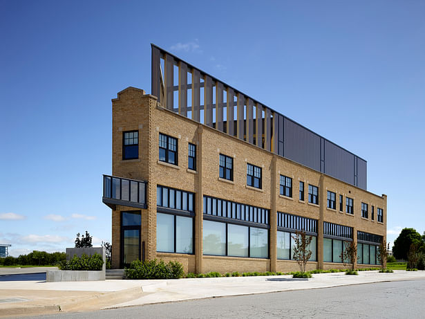
 
The view across a five-street intersection shows two historic flatiron buildings in dialog.
The classic flatiron view including the new 3rd floor addition and enhanced main entry door canopy.
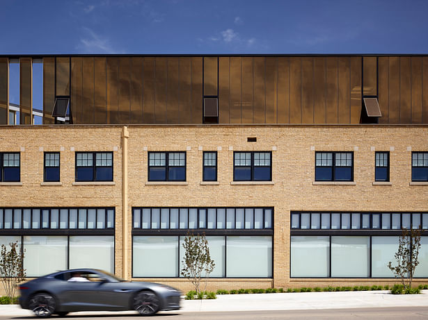
South elevation illustrating the 3rd floor glass addition and the protected outdoor deck. Triangular shaped down spouts show consistent detailing.
South elevation. At early dusk the building begins to glow.
South elevation showing the renovated 1924 building and the new gold glass addition. Note the triangular downspouts.
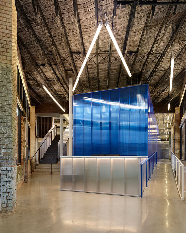
View from the flatiron entry towards the reception desk. The blue polycarbonate office core defines new vs. historic. The original exposed metal lath and concrete deck above remains. Floors are polished concrete.
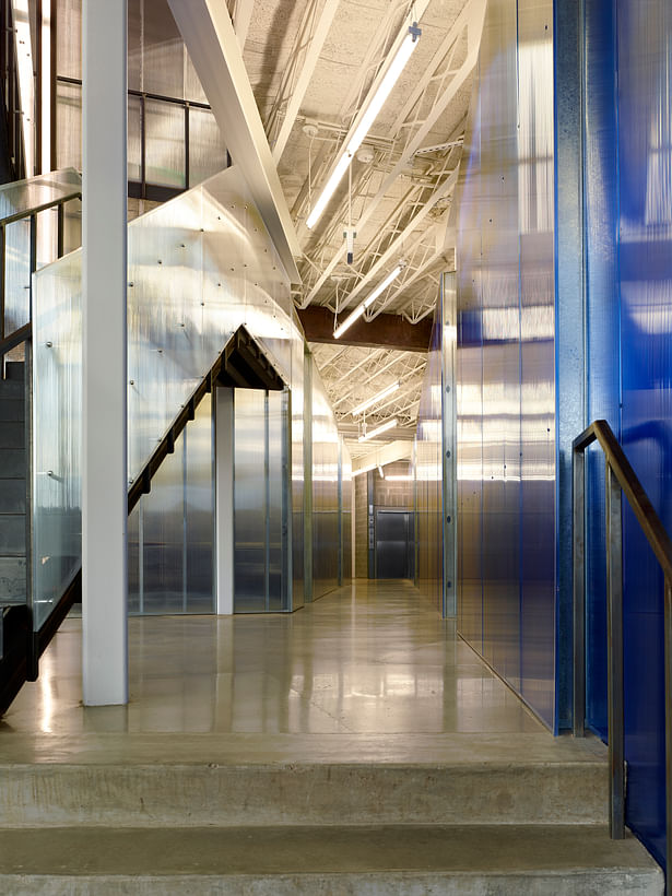
The blue polycarbonate defines the office space edge. The historic structure is painted white beyond beam number one to improve the lighting reflectivity.
The existing clay tile firewall at the historic stair remains in place.
ADA ramp is placed along the south elevation.
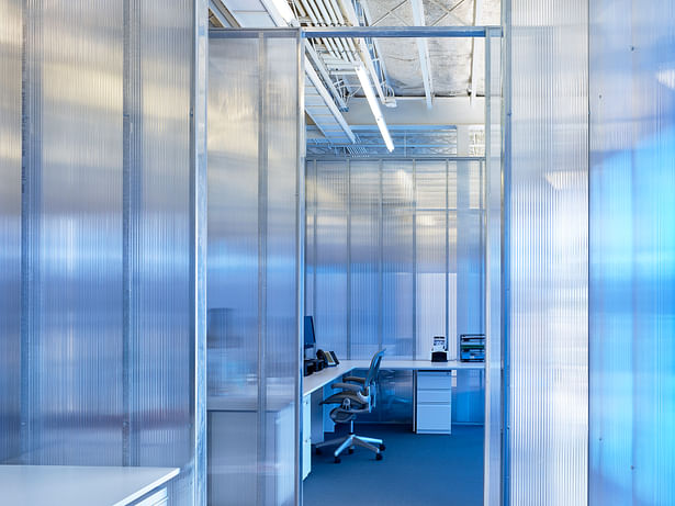
A typical open office space created by clear polycarbonate panels. The perimeter blue panels provide a softened blue hue.
The ladies room is also home to the fire protection valves.
Folding steel plate stair detail.
2nd floor overlook at ceremonial stair.
Originally intended as growth space the second floor’s north east corner has become a multi-purpose room. It has become a yoga space or a dining room for thanksgiving lunch.
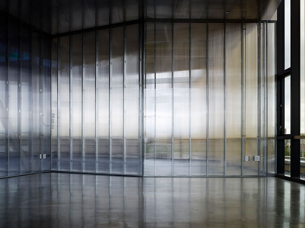
The 3rd floor multi-purpose room becomes an artistic volume with the late afternoon sun. The awning windows pushed open reflect the rooftop river rocks.
3rd floor boardroom enjoys the western exposure and access to the protected outdoor deck.