Archinect
Rand Elliott Architects

Rand Elliott Architects

Oklahoma City, OK

anchor
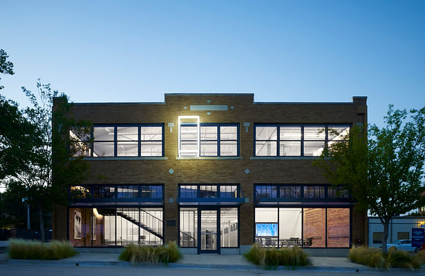
The restored south elevation of the Sharp Auto Supply Co. building. Details include modern roof downspouts, new sidewalk and landscaping, new first floor canopies, and sculptural light box extruding from the second floor window. This object symbolizes the concept of construction with exterior changes and interior changes.
14 more images  ↓

Lingo Construction Services

Description:  Located in the historic Automobile Alley District of Oklahoma City the design seeks to transform an existing 1930 historic masonry and steel building into a modern office space. The character of the 12,000 sq. ft. two story building, originally built for Sharp Auto Supply Co, had been diminished by thick layers of paint, historically inaccurate additions, and years of misguided design efforts.

Architectural Concept:  Our concept for the project is called X-Ray. To create an architectural portrait of the company we imagined explaining that the construction product is about its process. By showing what is inside the wall, we can communicate the importance of the details, those seen and those unseen. The project is a celebration of construction and those who build. Clear polycarbonate walls and roofing combined with shadows created by natural light reinforce the “x-ray” concept.                     

Project Goals:   Restoring the historical integrity to the original structure both internally and externally is central to the project. Once complete, the design seeks to gracefully insert new elements, such as walls, beams, and ceilings, treated as if they were “x-rayed” versions of typical construction methods. This approach exposes the internal framing and building systems through the use of clear polycarbonate panels rather than hiding all elements through typical opaque gypsum board for all to see. This approach allows one to understand how the building is put together and how it functions. The selective addition and placement of new walls stand in a harmonious contrast with the existing structural elements, which remain. Our concept allows construction to be visible.

Program Requirements:  A two story entry and lobby space is filled with natural light from the south-facing storefront and skylights in the existing bowstring truss roof make the transparency of the building is evident before entering the building. A new sculptural steel stair cantilevers overhead, physically, but not visually separating the offices from the adjacent lobby space.  A high level of craftsmanship insures the exposed elements contribute to the overall understanding of the construction process. The expression of the construction process is continued outside, where the north-facing deck provides a visual understanding of “stick framing” as well as a comfortable shaded area for a place to pause.

 
Read more

Status: Built
Location: Oklahoma City, OK, US
Firm Role: Architect
Additional Credits: General Contractor and Structural Engineer: Lingo Construction Services
Mechanical: Wattie Wolfe Co.
Electrical: Osborne Electric Co.
Plumbing: Goforth Plumbing & Mechanical, LLC
Landscaping: GreenShade Trees, Inc.
Photographer: Scott McDonald, Hedrich Blessing
Lighting: Elliott + Associates with Smith Lighting Sales, Inc.
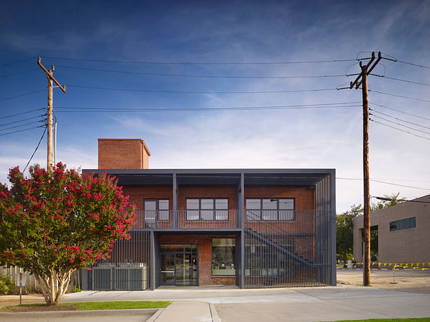
 
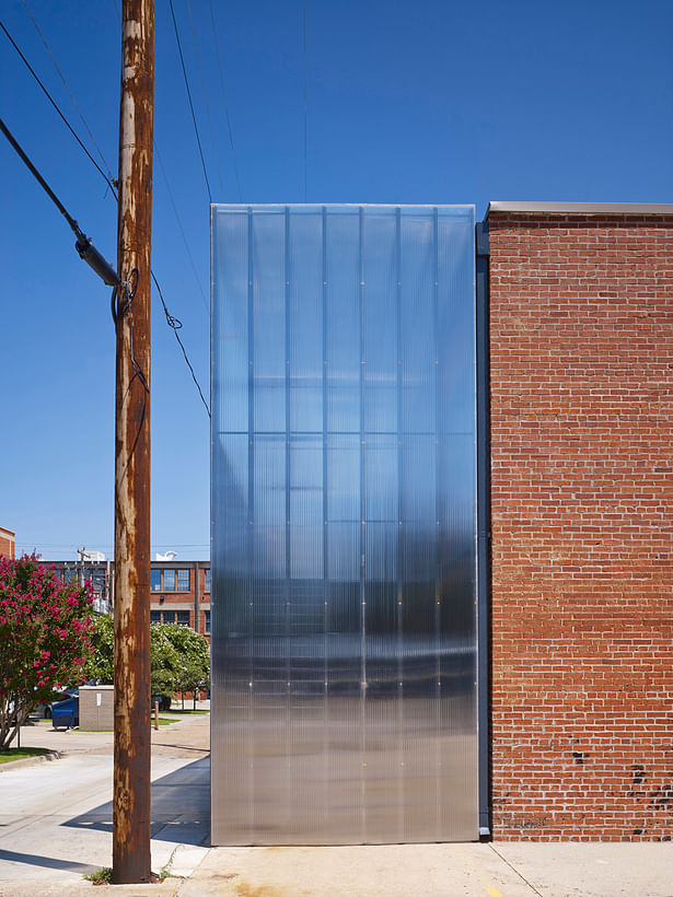
The building covers the entire lot. There is 10 feet of additional space on the north end that allowed us to construct a fire stair, mechanical enclosure, and covered outdoor deck. This exterior construction made it possible to leave the interior intact. The open framing is consistent with the exposed studs on the interior that dramatizes the construction behind the walls.
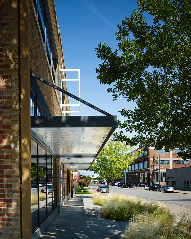
Canopy detail looking east. The canopy is constructed of steel plate with translucent polycarbonate infill. The company logo is installed on the entry canopy and the sun casts a shadow of the logo onto the sidewalk below. The presence of the open box in the daytime is as mysterious as it is at night.
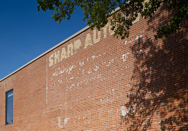
Partial west elevation showing the original ghost sign still in place. New windows were added on the east and west which were surfaces that were once adjacent buildings.
This is the northwest corner showing the polycarbonate addition on the north side. We embraced the alley aesthetic.
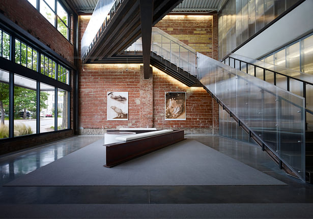
The main entry lobby view looking west. The original building includes 50 foot spans with large steel beams. Since our client is a structural engineer, we embraced the structure as a signature for the company. The seating was an internal competition with the construction company staff.
Main lobby view looking east. Historic steel beam is exposed and supports a new steel stair and bridge. The clear polycarbonate walls expose all of the internal construction. A clear illustration of the x-ray concept.
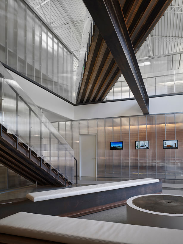
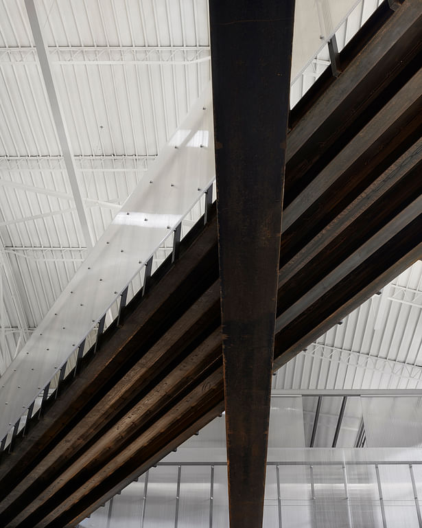
View from below of the new steel bridge and historic wide flange beam. We left the steel exposed and waxed it to keep it from rusting. The 1930s bowstring truss ceiling and deck is visible.
Ground floor stair landing view of the folded steel stair and shop markings.
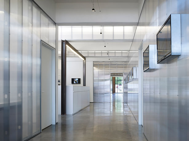
Main entry gallery with polycarbonate panels over steel studs. Project images are in a slide show on the plasma screens on the right. The steel portal defines the serving kitchen. The original beam structure remains and we added a lighted translucent duplicate to house lighting, fire protection and HVAC.
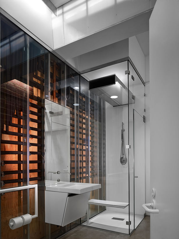
In the spirit of exposing the construction components inside walls, we chose to expose all of the refrigerant lines for the mechanical systems behind glass in the ground floor toilet. Note the duct penetrates the shower enclosure both for air delivery and lighting. The custom ADA handrail/toilet paper holder illustrates the quality of detail throughout the project.
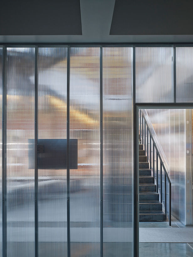
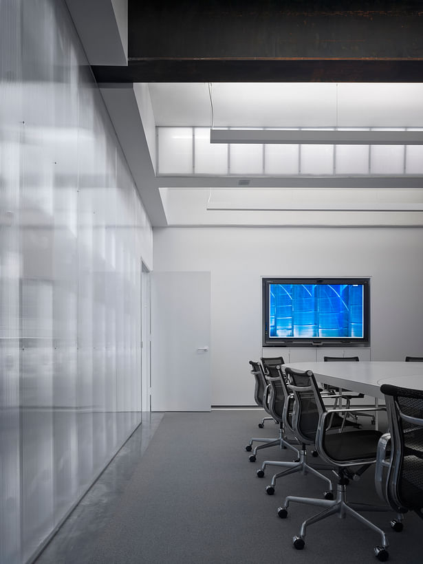
View from main conference room looking west at new folded steel stair. This image illustrates the beauty of the transparent polycarbonate and its reaction to light and surface.
Ground level conference room looking north. Conference table has lighting underneath. The new polycarbonate beam / light is exposed as well as the indirect room lighting. Clear polycarbonate separates the entry gallery from the conference room.
The entry lobby overlook showing historic beam pockets on the left, the 1930s bowstring truss roof, and the new steel and polycarbonate bridge.
The 2nd floor workspace corridor is asymmetrically placed in order to take advantage of the existing skylight locations. The polycarbonate is transparent, reflective and private all at once.