anchor
Ahead of Its Time | An Icon Goes Digital

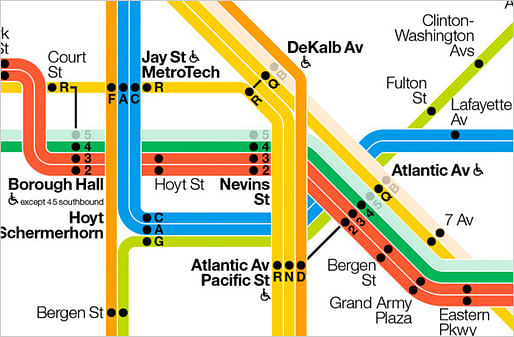
The interactive subway diagram that was designed by Massimo Vignelli, Beatriz Cifuentes and Yoshiki Waterhouse for The Weekender Web site of the M.T.A. offers riders information — driven and updated by live data — on planned weekend work projects that will affect subway service. At any point, the diagram can be clicked, zoomed, panned or expanded to full screen. In this screen, the B and 5 lines are shaded to indicate a weekend service interruption. (Image via NYT)
In 1972, Massimo Vignelli designed a diagrammatic map for the New York City subway. It was a radical departure. He replaced the serpentine maze of geographically accurate train routes with simple, bold bands of color that turned at 45- and 90-degree angles. [...] Its abstract representation of the routes was elegant but flawed. To make the map function effectively, a few geographic liberties were taken, something that didn’t sit well with New Yorkers.
— tmagazine.blogs.nytimes.com
Similar articles on Archinect that may interest you...

1 Comment
The whole point of the map is that it worked in a media that had no "zoom" (the poster). If the online map were just a zoomable geographic map, you can resolve to the complexity of certain nodes just by pinching your fingers on your iPhone.
Block this user
Are you sure you want to block this user and hide all related comments throughout the site?
Archinect
This is your first comment on Archinect. Your comment will be visible once approved.