
Today is Flag Day in the United States and in celebration of the country’s first adoption of the national flag as a symbol of unity in 1777, we’ve decided to present some of the select architecturally inspired works of the Italian-born graphic designer Federico Babina.
Babina describes his approach: “I like trying to explain the world I see through different techniques of expression.” Indeed, as Jasper Johns' own six-decade experimentations in vexillography showed us, flags are as much cultural symbols as they are communication devices to be manipulated by various (and sometimes opposing) parties in order to accomplish different political and social aims.
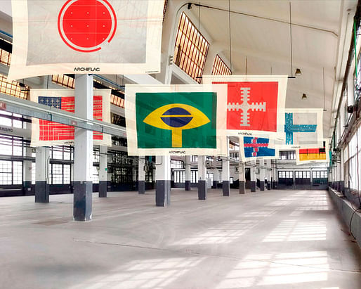
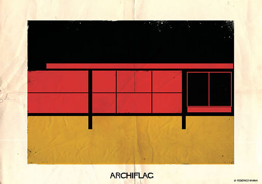
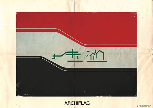
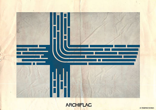
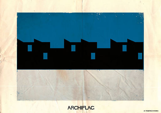
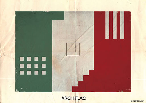
Babina crafts his own versions of national standards using elevations, section drawings, plans, and silhouettes that are sometimes representative of each country's endemic architecture to give forms which, in turn, fit into the visual field to create imaginative counternarratives to a world seemingly more sordid and conflict-prone by the hour.
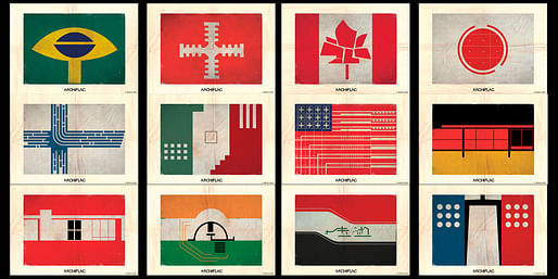
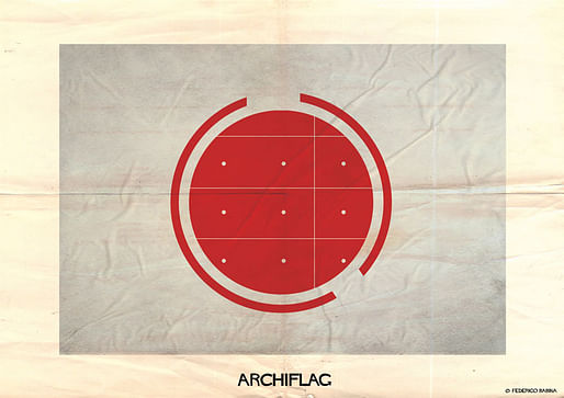
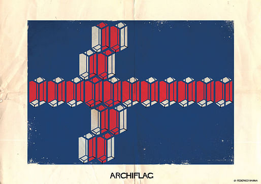
Below, you can view our selections from his new 23-count ARCHIFLAGS series. Each illustration, he says, evinces "architectures that bypass and blur boundaries." "Flags that wave lightly without the weight of symbols that too often burden them with erroneous meanings," he adds finally. Scroll down to see some of his theory's best examples.


3 Comments
These are fantastic. Beautiful and smart.
Great work, but the brand-y moniker is a distraction.
Very cool!
Block this user
Are you sure you want to block this user and hide all related comments throughout the site?
Archinect
This is your first comment on Archinect. Your comment will be visible once approved.