
Five design proposals have been unveiled for the Bezos Learning Center at the National Air and Space Museum in Washington D.C. The $130 million Smithsonian scheme, funded by a $200 million donation from Amazon founder Jeff Bezos, will serve as an education center on the topics of air and space exploration.
The center will be built on the site of a recently-demolished glass pyramid pavilion designed by the late architect Gyo Obata, which opened in 1988. In its place, the Bezos Learning Center will measure approximately 50,000 square feet, holding restaurants, exhibition spaces, a rooftop terrace, and a public observatory.
The five proposals have been made publicly available for comment on the National Air and Space Museum website until September 19th. While the architectural team behind each scheme remains anonymous, the scale and profile of the commission has no doubt attracted some of the largest names in the industry.
A timeline for the selection of winners, and a program for construction and completion, are yet to be announced. In the meantime, feel free to speculate on the authorship of each design, and name your favorite, in our comments section below.

56 Comments
What a sh*tshow. They all look like undergrad thesis projects at some second or third-tier school where the teacher hectored the students to make "expressive" designs.
Does Bezos get to pick the winner? Several of these look like naked attempts to appeal to his appetite for weird buildings.
"They all look like undergrad thesis projects" Yes, because the 'craps' school of design is so arbitrary and capricious that one can't recognize the difference between a seasoned architect and a student if it weren't for the splashy graphics. That said, I'd go for the egg shaped one. With a reflective skin, it might have that effect of the egg in Chicago's waterfront park. This is assuming the program can be elegantly handled by a variety of 'who gives a shit' sculptural forms. 777
A - BIG
B - Snohetta
C - MAD
D - Morphosis
E - thinking face emoji
John is right.
No. Flip B and D. Morphosis has been doing that sculpted precast for years.
E is Adjaye
yes
A is BIG maybe C is Renzo Piano
C could also be Foster
A kind of feels like DS+R. Has their black line rendering style.
I think E is BIG. If you look at the full proposal on the museum website, the building has a nickname and little logo, just like BIG likes to do.
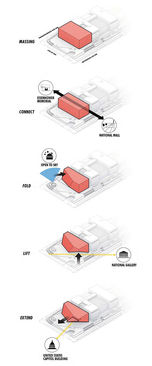
Diagrams are the give away. A is DSR and E is Morphosis. D is the biggest question mark to me, it's like a knock off BIG.
Only two of these guess are correct. The rest didn’t make the shortlist or weren’t even invited. But these comments are funny.
wadetown/miesian make a good case; A is probably DS+R
I think D is BIG. And A, I agree that it is DS+R
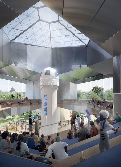
nothing is more base than having a public institution sell itself out to a billionaire, not only naming the center after him, but displaying his private rocket-dick toy on the national mall.
what a disgrace; we've come a long way from the east gallery.
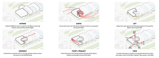
p.s. are we still doing this operational diagrams and pretending they offer any sort of intellectual contribution to the project? spin! carve! twist! lift! bend over!
Totally agree. At least Firms B and E didn't put the penile projectile in their renderings.
First impressions:
A: BIG (it's got a big dick in the rendering)
B: Morphosis
C: Foster
D: HOK
E: Snohetta
Now I'll go read the 12 comments above me and see where I'm going to rethink!
I should say, D is HOK or some other alphabet firm that got invited because they're big and connected. It's got that look of a corporate firm trying to stretch.
Yes,I could see someone pushing for HOK as "the architect of the original building" to get a chance at doing this thing. Of course, most of the HOK team of the 1970's is probably by now retired or deceased.
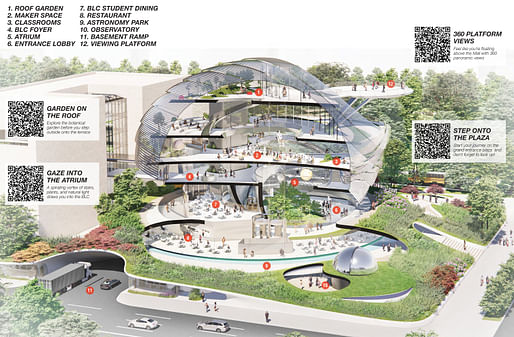
Also, I'm pulling for Scheme C at this point, based entirely on a rendering that was not included here, that I find captivating for its yonic energy:
C has to be Renzo . it has all the Renzo items. The landscaped ondulating roof San fran science center and the winery, the cantilevered platform at the race track in Italy I think. and of course the spherical form he just did at the LACMA movie museum.
Except Renzo stopped doing competitions like this years ago.
A Steven Holl
B Morphosis
C Gehry
D BIG
E David Adjaye
A can't be Holl,no water color.
Pretty sure about this:
A. Student Entry (I hope, and if so, good for them)
B. Snohetta (SFMoMA replica)
C. MAD (they only do swoopy space orbs regardless of context)
D. NBBJ / HOK / SOM / HGA / DLR joint venture
E. [no guesses- but I'm legitimately curious]
A. REX (2nd choice: BIG)
B. Morphosis (2nd choice: Snohetta)
C. NBBJ
D. HOK
E. Snohetta (2nd choice: Kuma)
I'm a bit skeptical that a Chinese firm would be considered for a major project in DC - not in this political climate. Granted, MAD has American projects and an office in LA but there's a difference between a major civic building in the capital and an office tower in Denver!
A - No idea, but it's way undercooked for a starchitect.
B - Morphosis
C - MAD
D - Snohetta
E - BIG
A - DS+R
B - BIG
C - MAD Architects
D - 3XN Architects
E - Morphosis
haha Morphosis gives itself away way to easily. I like it though.
(Thanks, Donna)
I'm curious what should go there, given site, program, and context.
Observation: DC is kind of cluttered and boxy. It's been decades since I've been there.
Imagine 5 medical doctors giving you 5 wildly different diagnoses based on the same information
That could be scary to experience as a patient. But architecture isn’t medicine.
A - cant be BIG seems awfully conservative (old) HOK maybe
B - Morphosis (sure thing)
C - Renzo Piano (pretty confident)
D - DS+R (Broad LA vibe) maybe
E -Adjaye (gotta be)
It’s amazing how out of scale the majority of the submissions are with the exception of E. That’s the only one that actually pays attention to context, scale, and material and uses that along with the mission of the new building to create something new and innovative. It’s actually the most timeless of them all.
A. Is a complete travesty and a waste of everyone’s time! C. While the ground plane is cool, the rest has harboiled egg vibes and will feel dated in the not too near future. B. Definitely has to be morphosis, and sadly feels like a rehash of some of their past projects. Would have been nice to see a fresh take for this specific site. D…..yawwwwwwnnnn.
Don't quote me here:
Snøhetta or another Scandi firm
Morphosis
MAD
3XN
Last one's probably Adjaye with an outside chance of ZHA. None of them can be BIG as there isn't mistakenly an image of Baltimore's skyline in the render background.
A has Planet Of The Apes vibes.
this guy fasho
A > Very Firm Dick Bush Assoc. VFDBA
B > Dick Bush & Son
C > Dick Bush Dick
D > Dick Dick Dick BushDick
E > Dick Bush & Dick Bush Bros.
Blank Gehry got it right:
The rendering in the post for E is attractive—and deceptive.
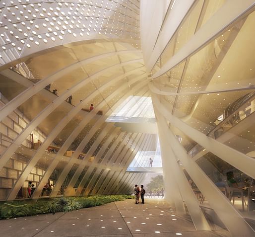
Still, the building will present varying presence with the changing light, inside and out. Nebula is an apt metaphor for the program and the handling here is distinctive without being too literal or simple or obtrusive or heavy-handed.
It is quiet and subtle and doesn't conflict with anything that surrounds. It picks up and repeats the line of boxes from the rest of the Air and Space museum, providing closure and at the same time opening the building up, this opening thematically appropriate for what it is. And it provides a dynamic curving shape that complements the curving Native American museum, across the street. It keeps to the grids of the museum, of Washington, of the universe, and opens them up in questioning and takes us beyond.
The description is a good read, and you see how they worked out the program:
https://airandspace.si.edu/sit...
And I'm guessing Snohetta as well. They do stuff like that. Cf. the Teddy Roosevelt Library. I do like this. I hate their SFMOMA addition, however. It reminds me of this:
As does the Firm B proposal.
I assume we'll get a follow-up post. I'm really curious now. I'm also curious about the public opinion they seek and how much sway it has.
Compare:
(Morphosis)
E also picks up the stone pattern of the original:
And dissolves it as the building rises:
OTOH Plan C ("Mission Control") has a very high I-want-to-go-inside-that-thing-and-walk-out-on-the-platform factor, thus might prove a big draw. I'm not a fan, but it's where we are now.
https://airandspace.si.edu/sit...
Its glass pavilion extends the pattern of solid and glass volumes that march down the historic NASM’s existing façade. But this expressive addition stands out as a beacon of curiosity and wonder, just as a spaceship that has landed on Earth, its impact rippling into the landscape. In that respect, the BLC’s architecture will inspire generations of instructors and students from DC and beyond to unlock discoveries in the fields of science, technology, engineering, arts, and mathematics.
Yuck. Sounds like a scene from a sci-fi flick.
Independence Day?
Site, context be damned.
Compare also with:
i truly think all of these are horrible.. they're all overly fussy, trying to justify the sculpture games with gimmicky diagrams.
the african american museum is light years beyond all of them.
oh man - tried not to look at previous answers so... my logic is: whoever they invited is likely to have done a least one prior GSA project or similar; has done major cultural projects; has NOT done another project on the Mall (you only get one by design); and is a little bit 'hot' right now in terms of having something recent done. bonus in that i think they'd pick someone more mid to late career.
a - REX. doesn't feel totally like them but the sketches are probably throwing everyone. go look at the competition website - there's better explanations for the honeycomb and the kind of rationality of it feels like they could have done it.
b - morphosis. all the hallmarks of their recent projects and they've done 2 major GSA projects. this one is the only 'lock' of the bunch.
c - (insert your favorite 3 letter firm here). i wanted to say foster because it's rocking that london city hall vibe. but dear lord please tell me it's not. it's not MAD (nothing about the presentation is like what they'd do). feels like it's a corporate firm trying way. too. hard.
d - if this is weiss manfredi or studio gang, i'm not going to be shocked because both of them would be sensitive about addressing the space between the addition and the new bar. if i had to pick between, i'd say studio gang just because the architectural ticks don't line up with w+m.
e - snohetta - they have the teddy roosevelt library, so a check on doing big governmental projects. the vibe and renders look too much like them.
i will say, the competition boards themselves have better images and diagrams than the ones here. cheeky move archinect - pick some of the worst moments of each to try and throw us all off. i see you.
Spoiler alert, kind of.
These guesses are not from the visuals but context clues, mistaken info they let thru.
Firm A is Foster /Beyer Blinder Belle. There is info in the metadata of the 3D walkthrough.
Firm B: Piano + HED. The images on the board are from their projects.
Firm C is MAD/ Perkins Eastman. Metadata info.
Firm D is someone with Perkins & Will. The pdf uses "PWCentra" font
Firm E I don’t know. I would guess SO IL.
Nice detective work. If correct kind of appalling, though.
This is a major building on the National Mall in the nation's capital and they couldn't find 5 USA-based and owned firms? Morphosis, SO-IL, Studio Gang, Ennead, REX, Holl, Gehry, DS+R, SOM, etc...
Even the corporate one they picked (Perkins&Will) is owned by the Saudi Bin-Ladin family.
I can't see any way B is by Renzo Piano. Maybe by Steinway or Bosendorfer. I don't even understand what's meant by 'their projects' on the boards. Absolutely guarantee that B is Morphosis.
Do we have to endlessly trivialize star culture? In a way, this is like a gossip column down to the line thickness styles etc. That's the silly part of architectural community.
Ok, let's get to the point,
I think B's public space is really well done and how it works with the building form in a leftist way. Morphosis does this well. Though, I don't know why they use trite form diagrams, must be the intern.
C, B are very similar that they have the Jerde Partnership mall know-how. Cultural institutions are transformed via commercial aesthetics and use patterns, target clientele.
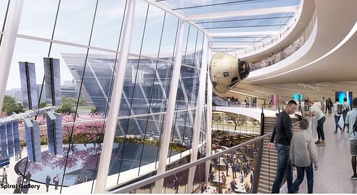
E is a nice one too along with airport terminal street space feel, taking you to the wonders of blue.
I don't dare to say anything on firm A so to save my back from a potential assault. But, I don't know if that one is a prank. If it is.., well done, three stars all the way...
I just found this out. Blue Origin is the firm founded by Bezos to make space launchers.
Hmmmmm.
The Bezos blue member not only stands at the hub of the building, it also is featured prominently from the grounds.
Seriously, what has happened here?
These all look like shit. Therefore, BUILD IT!
Block this user
Are you sure you want to block this user and hide all related comments throughout the site?
Archinect
This is your first comment on Archinect. Your comment will be visible once approved.