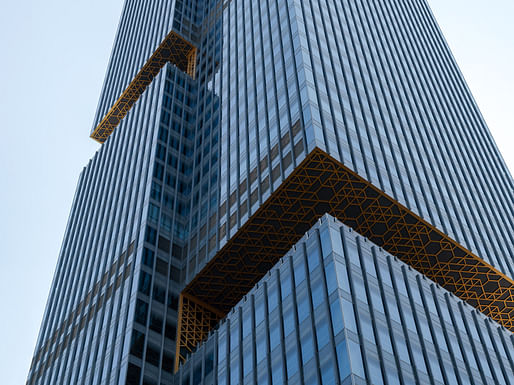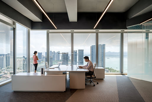
Prince Plaza, designed by OMA has opened in Shenzhen, China. The 200-meter tall tower offers 60,000 square meters of office space and sits on a 40,000 square meter podium mall. Located at a prominent view corridor linking the Nanshan mountains and the Shenzhen Bay, this monolith capitalizes on its surrounding panorama to maintain a connectedness to the outside urban landscape.

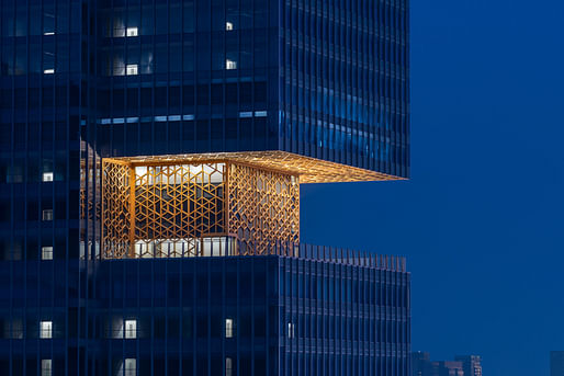
"Prince Plaza engages with Shekou’s dynamic context formed by its mountains and sea, industrial fabric from the early reform era, and recent skyscrapers," said OMA Managing PArtner David Gianotten in a statment. "Its three sky decks are important design features. They are public spaces for everyone to appreciate the area’s natural environment through the city’s main view corridor. They also break down the otherwise monolithic skyscraper to create an architecture respectable to buildings of distinctive scales in its surroundings."

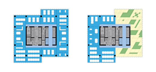
Formally, the tower is a conglomeration of four bars attached to a central core. Three sky-decks emerge from the voids at the edge of these bars, creating prominent viewing platforms for building users. Each "side" of the tower holds two bars. At one side the forms are slightly set back to increase the perimeter for each floor plate and to allow more natural light into the office spaces.

Moreover, the tower's fluted facade create expansive sections for glazing, further enabling office tenants to connect with the mountains and the sea.

17 Comments
BOXES!
Guys this is just the shipping container for the project in Manhattan.
The gold bits are both Trumpy and hip, edgy-euro!
Everyone bows down to Le Corbusier eventually
The parti diagram for this:
seems like it would be stronger if you put some columns in the corners. the greeks used columns and they were good at architecture.
OMA is heading in the direction of post Bunshaft SOM. The buildings will be handsome, but no longer carry the impact of the early work. OMA will become no different than any other three letter firm.
That's been true for at least a decade.
Very true
SOMA.
This and the addition to Tiffany's in NY could easily pass for designs by Gensler.
wicked burn, tinmn.
Well, I wonder if OMA intends this kind of stuff to be an ironic parody of what is being designed in giant corporate USA practices these days.
that would be pretty meta of them.
Ugh, why do I dislike this so much....
if it's open, why not show real photography. Your renders are out of context with the surrounding structures. More of a dislocated cartoon than a proper render, coming from such prestigious firm.
those are all photos, old sport
Block this user
Are you sure you want to block this user and hide all related comments throughout the site?
Archinect
This is your first comment on Archinect. Your comment will be visible once approved.