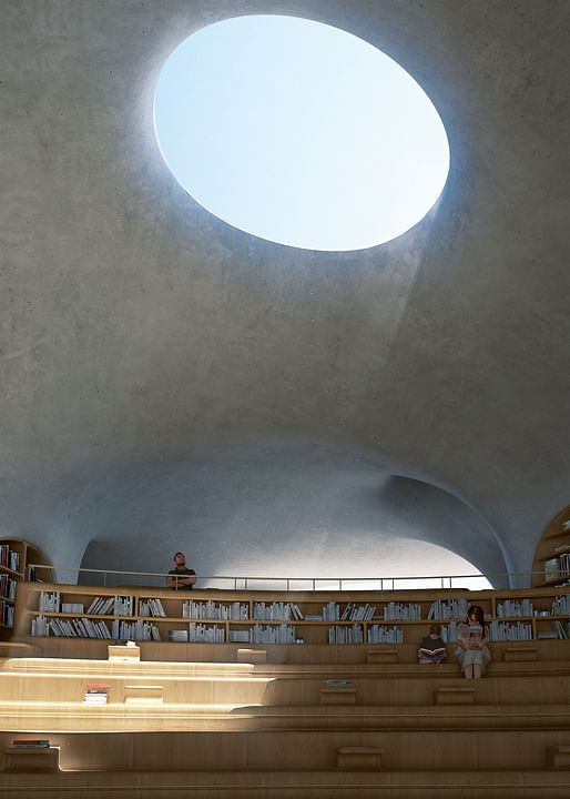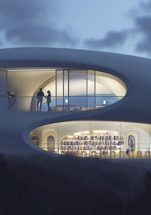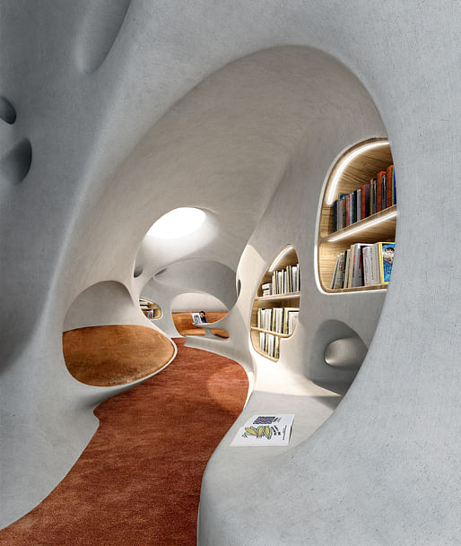
MAD Architects, led by Ma Yansong, have released the design of the Wormhole Library, which will sit on the coast in Haikou, Hainan Province in China. The library will serve as a multi-functional building that will invite visitors to enjoy views of the sea, read through a collection of about 10,000 books, and attend open-air performances.

The project comes as a response to the local government's rejuvenation plan for Haikou Bay to enhance the use of public space along the coastline. As a part of the project, a series of pavilions by a number of local and international architects are currently under planning and the Wormhole Library will be the first to be completed.

The building is a large structure cast as a single piece of white concrete, giving the architecture an aesthetic characteristic similar to that of a wormhole, with its curving organic geometries. The building is being cast using both a CNC and 3D-printed model to ensure accuracy and mitigate any margins for error.

Even the sliding doors and retractable glass curtains throughout the project are curved, allowing for a seamless integration of openings that stay true to the developed conceptual approach.

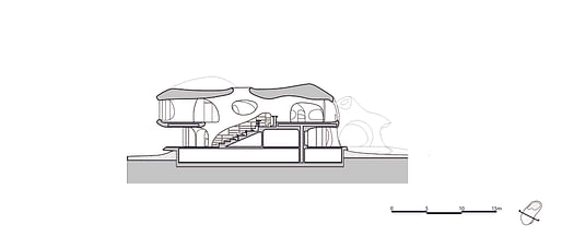
The program is split into two primary sections: the first is a 7,430-square-foot reading space, a cafe and a terrace; and the second is a 3,230-square-foot public rest area that houses a bicycle parking system, public bathrooms, and shower areas. The building is now under construction and is due to be completed in 2021.

15 Comments
This marvelous structure is strongly reminiscent of Eero Saarinen's TWA Terminal of 1962.
welcome to the 'nect, bruno!
George Jetson, meet the Teletubbies. It's almost as exciting as the Satellite Dress Shoppe but far better than Spacely Space Sprockets. Well done MAD Architects. Now if you could only do something about those pesky BOOKS! They are SO rectangular!
It's fascinating how the form tries so HARD to be interesting, and the technique to build the thing SO up-to-date, but the plan and section are SO conventional.
It's useful to remember what Charles Jencks said of the now much loved TWA Terminal (Hotel) -- that it's more sculpture than architecture and bad sculpture at that.
Its the eternal struggle between whacky forms and the need for flat surfaces. I think few buildings manage such geometry well - the ZHA concert hall in Baku, Mecanoo's performance arts center in Kaoshiung, and maybe SANAA's Rolex Learning Center were succesful in parts - largely due to the massive transitions between vertical and horizontal planes in ZHA's case, clear seperation of enclosed volumes and open spaces in the second, and a single storey in the latter. Maybe the Yokohama Terminal too, though that one uses faceted geometry to navigate planes. Toyo Ito's Taichung Opera did a awkward job managing sweeping walls and flat floors.
just because you can doesn't mean you should
The only redeeming part of this project is the toilet icons on the stall doors.
What about the medium shag?
I appreciate the Aalto influence.
. . . intended "to be a wormhole that transcends time and space"
Cue the theremin:
Theremin sample
I generally don' t like swoopy, blobby projects because I don't believe they'll make good buildings that weather well. For example, this design shows disregard (or ignorance?) for what distinguishes a wall from a roof. Not just formally, but also structurally and practically. (Are there notable exceptions? Of course. But this is not easy to do with actual tradesmen using real materials on physical sites.)
But some of these renderings had me going, they're so realistic looking. I thought, "Maybe they got the concrete and coatings right and this'll be good." Then... pysch! Just nice drawings, no building yet. (The nice lady going to the bathroom gave it away.)
So we're back to the troublesome roof/wall, no-difference-between-horizontal-and-vertical question. Especially in off-white. Easy to draw, possible to build, unlikely to satisfy.
This is refreshingly subdued for MAD and on a perfect scale to showcase some of these transitional details that make or break the project. I'm looking forward to its construction at least.
On another note, OPEN architecture headed by Li Hu, an ex-associate of Steven Holl Architects, just recently finished the UCCA museum on the same island. If you're interested in the details and finished construction of something similar, you should check it out.
The Open project used fishing boat fabrication techniques for the formwork IIRC. Interesting project!
I would love for MAD to pull this one off, just to prove me wrong!
For a country that loves book censorship.
Block this user
Are you sure you want to block this user and hide all related comments throughout the site?
Archinect
This is your first comment on Archinect. Your comment will be visible once approved.