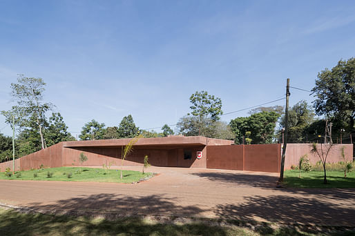
Having to work through a flurry of logistical challenges from 3,700 miles away, Lucerne-based Roeoesli & Maeder Architects (or ro.ma) led an international design team to successfully complete the new Swiss Embassy in the Kenyan capital of Nairobi. The architects describe the design as “an appropriate representation of Switzerland”, while also incorporating local Kenyan building practices and the skills of local companies. Roeoesli & Maeder won the commission in an open competition in 2011.
During the construction phase, Roeoesli & Maeder couldn't spontaneously drop by the site, so they observed the project through only photos. “Building was often done by ‘trial and error’. In other words, they build something (which does not necessarily have to correspond with the plans) and ask whether or not it is OK; if the answer is no, then it is demolished and a new attempt is made,” they explain.
The exposed concrete building has an earthy red dye whose color was inspired by the rich soils of the East African countryside. Geometric windows that pop out from the facade reflect the surrounding vegetation, while other projecting elements provide shade.
“The embassy building shifts between an expression of civic pride and restraint, exploiting various points of reference and bringing together the required aspects of functionality, safety and sustainability in a coherent spatial structure,” the architects describe. “By allowing the actual building to grow out of the enclosing perimeter wall (required for compound security), a spiral spatial relationship is created that frames the entire compound, culminating in the central two-story structure.”
In response to the slightly sloped north-facing site, the building has a split-level floor arrangement. The reception hall serves as the central hub in connecting the building's mezzanine sections as well as its public, diplomatic, and consular areas. Suites of naturally lit rooms flank the hall on both sides, and alternate with load-bearing wall panels. The two outer suites were flexibly designed to adapt to future needs. The inner offices have glazing to convey a more open, transparent approach to work.

Find more project images in the gallery below.
No Comments
Block this user
Are you sure you want to block this user and hide all related comments throughout the site?
Archinect
This is your first comment on Archinect. Your comment will be visible once approved.