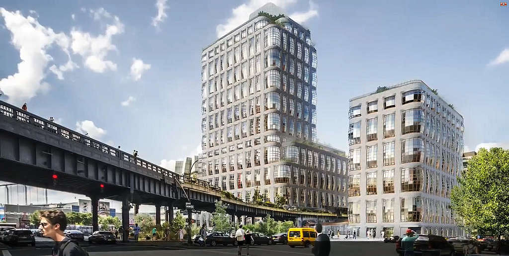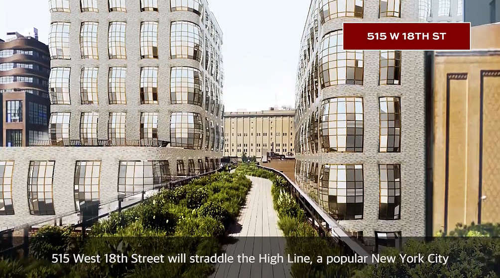
Thomas Heatherwick plans to bring more eccentricity to Manhattan’s west side with two condo towers covered in a bubbled facade and bisected by the High Line, as CityRealty reported on Wednesday. The straddling pair at 515 West 18th Street, currently known as the Hudson Residences in conjunction with another tower planned on West 22nd Street, will contain 181 condos split between a 10-floor east tower and a 22-floor west tower. The development spans 425,000 square feet and will include 17,000 square feet of retail and gallery space, as well as 175 parking spots.

The project’s developer, Related Companies, first purchased the site in 2014 for a then-record of $205 million. Executive architects SLCE filed construction permits in late 2016, which are now approved. The buildings anchor the western side of Tenth Avenue between 18th and 20th Street in Chelsea.

Related plans to build to the maximum allowable floor area, nearly bursting its bubbled exterior. The bulging, rounded-out windows will give residents a unique perspective of the popular High Line walkway below and of the nearby Hudson River. Amenities include a spa, fitness center and entertainment lounges.
The renderings of both condo towers remain preliminary, but Related expects the Hudson Residences to be completed by the middle of 2020.
in a weird way this reminds me of a project by Grant Gibson of CAMESgibson, where he made Mies' Crown Hall fat.
It's his twitter account header, I hope he doesn't mind me posting it here
All 8 Comments
3rd wave high line development is the most depraved. 1st wave was good tho (Ban, G, Ando) but now it’s trash.
Another weird looking facade for the High Line tourists to Instagram.
WTFFF
Hmm... seems awful similar to his recently completed South African museum facade...
sad. can you get more
shit? well, at least it's not as
bad as the hudson yards.
The bubbles kind of made sense in Heatherwick's South Africa art gallery but here I don't get it. Probably the client said: I want you to make me some condo towers that look exactly like your art gallery but make it cheaper and uglier.
Heatherwick's lauded Shanghai Expo pavilion was also a copy of his own design he made years earlier in wood, it's in XS:Big Ideas, Small Buidlings.
Coming up with something new and different all of the time can be exhausting, apparently.
in a weird way this reminds me of a project by Grant Gibson of CAMESgibson, where he made Mies' Crown Hall fat.
It's his twitter account header, I hope he doesn't mind me posting it here
You sold out when a functional necessity with an aesthetic and tectonic logic on one project becomes an additive fashionable fad on another because a client wants it like South Africa.
Block this user
Are you sure you want to block this user and hide all related comments throughout the site?
Archinect
This is your first comment on Archinect. Your comment will be visible once approved.