Boston, MA
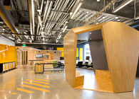
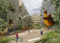
It’s not often that a client asks for private offices overlooking an American Ninja Warrior training space. But with this as our point of departure, we approached this addition to the existing four story Squashbusters building with the aim of erasing the boundary between the interior program—offices, multipurpose space and lobby—and the exterior functional training space.
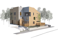
During a series of space-planning workshops, the client articulated their desire to have a greater public presence at the southern edge of the site. We proposed a wedge-shaped addition that relocates the lobby from the center of the building to the public face: increasing visibility from the street, shaping a more spacious entry, reducing noise transfer into the existing atrium, and creating a control point for the functional training space at the site’s eastern edge. The design leverages the largest clear space to house a multi-purpose room that can be subdivided by an operable partition to host multiple events concurrently. At the north of the plan, an office suite recoups a portion of the previous lobby, and a large storage room provides a place for weight sleds, tractor tires, and other equipment relevant to the functional training space, which runs the length of the east facade.
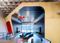
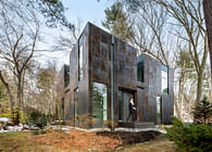
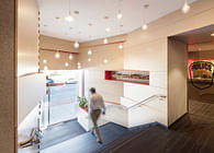
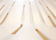
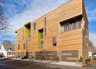
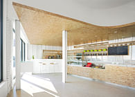
This project aims to blur the boundary between inside and outside through a unified formal & material language. The addition is clad in vertically-installed burnt cypress shiplap siding to differentiate it from the metal panel of the building above through its warmth and natural patina. This cladding wraps into the interior on the line of the entry canopy, forming a feature wall that anchors the lobby. The floor, wall, and ceiling of the lobby, as well as the reception desk, read as if they have been carved from the volume of the canopy, revealing a blanched white oak surface that brightens the space and signifies its importance. As one passes through the vestibule, one of the gray turf circles from the functional training space appears to have migrated through the wall to act as a walk-off mat.
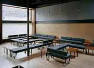
The lobby furnishings, a series of circular ottomans, create an interplay with the form and color of the custom concrete furnishings that spill into the exterior plaza and workout space–providing security, seating, and unique fitness opportunities. The black and gray woven flooring throughout references the turf just beyond the wall. The rest of the loose furnishings and paint colors draw their inspiration from this palette, extending it into the space and up through the building’s atrium (as part of the project we were asked to refresh the remainder of the building’s finishes). When the first floor is viewed from outside, one realizes that the progression of wall colors on the interior mirrors the colors of the concrete furnishings on the exterior. This extends to the custom mailbox in the office suite, which addresses a functional need, while providing a privacy screen between the open and private office spaces, and injecting a touch of whimsy.
Status: Built
Location: Boston, MA, US
Firm Role: Architect / Designer
Additional Credits: General Contractor: BOND Brothers
Civil Engineer: Nitsch Engineering
MEP Engineer: BR+A Consulting Engineers
Structural Engineer: RSE Associates Inc.
Photography: John Horner Photography
