thought it'd be interesting to start a thread (based on libraries, pavilions, etc) for small obscure projects: pavilions, bathing facilities, rest stops, kiosks, bus stops... trying to avoid the better known projects (so the EXPO & serpentine are right out)
the smaller the better! (and i don't mean file size)
I think it would be worth hearing everyone's opinion on what
small is...
I agree a-techno.
for starters, small isn't just size, i think it has very much to do with program, or programmatic strategy.
the leaf chapel (by klein dytham, posted by jump above) is a single room and a singular gesture.
many of the projects posted by holz.box in the first entry are successful in part because they are spatially and formally straightforward. they often are doing just one thing, but doing it with a confidence that communicates strongly, without interference. a young child could draw most of these projects with just a few strokes of a crayon.
...for a single family house to be small it can't have an overambitious program...one that attempts to do more than a few essential things.
a small house should come with a poem, prepared by the architect or a collaborator (perhaps the client). this poem should only be a few lines long. something along the lines of this ending to old favorite:
A Winter Evening by Georg Trakl (excerpt)
...
Wanderer quietly steps within;
Pain has turned the threshold to stone.
There lie, in limpid brightness shown,
Upon the table bread and wine.
the small projects effectively divorce great architecture from big clients, there is a lot of hope in that, I think, given the sick values of so many big clients over the past decade. maybe the ultimate form for small projects is D.I.Y.
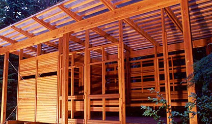
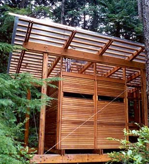
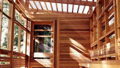
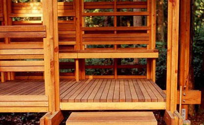
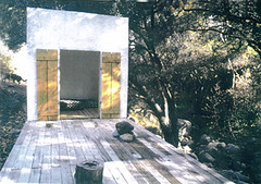
I did do a small project that fits your description in 1995. it was 2 10x10 cubes connected by a wood platform above a creek.
Pavillions to shelter. No electricity or plumbing was involved.
Topanga Canyon, California.
is the approach to the platform from the highside of the creek? is there a single stone step to transition? are there scuppers on the downhill side of the cubes?
I can't find the exterior, but I'm very taken by the interior of this project in Austria by Christian Jabornegg and Andras Palffy, the Generali Foundation exhibition space:
also, it has a nice 5th facade (see if this works):
after looking at a lot of galleries, it seems to be one of the better ones. also reminded me a lot of the kunstmuseum liechtenstein by morger + degelo + kerez:
[/img]http://farm1.static.flickr.com/108/301072195_e368efe143.jpg?v=0width=416[/img]
and i like the d'arcy jones stuff... but it feels too heavy, the flashing and coping details aren't very refined. could use some finesse/rigor. but that's just my amateurish opinion.
but i see what you mean about aspects that looked similar:
I love that rain chain image, every little bit of it.
I fell in love with this little Front Studio interior design project that architechnophilia posted on his blog. A-techno, do you allow linking? I guess I'll find out...
i agree with you holz.box, re d'arcy jones' work. in my memory it had improved and i was a little surprised when i revisited it to post here...still quite good, but a little heavy,as you say. however d'arcy was a year ahead of me at uni so not particularly old (i think in fact a few years younger than me) and still learning. i expect he is getting better, and will continue to improve...
the work feels quite canadian to me, if there is such a thing...
for a more japanese touch i think it is safe to offer up the work of atelier bow-wow as masters of the small. i don't always like their work, but is often interesting.
and of course the always flash work of klein dytham, which still tends to the small...
mark and astrid are beginning to become quite interesting. their recent "heidi house" is very nice.
To add to the above, it think Atlier Bow-Wow have a pretty interesting thought process. I love their definition of public space. They define public space by responsiblity, not use. Hence a mall does not qualify as public space.
Sci_skew also has some sweet small projects. They're an upstart though and i cant find any images of their projects outside their webpage. The specialize in interventions, and despite the "formal" appearance of most of their work, its actually very rigorous.
I think it would be worth hearing everyone's opinion on what
small is...
I agree a-techno.
for starters, small isn't just size, i think it has very much to do with program, or programmatic strategy.
the leaf chapel (by klein dytham, posted by jump above) is a single room and a singular gesture.
many of the projects posted by holz.box in the first entry are successful in part because they are spatially and formally straightforward. they often are doing just one thing, but doing it with a confidence that communicates strongly, without interference. a young child could draw most of these projects with just a few strokes of a crayon.
...for a single family house to be small it can't have an overambitious program...one that attempts to do more than a few essential things.
a small house should come with a poem, prepared by the architect or a collaborator (perhaps the client). this poem should only be a few lines long. something along the lines of this ending to old favorite:
A Winter Evening by Georg Trakl (excerpt)
...
Wanderer quietly steps within;
Pain has turned the threshold to stone.
There lie, in limpid brightness shown,
Upon the table bread and wine.
And AP, i think that's dead on. but it borders on simplistic as well, sometimes the two meld togethor (you can have a very small, maximized project) but i'm drawn to the pared down, the reduced, the pure for the most part.
ya...i agree holz. i actually wrote a sentence or two about how a small project can actually be quite complex and still successful, but it didn't work too well with everything else so i cut it.
...more pics of Maerkli's La Conguinta here...
there are a few pics of another great small project in that set (although it's very known, and perhaps not ideal for this thread)...
yes - it's the complex for an architectural historian living in toronto. shim sutcliffe is the firm. beautiful work. i want to say it was in a the wood design building magazine or some equivalent.
that cantilevered project by klein dytham is indeed amazing, AP.
the engineer is alan burden, who has a firm here in tokyo called structured environment. you can see a nice construction sequence of the project here. alan has an amazing bio, including supervising/designing the structure for tokyo forum and the yokohama ferry terminal to name a few...scale of work is smaller since he set up own shop, which is an amazing opportunity for small guys like us who otherwise couldn't get world class engineers to help out on our small projects...
on smallness...size works pretty good for me as prime definition. i am not very good at philosophy. ;-)
[entirely un-related to thread: not sure about (bow-wow front man) tsukamoto's definition of public. it is interesting and provocative, but i do think they are in a privileged position where such things can be said without thought...what would really impress me would be a bow-wow mall that overcame whatever inadequacies the current system of public private we are usually forced to contend. jon jerde does that not half badly...bow-wow may never be asked...but i bet they could do very intreesting things if they could climb off their high horse for an hour or two.]
Ah nice I was going to post photos of the maerkli project but I can't figure out which disk I burned them to... didn't think to search other peoples albums! I think as much as the project is nice the whole experiience of getting the key and finding the place really made it memorable different.
bruder klaus by zumthor...achingly beautiful...i am in love with it!
i'd image all senses would be dancing...the smell of the concrete and burn timber, the vision of the lights, the texture of the materials, the echo of your voice, the sound of your steps...must be amazing...
i wonder how it would feel to be there after a summer rainfall, the residual warmth of the concrete crashing against cool atmosphere...
miralles and ron herron in toyama. my office worked on the pink building with ron and it is kinda kool, but miralles' project blew me away, he wasn't so famous when he did this one, but was clearly amazing even then (can you tell i am infatuated?)
small projects
thought it'd be interesting to start a thread (based on libraries, pavilions, etc) for small obscure projects: pavilions, bathing facilities, rest stops, kiosks, bus stops... trying to avoid the better known projects (so the EXPO & serpentine are right out)


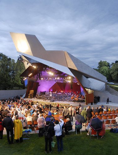
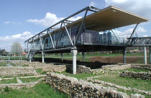

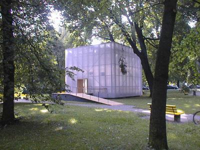


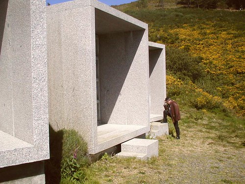

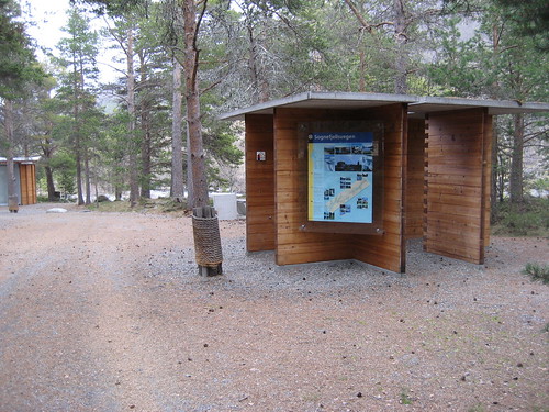
the smaller the better! (and i don't mean file size)
luca selva:
rene van zuuk:
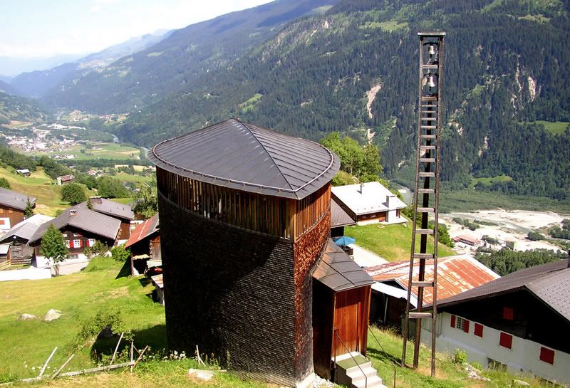
caminada:
lake|flato:
the next ENTERprise:
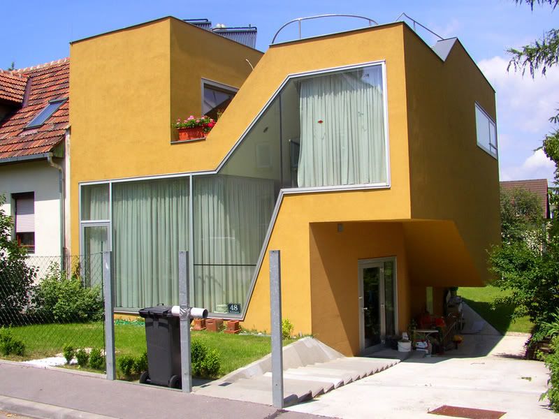
kurt rumplmayr, ursula klingan:
ai weiwei:
toyo ito:
peter zinganel:
shigeru ban:
rafael iglesia:
rural studio:
hild & k:
juerg conzett w/ guido lauber:
cesar portela:
saucier perrotte:
4 Featured Comments
Best thread ever.
small is...
I agree a-techno.
for starters, small isn't just size, i think it has very much to do with program, or programmatic strategy.
the leaf chapel (by klein dytham, posted by jump above) is a single room and a singular gesture.
many of the projects posted by holz.box in the first entry are successful in part because they are spatially and formally straightforward. they often are doing just one thing, but doing it with a confidence that communicates strongly, without interference. a young child could draw most of these projects with just a few strokes of a crayon.
...for a single family house to be small it can't have an overambitious program...one that attempts to do more than a few essential things.
a small house should come with a poem, prepared by the architect or a collaborator (perhaps the client). this poem should only be a few lines long. something along the lines of this ending to old favorite:
A Winter Evening by Georg Trakl (excerpt)
...
Wanderer quietly steps within;
Pain has turned the threshold to stone.
There lie, in limpid brightness shown,
Upon the table bread and wine.
the small projects effectively divorce great architecture from big clients, there is a lot of hope in that, I think, given the sick values of so many big clients over the past decade. maybe the ultimate form for small projects is D.I.Y.
<img src="http://farm2.static.flickr.com/1431/1244185274_02f8c02ed7.jpg" width="473" height="500" alt="christiania, glass house, august 2007" />
bump...
Come on, anybody?
All 357 Comments
I did do a small project that fits your description in 1995. it was 2 10x10 cubes connected by a wood platform above a creek.
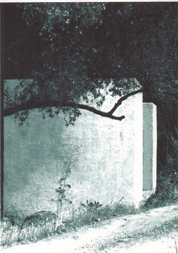
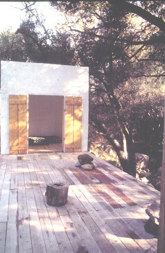
Pavillions to shelter. No electricity or plumbing was involved.
Topanga Canyon, California.
Excellent! For those about to post... if your image is over 416px wide, format your image tag like this, so it fits in the comment area:
[img]http://archinect.com/images/image.jpg width=416[/img]
* reminder, the code to post an image is located at the bottom of this page (and all other thread pages)
whoa. nice, thanks for sharing orhan.
is the approach to the platform from the highside of the creek? is there a single stone step to transition? are there scuppers on the downhill side of the cubes?
yes, yes and yes.
I can't find the exterior, but I'm very taken by the interior of this project in Austria by Christian Jabornegg and Andras Palffy, the Generali Foundation exhibition space:


Now this is a sweet thread.
the generali looks amazing, nice find!


also, it has a nice 5th facade (see if this works):
after looking at a lot of galleries, it seems to be one of the better ones. also reminded me a lot of the kunstmuseum liechtenstein by morger + degelo + kerez:
[/img]http://farm1.static.flickr.com/108/301072195_e368efe143.jpg?v=0width=416[/img]
well, it was; if i can't see the exterior in a photo or two, nonetheless natural day/moonlight, it is not a pavillion.
Best thread ever.
here's the generali roof and another small project up the coast in vancouver:


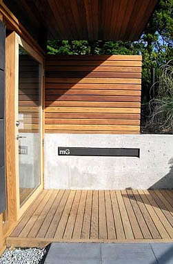

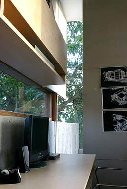
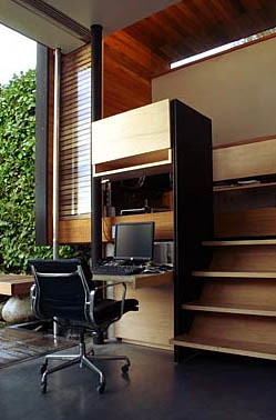
hm. that looks familiar.. something like d'arcy jones' work...but i think maybe is not...who is it by, holz?
and i like the d'arcy jones stuff... but it feels too heavy, the flashing and coping details aren't very refined. could use some finesse/rigor. but that's just my amateurish opinion.


but i see what you mean about aspects that looked similar:
Micro comapct houses, Richard Horden


Hairywood, 6a intallation at the architecture foundation London.
I love that rain chain image, every little bit of it.

I fell in love with this little Front Studio interior design project that architechnophilia posted on his blog. A-techno, do you allow linking? I guess I'll find out...
i agree with you holz.box, re d'arcy jones' work. in my memory it had improved and i was a little surprised when i revisited it to post here...still quite good, but a little heavy,as you say. however d'arcy was a year ahead of me at uni so not particularly old (i think in fact a few years younger than me) and still learning. i expect he is getting better, and will continue to improve...


the work feels quite canadian to me, if there is such a thing...
for a more japanese touch i think it is safe to offer up the work of atelier bow-wow as masters of the small. i don't always like their work, but is often interesting.
and of course the always flash work of klein dytham, which still tends to the small...
mark and astrid are beginning to become quite interesting. their recent "heidi house" is very nice.
is that last one floating, jump? that cantilever is outrageous.


great thread, and some gorgeous projects so far.
here are a few small houses by Tezuka Architects:
My Own Sky House
Forest House
Canopy House
Wall-less House
Reflective beach hut - Feix & Merlin

liberty - you can link anytime you want to (god knows I do)
btw holz that's a crazy amount of images you posted...but nice
I think it would be worth hearing everyone's opinion on what small is
Tonkin Liu - singing ringing tree
Cottrell & Vermeulen - Westborough After School Club
Martin + Trottin Architects, Périphériques Architects - Matsudai small tower
Kazunari Sakamoto Architectural Laboratory - Hut T [647 sq ft]
To add to the above, it think Atlier Bow-Wow have a pretty interesting thought process. I love their definition of public space. They define public space by responsiblity, not use. Hence a mall does not qualify as public space.
Sci_skew also has some sweet small projects. They're an upstart though and i cant find any images of their projects outside their webpage. The specialize in interventions, and despite the "formal" appearance of most of their work, its actually very rigorous.
small is...
I agree a-techno.
for starters, small isn't just size, i think it has very much to do with program, or programmatic strategy.
the leaf chapel (by klein dytham, posted by jump above) is a single room and a singular gesture.
many of the projects posted by holz.box in the first entry are successful in part because they are spatially and formally straightforward. they often are doing just one thing, but doing it with a confidence that communicates strongly, without interference. a young child could draw most of these projects with just a few strokes of a crayon.
...for a single family house to be small it can't have an overambitious program...one that attempts to do more than a few essential things.
a small house should come with a poem, prepared by the architect or a collaborator (perhaps the client). this poem should only be a few lines long. something along the lines of this ending to old favorite:
A Winter Evening by Georg Trakl (excerpt)
...
Wanderer quietly steps within;
Pain has turned the threshold to stone.
There lie, in limpid brightness shown,
Upon the table bread and wine.
wannamacher russel
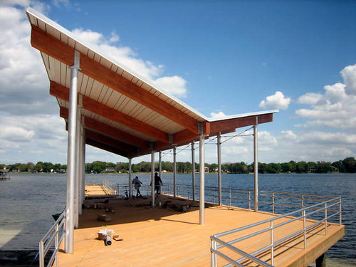
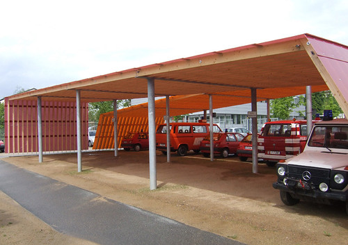
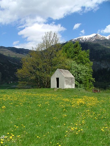
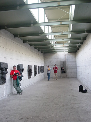
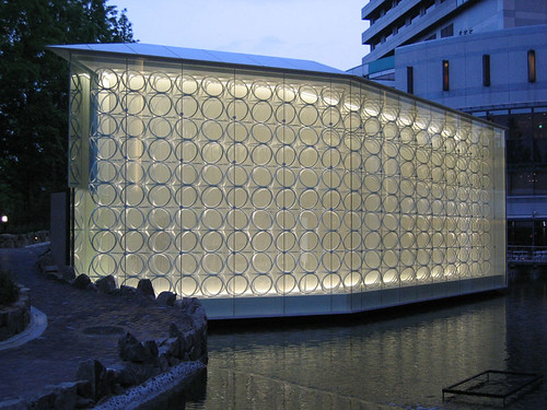
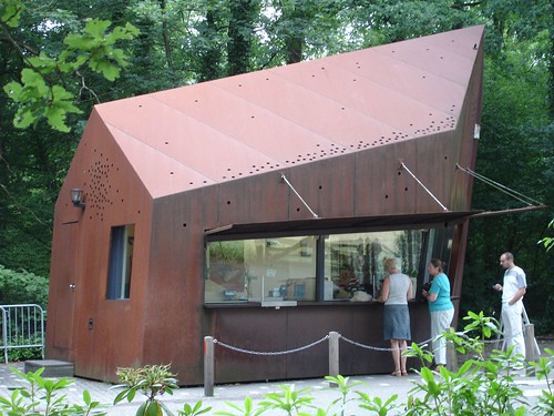

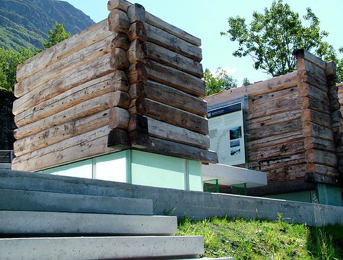
markus stark
christian kerez
peter maerkli
jun aoki
mvrdv
MAD office
3RW
And AP, i think that's dead on. but it borders on simplistic as well, sometimes the two meld togethor (you can have a very small, maximized project) but i'm drawn to the pared down, the reduced, the pure for the most part.
wow what an amazingly delightful thread.
to Orhan Ayyüce:
that's a beautiful project, i like the print quality
ya...i agree holz. i actually wrote a sentence or two about how a small project can actually be quite complex and still successful, but it didn't work too well with everything else so i cut it.
...more pics of Maerkli's La Conguinta here...
there are a few pics of another great small project in that set (although it's very known, and perhaps not ideal for this thread)...
whoa, didn't even realize that was your flickr acct AP. nice photos.
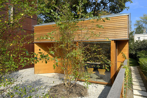
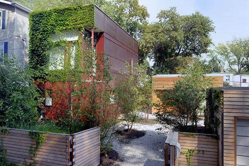
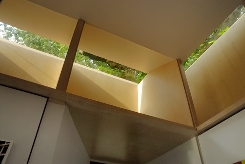
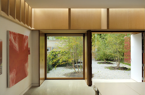
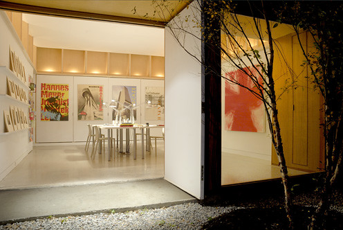
the chapel - yeah maybe a little too well known, though an amazing project.
has anyone seen this project published anywhere?
yes - it's the complex for an architectural historian living in toronto. shim sutcliffe is the firm. beautiful work. i want to say it was in a the wood design building magazine or some equivalent.
nice thread. lots of seductive projects here!
henning stummel's shouldham street is juicy
todd saunders here and here
that is nice njp.
that cantilevered project by klein dytham is indeed amazing, AP.
the engineer is alan burden, who has a firm here in tokyo called structured environment. you can see a nice construction sequence of the project here. alan has an amazing bio, including supervising/designing the structure for tokyo forum and the yokohama ferry terminal to name a few...scale of work is smaller since he set up own shop, which is an amazing opportunity for small guys like us who otherwise couldn't get world class engineers to help out on our small projects...
on smallness...size works pretty good for me as prime definition. i am not very good at philosophy. ;-)
[entirely un-related to thread: not sure about (bow-wow front man) tsukamoto's definition of public. it is interesting and provocative, but i do think they are in a privileged position where such things can be said without thought...what would really impress me would be a bow-wow mall that overcame whatever inadequacies the current system of public private we are usually forced to contend. jon jerde does that not half badly...bow-wow may never be asked...but i bet they could do very intreesting things if they could climb off their high horse for an hour or two.]
Ah nice I was going to post photos of the maerkli project but I can't figure out which disk I burned them to... didn't think to search other peoples albums! I think as much as the project is nice the whole experiience of getting the key and finding the place really made it memorable different.
that's a nice point jump, although im not too sure they could do a large project well.
bruder klaus by zumthor...achingly beautiful...i am in love with it!

i'd image all senses would be dancing...the smell of the concrete and burn timber, the vision of the lights, the texture of the materials, the echo of your voice, the sound of your steps...must be amazing...
i wonder how it would feel to be there after a summer rainfall, the residual warmth of the concrete crashing against cool atmosphere...
images here:
http://thomasmayerarchive.de/categories.php?cat_id=1325&l=english&page=1
and, when it comes to small projects, you can not, for any reasons, exclude the Barcelona Pavilion

impossible to capture the strength of those spaces in photograhps;
the richest architectural experience per sq.ft. on earth
(at least until i visit bruder klaus')
here is a detail from the morger + degelo kindergarten in basel
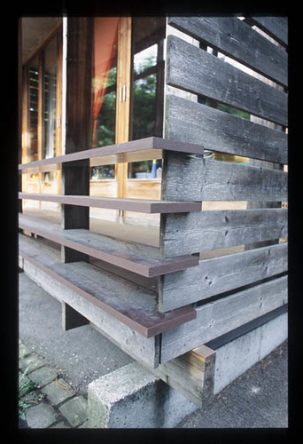
ah...i have a book that this project is in...
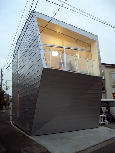
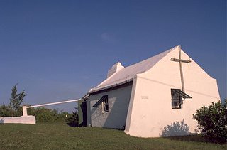
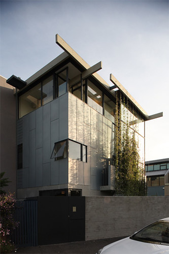
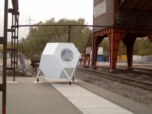
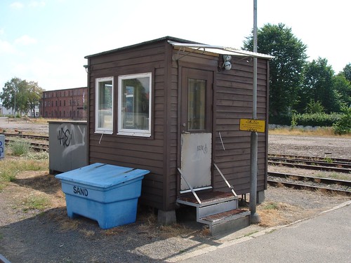
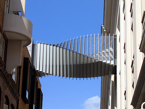
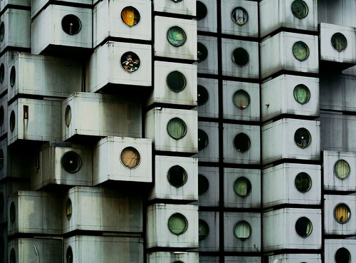
..."small architecture" from flickr: No 7 is the smallest
Poti 01
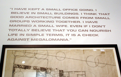
Eric Lyons: "I have married a small wife"
Smallest_church (Bermuda)
IMG_2702.jpg
Swedish Cabin
beam me up
0132.jpg
Launderette psychosis
UW master's thesis by webster wilson
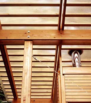
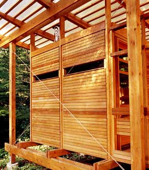
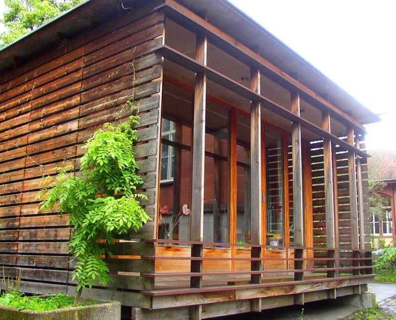
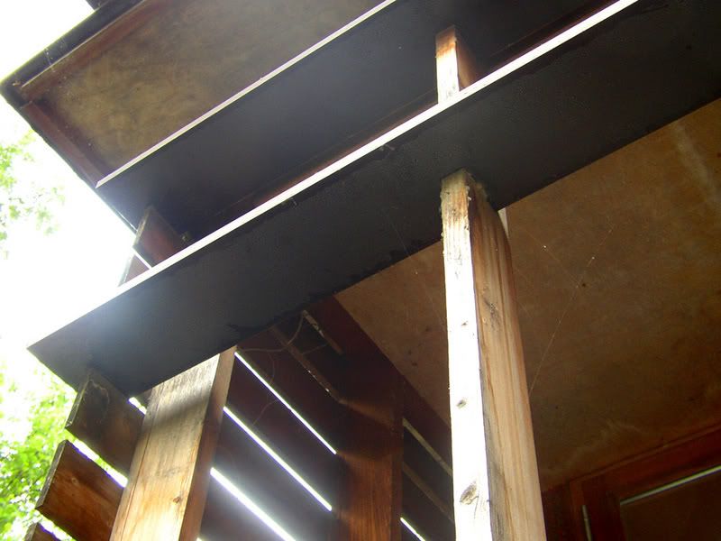
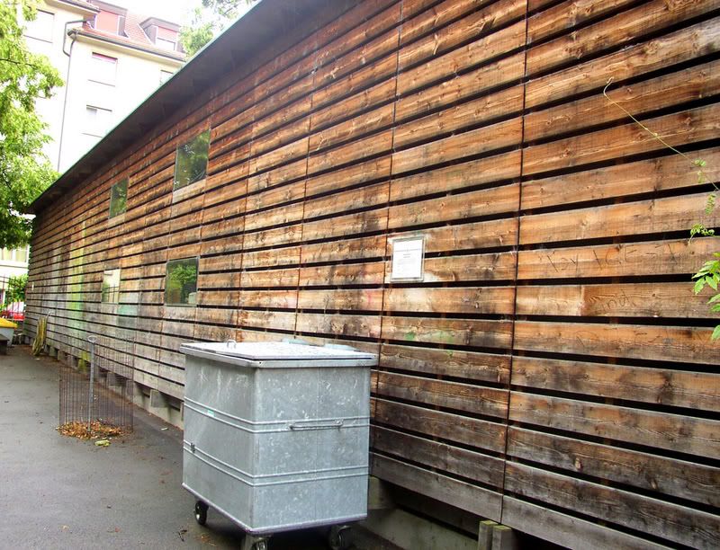
holz... some additional pictures of M+D's temporary kindergarten:
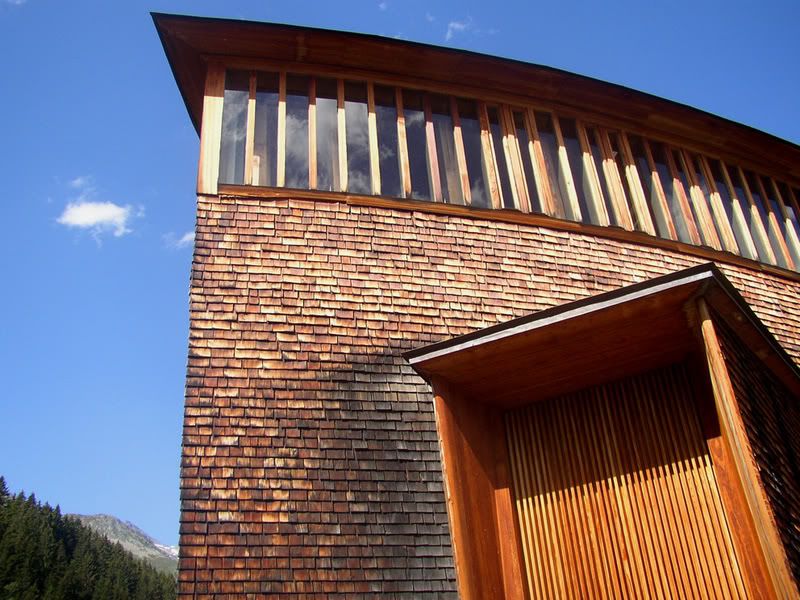
and of course Zumthor's chapel:
and while going through my pictures i found this little house by POOL:
nice. thanks for posting.
that kindergarten was really an eye-opener for me.
it helped validate a lot of the things i was grappling with as a student.
i really wanted to work for those guys before they split, but alas.
not that i'm really talented enough, but they did some great projects.
glen small with sci arc students in front of rhombics circa early 1970's.
Sasquatch designlab
& Paul Raff Studio
miralles and ron herron in toyama. my office worked on the pink building with ron and it is kinda kool, but miralles' project blew me away, he wasn't so famous when he did this one, but was clearly amazing even then (can you tell i am infatuated?)
I love Orhan's two room cottage...it touches me in this unbelievable way.
since i am moving my office, i've found two more pictures showing the context of the pavillions. thanks for the complements.
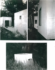
okay back to box-ing...
Block this user
Are you sure you want to block this user and hide all related comments throughout the site?
Archinect
This is your first comment on Archinect. Your comment will be visible once approved.