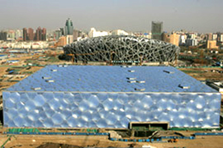
I find that bubbles are cut rather crudely on the edges. It is okay for me to make those sort of compromises but a high profile project like this? Is it more than a sign?
Also,
do you think those buildings (stadium and the enclosed pool) should be in different cities instead of turning towards each other like Disneyland? I mean, sure, I understand it is olympic broadcasting and all, but somewhat I don't see a good feng shui between those structures.
~~~
This discussion is meant to have quick crits like this, from various buildings around the globe and in your neighborhood. it is okay not to be too deep, but you can... It shouldn't be limited to just bad or misunderstood details, but also open to beautiful works of detailing 'in your opinion' (iyo.)
The saying, 'God is in the details' is not for me, but it is interesting that a detail can be of a size of finger joint to 40 acres large bubble wrap.
it will happen here for sure...basically anywhere but Switzerland / Germany
I think that building is more about the idea than about the building. I know that this isnt a justification for making a shoddy building, but many people use it
This one sits and looks a bit like a branch library on a venice street with house numbers your party will never miss. the little rectangle on the lower right of the front window is the operable portion of the window with possibilities from lemon-aid sales to will call window. but sure, it is for natural ventilation. some might say, 'hey it is better than mc mansions', i say 'maybe.'
Bad studs & stucco with flat roofs and boxy shapes, AKA "developer modern," seems less obnoxious to me than bad historical pastiche, for some reason. Maybe it's because there's less to it, less involved, and easier to skip over.
By the way, modern buildings haven't BECOME the hot new style in LA. This region's been a haven for modernism for almost a century.
I guess my modern comment was directed at mdler's assertion.
And the popular aversion to modern houses has always interested me. Gregory Ain's tract of gorgeous little gems in Mar Vista is a legendary example. Thank goodness SOME of us like beautiful modern design!
And on "developer modern," John Chase's article (now book chapter) on stucco box "dingbat" apartments is the best read I've found.
here is a photo of eames house. even though it is sitting in a secluded beautiful large site, the house is comfortably small and precautions are taken to screen it from outdoor activities when necessary. beautiful use of everything.
a lesser lautner, just for fun. a crazy roofline that may have ruined lautner's credibility as a modernist. in retrospect this building was the perfect alternative to postmodernism - far more insightful than anything venturi had to offer.
imo this building ushered in the contemporary modern design of koolhaas, zaha, etc, but they would never admit it.
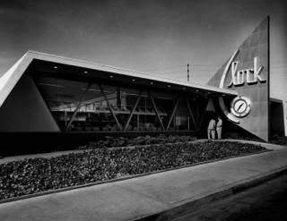
In 1951, inspired by the first googie coffee shops, USC grads Louis Armet and Eldon Davis created a spectacular sculptural icon for Clock restaurant in Westchester. This was their first true googie design and they soon refined and perfected the style. Their creations defied gravity and were created from new and exotic materials like resin, flagcrete and Formica.
you should check out all of armet and davis's work. brilliant designers that never got credit for their work because it was commercial, popular, and went against the trends of high modernism.
a previous jewelery store hired frank gehry to do their storefront in the santa monica mall, which was designed by the architect and completed in 1980. the painted plywood and marble tile interior facade had endured the test of time but was painted to different colors with no other major changes. at the time even gehry was toying around with post modern forms as his peers in italy and elsewhere and perhaps dealing with conservative clients by introducing familiar shapes but with totally cartoonistic handle and deconstructed ways.
the storefront is still there in an almost abondoned section of the once glorious mall and its windows rented to a business called ANTIQUA (?)...
basically, gehry designed mall lost it's midas touch long ago, when it was renovated with universal studios concept marketing tools a while back.
A friend of mine in LA (who worked for Gehry) took me on the "Gehry Mystery Tour" thru Santa Monica - mostly normal-looking apartment buildings that were designed by Frank Gehry before he became "Frank Gehry"...
gehry has the largest range among the most living masters. i have a lot of respect for him even though i ain't no ah-oh fan of him. i have not been in a gehry designed space yet that didn't have some kind of special offering and masterful interpretation of the program. i had the opportunity of working in the remodeling of three projects that was designed by him and these houses were like jewels in addition to being put together with a magical ease.
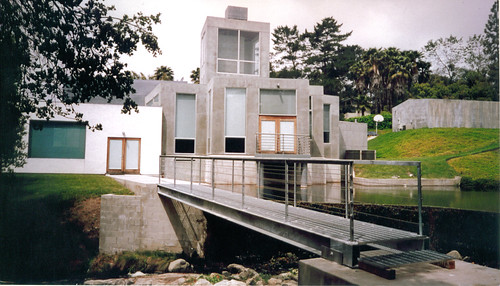
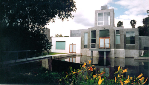
i wasn't going to drop it yet but i designed this simple bridge to one of his most beautiful houses. i restrained from doing anything fancy and competetive. i believe this was his last house with greg walsh and last house with the sprit of common materials used in artful ways. pictures by me as well. ®
I love the Bubar's Jewelry storefront Ohran posted. My old boss did it when he was at FOG in the late 70s.
Speaking of the Santa Monica Place mall, that is my favorite Gehry building---the basic shed form, the stepped section, the plain white structural elements, the burnt-orange floor tile, the terraces facing the ocean. And that chain-link signage facing the civic center--beautiful!
My take on Gehry is that (with a few exceptions) the bigger budgets he gets, the worse the architecture.
WTD, that was the first plan, followed by a major hue & cry by the local citizenry when it was discovered that the replacement would be very dense development, including a highrise.
Fast forward to a few months ago, and Macerich (the mall owner) unveiled a plan that basically says: "Existing mall to remain; remove roof."
St. Monica's High School student center, santa monica
Frank O. Gehry Associates
see there is a whole different, practical side to gehry out there. usually at home in santa monica. he is our local guy.
Clockwork Real Estate Detail Crit
I find that bubbles are cut rather crudely on the edges. It is okay for me to make those sort of compromises but a high profile project like this? Is it more than a sign?

Also,
do you think those buildings (stadium and the enclosed pool) should be in different cities instead of turning towards each other like Disneyland? I mean, sure, I understand it is olympic broadcasting and all, but somewhat I don't see a good feng shui between those structures.
~~~
This discussion is meant to have quick crits like this, from various buildings around the globe and in your neighborhood. it is okay not to be too deep, but you can... It shouldn't be limited to just bad or misunderstood details, but also open to beautiful works of detailing 'in your opinion' (iyo.)
The saying, 'God is in the details' is not for me, but it is interesting that a detail can be of a size of finger joint to 40 acres large bubble wrap.
dude, its China
Do you think it wouldn't happen here? Or, it looks good in China?
it will happen here for sure...basically anywhere but Switzerland / Germany
I think that building is more about the idea than about the building. I know that this isnt a justification for making a shoddy building, but many people use it
does it look good anywhere???
This one sits and looks a bit like a branch library on a venice street with house numbers your party will never miss. the little rectangle on the lower right of the front window is the operable portion of the window with possibilities from lemon-aid sales to will call window. but sure, it is for natural ventilation. some might say, 'hey it is better than mc mansions', i say 'maybe.'
it is 'co-opted modernism'
modernism has become the new hot style...especially here in LA. When people dont know what the fuck they are doing, stuff like that happens
I like lemon-aid, btw
Bad studs & stucco with flat roofs and boxy shapes, AKA "developer modern," seems less obnoxious to me than bad historical pastiche, for some reason. Maybe it's because there's less to it, less involved, and easier to skip over.
By the way, modern buildings haven't BECOME the hot new style in LA. This region's been a haven for modernism for almost a century.
citizen
I know that LA has been the haven of modenism for a while...my point is the developer modern that you speak of is all over LA
btw, in the early 90's you couldnt give away modern houses in LA...very few people wanted them
I guess my modern comment was directed at mdler's assertion.
And the popular aversion to modern houses has always interested me. Gregory Ain's tract of gorgeous little gems in Mar Vista is a legendary example. Thank goodness SOME of us like beautiful modern design!
And on "developer modern," John Chase's article (now book chapter) on stucco box "dingbat" apartments is the best read I've found.
citizen
I work in Ain's office...
What do you mean, Mdler?
the building where I report to duty every morning used to be Gregory Ain's office. It is on Hyperion in Silverlake
Very cool. Is it that great little courtyard building up on the hill?
it does have a courtyard, but it isnt on a hill...at the bottom of one. It is purple. I am behind the red door
Ominous... and excellent. Is your firm's work affected by Ain's ghost? Let's hope so... :-)
we do take him into consideration in all of our designs ;)
here is a photo of eames house. even though it is sitting in a secluded beautiful large site, the house is comfortably small and precautions are taken to screen it from outdoor activities when necessary. beautiful use of everything.
*except for the first image, all images are by me ®
Garcia House - John Lautner
simple formal gesture provides a powerful, iconic image for the house
a lesser lautner, just for fun. a crazy roofline that may have ruined lautner's credibility as a modernist. in retrospect this building was the perfect alternative to postmodernism - far more insightful than anything venturi had to offer.
imo this building ushered in the contemporary modern design of koolhaas, zaha, etc, but they would never admit it.
I never knew about Googies...wow...so cool! I snooped your source jafilder...

johnies wilshire
check out Clock in westchester
In 1951, inspired by the first googie coffee shops, USC grads Louis Armet and Eldon Davis created a spectacular sculptural icon for Clock restaurant in Westchester. This was their first true googie design and they soon refined and perfected the style. Their creations defied gravity and were created from new and exotic materials like resin, flagcrete and Formica.
oops

you should check out all of armet and davis's work. brilliant designers that never got credit for their work because it was commercial, popular, and went against the trends of high modernism.
thanks jafidler...i def. will!
a previous jewelery store hired frank gehry to do their storefront in the santa monica mall, which was designed by the architect and completed in 1980. the painted plywood and marble tile interior facade had endured the test of time but was painted to different colors with no other major changes. at the time even gehry was toying around with post modern forms as his peers in italy and elsewhere and perhaps dealing with conservative clients by introducing familiar shapes but with totally cartoonistic handle and deconstructed ways.
the storefront is still there in an almost abondoned section of the once glorious mall and its windows rented to a business called ANTIQUA (?)...
basically, gehry designed mall lost it's midas touch long ago, when it was renovated with universal studios concept marketing tools a while back.
orhan
tony loves that shit as well
there are some bones in tony's closet but i love him nevertheless.
i forgat to put a smiley on the above sentence. ;.)
A friend of mine in LA (who worked for Gehry) took me on the "Gehry Mystery Tour" thru Santa Monica - mostly normal-looking apartment buildings that were designed by Frank Gehry before he became "Frank Gehry"...
gehry has the largest range among the most living masters. i have a lot of respect for him even though i ain't no ah-oh fan of him. i have not been in a gehry designed space yet that didn't have some kind of special offering and masterful interpretation of the program. i had the opportunity of working in the remodeling of three projects that was designed by him and these houses were like jewels in addition to being put together with a magical ease.


i wasn't going to drop it yet but i designed this simple bridge to one of his most beautiful houses. i restrained from doing anything fancy and competetive. i believe this was his last house with greg walsh and last house with the sprit of common materials used in artful ways. pictures by me as well. ®
I love the Bubar's Jewelry storefront Ohran posted. My old boss did it when he was at FOG in the late 70s.
Speaking of the Santa Monica Place mall, that is my favorite Gehry building---the basic shed form, the stepped section, the plain white structural elements, the burnt-orange floor tile, the terraces facing the ocean. And that chain-link signage facing the civic center--beautiful!
My take on Gehry is that (with a few exceptions) the bigger budgets he gets, the worse the architecture.
citizen....isn't it getting torn down? I heard it was as the developer wants to extend 3rd street.
I'll do a search later...
WTD, that was the first plan, followed by a major hue & cry by the local citizenry when it was discovered that the replacement would be very dense development, including a highrise.
Fast forward to a few months ago, and Macerich (the mall owner) unveiled a plan that basically says: "Existing mall to remain; remove roof."
hahaha...
probably the most brilliant CD note I've read. hey subs- figure it out!
St. Monica's High School student center, santa monica
Frank O. Gehry Associates
see there is a whole different, practical side to gehry out there. usually at home in santa monica. he is our local guy.
if anyone cares, the Gehry mall on 3rd street was used for the outside shots of the mall in Fast Times at Ridgemont High
felt obligated to post the following post script to the above post...

Block this user
Are you sure you want to block this user and hide all related comments throughout the site?
Archinect
This is your first comment on Archinect. Your comment will be visible once approved.