i was being facetious. you can tell its helvetica by the capitol Q and R.
afrdzak, i was looking on the list of where the documentary is playing and i noticed a date for SD. im gonna miss it in chicago and twin cities is too far. again, i envy your position.
Haas set out to design a new sans-serif typeface that could compete with Akzidenz Grotesk in the Swiss market. Originally called Neue Haas Grotesk, the typeface's name was changed by Haas' German parent company Stempel in 1960 to Helvetica...
Ok... (sorry garpike!) I really don't agree with the people who believe that serif fonts are necessarily fusty, old-fashioned, unclear, or distracting. It's all a matter of how they are used.
I realize these photos obfuscate a lot of info - I don't want to post the details of my whole CV on the forum. Hopefully you can see enough to scan the pages and get a sense of what I'm talking about. Oh, and these images may just disappear without warning!
I realize that layouts like this - text-only intro spreads followed by image-only sections - would not work for many portfolios of architecture, where you need to explain/caption specific images as they appear. & I know there are flaws in this design... I'm just saying that there *is* a place in contemporary design for all kinds of fonts (except for comic sans, papyrus, and matisse ;) ) Stop Sans-Serif chauvinism!
Hmm, I suspect your love of italics is intertwined with the serif thing. Serif italics are so much more unique than the sans-serif italics. I had a teacher once who said all italics were a waste, there was no point using them: I looked at her personal work online once, and she was a big sans-serif fan.
Having read this thread, I think from now on I'm going to refer to rationalist for all my typographical needs. And that's a pretty sharp portfolio, namby.
nah, agfa8x, loads of opinions are good. Some of us forget things that other people are more current on, and visa versa. For instance, I had almost forgotten the slabby goodness of Clarendon and the beautiful capital Q's of Mrs. Eaves.
My choices in typography (and, ahem, color!) are as political as they are formal & personal. Decoration and ornamental "extras" are culturally associated with femininity. Decoration has been devalued because[i] it is associated with femininity, which has been historically devalued. Even teeny weeny little extras like serifs on a perfectly serviceable font are being devalued here as silly, unnecessary, fusty old frippery. The mental alphabet-soup I have up here, making all these connections (even if it seems ridiculous & over-thinky, at first, to connect [i]fonts with a personally dear social issue) makes me want to jump up and defend serifs! I love certain sans-serif fonts too. Just hate to see an entire classification of fonts pushed aside. & That's the greatest compliment you could say - that it's "So me." [Whether this is a good thing or a bad thing in anyone's mind is irrelevant! heh.] I really tried for that more than anything. :)
The ideas I have on this topic go pretty far beyond where this discussion needs to go. Ultimately, for someone who doesn't really know graphic design and who's submitting to a school of architecture, to a bunch of architects who most likely don't know the finer points of leading and kerning (even if they might instinctively perceive varying degrees of fine-tuning) - it's just, dude, pick a font, any basic font, and keep the layouts as simple as possible. You may not produce an innovative book design of great genius, but you'll be a step closer to producing a clear, readable, communicative one.
hmmm, Gotham Thin Italic = yuck. Gotham Ultra = beefy authoritative goodness. I wonder if when developing the family of fonts, a typographer ever just chucks one out (like Thin Italic for example...) because it just doesn't bring anything to the party?
Paul Mijksenaar's book Visual Function has lots of great basic information about typography and how it can be used successfully. He also discusses when and why sans-serif/serif fonts are appropriate.
I like Myriad, afrdzak. It's very pleasantly proportioned. I don't use it as much as I'd like because I'm afraid of people recognizing it as a MS default font, though.
shhhh, ckp, Kabel Book Ultra has been my secret font for a while now. Every time I use it, people comment on it, yet I never see it in other people's work.
I like your models and photographs of them. But I think the font doesn't really lend itself to the projects. That BankAntiqua font is a good one, but I think ti works better with digital renderings as opposed to nicely crafted analogue models.
Something a little more subtle would look a little nicer.
Bank gothic is a rather dated font. I might try something like Gotham, DIN, or Akzidenz Grotesk. I also agree with agfa that body copy does not read easily when in all caps.
Oh I actually like all three of those, e, but I would have to put a rather large hole in my wallet to attain those legitimately. Myriad fortunately came with my InDesign.
yea... i realise that the lesser sheets with stronger content is appreciated better, i remmember coming across 10 pages (20 sheets as a max limit) also 15 pages in college requirements.... also if you have had a look at the other portfolio's ( rather most) its done in 30 - 35 sheets....
yea...... totally agree with the fonts.... probably restrict it to 2-3 fonts, even swiss721 blk ext bt can be used for bold highlighters..... verdana and tahoma.... my personal fav.
Portfolio - Fonts
i was being facetious. you can tell its helvetica by the capitol Q and R.
afrdzak, i was looking on the list of where the documentary is playing and i noticed a date for SD. im gonna miss it in chicago and twin cities is too far. again, i envy your position.
Ah yes, Akzidenz has a straight cap R tail thingy.
rational?
straight cap R tail thingy indeed. also, Akzidenz Grotesk cap Q's dont have in inside tab thingy.
If I go, I'll let you know how it is. :-P Maybe even send you pictures!
Danny W. Thanks for your input.
After much inner-deliberation I think I will start leaning back towards the more minimalistic look which is what I had originally.
What font will I eventually chose? Helvetica is starting to look good, LoL. My original portfolio using solely Lucida Console.
hmmmmmmmmmmmmmmmmm........................
Yeah I had a thing for the monospaced fonts... Lucida Console.
pics would be sweet. I assure you, there's going to higher concentrations of complicated glasses at these showing than ever witnessed before.

did someone say helvetica?
Aaaah...
Haas set out to design a new sans-serif typeface that could compete with Akzidenz Grotesk in the Swiss market. Originally called Neue Haas Grotesk, the typeface's name was changed by Haas' German parent company Stempel in 1960 to Helvetica...
hot to spot arial.
Ok... (sorry garpike!) I really don't agree with the people who believe that serif fonts are necessarily fusty, old-fashioned, unclear, or distracting. It's all a matter of how they are used.
I realize these photos obfuscate a lot of info - I don't want to post the details of my whole CV on the forum. Hopefully you can see enough to scan the pages and get a sense of what I'm talking about. Oh, and these images may just disappear without warning!
Title page actually done in a *very* traditional title-pagey way (centered! YEAH!) but kind of updated for contemporanety through use of color & white space. Here's a text only page from my portfolio. Set in Baskerville. Hope you can see enough to tell the use of size, italic vs. regular, all caps vs. caps/lowercase, etc. in creating info hierarchy. Plus using grey to make it feel a bit lighter. All the spreads were single image full bleed , full bleed but with 2 images or at least taking up most of the page, like this scan of a sketchbook, in situations where full bleed didn't make sense for the layout (incl. showing multiple pieces of a web design in Aksidenz Grotesk as required by the client.
I realize that layouts like this - text-only intro spreads followed by image-only sections - would not work for many portfolios of architecture, where you need to explain/caption specific images as they appear. & I know there are flaws in this design... I'm just saying that there *is* a place in contemporary design for all kinds of fonts (except for comic sans, papyrus, and matisse ;) ) Stop Sans-Serif chauvinism!
Hmm, I suspect your love of italics is intertwined with the serif thing. Serif italics are so much more unique than the sans-serif italics. I had a teacher once who said all italics were a waste, there was no point using them: I looked at her personal work online once, and she was a big sans-serif fan.
p.s.- portfolio is so you namby. Very personal.
Having read this thread, I think from now on I'm going to refer to rationalist for all my typographical needs. And that's a pretty sharp portfolio, namby.
the word obfuscate obfuscates me.
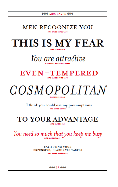
nah, agfa8x, loads of opinions are good. Some of us forget things that other people are more current on, and visa versa. For instance, I had almost forgotten the slabby goodness of Clarendon and the beautiful capital Q's of Mrs. Eaves.
all this and modest too...
the Swiss 721 fonts are a great set. the different extensions and boldness of the family work perfectly for portfolios
My choices in typography (and, ahem, color!) are as political as they are formal & personal. Decoration and ornamental "extras" are culturally associated with femininity. Decoration has been devalued because[i] it is associated with femininity, which has been historically devalued. Even teeny weeny little extras like serifs on a perfectly serviceable font are being devalued here as silly, unnecessary, fusty old frippery. The mental alphabet-soup I have up here, making all these connections (even if it seems ridiculous & over-thinky, at first, to connect [i]fonts with a personally dear social issue) makes me want to jump up and defend serifs! I love certain sans-serif fonts too. Just hate to see an entire classification of fonts pushed aside. & That's the greatest compliment you could say - that it's "So me." [Whether this is a good thing or a bad thing in anyone's mind is irrelevant! heh.] I really tried for that more than anything. :)
The ideas I have on this topic go pretty far beyond where this discussion needs to go. Ultimately, for someone who doesn't really know graphic design and who's submitting to a school of architecture, to a bunch of architects who most likely don't know the finer points of leading and kerning (even if they might instinctively perceive varying degrees of fine-tuning) - it's just, dude, pick a font, any basic font, and keep the layouts as simple as possible. You may not produce an innovative book design of great genius, but you'll be a step closer to producing a clear, readable, communicative one.
Messing up my tags on the message board is the hallmark of superb typography. Thanks, 230AM and Earl Grey.
well said namby.
bravo pambics. i'm also a fan of mrs eaves. it's my wooby serif font.
slate has a two font stories today...
the first is a slideshow on helvetica...
How an unassuming font took over the world
the second is a survey of some writers' favorite fonts to compose with...
My Favorite Font
oddly enough, COURIER, is a frequent favorite...
ok, i have a new sans favorite: gotham

hmmm, Gotham Thin Italic = yuck. Gotham Ultra = beefy authoritative goodness. I wonder if when developing the family of fonts, a typographer ever just chucks one out (like Thin Italic for example...) because it just doesn't bring anything to the party?
Paul Mijksenaar's book Visual Function has lots of great basic information about typography and how it can be used successfully. He also discusses when and why sans-serif/serif fonts are appropriate.
Gotham has rather good tracking. I was surprised how little kerning actually needed to be done.
For those of you who care, I think I've decided to go with two different variations of Myriad Pro.
1 font, different sizes. No comic sans, no times new roman, etc.
Good ones:
Arial
Century Gothic (my favorite)
Verdana
I like Myriad, afrdzak. It's very pleasantly proportioned. I don't use it as much as I'd like because I'm afraid of people recognizing it as a MS default font, though.
I hear Madonna is way into Kabel.
Madonna is into a new religion every album. Wasn't she all like Hindu for a while?
shhhh, ckp, Kabel Book Ultra has been my secret font for a while now. Every time I use it, people comment on it, yet I never see it in other people's work.
i need some ideas for my bankfont...haha.....

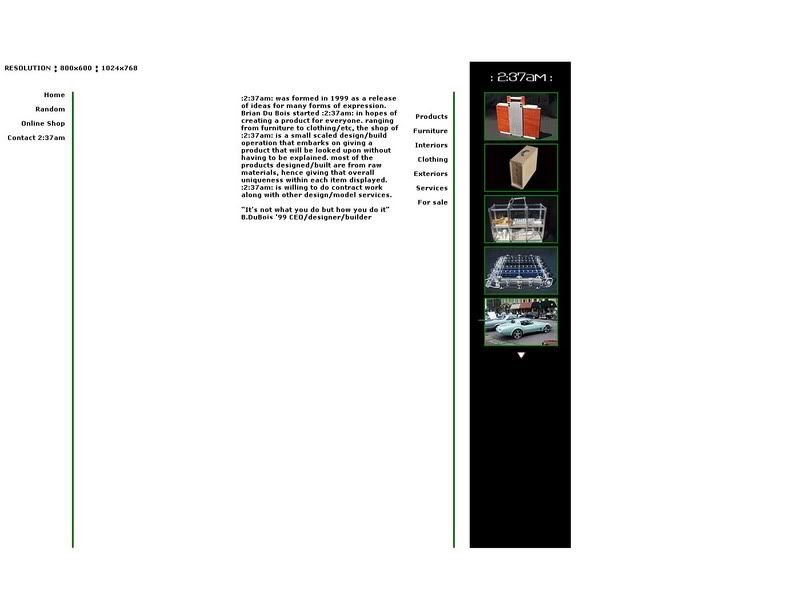
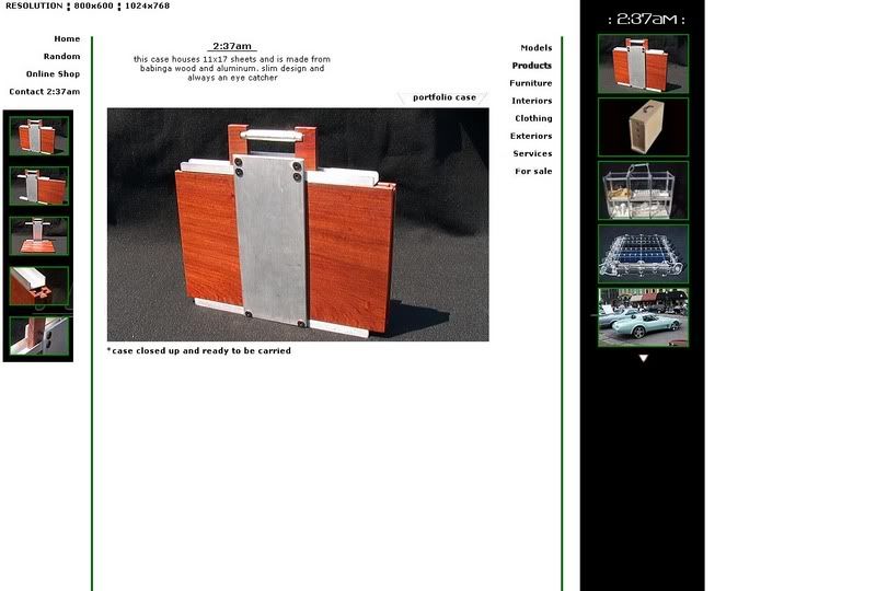
heres the link to the brochure that i'll send out soon.....
http://s145.photobucket.com/albums/r231/237am/?action=view¤t=237am-brochure-trifold1-NEW-copy.jpg
and the new ideas for my site
http://i145.photobucket.com/albums/r231/237am/new-layoutgreenlines.jpg
http://i145.photobucket.com/albums/r231/237am/new-layout1greenlines.jpg
i still need to figure out a few things but suggestions are welcome
b
damn...... i thought the size was right...wtf
I like your models and photographs of them. But I think the font doesn't really lend itself to the projects. That BankAntiqua font is a good one, but I think ti works better with digital renderings as opposed to nicely crafted analogue models.
Something a little more subtle would look a little nicer.
What was it called?
In the first image, can I suggest you might be better using body case for your text rather than upper case? Blocks of upper case text don't read well.
Bank gothic is a rather dated font. I might try something like Gotham, DIN, or Akzidenz Grotesk. I also agree with agfa that body copy does not read easily when in all caps.
Oh I actually like all three of those, e, but I would have to put a rather large hole in my wallet to attain those legitimately. Myriad fortunately came with my InDesign.
yeah, fonts aren't cheap.
going off tangent.... but whats the max limit of pages for a portfolio- m.arch???????
technically, there's no max # of pages.
oh... right o!
Technically asking means you have too much.
You could do it in 3. You could do it in 12. Don't do it in 20 or more.
yea... i realise that the lesser sheets with stronger content is appreciated better, i remmember coming across 10 pages (20 sheets as a max limit) also 15 pages in college requirements.... also if you have had a look at the other portfolio's ( rather most) its done in 30 - 35 sheets....
clean, sharp, communication is key...and of course it has to be a bit slick
font wise i generally opt for ariel, ariel black and my old favourite; eurostile
also...not too fashionable, thats always bad...classic and clean
yea...... totally agree with the fonts.... probably restrict it to 2-3 fonts, even swiss721 blk ext bt can be used for bold highlighters..... verdana and tahoma.... my personal fav.
1 font is fine...utilize the family variances for hierarchy...it is referred to as a family for a reason.
I just updated my stuff and I used Trajan Pro for headings and Optima for the text. The Q is what drew me to Trajan.
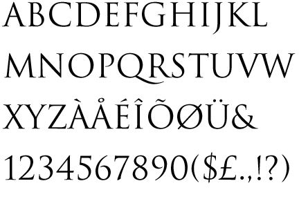
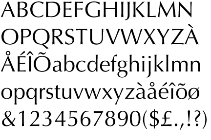
Trajan
Optima
aquino- just avoid Trajan in all caps, as it gives a movie-poster vibe.
I did...the one thing I don't like about Trajan is the lack of a true lower case.
whiteny or verlag is quite nice.
also look at vista sans, from emigre.com as well
houseindustries does some funky stuff if you are into that.
I would suggest using only one sans and one sans serif that are complimentary
Block this user
Are you sure you want to block this user and hide all related comments throughout the site?
Archinect
This is your first comment on Archinect. Your comment will be visible once approved.