Gurgaon, New Delhi, IN | Singapore, SG | Bangkok, TH | Bangalore City, IN | Mumbai, IN | Hyderabad, IN | Pune, IN | Beijing, CN | Chennai, IN | Hong Kong, HK | Makati, PH | Melbourne, AU | New York, NY | Shanghai, CN | Sydney, AU
“If you want to go fast, go alone. If you want to go far, go together.” So the popular saying goes.
But for the investment management firm, Arisaig Partners, this saying is not just an empty philosophy — it forms the very DNA of their corporate brand. This focus on unity and togetherness is evident in the way the company functions. Its employee-owned approach means that there is a strong feeling of ownership and belonging among those who work and manage the day-to-day functioning of the firm. They offer boutique services, which allows them to work very closely with each client and stakeholder and form long-term partnerships — so that eventually, these clients end up feeling like an extended part of the Arisaig family too.

When the company wanted to relocate to a new space in Singapore, they reached out to Space Matrix to conceptualise a corporate office design that would not only tell their brand story but also express these feelings of warmth, homeliness and belonging. They wanted to ensure that both guests and employees would feel welcome, relaxed and at home in the office, no matter how many times they visit.
Here’s how we expressed their corporate brand identity with a strong focus on wellness, comfort and aesthetics.
1. A strong design focus on heritage
The company’s heritage spans across two different locations in the world — Arisaig Beach in Scotland from which the company derives its inspiration, and Singapore, where their offices are based. We wanted to ensure that the essence of both these places are reflected in the office brand identity.

The word ‘Arisaig’ in Scottish Gaelic means ‘safe place’ — and this fit in perfectly with the cosy aesthetic of safety and comfort we were trying to create. The wide open spaces, the abundance of sunlight, and the soothing colour palette of blues, yellows and sandy tones are all a visual nod to Arisaig Beach. Framed paintings of the beach and other beautiful artwork are also strategically displayed across the office to maintain this visual connectivity throughout the space.

Singapore’s contribution to the design aesthetic is apparent even before you step in. The office is located in a historical shophouse — so we retained the classic shophouse exteriors featuring the red shuttered doors and windows. In fact, these doors and windows helped us add some extra texture and visual interest to the office interiors as well. We underlined this local charm through several other design elements. For instance, one section of the pantry features colourful Peranakan tiles, while some of the meeting rooms have stunning accent walls decorated with printed, patterned wallpaper.
2. Cosiness knit into every nook
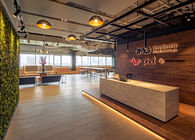
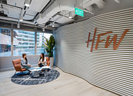
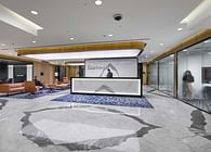
Aside from the overall look and feel, we paid special attention to specific nooks and corners too, to ensure that the peaceful, homely vibe is extended across the entire space. For example, instead of a typical corporate reception area, we went for a cosy, resimercial-inspired welcome space, complete with cushioned sofas, artwork on the walls, and subtle overhead lighting. On one side, stands a chic artists’ studio lamp to add an extra dash of interest. There are display shelves at strategic spots across the office, that showcase a selection of products from companies that Arisaig invests in. This is an important way to extend that sense of belonging to clients and stakeholders — it helps weave in clients’ stories into the workspace design, thus making them an integral part of the Arisaig journey.
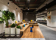
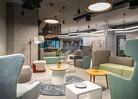
In another corner of the office, we created a snug little reading nook. Here, we introduced soft accent chairs and pouffes in soothing pastel hues, a stylish centre table and uniquely patterned wallpaper. Wide windows on one side let in a flood of sunlight, making this a relaxed, inviting space — perfect for curling up in to read, chat or work from for a few hours.

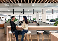
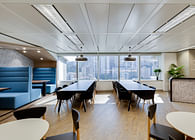
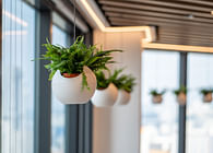
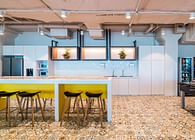
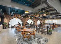
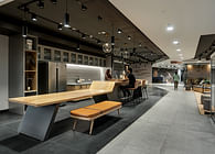
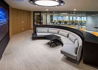
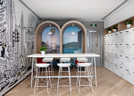
With a long table, stylish chairs and soft overhead lighting, the pantry is yet another area in the office that invites casual collaboration and informal gatherings. A chic ceiling feature with accent lamps and tumbling plants adds to the urban, café-like vibe while the wood-tone flooring and fittings give the space a touch of warmth and cheer.
3. Wellness ensured through sustainability
Sustainability is an important part of the company’s values — and incorporating sustainable products and design practises into the office design only helped us add to the sense of contentment and wellbeing.

For instance, you would notice an interesting ceiling feature at the reception area as well as in various collaboration zones. This aesthetic feature actually doubles up as acoustic panels, and helps absorb sounds in spaces where buzz and chatter are expected. But what you may not know are that these acoustic panels are eco-friendly too — they are made with recycled polyester fibres derived from discarded PET bottles.
When it came to lighting solutions too, sustainability went hand-in-hand with aesthetics and user wellness. The wide shophouse windows bathe the entire space in natural sunlight. We ensured that there were minimal design interruptions so that sunlight could permeate deep within the office. We also used energy-saving LED lights and accent lamps throughout the workplace. Not only was this the more sustainable option, it also helped us give a softer effect to the space — something that would not have been possible with harsh fluorescent lights.
Looking to interpret your corporate brand DNA through a unique workplace strategy too? We can put our experience to work for you.
Status: Built
Location: Singapore, SG
Firm Role: Designers
![Welcome to the Space Matrix [β] Lab (Beta Lab): Explore | Experiment | Evolve your workplace at our workplace Welcome to the Space Matrix [β] Lab (Beta Lab): Explore | Experiment | Evolve your workplace at our workplace](https://archinect.gumlet.io/uploads/a2/a299a4d482050f4cde0c2319362274b2.jpg?fit=crop&auto=compress%2Cformat&enlarge=true&crop=entropy&w=195&h=140)
![Welcome to the Space Matrix [β] Lab (Beta Lab): Explore | Experiment | Evolve your workplace at our workplace Welcome to the Space Matrix [β] Lab (Beta Lab): Explore | Experiment | Evolve your workplace at our workplace](https://archinect.gumlet.io/uploads/c6/c640bc99dae2fa43f4703128358c0869.jpg?fit=crop&auto=compress%2Cformat&enlarge=true&crop=entropy&w=195&h=140)
