Gurgaon, New Delhi, IN | Singapore, SG | Bangkok, TH | Bangalore City, IN | Mumbai, IN | Hyderabad, IN | Pune, IN | Beijing, CN | Chennai, IN | Hong Kong, HK | Makati, PH | Melbourne, AU | New York, NY | Shanghai, CN | Sydney, AU
Azqore, a technology services company, was launched in 2018 as an independent subsidiary of Crédit Agricole Private Banking Services, to help wealth managers and private banks transform their operational efficiency and ensure compliance with regulations. Azqore Singapore first shared their office with Crédit Agricole at Mapletree Business City but relocated as they were expanding and wanted to bring the Azqore team together, in one central location, giving them their own branded office workplace and innovative office design that would foster a sense of belonging and a stronger team culture.
The Space Matrix design team found that automation is one of the biggest trends that is impacting Singapore’s financial workforce, an industry that Azqore is in. In 2019, data released by the Monetary Authority of Singapore (MAS) and the Institute of Banking and Finance (IBF) showed that one-third of all the job roles in the financial sector may be impacted due to automation within 3-5 years, such as AI-driven chatbots that take care of customer queries, interactive teller machines that reduce the need to have advisors at every bank counter, and intelligent programmes that assess and analyse market risks without the need for manual intervention. These innovations will take a lot of mundane, time-consuming tasks off finance employees’ to-do lists, leaving them free to take on newer, more innovative roles.
Azqore’s workspace design was updated to complement this change. For instance, instead of being tied to a single desk, performing a routine task, employees will now experience a more varied workday. They would need to collaborate more and present their ideas to larger teams while only analysing and processing the most sensitive data manually. So, Azqore’s corporate interior design included Neighbourhood-Based Choice Environments (NCEs), with one work pod functioning as employees’ home base, and various collaborative clusters for the more interactive parts of their day. Given that job roles are changing from monotonous to innovative, it was also important to have the workspace designed for creative function. Rather than stuffy, conventional spaces that make people feel walled in, open, airy, sunlit mixed-use space where one can work and relax was the way to go.
Space Matrix was interested in designing a modern office interior - centred around the idea of neighbourhoods - that reflected Azqore’s engineering excellence and create excitement through innovation, flexibility, and functionality, while encouraging collaboration and fostering a sense of community.
Aesthetics & Spatial Design
Using the Azqore business ethos as the basis for inspiration, the Space Matrix design team decided to go with the idea of creating a network, a NETWORK that connects people, ideas, spaces.
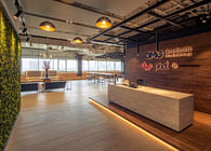
With the concept of Neighbourhood-Based Choice Environments in mind and thinking of the Azqore design office as a small town built for human connections and organic social interaction, the new Azqore office design was designed as a town with a big, central, buzzing public square. This square, as a central artery, is connected to streets leading into different neighbourhoods, all with their own – smaller, more quiet – meeting spaces.
The Space Matrix designers’ raison d'être was to allow the Azqore community to find comfort and wellbeing, and to share collective thoughts in a central unified location. The circulation of leading passageways was examined, connecting streets, and water locations, and even allowing smaller neighbourhoods for a more integrated community.
These were the office interior design principles as applied to Azqore’s space:
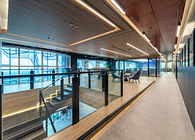
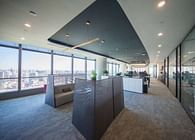
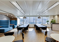
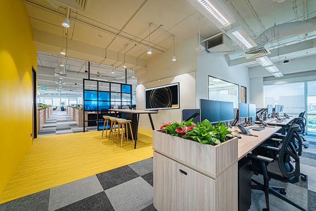
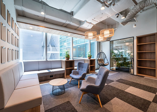
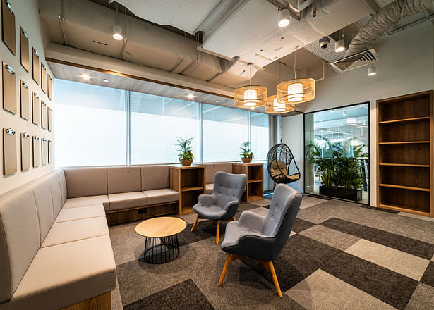
Creating open spaces. Open, bright spaces with as much natural light as possible, with open ceilings and sight lines kept as long as possible in the space.
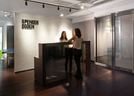
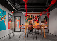
Inspiration in subtlety. Rather than overwhelm the space with excessive corporate branding, the primary and secondary brand colours were strategically sprinkled here and there. Better for the eye—and actually more impactful, too.
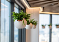
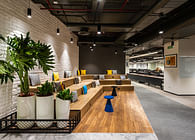
Biophilia. Greenery helped bring the office to life; a touch of colour, a breath of fresh air, and organic textures broke up the clear sight lines for greater pleasure to the eyes.
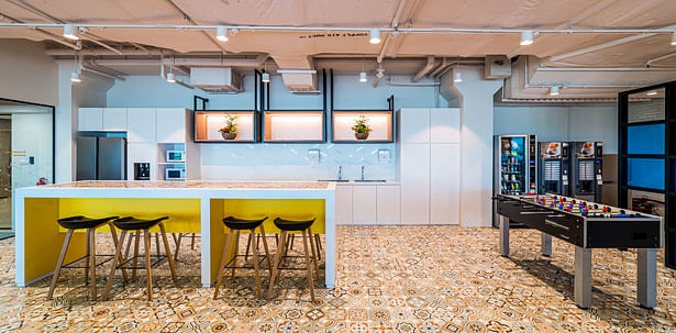
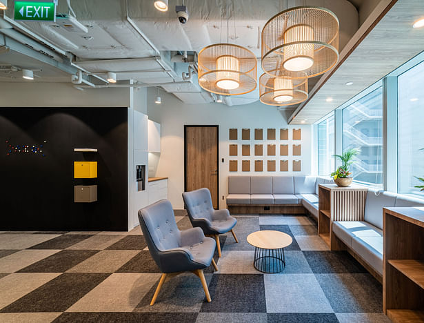
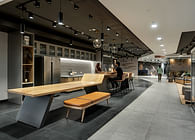
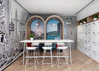
The office interior occupies two separate spaces and it was designed in a way where the pantry in the bigger space leads to the library in the smaller space, giving the impression of a single office “linked” by “a bridge”. In addition, all the access doors into each space open up into a collaborative area, giving the staff near the doors the needed privacy while creating buzz, in line with the workplace strategy to make the office collaborative, co-creative and innovative.
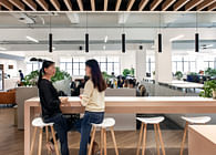
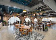
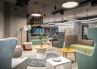
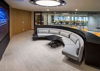
This office interior design concept divided the available space into small clusters or ‘neighbourhoods’, each with its own work areas and huddle spaces, much like ‘resimercial design’, which combines elements of home within a commercial space. Though it maintained an overall brand unity, each neighbourhood had its own unique vibe and functionality, which gave teams the ability to operate within an atmosphere that works for them. This went a long way in improving workplace productivity and minimising the disruptions of a typical open office environment. Having a unique niche to work from also instilled a sense of belonging — employees felt more at home within their own neighbourhood than they did in a completely open office environment. Following the resimercial design concept, most of the neighbourhoods were styled to look like a living room or kitchen hangout, with homely furniture chosen in natural tones, combined with pops of accent colour. The office was done up in soothing wood and bamboo tones, accentuated with vibrant hues.
In bringing the homely atmosphere of one’s house into the workplace, resimercial design could cater to the changing needs of a new generation of workers – the millennials. A far cry from the stark, impersonal office interiors of the previous decades, resimercial offices like Azqore became cosy, charming and inviting. It became a space that kept the employees comfortable when the workdays were long; a space where employees found themselves relaxing for an hour or two, after all tasks were done.
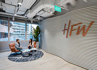
In Azqore, special seating was created for the directors but were still included in the open plan together with other staff. Private offices could be converted to meeting rooms for future possible requirements, with the Social Hub behaving as the main focal point since it allows for maximum daylight penetration into the main entrance and acts as the main connecting element within the unique floor plate that Azqore has.
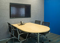
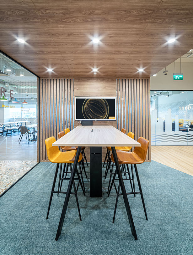
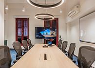
Work stations and manager work stations were designed in factorial units, such that one manager work station would be the equivalent of two regular work stations. This permitted flexibility and change in structure. The work stations catered to modularity and future expansion. There was also a flexibility of space in the design to allow for future growth, as the collaboration zones and one six-person meeting room were all located along the grid and could be dismantled and moved easily to add more work stations.
Environmental Site Analysis
A site analysis was done to better understand what the optimal workspace layout would be for Azqore employees, without compromising their comfort and well-being during the extended time that they spend in the office. A daylight analysis was done at 12pm, considered to be the hottest hour in Singapore’s weather, and daylight simulation results showed that more than 78 per cent of the floor plate would receive sufficient daylight. Hence, the design team decided that designing open plan workstations in a daylit area would reduce dependency on artificial lighting during the daytime with the integration of daylight sensors. Non-regularly occupied spaces, which do not need continuous daylight, would then be designed in non-daylit spaces.
A shadow range analysis for the Summer Month (9am to 5pm), was done to understand how to create a comfortable working environment for employees throughout the day. The results showed no substantial overshadowing impact from the surrounding built environment. Exposure to high intensity radiation proposed a potential challenge in terms of glare control, but the interior design zoning was handled carefully with additional glare control strategies.
Fostering Collaboration and Breaking the Traditional Model
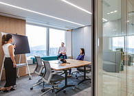
There used to be a time when managers would spend their days sequestered in mahogany-lined offices, while junior employees would sit in cubicles on the main floor. Now, the challenge with Azqore was that corporate office interiors had to be designed in a way that bridged the gap between on-shore workers, frequently travelling senior management, remote managers and colleagues visiting from various branch offices. Rigid, assigned seating structures had to make way for more open work neighbourhoods with cluster seating arrangements, interactive walls and movable partitions to enhance the flexibility of the space. This ensured that people could settle down anywhere, without feeling like they were encroaching on another’s ‘territory’. Yet, given the sensitivity of the information that Azqore worked with, being in the financial services industry, secure storage areas where sensitive documents can be kept were left in place.
Azqore’s second challenge was moving their team to a location that was not considered to be as attractive as Mapletree Business City. They wanted to replace the traditional mindset of private offices equating to seniority and hierarchy with a culture of open-plan seating that would foster collaboration and new ways of working. The designers worked with the Azqore client to understand the concerns of the employees and how to get their buy-in for the design through an ideation workshop. The Azqore team then realised that the open-plan seating could be phased in as staff adapted their behaviour. Team leads who had grown accustomed to having their own office space were given larger desks with higher partitions and even the CEO’s office could be converted into a meeting room if he decided to travel, allowing for greater flexibility of space, dissolution of hierarchical boundaries between leaders and staff, fostering greater trust and engagement among all employees.
Ultimately ,“listening” was critical to the success of this project. Engagement sessions with the client prior to the design phase focused on their concerns and pain points and resulted in a space described by Azqore as “design that speaks to the heart”.
Seeking to stay ahead of these trends and be a part of the financial workplace of the future? Let's discuss.
Status: Built
Location: Singapore, SG
Firm Role: Designers
Additional Credits: Design - Jodie Darmawan, Richard Baker, Sayuri Kulkarni, Samantha Soe, Milca Chungtuyco
Project Management - Lui Chuen Poh
QS - Angela Chang, Sylvia Tudy
Procurement/MEP - Praveen Kumar K M
![Welcome to the Space Matrix [β] Lab (Beta Lab): Explore | Experiment | Evolve your workplace at our workplace Welcome to the Space Matrix [β] Lab (Beta Lab): Explore | Experiment | Evolve your workplace at our workplace](https://archinect.gumlet.io/uploads/a2/a299a4d482050f4cde0c2319362274b2.jpg?fit=crop&auto=compress%2Cformat&enlarge=true&crop=entropy&w=195&h=140)
![Welcome to the Space Matrix [β] Lab (Beta Lab): Explore | Experiment | Evolve your workplace at our workplace Welcome to the Space Matrix [β] Lab (Beta Lab): Explore | Experiment | Evolve your workplace at our workplace](https://archinect.gumlet.io/uploads/c6/c640bc99dae2fa43f4703128358c0869.jpg?fit=crop&auto=compress%2Cformat&enlarge=true&crop=entropy&w=195&h=140)
