Archinect
L+C Design Consultants PA

L+C Design Consultants PA

North Bergen, NJ

anchor

Glenn D. Cunningham Early Childhood Center

The Glenn D. Cunningham Early Childhood Center is an adaptive re-use of an existing light manufacturing facility. Completed in 2005, the project included gut renovation and restoration of the existing brick façade in a densely-built urban neighborhood.


This small, community-based school contains five classrooms, an Indoor Play Area, and support services for full-day and after-care programs. The existing industrial building occupied the full site and a creation of a bright, well lit interior play space was critical. A 14’ high vaulted ceiling and large East / West windows were created to provide a sense of openness and abundant daylight; these features are clearly visible from the street. Brick, cast stone, signage and window guards were detailed to create a strong identity as a valued community resource. The paper cut motifs in window guards and signage and the bright blue ‘cloud’ equipment screens mark the project as a children’s facility.


Read more

Status: Built
Location: Jersey City, NJ, US
 
The designated drop-off area is located at an entrance along Cator Avenue, a quite side street, to facilitate traffic flow from busy Ocean Avenue. The main Schoolhouse Entry “Tower” is an important exterior and interior feature. Tower marks the school’s presence and entry and adds interest to the long façade. As the building occupies the full site, brick, cast stone, signage and window guard details were provided to create a strong identity. As existing paving received only limited...
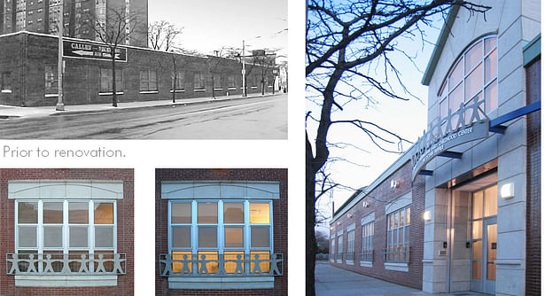
The designated drop-off area is located at an entrance along Cator Avenue, a quite side street, to facilitate traffic flow from busy Ocean Avenue. The main Schoolhouse Entry “Tower” is an important exterior and interior feature. Tower marks the school’s presence and entry and adds interest to the long façade. As the building occupies the full site, brick, cast stone, signage and window guard details were provided to create a strong identity. As existing paving received only limited repair, entry was outfitted with bright paving patterns.
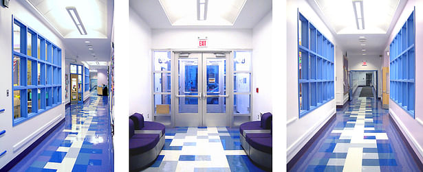
Interior Corridor windows were used to bring in light through multiple surfaces. Tile patterns were chosen to visually coordinate with window systems, finishes, and lighting.
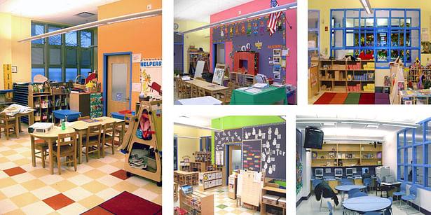
Bright, warm colors were used to create a supportive and nurturing visual environment. The rooms would took on individual identities through the use of specific colors.
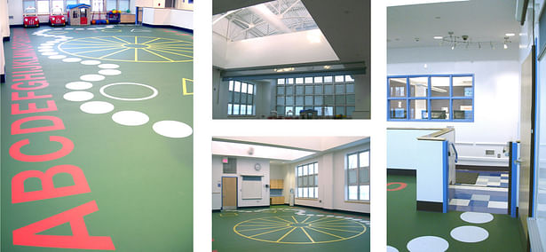
Clerestory windows are utilized in the two gathering spaces (Main Entry and Play Area). Along with the 14 foot high vaulted ceiling and large east / west windows, building “UP” was the best way to open up the gathering spaces and increase the sense of space. Graphic patterns that evoke board games were chosen for floor treatments.