
ShowCase is an on-going feature series on Archinect, presenting exciting new work from designers representing all creative fields and all geographies.
We are always accepting nominations for upcoming ShowCase features - if you would like to suggest a project, please send us a message.
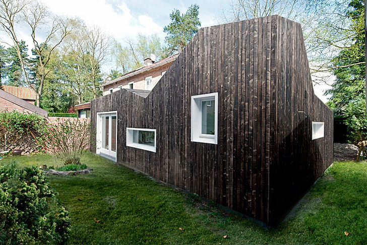
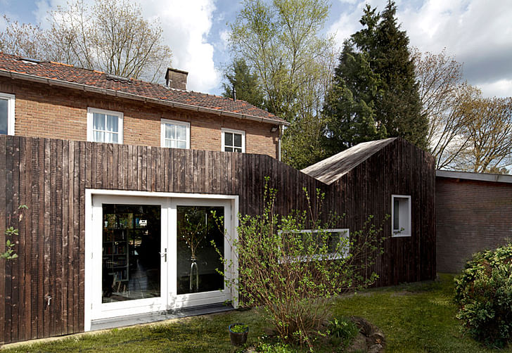
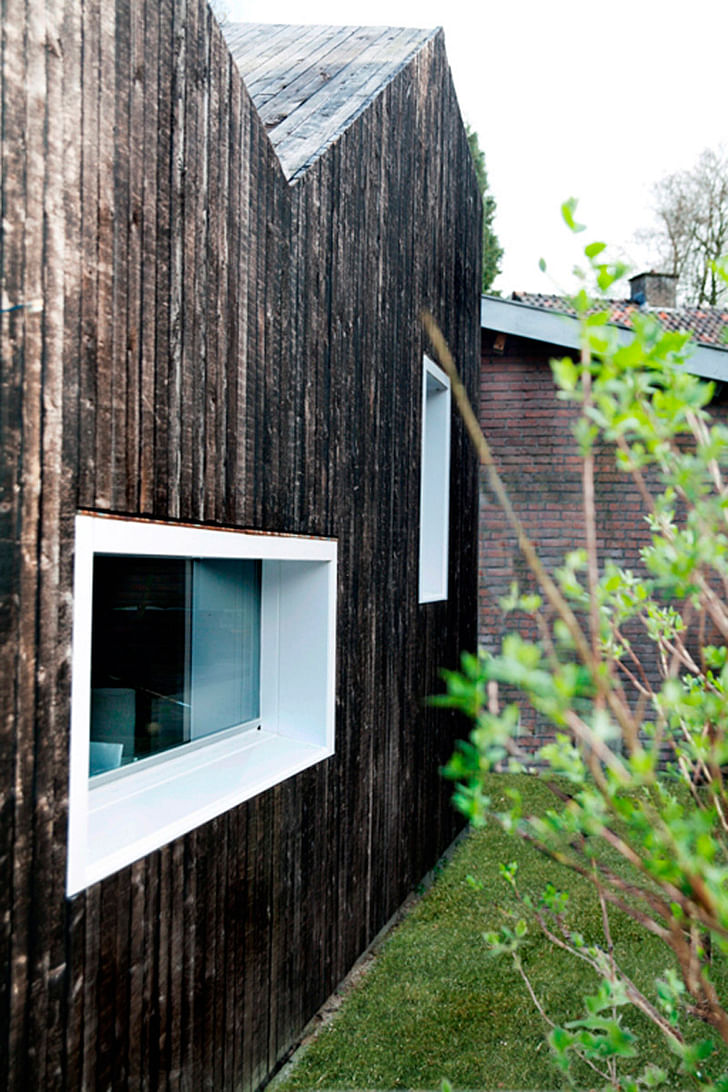
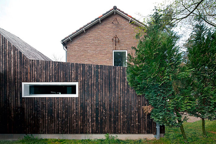
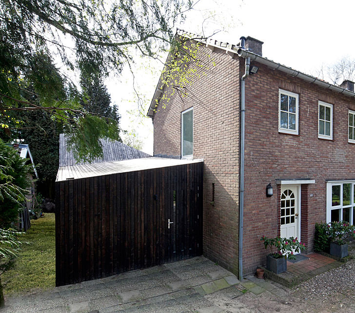
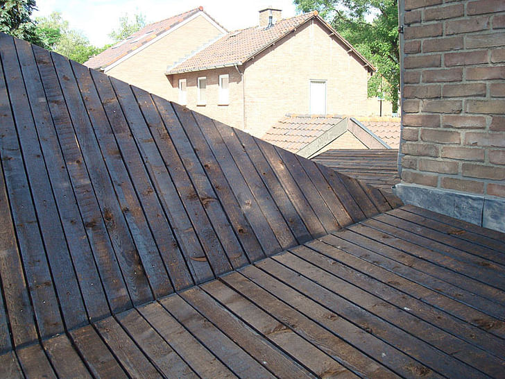
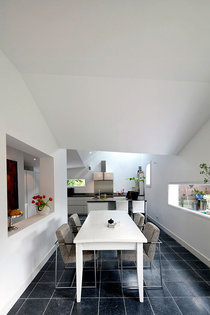
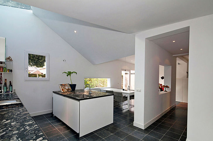
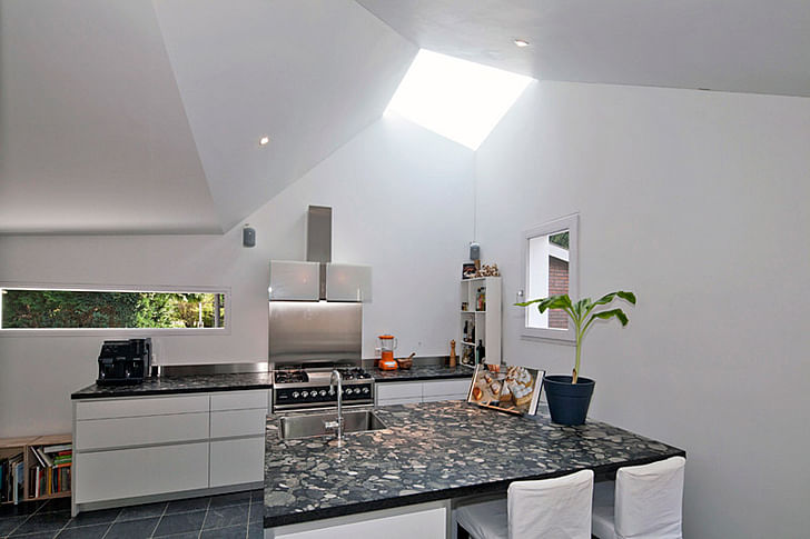
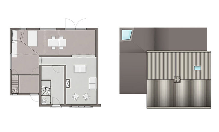
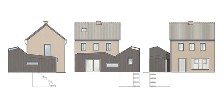
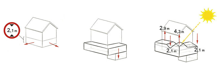
The sculptural form of this extension adds a nice contrast to the minimal expression of the 1950’s main house. The shape of the extension and the position of its windows are carefully related to the interior functions. The skylight in the highest point provides extra daylight to flood the kitchen desk. The stretched window in the back facade provides a panoramic view into the garden.
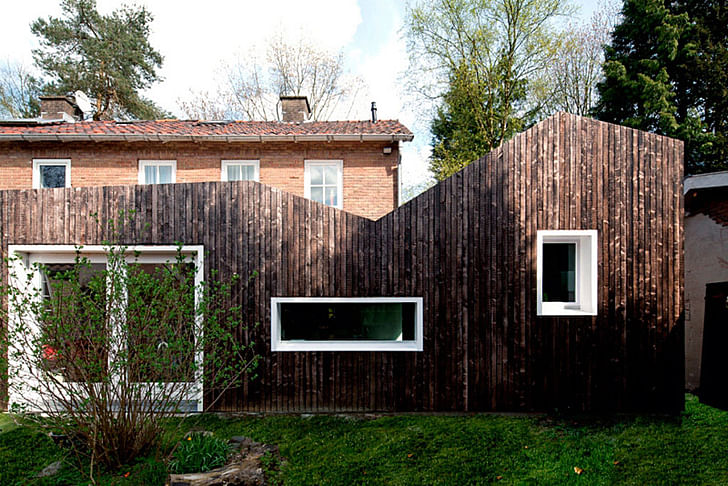
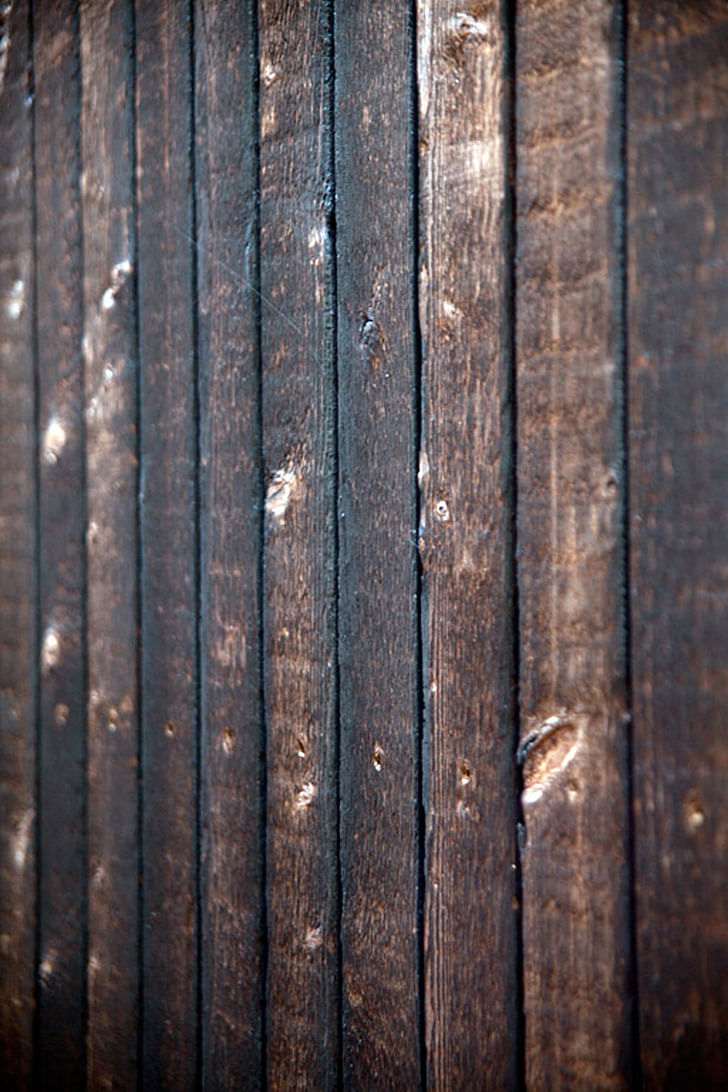
The extension is built with sustainable materials and techniques. The prefab wooden walls are insulated with recycled paper scraps, which results in an insulation value that is twice as high as the current regulations prescribe. The cladding is made of wood which has been carbonized with fire on the front side. This carbon layer gives the extension a deep black glow and simultaneously acts as a protective layer for the wood, resulting in a completely maintenance-free facade.
All construction elements are prefabricated and constructed at site, resulting in a total building time of 8 weeks. After the basement and foundations were cast in concrete, the wooden extension got placed in one working day.
Architects: BYTR Architects
Project team: Tjerk van de Wetering, Richel Lubbers, Dominique Vermeulen
Client: Private
Location: Maarn, the Netherlands
Design: 2009
Realization: 2010
Photography: Ossip van Duivenbode
Find photos of the construction process, as well as model photos, in the image gallery below.
5 Comments
Very nice!
Good Concept of using wooden cladding for warm houses...
Definitely confused this with Okada's House on Mt. Fuji (Forest Refuge) at first glance... Beautiful siding, nice form. Some angles seem a bit arbitrary, especially in the ceiling plane.
Its a really really nice plan........
how do they waterproof that thing? the wall to roof, valley, and roof in general look scary as far as water infiltration. is it just wrapped in rubber or something?
oh yeah, nice form, love the burned wood siding, etc. but dislike the flooring and countertops .. i think some colo(u)r on those cabinets would have been nice either paint or wood and lastly i wish the windows weren't trimmed out and instead more clean and minimal like the ceiling - like how the skylight was handled.
oh i almost forgot they should have turned the flatter part of the addition into a big party deck with a stair down to the garden, it all could have been deftly handled with their warped/angular forms oh YEAH!
Block this user
Are you sure you want to block this user and hide all related comments throughout the site?
Archinect
This is your first comment on Archinect. Your comment will be visible once approved.